
How to Build a Mobile Website


Asking this question is critical, because if your company doesn’t have a site compatible with mobile devices, it’s likely that you’re losing a high number of potential customers.
Fortunately, there’s a solution. By updating or building a mobile website, you can capture all of the customers and leads that you otherwise would’ve lost to your competitors. Keep reading to learn how to build a mobile website, plus learn about the challenges that come with building a mobile site!
How to build a mobile website in 3 steps
Are you ready to learn how to build a mobile website for your business?
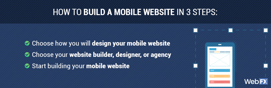
Get started with these three, easy-to-follow steps:
1. Choose how you will design your mobile website
Before you start building your mobile site, you need to choose how you will design your website. When creating mobile websites, companies can choose between a few approaches. These approaches come with different benefits, challenges, and costs.
Your options include:
- Responsive web design
A responsive web design uses adaptable layouts, which means you can have a website that appears almost the same on desktop, mobile, and tablet devices. Your content and your design adapts itself to a user’s device automatically.
- Adaptive web design
An adaptive web design uses unique layouts for devices, which means your website features different designs or versions for desktop, mobile, and tablet devices. You deliver different experiences to users, based on their device, and may even maintain three separate websites to accomplish this task.
While you can choose either responsive or adaptive web design, responsive design is becoming the go-to choice for businesses. That’s because a responsive design allows you to provide a consistent experience to users. Plus, you maintain a single site.
2. Pick your website builder, designer, or agency
Next, your team needs to choose how you want to create a mobile site.
Do you want to hire a freelance designer or a professional web design agency to build your site? Or, do you want to use a website builder and make it yourself? The choice is yours, and each option offers different advantages and disadvantages.
No matter which one you choose, you want to make sure you compare your options.
- Web designer
A web designer can help your business create a fresh and functional website for mobile and desktop users. Their design experience can improve the usability and look of your site, which are critical factors when it comes to how people interact with your website, like when deciding to make a purchase.
If you decide to work with a web designer, however, you will need to have a decent budget. If you set a low budget, it can result in a subpar designer and broken website, which you don’t want. Research web designers in your area and get some custom quotes.
- Web design agency
A web design agency can also help your company launch an attractive and easy-to-use website. The advantage of partnering with a web design agency, however, is that you often get access to a team of designers and developers, which can make a massive difference in the look and speed of your site.
In most cases, established web design agencies can also offer lower rates than professional web designers. That’s because they feature the necessary talent to create and build mobile websites fast, which allows them to take on additional projects.
If you decide to partner with a web design agency, follow an approach similar to hiring a web designer. Request a custom quote, browse their portfolio, and meet with their team to see how they can help your company build a mobile website that generates sales and phone calls.
- Website builder
A website builder can help your business create and launch a desktop- and mobile-friendly website too. These builders can range from WordPress to Wix, and while free, most companies will eventually invest in the paid version to access additional features.
For example, to use your unique domain, you will need to maintain a monthly subscription.
While website builders provide your company complete control over the web design and web development process, they also limit the capabilities of your site. You will often rely on templates, for example, which can stop you from accessing the kind of functionalities you want in a website.
Once you decide how to build a mobile website, whether with a designer, agency, or website builder, you can begin the process. Remember to research each option in-depth. That way, your business can make the best decision for your site, budget, and ideal website visitor.
3. Start building your mobile website
Now that you’ve chosen your website builder, web designer, or web design agency, you can start building your mobile website. This process will likely include some trial-and-error. If you partner with a designer or agency, for instance, they may create mockups for you to review.
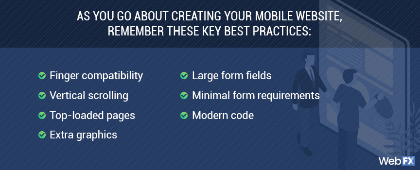
As you go about creating your mobile website, remember these key best practices for mobile sites:
- Finger compatibility. Can someone tap all the links on your site?
- Vertical scrolling. Can someone use their thumb to read all of a page?
- Top-loaded pages. Is your most important information at the top of each page?
- Extra graphics. Can you remove any unnecessary images or videos?
- Large form fields. Can someone tap a form field with their thumb?
- Minimal form requirements. Do you absolutely need all of the information you require in form fields?
- Modern code. Are you using HTML5 code?
Before you launch the finalized version of your mobile and desktop site, make sure you test it. You want to provide website visitors with a seamless experience, and if they run into issues, they may not bother coming back.
With testing and preparation, though, you can launch a functional and good-lucking website!
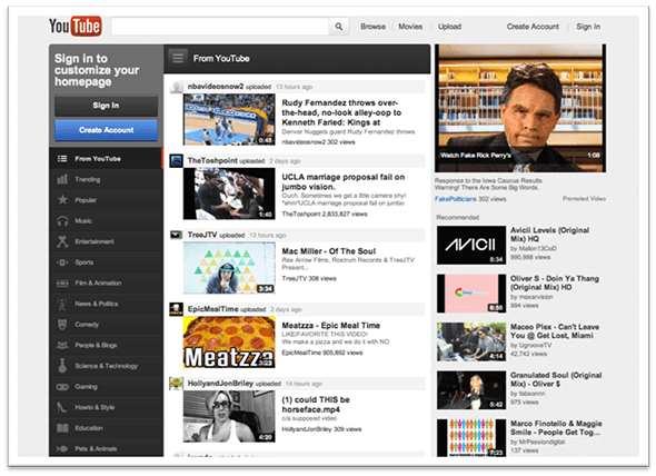
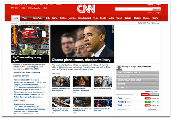
4 examples of mobile web design
Need some mobile web design examples before building your mobile site? Check out these four examples:
- Youtube

- CNN

- Clarity Way


- Yuma Dental


How to create a mobile site for your business
We understand you’re swamped with running your business or organizing a marketing department.
If you want the fast details on how to create a mobile site, check out the slideshow below.
Why are mobile websites important?
Without a mobile website, you stand to lose more than half of your potential customers online. In a nutshell, that means you’re earning 50% of what you should be earning every day, every month, and every year. That’s why companies (including your competitors) are researching how to create a mobile website.
More than ever, shoppers are turning to their mobile devices to surf the web and to make transactions. In fact, in 2020, $650 billion was spent on mobile ecommerce, and that number has only continued to rise. By 2025, the mobile ecommerce amount is set to reach $700 billion in spending.
In addition, in 2015, mobile commerce reached 30% of all U.S. e-commerce.
Have we convinced you that a mobile site is crucial yet?
We don’t want to tell you about the work we do, we want to SHOW you.
View Our Portfolio
We’ve built over
Websites
in a variety of industries.
How does mobile web design work?
Mobile web design lets your website detect the size of the device that someone is using. Then, your website automatically scales to the size of that device’s screen, if you’re using responsive design. If you use adaptive web design, your site will deliver the most appropriate site version.
Either way, building a mobile website lets users easily scroll through your website without having to zoom in on text or tap at tiny text links, which is definitely a reason for users to navigate away from your website and find one that responds well to their tiny screen.
You could also hear people call this “responsive design,” which is essentially the same. But there’s a key difference you should know.
Mobile web design gives businesses the option to have a separate, mobile-only website in addition to their current website. A lot of companies that use this format keep their website name the same, but they’ll add an “m” before their domain name.
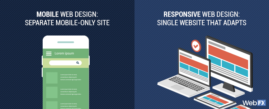
Responsive design gives you one single website, but it has the ability to adapt to different screen sizes. So whether someone uses a 30″ desktop monitor or a 5″ smartphone screen, they’ll get a great experience on your site. This does not require you to have a second version of your website.
Still, there’s no right or wrong answer. Sometimes it makes more sense for a company to use a mobile-only site, and sometimes it makes more sense to use a responsive one.
While we can’t give you a recommendation right now, we’re always happy to hear your thoughts on your business’s site. We can help you figure out the best solution for your site with one conversation!
There’s more to mobile web design than just screen sizes, though. You also have to consider load times.
The biggest challenge of building a mobile website
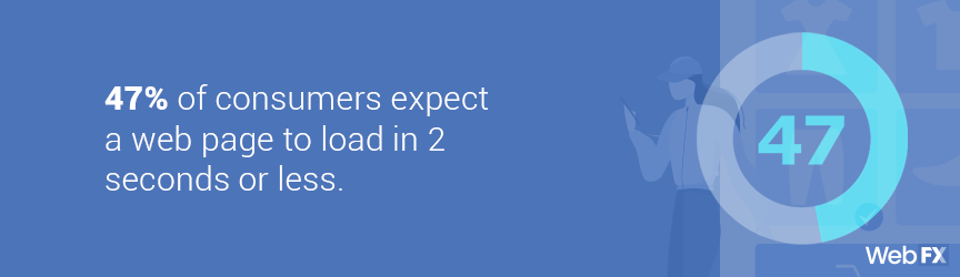
One of the most challenging parts of mobile web design is making your website load quickly on every possible device.
This is important since it only takes half a second of loading for someone to leave your site and go to a competitor. In fact, 47% of consumers expect a web page to load in 2 seconds or less.
In order to ensure that your site loads quickly, you’ll have to make sure that you reduce your image sizes, streamline your HTML code, and perform a number of other optimization tasks.
None of this is difficult – but it can be time consuming if you’ve never dealt with these elements before.
However, the payoff is huge. Google ranks fast-loading sites high in search results. It also uses mobile-compatibility as a ranking signal for your site. So when you have a mobile website that loads quickly, you can be sure you’re ranking well in Google search results.
Those rankings may not happen overnight, but your users will notice right away. After all, there’s a huge difference between a site that takes 10 seconds to load and one that loads instantly.
One of the most extreme ways to reduce load time on your mobile site is to use accelerated mobile pages, or AMP. This is a simplified coding language that helps Google read, understand, and recommend your pages more easily.
AMP also helps pages load instantly on mobile devices.
When building a mobile website, you need to think about the load time of your site. Whether you partner with a designer or agency, or use a website builder, you need to make sure your website delivers a fast experience for users. Otherwise, they won’t bother purchasing your products, completing your contact form, or visiting your business.
How to choose your mobile web designer
It can be overwhelming to learn how to build a mobile website. That’s why many businesses decide to partner with a web designer or web design agency. If you decide to outsource building your mobile site, there are a few things you should consider to make the choice a little easier. In order to make the right selection, you’ll need to know:
- Your budget
- Your website goals
- Your company goals
- Your industry
- How all of them work together
Most of these factors make sense. You need to know how much money you have to spend, what you want to achieve online, and how you want your business to grow. But why is it important to know your industry?
The truth is, mobile web design helps some industries more than others, and it’s important to know and understand the potential ROI of a mobile site before investing in one for your business.
In order to determine the benefits of a mobile site for your industry, it’s so crucial to understand how it’s represented online.
For example, if you’re in an industry where your competitors haven’t updated their websites since 1998, mobile web design will be a miracle for your site in terms of Google search results and user-friendliness.
But if you’re one of the last companies in your industry to get a mobile website, you may notice lower returns. But that’s not a bad thing – you’ll still earn a great ROI from investing in a mobile website.
It simply comes down to how much of an ROI you’ll earn. No matter what, launching a mobile website will always get your business some level of ROI.
How much does building a mobile website cost?
Building a mobile website can cost anywhere from $1400 to $2800 or more. How much your business pays for a professional designer or web design agency to create your responsive site depends on your website’s size, preferred project turnaround time, and more.
If you’re curious about our mobile website design pricing, you can view our prices and plans below:
At WebFX, we have an award-winning team of web designers that strive to give our clients the absolute best results. We’ve even won numerous awards for our accomplishments. Those awards translate to high-quality websites, improved website traffic, and more customers for our clients — all of which can help any business grow.
Are you ready to take your business to the next level? Get a free quote for building a mobile site for your business now!
Are you ready to build a mobile website?
Now that you’ve had a crash course in mobile web design, it’s time to put your knowledge in action!
WebFX is here to give you the support you need. Our award-winning team of designers, marketers, and developers will make a website for your business that’ll help you stand out against your competitors.
All you have to do is contact us!