
 In this web development tutorial, you will learn how to code a web page template from a Photoshop mock-up from a previous tutorial called “Create a Clean and Professional Web Design in Photoshop” using HTML/CSS. This is the second part of a two-part series that will teach you how to create the layout in Photoshop, and then how to convert it to a standards-compliant (X)HTML web design.
The “Clean and Professional Web Design” Series
- Part 1: Create a Clean and Professional Web Design in Photoshop
- Part 2: Coding a Clean and Professional Web Design
Final Result
Click on the preview below to see the live demo of the web design that you’ll be creating in this tutorial. 
Download
You will need the Photoshop (PSD file) of Part 1 of this tutorial, download it from that tutorial. Also you can download all files including the examples used in this tutorial from the link below if you want to study it offline (or use it in a project).
- clean-professional-website.zip (ZIP, 74.8 KB)
Introduction
In this tutorial, we’ll create a fixed-width web layout using some basic coding techniques. We will go through step-by-step from the top to bottom. So this means that we will start from the the header, then content, and then the footer section.
Preview the examples when they are available to make sure that you are following along.
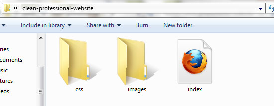
Setting up the file structure
1 Create a folder in your computer for the tutorial files and name the folder clean-professional-website. This will be our working folder.
2 Inside this folder, create the following:
- images folder – will contain all images used in the tutorial.
- index.html – our site template.
- css folder – will contain our stylesheet called styles.css
 3 Open index.html and styles.css in your favorite text editor. Also, open the PSD file in Photoshop; it’s inside the clean-professional-weblayout zip file from Part 1. 4 Our file structure is set up now and we are ready to go.
5 Open the Photoshop file. Open the Info panel from Window > Info (shortcut key: F8). The Info panel gives useful information depending on the selected tool.
Choose the Rectangular Marquee Tool (M) and set the options as shown below. After the options are set, click on the top left of the canvas (next to the logo) to make a selection. 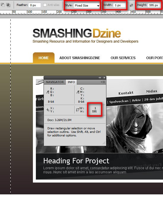 6 Use Edit > Copy Merged (Ctrl + Shift + C) to copy the selected area.
Create a new document and paste (Ctrl + V) the copied selection into the new document. Save the file for the web, File > Save for Web (Alt + Shift + Ctrl + S) as bg_body.jpg in the images folder. Use the same settings for saving all the files so that there is no issues with how they are rendered on a web page.
I used the JPEG – Very High preset but feel free to change these settings (you can probably get away with just JPEG – High or PNG-8 to keep your web page CSS backgrounds as lightweight as possible). If you change the default settings, be sure to save it the same way every time to provide consistency in the images. 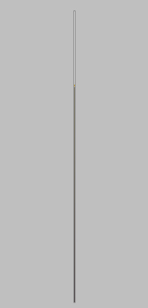
Setting up the HTML and CSS files
7 Move to index.html.
The first thing we want to do is reference style.css and in the <head> of our HTML document.
<head> <link href="css/styles.css" rel="stylesheet" type="text/css" /> </head>
8 Open styles.css and add some basic style rules. We’re going to take a shortcut here and use the Universal Selector margin/padding CSS reset to zero out all the elements’ margins and paddings.
This works the majority of the time, but it’s better to invest some time learning about more robust CSS Reset techniques which you can find here: Resetting Your Styles with CSS Reset. 9 Here is the style rule declaration for resetting the margins and paddings:
/* CSS Reset */ * { margin: 0; padding: 0; }Implementing the background
10 We’re going to implement the background we created (body_bg.jpg), tiling it horizontally (repeat-x). We’re going to set it as the <body> background.
We also define the default font-family that we are going to use in this website.
body { background: #fff url(images/body_bg.jpg) repeat-x 0 0; font-family: Arial, Helvetica, sans-serif; }Let’s preview how the background looks. In Example 1 below, you can see how background is implemented.
Example 1: See the background in action.
Setting up the layout’s container div
11 Let’s move into some HTML. We’ll contain our layout in a 960px-wide container div called #container.
<body> <div id="container"> <!-- content goes here --> </div> </body>
12 Since our content area is 960px, we’ll give #container a width of 960px and add a padding of 10px on the right and left. This will give us sufficient room on either side of the layout for scroll bars so that when the user minimizes the web browser, there’s still a bit of padding on the left and right and our content is not right at the edges of the view port (making the content hard to read). Center it using the margin attribute.
#container { width: 960px; margin: 0 auto; padding: 0 10px; }Creating the logo
13 Let’s slice up the other stuff, starting with the logo. Head over to the Photoshop file. Create a selection around the logo that is exactly 360px and 115px wide using the Rectangular Marquee Tool (M) as shown in the image below.
Use Photoshop Guides (View > Show > Guides) to make this easier. 14 Copy Merge (Shift + Ctrl + C) and then paste the logo in a new document. Note: It’s not necessary to draw a selection with the Fixed Size option from the Style option.
Select Normal as the Style option and drag around the target to have a similar selection as below. 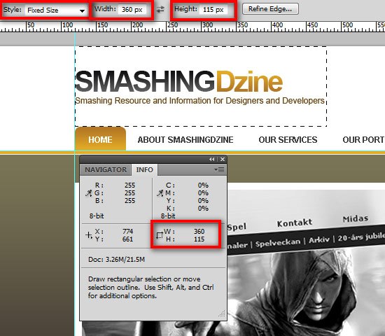 15 Save the file for the web, File > Save for Web (Alt + Shift + Ctrl + S) as logo.jpg in the images folder.
Creating the phone icon
16 Create a selection around the phone icon that is exactly 47px and 47px wide using the Rectangular Marquee Tool (M) as shown in the image below.
Copy Merge (Shift + Ctrl + C) and then paste it into a new document. 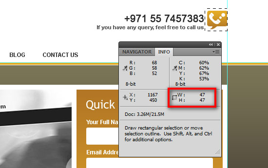 17 Save the file for the web, File > Save for Web (Alt + Shift + Ctrl + S) as phone_icon.jpg in the images folder.
Coding the Header’s HTML markup
18 Let’s get back to our HTML/CSS.
First, we’ll start with the markup. Inside the #container div, we use another div to create our header section – we’ll call it #header. 19 For the logo, we’ll use an <h1> element.
To make the logo clickable, we will need an <a> element inside the <h1> element to be a block element, and give it the same width and height as its parent <h1>. Also we add another div which is named #phone positioned below our <h1> element. This will hold the phone icon in the background with the phone number and text beside them.
Let’s see how the markup will look like:
<div id="container"> <div id="header"> <h1><a href="#">Smashing Dzine</a></h1> <div id="phone"> <p>+971 55 7457383</p> <h6>If you have any query, feel free to call us</h6> </div> </div> </div>
Styling the logo
20 First, let’s style #header. We are going to set the position property to relative for #header so the phone icon—which will be absolute-positioned—positions itself relative to the #header. Also give it a width of 960px or 100%.
I am using 100% here.
#header { position:relative; width: 100%; } 21 We will work on the logo style first. We transform our <h1> element into a block element.
Float it to the left. We use the logo we created earlier in Step 15as the background, and finally indent the text to the left where it can’t be seen to hide our text. This method of replacing text with a background image is called CSS Background Image Replacement.
#header h1 { display:block; float:left; width:360px; height:115px; background:url(../images/logo.jpg) no-repeat 0 0; text-indent:-9999px; } 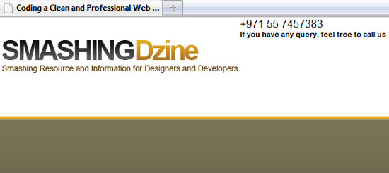 22 To make the logo clickable, we also need the
 <a> element inside the <h1> element to be a block element, and give it the same width and height as <h1>.
#header h1 a { display: block; height: 100%; width: 100%; }Styling the phone section
23 We will use the phone icon (phone_icon.jpg) we created in Step 17as the background for #phone. Position it absolutely as mentioned before in Step 20. We’ll add paddings 5px from top and 50px from right, so the text inside #phone is aligned properly with the icon on the left.
#header #phone { background: url(../images/phone_icon.jpg) no-repeat right 0px; height: 47px; position: absolute; top: 41px; right: 0; text-align: right; padding: 5px 50px 0 0; } 24 Add the font size for <p> and <h6> elements.
#header #phone p { font-size: 20px; }#header #phone h6 { font-size: 11px; }Preview your work in a web browser.
Check out Example 2 below to see where we are now. Example 2: Our header section which includes the logo and phone section is completed.
Creating the navigation menu
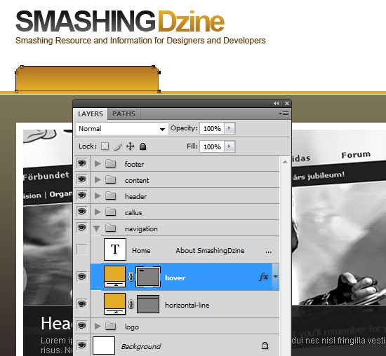
25 Move back to Photoshop file.
Expand the navigation layer group if its not already expanded. Hide the navigation text. Select the hover layer and with the Direct Selection Tool (A), drag the right anchor points of the the path to the right as shown in the image below.
(We will use this image for our navigation hover). Tip: After selecting anchor points with the Direct Selection Tool, hold down Shift and move it to the right with your Right Arrow key. This will move anchor points 10px to the right.
 26 Just like with the logo, create a selection exactly 203px by 35px. Copy Merge (Shift + Ctrl + C) and then paste the hover background in a new document.
 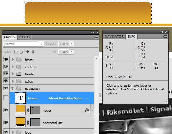 27 Save the file for the web, File > Save for Web (Alt + Shift + Ctrl + S) as hover.jpg in our images folder.
Coding the Navigation Markup
28 We will add another div where #header ends and name it #nav. Our navigation will be a standard unordered list item. Each list item’s <a> element will contain a <span> element because of our rounded corners (you’ll see why in just a bit).
Also the first list item (Home) will have a class of active to show the page name that the user is currently one.
<div id="nav"> <ul> <li class="active"><a href="#"><span>Home</span></a></li> <li><a href="#"><span>About SmashingDzine</span></a></li> <li><a href="#"><span>Our Services</span></a></li> <li><a href="#"><span>Our Portfolio</span></a></li> <li><a href="#"><span>Blog</span></a></li> <li><a href="#"><span>Contact Us</span></a></li> </ul> </div>
Styling the navigation menu
29 First we will clear the floated elements we have before #nav and set height and width of the #nav div.
#nav { clear: both; height: 35px; width: 100%; } 30 We will float <ul> element to the left so that it remains with the flow our our web page.
#nav ul { float: left; }31 For the list items, we’ll make them into block elements, then float them to the left so that they display side by side.
We’ll also add 1px padding to list items at their right.
#nav ul li { display: block; float: left; height: 35px; list-style-type: none; padding: 0 1px 0 0; } 32 The image (hover.jpg) we created in a preceeding step will be used as the background for the <a> elements with x-position:left and also for <span> element with x-position: right. We’ll set text-transform to uppercase so that it is all in capital letters.
#nav ul li a { color: #3f3f3f; display: block; text-decoration: none; font-size: 12px; font-weight: bold; text-transform: uppercase; height: 100%; line-height: 35px; padding: 0 0 0 18px; }#nav li a span { display: block float: left; height: 100%; padding: 0 18px 0 0; } 33 Finally, for the hover and active states, we adjust the background property. This will show the “hover.jpg” when you hover on a menu item.
#nav li a:hover, #nav li.active a { background: url(../images/hover.jpg) no-repeat left; color: #fff; cursor: pointer; text-decoration: none; } 34 Here the <span> element shows the background image from the right side.
#nav li.active a span, #nav li a:hover span { background: url(../images/hover.jpg) no-repeat right; }Preview your work in a web browser. Check out Example 3 below to see where we are. Hover over the menu items to see how our primary navigation works.
Example 3: Our navigation section is completed.
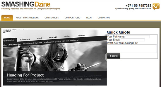
Creating the Featured section
35 Let’s call the big image and Quick Quote form area as our “Featured” section. 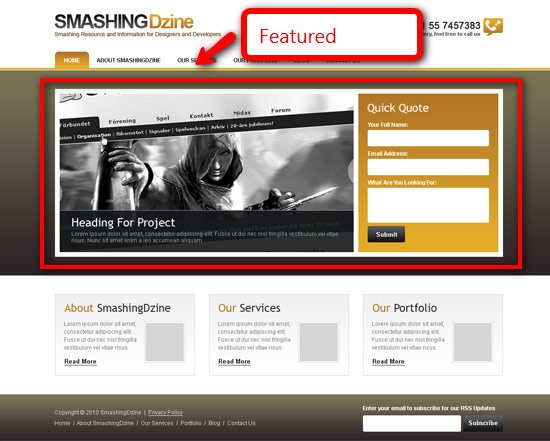 36 Go to our Photoshop file and browse to the header layer group and then to the fp layer group.
Ctrl + Click on the vector mask thumbnail (as shown below). You will get a selection around the big image. 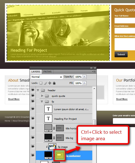 37 Copy Merge (Shift + Ctrl + C) and then paste the image in a new document.
 38 Save the file for the web, File > Save for Web (Alt + Shift + Ctrl + S) as fp-01.jpg in images folder. 39 Next we’ll create the Quick Quote form background. With the Rectangular Marquee Tool (M), make a selection of 1px width and 340px height as shown below.
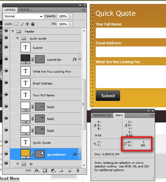 40 Copy Merge (Shift + Ctrl + C) and then paste the image in a new document. Save the file for the web, File > Save for Web (Alt + Shift + Ctrl + S) as form_bg.jpg in the images folder. 41 Select the Rectangular Marquee Tool (M) again and make a selection around the submit button as shown below.
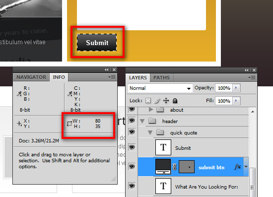 42 Copy Merge (Shift + Ctrl + C) and then paste the image in a new document. Save the file for the web, File > Save for Web (Alt + Shift + Ctrl + S) as submit_btn.jpg inside the images folder.
Coding the Featured section
43 We’ll create another div called #featured under our #nav div.
This will contain the featured image on the left. You might decide that this image should be a slideshow, and if that’s the case, you can check out the tutorial “Create a Slick and Accessible Slideshow Using jQuery“. Note: We are displaying the Featured image as an unordered list item, making it easy for anybody who wants to convert this section into an image slideshow later on. We’ll name our single <li> element as “ss1“. 44 Featured section also contains the Quick Quote form on the right. This form will hold a title using an <h2> element, a <label> element for each <input> text element and lastly, an <input> element with type property set to image for the button. We’ll use “submit_btn.jpg” as the src for the image button and name it as .btn.
Here’s the markup:
<div id="featured"> <ul> <li class="ss1"><a href="">Heading for Project</a></li> </ul> <form id="quote" action="#" method="post"> <h2>Quick Quote</h2> <fieldset> <label>Your Full Name:</label> <input type="text" name="Full Name" /> <label>Your Email:</label> <input type="text" name="Email" /> <label>What Are You Looking For:</label> <textarea cols="35" rows="2"></textarea> <input class="btn" type="image" src="images/submit_btn.jpg"/> </fieldset> </form> </div>
Styling the Featured section
45 Let’s style the #featured div first. Adding a top margin of 45px will center the #featured container vertically to the brown color gradient background. Also add a padding of 10px so the inner content doesn’t stick to the borders of featured container.
#featured { margin: 45px 0 0; background: #fff; padding: 10px; height: 340px; width: 940px; }46 Set the float to left for the unordered list.
#featured ul { float: left; }47 We will convert the list item into a block element and float it to the left as well. Then we set the width to 630px.
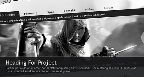
#featured ul li { float: left; list-style-type: none; display: block; width: 630px; } 48 Then, just like the logo, we will display the <a> element as a block element and use text-indent to hide the text.
#featured ul li a { display: block; height: 340px; text-indent: -9999px; }49 Add “fp-01.jpg” as a background image for the list item.
#featured ul li.ss1 { background: url(../images/fp-01.jpg) no-repeat; }This is how it should look like in your browser.
 50 Next we will style our
 <form> element. Add the “form_bg.jpg” background we created some steps back and float it to the right.
form#quote { background: url(../images/form_bg.jpg) repeat-x; margin: 0px; padding: 20px; float: right; width: 260px; height: 300px; } 51 Style the <h2> element in the form.
Add a bottom margin of 18px.
form#quote h2 { font: normal 24px "Trebuchet MS", Arial, Helvetica, sans-serif; color: #fff; text-decoration: none; margin-bottom: 18px; } 52 We’ll make the <label> element into block elements and float them to the left. Set their width to 100%.
form#quote label { font-weight: bold; color: #fff; font-size: 12px; display: block; float: left; width: 100%; } 53 Next we’ll style our <input> and <textarea> elements.
We’ll add height to the <textarea> element separately so that it doesn’t affect our <input> elements. We will also use some CSS3 properties here for rounded corners.
form#quote input, form#quote textarea { background-color: #fff; border:1px solid #ddd; color: #666; float: left; font: 12px Arial, Helvetica, sans-serif; margin: 5px 0 8px; padding: 8px; width: 240px; -webkit-border-radius: 3px; -moz-border-radius: 3px; } form#quote textarea { height: 45px; } 54 Lastly for our form, we will add the following CSS attributes for the image button named .btn.
We’ll hide the border by giving the border property a value of none.
form#quote input.btn { width: auto; border: none; padding: 0; margin-top: 0; }You can find a big list of CSS Rounded Corners Tutorials here if you want to learn more about this in detail. CSS3 properties used here are not supported in Internet Explorer, but still, it looks decent in Internet Explorer.
See the difference below between Firefox and Internet Explorer. 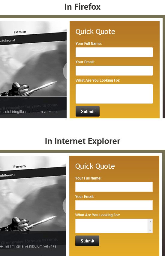 The Featured section is completed. Checkout the Example 4 below to see how it looks like in your browser.
Example 4: Our featured section is completed.
Creating the Content Section
55 Get back to Photoshop and with the Rectangular Marquee Tool (M), make a selection of 1px by 173px as shown below. 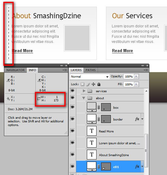 56 Copy Merge (Shift + Ctrl + C) and then paste the image in a new document.
Save the file for the web, File > Save for Web (Alt + Shift + Ctrl + S) as col_bg.jpg in our images folder.
Coding the Content Section
57 We will move to our Content section now. Create a div and name it #content.
This will hold our content. Inside this div, we’ll create three boxes with a class of .col. We will double declare the class property of the 2nd box with .noMargin and triple declare the class property of the 3rd box with .noMargin and .fr.
To be on the safer side in different browsers and at different resolutions. At the end we add an empty div with a class of .clear that will clear all floats. We will remove the margin of 2nd and 3rd box by adding .noMargin class to them and float the 3rd box to the right by adding .fr class to it.
<div id="content"> <div class="col"> <h2>About <span>SmashingDzine</span></h2> <img src="images/about_smashing_dzine.jpg" alt="About Smashing Dzine" /> <p>Lorem ipsum dolor sit amet, consectetur adipiscing elit. [...]</p> <a href="#" class="readmore">Read More</a> </div> <div class="col noMargin"> <h2>Our <span>Services</span></h2> <img src="images/about_smashing_dzine.jpg" alt="About Smashing Dzine" /> <p>Lorem ipsum dolor sit amet, consectetur adipiscing elit. [...]</p> <a href="#" class="readmore">Read More</a> </div> <div class="col noMargin fr"> <h2>Our <span>Portfolio</span></h2> <img src="images/about_smashing_dzine.jpg" alt="About Smashing Dzine" /> <p>Lorem ipsum dolor sit amet, consectetur adipiscing [...]</p> <a href="#" class="readmore">Read More</a> </div> </div> <div class="clear"></div>
Styling the Content section
58 First we set the atrribute of clear:both for the #content div so all floated elements before this div gets cleared.
Then add 80px of top margin. We float the .col divs to the left so that they are displayed next to each other. Set the “col_bg.jpg” as the background image for .col div.
Add a 1px border and 20px of padding. .noMargin will have 0px margin and .fr is set to float right. 59 We’ll set the <h2> element’s bottom margin so that it looks just like the mock-up.
Style the image by adding a border and a padding of 2px. We’ll also style the <a> element named as .readmore.
#content { margin: 80px 0 0; clear: both; font-size: 12px; color: #767676; } #content .col { float: left; width: 258px; background: url(../images/col_bg.jpg) repeat-x; height: 153px; border: 1px solid #CCC; padding: 20px; margin-right: 30px; } #content .col h2 { font: normal 24px "Trebuchet MS", Arial, Helvetica, sans-serif; color: #b47825;text-decoration: none; margin-bottom: 18px; } #content .col h2 span { color: #2f2f2f; } #content .col img { border: solid 1px #d8d8d8; padding: 2px; float: right; margin-left: 10px; margin-bottom: 10px; } #content .col p { margin-bottom: 20px; line-height: 17px; } #content .col a.readmore { font-weight: bold; color: #252525; text-decoration: underline; } #content .col a:hover.readmore { text-decoration: none; } #content .col.noMargin { margin: 0; } #content .col.fr { margin: 0; float: right; } .clear { clear: both; }60 Preview your work in your web browser.
It should look like Example 5. Example 5: Content section is completed.
Creating the Footer
61 Again we will go back to Photoshop and cut images out as required for our footer. With the Rectangular Marquee Tool (M), select the footer area as shown in the image below.
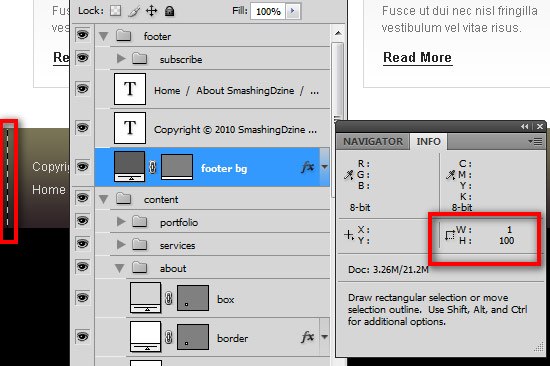 62 Copy Merge (Shift + Ctrl + C) and then paste the image in a new document. Save the file for the web, File > Save for Web (Alt + Shift + Ctrl + S) as footer_bg.jpg in our images folder. 63 Select the Rectangular Marquee Tool (M) again and make a selection around the Subscribe button as shown below.
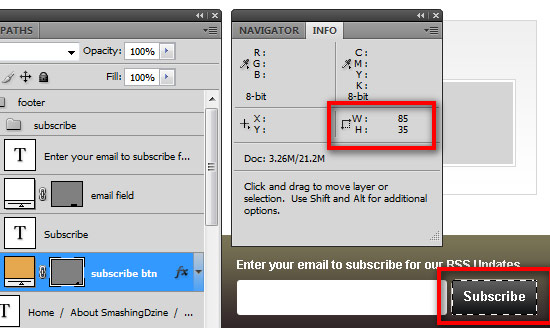 64 Copy Merge (Shift + Ctrl + C) and then paste the image in a new document. Save the file for the web, File > Save for Web (Alt + Shift + Ctrl + S) as subscribe_btn.jpg in our images folder.
Coding the Footer
65 To show the footer background with 100% width, we’ll create a div outside the #container div and call it #footer.
Inside #footer, we’ll create another div and name it #footerContainer. We will be using one <p> element for footer links. We can also use footer links as standard unordered list items. There is a newsletter section as well in the footer which we’ll wrap with a <form> element named #newsletter.
The form will contain a label, input fields and an image button.
<div id="footer"> <div id="footerContainer"> <p>Copyright © 2010 SmashingDzine | <a href="#">Privacy Policy</a></p> <p> <a href="#">Home</a> / <a href="#">About SmashingDzine</a> / <a href="#">Our Services</a> / <a href="#">Portfolio</a> / <a href="#">Blog</a> / <a href="#">Contact Us</a> </p> <form id="newsletter" action="#" method="post"> <label>Enter your email to subscribe for RSS Updates</label> <input type="text" class="textBox" /> <input class="btn" type="image" src="images/subscribe_btn.jpg"/> </form> </div> </div>
Styling the Footer
66 We’ll add clear:both to our #footer div to clear any floating elements. Add footer_bg.jpg to the background of this div and a width attribute of 100%.
#footer { clear: both; background: url(../images/footer_bg.jpg); height: 100px; width: 100%; margin-top: 40px; } 67 Set #footerContainer as 960px wide to align the content inside of this div with the rest of the page. We give this div a relative position so that we can absolutely-position the newsletter form on the right side.
#footerContainer { margin: 0px auto 0; width: 960px; font-size: 12px; color: #ddd; padding-top: 20px; position: relative; } 68 Add the following properties to the <p> and <a> elements.
#footerContainer p { margin: 8px 0 8px; } #footerContainer a { color: #ddd; text-decoration: none; } #footerContainer a:hover { text-decoration: underline; } 69 We’ll have #newsletter absolutely positioned on the right and 20px from top. For <input> fields, we will use the same styles we used above for the Quick Quote form input fields and set their width to 190px.
form#newsletter { position: absolute; right: 0; top: 20px; width: 300px; } form#newsletter label { font-weight: bold; color: #fff; } form#newsletter input { background-color: #fff; border:1px solid #ddd; color: #666; float: left; font: 12px Arial, Helvetica, sans-serif; margin: 5px 0 0; padding: 8px; width: 190px; -webkit-border-radius: 3px; -moz-border-radius: 3px; } 70 And lastly, we’ll hide the border that is around the image buttonby giving the border attribute a value of none.
form#newsletter input.btn { width: auto; border: none; padding: 0; margin-left: 3px; }Example 6: Footer completed.
And we’re all finished!
Congratulations, you have done it! Thank you for sticking through this tutorial – I hope you have enjoyed this tutorial and learned a few tips and tricks on converting a design mockup to an HTML/CSS template.
We would love to hear your feedback!
Please feel free to leave your feedback and questions in the comments section below. We will try our best to help you as best as we can.
Related Content
- How to Code a Grunge Web Design from Scratch
- Coding a Clean Web 2.0 Style Web Design from Photoshop
- Coding a Band Website Created in Photoshop
About the Author
 Waheed Akhtar is a freelance web designer from Dubai, UAE. He is the founder and editor of Boost Inspiration, where he showcases different creative resources of Digital Art, Graphic Design, Illustration, Photography and Typography for inspiration. You can reach him via Twitter or Facebook.
-
 President of WebFX. Bill has over 25 years of experience in the Internet marketing industry specializing in SEO, UX, information architecture, marketing automation and more. William’s background in scientific computing and education from Shippensburg and MIT provided the foundation for MarketingCloudFX and other key research and development projects at WebFX.
 -

WebFX is a full-service marketing agency with 1,100+ client reviews and a 4.9-star rating on Clutch! Find out how our expert team and revenue-accelerating tech can drive results for you! Learn more
Make estimating web design costs easy
Website design costs can be tricky to nail down. Get an instant estimate for a custom web design with our free website design cost calculator!
Try Our Free Web Design Cost Calculator
Share this article


Web Design Calculator
Use our free tool to get a free, instant quote in under 60 seconds.
View Web Design CalculatorMake estimating web design costs easy
Website design costs can be tricky to nail down. Get an instant estimate for a custom web design with our free website design cost calculator!
Try Our Free Web Design Cost Calculator


