

 As a designer, have you ever had to work on a project such as an annual report, brochure or even a blog post that contained a lot of data? Many designers are handed documents which contain tables of snore-inducing information with the expectation that they shine it up a bit—something akin to Extreme Makeover: Data Edition. The solution is to visualize this information in an attractive format by employing charts and graphs.
Some people may be under the impression that charts are just as boring as tabular data, but just like anything, charts can be designed with tact and taste. In this article, I’ll be talking about when to use a chart, what kinds of charts are out there, the design elements of a chart, how to gather data for a chart, and how to create a chart.
When to Use a Chart
Before we get into the nuts and bolts of effective chart creation, let’s talk about what makes a chart useful in the first place.
As the wise Solomon once said, “There is a time for everything,” and this includes using charts. Charts are most useful for packaging overwhelming information into a simple and easy to use format for comparisons and for discerning trends in a dataset. As a real-world example of proper chart usage, we need to look no further than the ubiquitous Google Analytics.
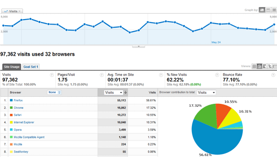 Google Analytics showing browser usage for Design Instruct. Can you imagine if — instead of charting website statistics — Google Analytics simply spit out raw numbers in tabular or list format? You’d miss out on 90% of the vital information! Let’s say that, hypothetically speaking, you’re working for Coca-Cola and they hand you a table with figures that detail the amount of people that preferred Coke to Pepsi in a survey that needs to be displayed in a brochure.
You can use a chart to give a visual snapshot that compares Coke drinkers to Pepsi drinkers that’s not only more interesting than a table, but that lets the reader understand the difference almost instantly.
Types of Charts
While writing this section, I realized how powerful a graphic is as a way to convey information. You can read through the definitions below, but my guess is that most of you will simply glance at the images and then move on just because it’s easier to absorb information and ideas visually.
It’s the exact same concept as charting data! Here are some popular types of charts and graphs for data visualization.
Pie Chart
A pie chart (circle graph) is a circular chart that is divided into sections to illustrate proportion.
Bar Chart
A bar chart (bar graph) is a chart with either horizontally or vertically-arranged rectangular bars—the lengths of which are proportional to the values that they represent.  Source.
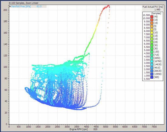
Scatter Plot
A scatter plot displays data as a collection of points. Each point on the chart is plotted with two variables on the horizontal and vertical axes.
Line/Area Chart
An area chart (which is a variation of a line chart) is made by a series of data points that are connected by a line. 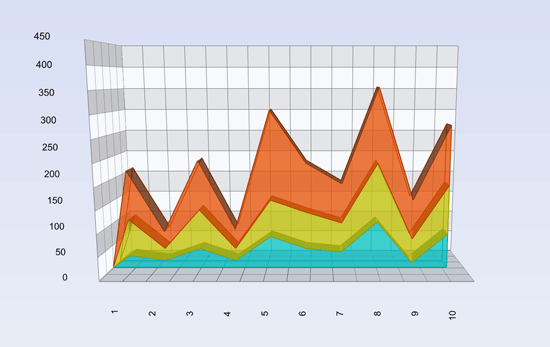 Source.
Design Elements of a Chart
When designing a chart, there are typically four main parts that you can customize (although not every type of chart uses each at once). These elements are the title, the legend, the data (sections/bars/points), and the parameters (axes, tick marks).
The chart title should accurately describe what the chart is meant to depict. It should be large enough to be easily readable, but not too large or too distracting. In other words, it should do its job and then get out of the way.
The legend is what describes the data—it’s what makes your chart make sense and is usually smaller that the data itself. Legends are generally placed beneath the data, but not always. The colors of the items within the legend should correspond to the data on the chart.
Depending on the type of chart in use, the data can take many different forms. It can be 2D, 3D or textured for example. The axes and tick marks should sort of fade into the background but be easy to read when needed.
Gathering Data
Sometimes data is handed to you in a tidy table format. If so, you’re lucky because it’s easier to create a chart at that point. If not, you’ll be tasked with gathering the appropriate information and sticking it in your own table in order to turn it into something cooler.
It’s really as simple as sticking numbers into a spreadsheet. While any spreadsheet application will work, keep in mind that some have powerful chart creation tools built in (I’ll talk more about programs and techniques in the next section below).
Case Example: Visualizing Promotion Techniques of Design Blogs
If I’m gathering my own data and starting from scratch, I’ll open up a blank spreadsheet and place a few labels.
For example, I recently published a blog post detailing the favorite promotion techniques used by authors of popular design blogs (including the one you’re on now) based on a series of interviews I conducted. To make the post a little more appealing, I put together a bar graph detailing which promotion techniques were used the most. 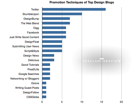 Bar graph depicting favorite promotion techniques of popular design blogs.
Source. To do this, I had to gather my own data, place it into a table and then turn it into a chart. The first thing I did was create a new spreadsheet. In the first column, starting at line 2 (you can label the column on line 1 if you’d like), I entered different promotion techniques such as Twitter, Digg and so on.
In the second column, I added 1 to the number of mentions each promotion technique garnered during the interviews. It turns out that 16 interviewees mentioned Twitter, so to the right of Twitter in my spreadsheet I simply put 16. I continued to do this for each mention of a promotion technique until I was completely through every response. This of course is just one simple example of gathering and organizing data.
Creating a Chart
There is a handful of good programs you can use to create sleek-looking charts.
The three big ones are Illustrator, Numbers and Excel. Numbers (Mac OS) and Microsoft Excel are of course both spreadsheet programs. I personally prefer using Numbers because it offers slick features such as 3D charts and textures that can be mapped to graph sections.
Creating a chart in Adobe Illustrator is nice as well because it offers complete flexibility. Illustrator also makes it easy to get 3D effects and, as with any editable object in Illustrator, you can manipulate chart pieces in a way that’s not possible in a spreadsheet program. Many designers will prefer using Illustrator over a spreadsheet program simply because it’s so easy for them to save and use Illustrator files, whereas spreadsheet files must be exported for use.
Creating a Chart in Illustrator: Overview
Once you’ve opened a new document, the first thing you’ll want to do is go to Window > Show Tools. Now you can click on the Graph Tool, which opens a window full of options. This is where you can begin to customize the look and feel of your graph by choosing a chart type.
Hit OK and then select the Graph Tool and click and drag in your open document to position and size the graph. Once you let go of the mouse button, a window will pop up which will allow you to either type or import your chart’s data.
Creating a Chart in Numbers: Overview
Once you’ve got a spreadsheet with data entered, creating a graph is as simple as highlighting the cells you want to include and clicking Charts in the toolbar.
From here, a pop-up menu appears and it will allow you to select from 11 different chart types plus eight 3D variations. If you perform a change to the chart’s data in the spreadsheet, it will automatically be updated in your chart. You can grab a corner of the chart with your mouse to adjust the width, height and how much data is displayed.
Creating a Chart in Excel: Overview
Similar to Numbers, once you’ve got a spreadsheet with data entered, you can create a chart with just a few clicks. Highlight the cells you want to include in your chart and click Insert > Charts. Select a chart type and you’re done!
DIY Charts: Create Your Own
Not every chart has to be created for you by a program. Depending on the situation, it’s perfectly viable to take a do-it-yourself approach. Information graphics, or infographics, are basically charts on steroids and often incorporate standard charts with additional creative output and flair.
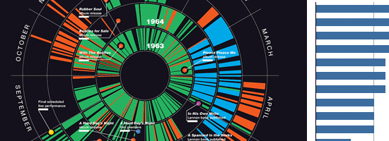
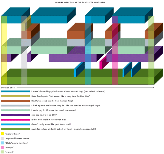
It’s easy to put together a Venn diagram with a couple of circles in either Photoshop or Illustrator. 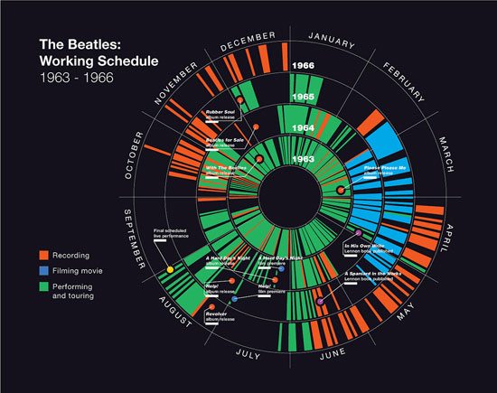 An example of a less common chart type charting the Beatles’ working schedule. Source.
Tips and Ideas for Better Charts
There are a few nice ways to spice up your charts and set them apart from the pack.
Use Textures
Try using textures instead of solid colors in your chart sections/bars. Wood or metal grains look particularly nice. 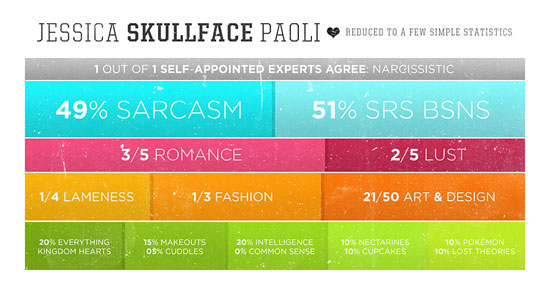 Source.
Use Depth
Adding depth to make a chart look three-dimensional is always nice but can impact readability, so make sure not to go overboard here.
Hand-sketched Charts
Hand-sketched charts and diagrams, while generally less accurate, can add an element of cool.  Source.
Other Ways to Spice Charts Up
You can also use custom icons to replace boring labels. Another one of my favorite ways of making a chart stand out a bit more is to take a picture of real-world objects arranged as a chart.
Why not use a real pie for a pie chart or stack pop cans on top of each other to form a bar chart?
Charting the Conclusion
Most designers, especially those who handle a lot of print work for corporate clients, are eventually tasked with finding a creative way to display tabular or charted data, which makes sense given that charts are the smart way to display information. I hope that this article has shown you that charts don’t have to be boring to look at or hard to make and has inspired you in the design and creation of visual graphics.
Got more tips, techniques, tutorials on using charts and graphs? Share them in the comments.
Related Content
-
 President of WebFX. Bill has over 25 years of experience in the Internet marketing industry specializing in SEO, UX, information architecture, marketing automation and more. William’s background in scientific computing and education from Shippensburg and MIT provided the foundation for MarketingCloudFX and other key research and development projects at WebFX.
 -

WebFX is a full-service marketing agency with 1,100+ client reviews and a 4.9-star rating on Clutch! Find out how our expert team and revenue-accelerating tech can drive results for you! Learn more
Make estimating web design costs easy
Website design costs can be tricky to nail down. Get an instant estimate for a custom web design with our free website design cost calculator!
Try Our Free Web Design Cost Calculator
Share this article


Web Design Calculator
Use our free tool to get a free, instant quote in under 60 seconds.
View Web Design CalculatorMake estimating web design costs easy
Website design costs can be tricky to nail down. Get an instant estimate for a custom web design with our free website design cost calculator!
Try Our Free Web Design Cost Calculator


