What Is Typography?
From a descriptive and simplistic point-of-view, typography is the arrangement of type. But there is so much more to it than that. It can mean different things depending on whom you ask.
For me, how typography is used in a design is deeply rooted in its overall theme, tone and message.
It works with your layout, grid and color choice to create a well-rounded design.
Your choice of typefaces and your technique of setting type give your composition its character, pace and style. Not only does it give the copy legibility, it also helps the reader gain a greater insight into the subject of the design.
For a designer, typography is as important as reporting is to an SEO. A simple illustration of how influential typography can be is to look at the same text with different typefaces.
Notice how typography can define and alter the message: 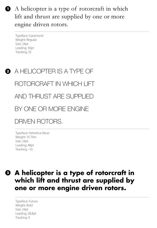
It’s this level of integration with a design theme that makes typography one of the most powerful tools in the designer’s toolbox. Next, let’s go through a few basic typography terms and concepts.
Lines
A line of characters has at least five lines that it can be aligned to. These horizontal lines are guides for capital letters, ascenders, lowercase and descenders (we’ll discuss these terms shortly).
Here are the five lines: 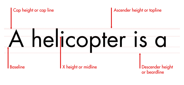
- Baseline: The one you might be most familiar with is the baseline. This is the line that the text sits on.
- Cap height (or cap line): This marks the top of capital letters.
- Ascender height (or topline): This line shows where the top of letters such as k and h touch. Strangely, in a lot of cases, this line is slightly higher than the capital line. It took me a while to get this into my head because, intuitively, you would think that capital letters would be the tallest characters.
- X-height (or midline): This shows the height of lowercase letters (excluding ascenders and descenders). It is typically measured using the height of the letter x.
- Descender height (or beardline): Descenders are the parts of characters that go below the baseline (such as the letters p and y). This line shows where the bottoms of the decenders are.
Leading
Leading describes the amount of space between lines of text. You can measure leading by obtaining the distance between two baselines. Leading is called line-height in CSS.
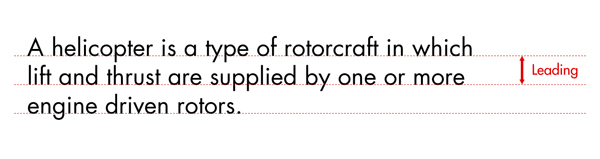
Leading is powerful.
It can affect how readable long blocks of text are. When you decrease leading, lines get closer to each other, making a block of text appear more compacted.
Lowering the amount of leading can cause descenders and ascenders to collide, and this could have an adverse effect on readability. But as a visual style, low amounts of leading can increase the pace of the reader and invoke the feeling of cramped conditions and claustrophobia, which can be desired when you are using type in this expressive manner.
Increasing leading can reduce the pace of a piece of text; it can slow the reader by introducing more white space.
It can display a more relaxed feel in text blocks.
Too much leading can cause continuity problems, as the eyes of the reader is required to travel a greater distance between lines of text. Look at the examples below. All are set in the same typeface, weight and measure.
However, each one has different leading values.
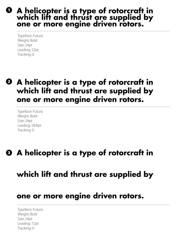
- Example 1 is set to a negative value (a value that is smaller than the type size). You can see the ascenders colliding with descenders and its effects on readability and aesthetics.
- Example 2 is set at an often-recommended value, which is 120% of the type size. This means that if your font size is 10pt, then leading should be set at 12pt.
- Example 3 is set to 200% of the type size. You’ll notice the disruption in the pace and flow of reading the text.
Here are a few leading guidelines:
- Leading can affect text blocks in different ways. A short block of text (such as a tagline/slogan) versus a long block of text (such as a paragraph or news column) will be affected by leading in its own way. Just because it works well on one doesn’t mean it will work equally well in the other.
- The more words you have in a line, the more leading you will need to maintain a pleasurable reading experience.
- If you increase word-spacing (the space between each word), you’ll have to increase leading to improve the readability of the text block.
Tracking
Tracking (or letter-spacing) is the space between groups of characters. This is called the letter-spacing property in CSS.
![]()
Tracking can be described as being loose or tight. Loose tracking is when the letters have a larger distance between them.
Tight tracking is when the letters are closer.
Tracking has similar guidelines as leading, and all of these best practices are tied to readability. The longer your line (or measure as it’s often called) the more loose your tracking needs to be.
This rule is not set in stone. Variables such as typeface choice, background color, number of columns and the surrounding design elements can also influence the readability of a block of text.
Each time you set type, you should be looking at the overall picture.
Kerning
Kerning describes the amount of space between two characters. 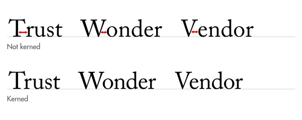
There is often confusion between tracking and kerning.
While tracking is a global setting that affects how close all the characters are, kerning is more the microscopic view of the space between two letters. Some character combinations might require more kerning than others to avoid collisions (e.g., compare KX versus ll).
Certain characters sit together in a manner that creates and minimizes space.
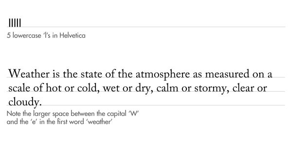
For example, the lower-case l in Helvetica is a rectangle; if you put 5 of them together, (i.e., lllll) the space between each of them will be equal.
Now consider a character like the capital W. The area it takes up is less simple to define as the diagonal of the final line creates space underneath it. With this in mind, once you place the rest of the sentence next to it, this space then makes a noticeable difference when compared to the rest of the characters:
Kerning is the art of adjusting the space between characters so that the eye can flow easily across the copy without being distracted by discrepancies.
Remember: good typography is never noticed.
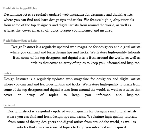
Alignment
How you align your text has a huge impact on how people will read and perceive it. The decision of alignment should be made with your design theme in mind, and of course, readability and legibility.
Flush Left (or Ragged Right)
Text is aligned to the left. This alignment complements the natural way we read text in western culture.
When done correctly, it is one of the biggest factors in improved readability. Be sure to pay attention to the right-hand side (or the rag). It is important to make sure there is a good balance with line length; make sure that they are not too similar, but also not too far apart.
Flush Right (or Ragged Left)
Text is aligned to the right.
If we read from left to right, flush right can hamper the natural flow of the text. Use it as a contrast to the main body of text to highlight complementary copy. Watch out for punctuation marks on the right-hand side as they can disrupt the alignment.
Justified
The start and end of text lines are both aligned to the left and right.
While justified alignment looks clean because it fits neatly into a box, it can also be hard to read because there is less visual cue between the termination of a text line.
Variances in spacing can appear between words in order to keep the lines even. Be vigilant on over- hyphenation, as some programs hyphenate words at the end of text lines to keep the text justified. In addition, some lines might have too much word-spacing, so you might need to adjust line breaks as needed.
Centered
Text is aligned to the center of the text area, rather than the edges.
Exercise caution when using centered alignment — there is nothing worse than poorly set centered text. There is no shared point where the line begins and ends, so it can be very hard to read.
Centered text looks best when there are only a few lines of text (2-3 lines). Done well, centered alignment can look classy and elegant.
Be sure that your text area is wide enough to break the text into logical lines and that there is enough contrast between the line length to make the text inviting.
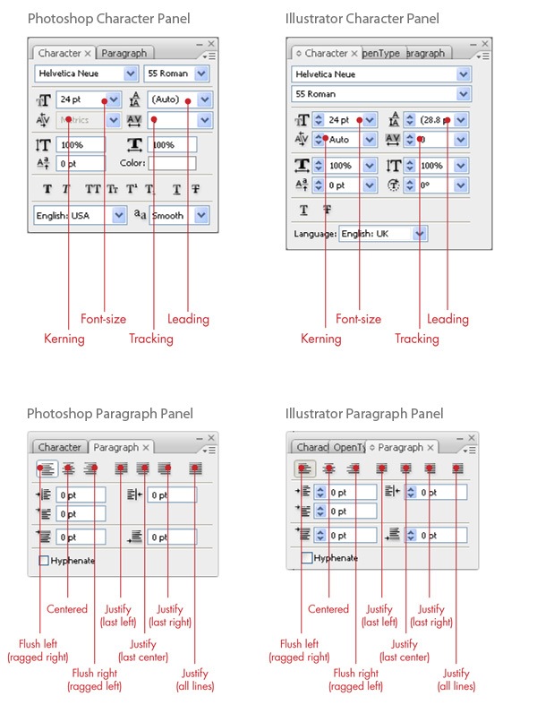
Working with Typography in Photoshop and Illustrator
Graphics software such as Photoshop and Illustrator have powerful typesetting features. The concepts discussed above are all available to you in Photoshop and Illustrator. The two panels that deal with typography are the Character Panel (Window > Character) and Paragraph Panel (Window > Paragraph).
Some Typography Tips
Here are some tips and ideas for working with type.
Information Hierarchy
When planning your design, it’s important to work out how you’re going to identify hierarchy and structure.
How big or how bold should the title/headline be?
What about sub-headings, body copy or figure captions? Also consider that using different typefaces can help you create distinctions between different text levels. Many successful publications combine different typefaces to create both classical and contemporary layouts.
Creating a logical hierarchy in your designs make them easier to scan and read.
Select Typefaces That Support the Theme
Thinking about the theme of your design while you choose your typefaces will help you make decisions.
After the often lengthy — but very enjoyable — job of short-listing typefaces, justify your choices by assessing them against your theme.
Get Familiar
The more you do something, the better you get at it. This being the case, you should try to experiment with typography as much as possible. Immerse yourself in the subject.
(I have included a short list of books and sites to check out at the end of this guide.) Look at the portfolios of designers you admire, and study how they use typography to create great work.
Take note of typefaces that appeal to you and how you might use them in your own work.
Get familiar with the art and science of typography; there is nothing that instills confidence in your decisions like knowledge. Being able to talk through your decisions confidently and clearly with the full support of your craft behind you is very important.
Use Your Own Judgement
While some of the rules I’ve discussed earlier seem rigid, at the end of the day, you should use your better judgment. Setting type is an art form as much as a science.
While we have talked about some of the rules about typography, it’s important to realize that each job is different.
A double spread, a web page, a business card, a letterhead — each have their own objectives and considerations.
While the rules we’ve covered can be a good starting point, outside influences such as the surrounding design, identity guidelines of the company and client approval can alter how you need to set the type. Above all, what really matters is that the design works.
Typography Is Everywhere
Type is a component of design that’s ever-present in the world around us. Road signs, magazine covers, posters, TV ads, film intro sequences — you don’t have to look far to find typography.
It’s everywhere on the web too.
Whether you are on a boat dealer’s website or a restaurant’s, they will have some typography. When you look at type, think about what you’re looking at and why it’s the way it is. Soon, you will notice the minor nuances of setting type that often make a big difference between good and bad typography.
Resources on Typography
Lots of books and websites cover the subject of typography.
They are fantastic references to have with you while you work with type. Here are a handful of my favorites.
Books
- Stop Stealing Sheep and Find Out How Type Works: By Erik Spiekermann and E.M. Ginger. Spiekermann tells us how it’s done in this great introduction to the subject.
- The Elements of Typographic Style: By Robert Bringhurst. This book is always on my desk and has helped me out more times than I’d like to mention! It’s the big daddy of typography books.
I smile every time I look at this book. If you like typography, then you probably already own a copy.
- The New Typography: By Jan Tschichold. First published in 1928, the lessons and information in this book are still relevant today. It discusses typography concepts as well as a reflection on typography’s place in society and how we should approach type.
- Modern Typography: An Essay in Critical History: By Robin Kinross. This book is heavy, but it’s worth a read. It’s an amazing record of the history of type from someone who clearly knows their beans!
Websites
- FontShop Education: FontShop Education docs are formatted for easy downloading and printing. Perfect for the classroom or studio.
- Typophile: Great place to identify a typeface. Look through the forums; there are many generous people there that share their own knowledge of the subject. I like looking through this site while eating a sandwich at work.
- Typographica: Typographica is a review of typefaces and type books, with occasional commentary on fonts and typographic design.
-
 The WebFX team is made up of more than 450 subject matter experts in digital marketing, SEO, web design and web development, social media, and more. Together, they’ve helped WebFX’s clients earn more than $3 billion in revenue from the web — and that’s just in the past five years.@webfx
 -

WebFX is a full-service marketing agency with 1,100+ client reviews and a 4.9-star rating on Clutch! Find out how our expert team and revenue-accelerating tech can drive results for you! Learn more
Make estimating web design costs easy
Website design costs can be tricky to nail down. Get an instant estimate for a custom web design with our free website design cost calculator!
Try Our Free Web Design Cost Calculator
Share this article


Web Design Calculator
Use our free tool to get a free, instant quote in under 60 seconds.
View Web Design CalculatorMake estimating web design costs easy
Website design costs can be tricky to nail down. Get an instant estimate for a custom web design with our free website design cost calculator!
Try Our Free Web Design Cost Calculator