
 Mobile does not just mean smartphones anymore. The word has metamorphosed into an all-encompassing term for any computing device not permanently tied to a wall outlet. While there are a billion phones in use worldwide, over 52 million tablets were sold in the last quarter of 2012 alone, and tablet sales are predicted to overtake notebook sales by 2016. Tailoring your website to offer an optimized mobile experience that automatically adjusts itself to multiple device types will very soon be a requirement rather than a feature.
The Popular Solution: Responsive Web Design
Developing for the Mobile Web now involves an understanding of mobile browsers, their JavaScript and CSS engines, and the expected user experience for a wide array of touchscreen devices. The popular solution for this issue is responsive web design. Responsive web design leverages new features in CSS3 to actively modify the size and position of web page elements based on screen size, orientation, and pixel ratio. It is a strong solution for content-driven sites, whose main requirement is to make text and images digestible.
On the other hand, resizing and repositioning content doesn’t fully address the interface or user experience needs of websites that have heavy interaction, such as web apps and e-commerce sites. For these types of sites, responsive design is only a small piece of a much larger puzzle.
Issues with Responsive Web Design
For one, mobile users have become acclimatized to how native applications work.
Engaging these users through the Web increasingly requires an interface layout that mimics the native applications they associate with their devices. Responsive design techniques alone fail in this task, for the following reasons:
- Screen size and pixel ratio are not enough to determine device type.
- Responsive design does not allow for the creation of in-depth, touchscreen specific interactive elements when the site is visited on mobile devices, but only the re-styling or hiding/showing of existing elements.
- Phablets, such as the Samsung Galaxy Note series, are growing in popularity. While they have the pixel count of small tablets, they are closer to phones in size and are often better served with phone UI and UX.
- Desktop layouts will be transformed into mobile layouts when the browser window is sized down. This will hinder UX if you gear your mobile design towards touch interaction.
Although the popularity of responsive web design is growing within creative circles, its limitations are keeping it from being a regular solution outside of blogs, design portfolios, and news sites.
Server-side Scripting + DOM Manipulation
Luckily, with the fairly recent and ubiquitous acceptance of HTML5, CSS3, and JavaScript DOM standards across major mobile browsers, alternative techniques (with responsive design as an optional component) are available. Building web applications that function like their high-end, native counterparts — without redirecting to separate subdomains — is an achievable goal for dedicated and adventurous web developers.
On the website for my company, SpotTrot — which is content driven, but offers some interactive elements — we not only serve desktop and mobile interfaces, but a separate tablet one as well. We do this without redirecting the user to separate “m-dot” (e.g. m.yourwebsite.com or mobile.yourwebsite.com) or “t-dot” (e.g.
t.yourwebsite.com or tablet.yourwesbite.com) subdomains. In other words, we don’t maintain a separate site for mobile and tablet devices — we simply modify the DOM and serve the appropriate JavaScript and CSS files based on the user’s browsing device. 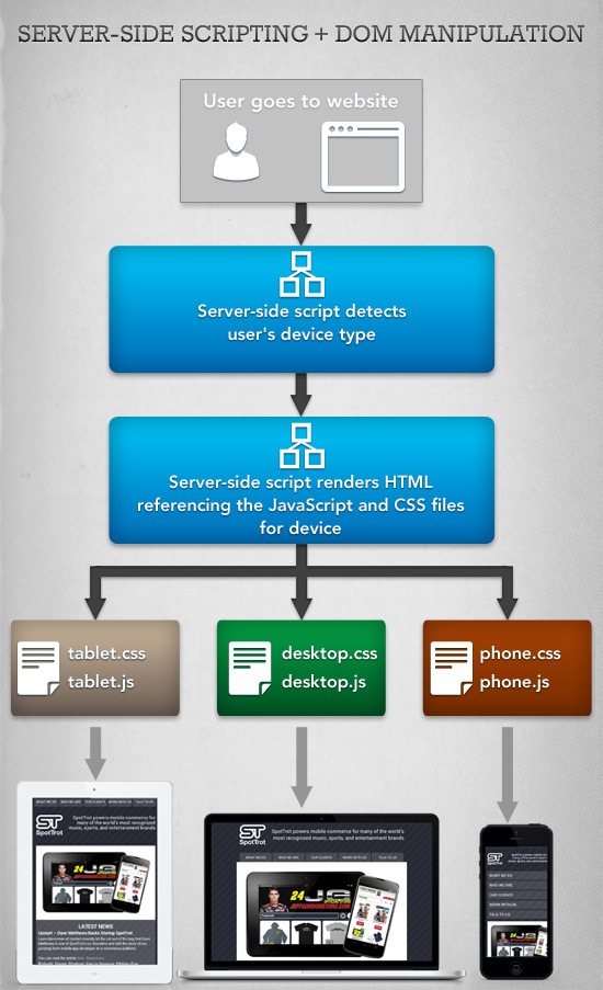
Using Server-side Scripting Libraries for Refined Device Recognition
The first step in achieving this is to use server-side user agent string parsing to determine the visitor’s device type.
Parsing user agent strings to serve a custom interface is almost as old as the Web itself. In recent years, it has become the main technique for delivering “m-dot” versions of sites. The responsive design philosophy shies away from serving up separate subdomains for mobile devices, but traditional server-side scripting detection can be repurposed to render the same HTML file in multiple ways.
There are a wide array of libraries that make server-side device detection easier, yet few work as well as MobileESP, in my opinion. MobileESP is available in every major Web programming language and detects both device type and capabilities. Here is an example of how our website uses the PHP version of MobileESP to categorize devices and serve the appropriate CSS and JavaScript:
<?php // Create some constants for devices class Device { const TABLET = 0; const PHONE = 1; const DESKTOP = 2; } // Initialize MobileESP object $uagent_info = new uagent_info(); // Define the device if($uagent_info->isTierTablet) { $device = Device::TABLET; } elseif($uagent_info->isIphone || $uagent_info->isAndroidPhone || $uagent_info->isTierRichCss) { $device = Device::PHONE; } else { $device = Device::DESKTOP; } ?> <html> <head> ... <!-- Serve up the appropriate CSS and JavaScript for the device --> <?php switch($device) : ?> <?php case Device::TABLET: ?> <link rel="stylesheet" type="text/css" href="style/tablet.css"/> <script type="text/javascript" src="js/tablet.js"></script> <?php break; ?> <?php case Device::PHONE: ?> <link rel="stylesheet" type="text/css" href="style/phone.css"/> <script type="text/javascript" src="js/phone.js"></script> <?php break; ?> <?php default: ?> <link rel="stylesheet" type="text/css" href="style/desktop.css"/> <script type="text/javascript" src="js/desktop.js"></script> <?php break; ?> <?php endswitch; ?> </head> ... </html> CSS Media Queries vs. DOM Manipulation
While desktop and mobile phone interfaces can follow more traditional design rules, the tablet space has a much higher degree of variation and requires more forethought. Tablet screen sizes commonly vary between 7 to 10 inches, while phones usually hover around 4 inches. Therefore, retina displays on tablets make a larger impact on the amount of pixels on screen.
For our website, this means that the single column text display does not always work for tablets and needs to be switched to the three-column display also used on the desktop version of the site. 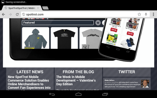 This can be accomplished through CSS media queries or JavaScript DOM manipulation.
CSS Media Query
CSS3 allows for extensive use of conditionals based on the user’s screen characteristics (such as width and orientation). Here is an example of using media queries to design responsive layouts:
@media screen and (min-width: [width]px) { .class { property: value; } } @media screen and (-webkit-min-device-pixel-ratio: 2) @media screen and (orientation: landscape) @media screen and (device-aspect-ratio: 16/9) DOM Manipulation
However, our site uses JavaScript DOM programming through jQuery to switch between the single and triple column view.
Manipulating the DOM allows complete, real-time control over the layout of a web page. The tablet-specific JavaScript, served up by user agent parsing, contains code that alters the CSS of preexisting HTML div elements.
// If the screen is wide enough that we want 3 columns if($(window).width() >= 770) { // Create the indent $("#front_items").css( { 'margin-top': '-5px', 'margin-left': '20px' }); // Size the columns var textWidth = ($("#carousel").width() - 70) / 3; $(".front_column").css( { 'width': textWidth + 'px', 'margin-bottom': '0' }); } // One column interface else { $("#front_items").css( { 'margin-top': '0', 'margin-left': '0' }); textWidth = $("#carousel").width() + 20; $(".front_column").css( { 'width': textWidth + 'px', 'margin-bottom': '5px' }); }Downsides of Server-side Scripting + DOM Manipulation
Though this technique, in my opinion, allows for far greater control over design and interactivity versus using CSS3/media queries, it’s not without its potential downsides.
- No device or browser detection is flawless. The best way to maximize proper device detection is to use a regularly updated library like MobileESP.
- This solution will not fully function if the user has disabled JavaScript. Although the exceptionally few users that have JavaScript disabled are used to websites not fully functioning, solely using device-specific, CSS media queries is the best option if you want to keep some of the benefits without using JavaScript.
- This solution requires the maintenance of separate CSS and JavaScript files for each targeted device as opposed to a single CSS file that media queries can afford.
How it Works on Our Website
The navigation menu is the only element on all three versions of the SpotTrot site that has complete variation. So it’s a great talking point to show how this method works in the real-world. On the desktop, a horizontal menu sits below the header, matching traditional website layout.
This allows the user to interact naturally and leaves the visual design of those elements as the main differentiator.  On the tablet, the same horizontal menu is moved above the header. It is then slightly altered, with the corner radius moved to the bottom, to reinforce its positioning at the top of the page.
This follows the expected interface of a native mobile application, with all navigation control usually in a bar at the top.  Finally, the phone version displays the highest amount of interface variation. It would be impossible to fit all of the horizontal navigation buttons on most smartphones, so the design opts for a vertical menu.
The buttons automatically fit themselves to the width of the screen to maintain the user’s sense of vertical direction, complementing the single column layout for small screens. 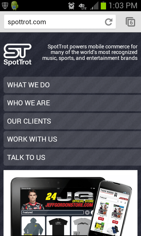
Conclusion
Within the last few years, web application design and development has been most affected by touchscreens. The shift of computer interaction to a tactile experience is the core factor in the “mobile revolution.” As touchscreen laptops and desktops are becoming the norm, the interface designs currently implemented on smartphones and tablets will soon be the way all web applications are laid out.
Learning these techniques and philosophies may be optional right now, but it will ultimately be a central part of any web developer’s job description soon.
Related Content
-
 President of WebFX. Bill has over 25 years of experience in the Internet marketing industry specializing in SEO, UX, information architecture, marketing automation and more. William’s background in scientific computing and education from Shippensburg and MIT provided the foundation for MarketingCloudFX and other key research and development projects at WebFX.
 -

WebFX is a full-service marketing agency with 1,100+ client reviews and a 4.9-star rating on Clutch! Find out how our expert team and revenue-accelerating tech can drive results for you! Learn more
Make estimating web design costs easy
Website design costs can be tricky to nail down. Get an instant estimate for a custom web design with our free website design cost calculator!
Try Our Free Web Design Cost Calculator
Share this article


Web Design Calculator
Use our free tool to get a free, instant quote in under 60 seconds.
View Web Design CalculatorMake estimating web design costs easy
Website design costs can be tricky to nail down. Get an instant estimate for a custom web design with our free website design cost calculator!
Try Our Free Web Design Cost Calculator