
Why Standards-Compliant Colors Are Important
In this article, I’ll talk about how color sometimes gets in the way of the message, and the simple practices we can follow to make sure that doesn’t happen. Perhaps it is no secret to you that a good frontend design should be usable and accessible. That could be understood as having content that’s organized, readable, and understandable to everyone browsing the web, regardless of any impairment they may have. In a nutshell, that is what web standards are all about.
And not complying with it could mean losing millions of visitors to your site. Yes, millions. There are at least 10 million American males that are affected by some form of colorblindness (around 7% of the U.S.
male population). Every day, they surf the web. If your site has important content presented in a color combination they cannot distinguish, you’re not effectively passing on information.
If the site you’re working on were an e-commerce site, failure to communicate would be even more disastrous because it leads to revenue loss. Extrapolate that fact to a global audience (not just the male populace in the U.S.) — and your confused customers could balloon to several millions more. And it’s not only the colorblind you’d lose when you use color without concern.
Even your ordinary, 20-something, credit card-wielding audience could have an unpleasant experience on your site if there’s insufficient contrast between your site’s content and its background. You’d unwittingly cause eyestrain – especially to those who are effectively blind without their reading glasses. So let’s go ahead and add several millions more to the people affected by poor color use.
Thankfully, the W3C formulated standards to address these and similar problems. In 1999, they released WCAG (Web Content Accessibility Guidelines) version 1.0, which was superseded by WCAG 2.0 in 2008.
WCAG What?
The WCAG are:
“… a set of guidelines on making content accessible, primarily for disabled users, but also for all user agents, including highly limited devices, such as mobile phones.”
In other words, these documents define the limits of what is and is not acceptable on the web in terms of how content should be provided by the public.
The standards make sure that content — whether in the form of text, audio, or video — can be accessed by everyone, regardless of any disability or user agent, from screen-reading devices to mobile phones. Furthermore, the guidelines are categorized into three priority levels:
- Priority 1: Web developers must satisfy these requirements, otherwise it will be impossible for one or more groups to access their web content.
- Priority 2: Web developers should satisfy these requirements, otherwise some groups will find it difficult to access the web content.
- Priority 3: Web developers may satisfy these requirements in order to make it easier for some groups to access the web content.
Section 508
A similar set of web standards are encapsulated in Section 508 (or the Electronic and Information Technology Accessibility Standards) — an amendment to a U.S. law enacting universal access to IT. Partly based on WCAG 1.0 recommendations, it requires federal agencies to give disabled employees and members of the public access to information that is comparable to the access available to others.
As we go along, we’ll see what the standards have to say about how to use color properly on the web. For now, let’s dig a little into the two primary problems I’ve mentioned above, starting with color combinations.
Combining Colors That Trip the Colorblind
Consider the following graph: 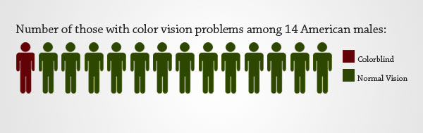 If you have no color vision problems, you’ll know perfectly how many people are colorblind; they’re 1 in 14 American males. However, viewed by a colorblind person, the graph above would actually look similar to this:
 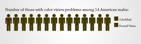 Not very helpful, right?
The second image is a simulation of the graph preceding it (done through Vischeck) as though viewed by someone with deuteranopia (red/green colorblindness which happens to be the most common type of colorblindness). As you can see, what’s clear to you could be confusing to a colorblind person. This, and similar problems, could crop up when we don’t understand colorblindness and how those affected with it perceive certain colors.
Types of Colorblindness
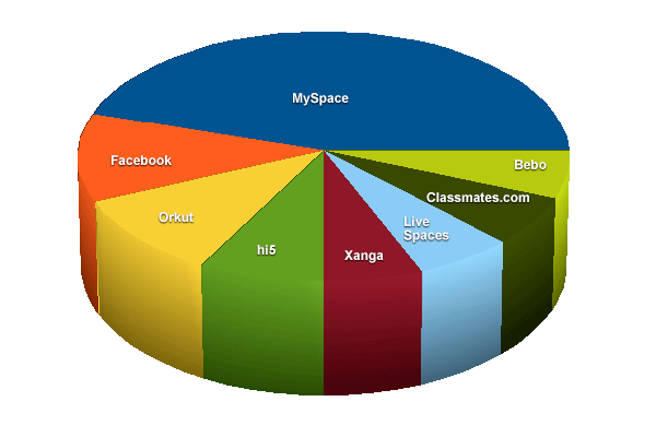
I’ve gone ahead and tested an image of a pie chart using Vischeck — a site where you can simulate colorblind vision of an image or a website, or even daltonize an image.
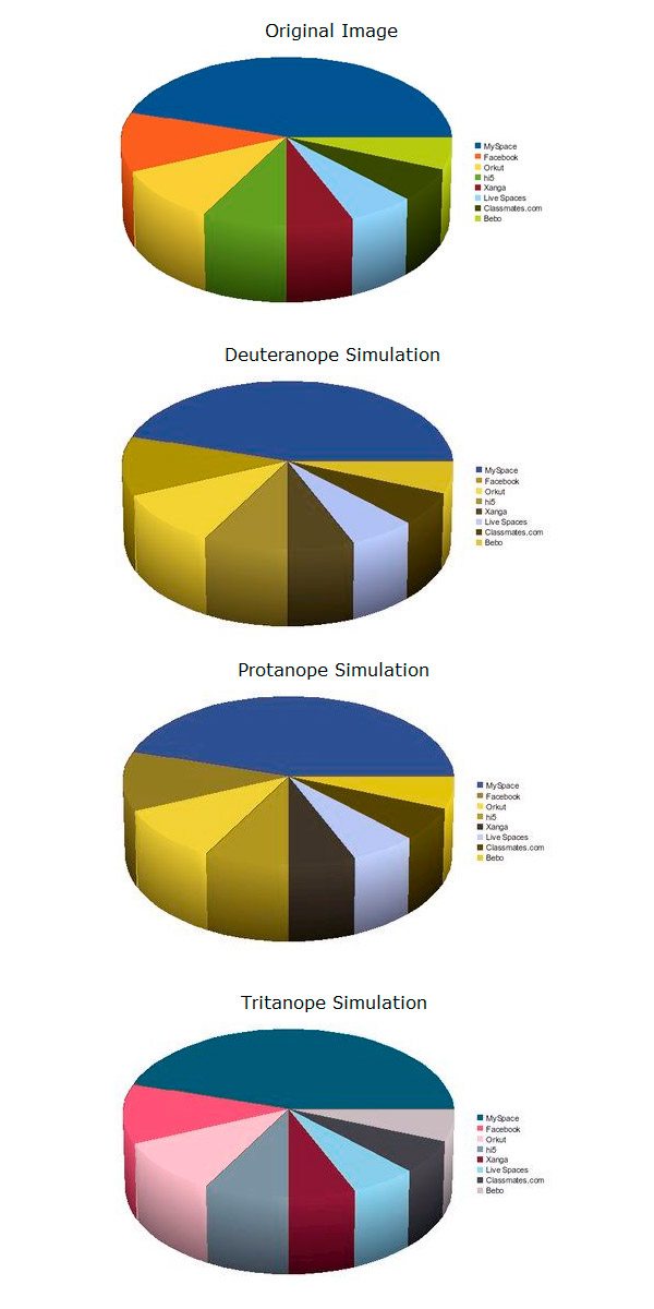 Example of a pie chart with different colors, viewed by different types of colorblindness. Here, you can see that there are three types of colorblindness:
- Deuteranopia (problems perceiving green colors)
- Protanopia (problems perceiving red colors)
- Tritanopia (problems perceiving yellow-blue colors)
However, looking at the results of the simulation, you’ll see that essentially we can group them into two:
- red-green colorblindness
- yellow-blue colorblindness
The red-green colorblindness is more common, roughly affecting 7% of the U.S. male population (or around 1 in 14 males), while yellow-blue only affects 0.5%. The pie chart (which outlines the market share of different social networking sites from a few years ago) shows that reds and greens look very similar to a deuteranope or a protanope.
Some members of this group (mostly protanopes) also perceive reds as a dark color, ultimately becoming indistinguishable from dark-gray and black hues (see protanope simulation). For the tritanope, the color vision problem seems less pronounced, as we don’t have confusion between which is blue or yellow. There is still however a significant shift from the original hue values of these colors, and in some situations this could still prove problematic for those people.
Looking at what we’ve done above, you might feel it’s too cumbersome to have your designs undergo a simulation first before its launch. You have an alternative, though: Just follow the standards, and you won’t have to go through the hassle of worrying if your color combinations might pose problems for the color-impaired.
How to Stick to the Color Blindness Standards
There are three suggestions here, and y only the first one is necessary (and the only one advocated by the standards). However, if you’re the obsessive about standards-compliance, then you might want to consider doing the last two — they can only help your users.
In Conveying Information, Don’t Use Color Alone
The operative word here is alone.
WCAG 1.0, WCAG 2.0, and Section 508 all require that information be conveyed not only through color. Section 508 says:
“Web pages shall be designed so that all information conveyed with color is also available without color, for example from context or markup.”
Priority 1, Checkpoint 2.1 of WCAG 1.0 has almost the same exact wording:
“Ensure that all information conveyed with color is also available without color, for example from context or markup.”
Stop right there and digest that bit of information. This recommendation is Priority 1, so you must satisfy it.
No ifs or buts. Finally, WCAG 2.0 also says the same thing:
“Any information that is conveyed by color is also visually evident without color.”
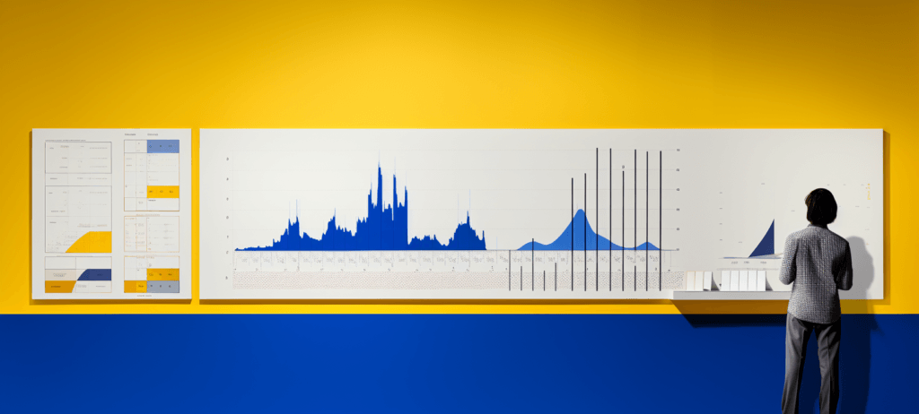
If we go back to our first graph, you’ll see that we could have presented it by using additional cues — cues that would make its meaning clear even without color. These cues could be a clearer title or summary of the graph (i.e.
letting the viewer know it’s 1 in 14 American males), or an added texture (the diagonal lines on both the human figure and the legend). 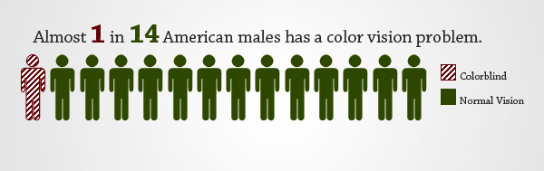 Chart corrected by adding diagonal lines. If we run this image on the vischeck simulator, a deuteranope or a protanope would have no problems interpreting it:
 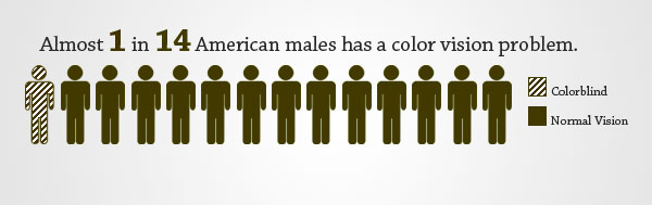 Color blindness simulation. We could also apply this principle to our pie chart. Instead of creating a legend that shows which slice of the pie is which using colors, we could do away with the legend and simply place the social networking site’s name on top of its slice (thus canceling the need for matching the slice’s color with its counterpart box).
 Pie chart corrected by displaying the name of each slice.
Don’t Use Problematic Colors Side-By-Side
Our simulations above show that, depending on the colorblindness type, other hues replace the original problematic colors accordingly. That is, for deuteranopes or protanopes, reds and greens become brownish (with greens having a lighter tone). For tritanopes, yellows become pinkish, and blues would appear lighter.
You can thus imagine a situation wherein the colors you’ve picked for your design’s color theme are exactly these (red, green, and brown; or yellow, pink, and blue), and using them side by side would create a “blending effect” — reds and greens blending into shades of brown or gray, as the browns and grays retain their color. If you combine these colors by themselves to convey information (as in our graph example), or as the color of a text and its background, then obviously you’ll be making an unwise design decision. Not using these problematic colors at all is certainly an option too, and our third suggestion is applicable if your theme colors aren’t set in stone.
Daltonize Your Designs
Daltonization is:
“…a process performed by the computer that allows people with color vision deficiencies to distinguish a range of detail they are otherwise excluded from perceiving.”
Applied, daltonization changes the colors of a given image or design, such that the colors in it no longer pose any problem for the color-impaired.
(By the way, the process was named after the English scientist John Dalton, who first proposed the existence of colorblindness after he noticed differences in the way he sees things, being colorblind himself.) I’ve gone ahead and daltonized our original graph through Vischeck’s Daltonize page. Check out the results below. 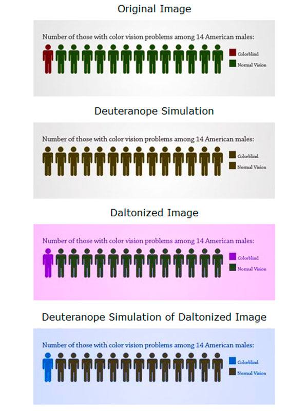 Daltonization simulation. Our daltonized image shows that, in effect, we can “get away” with not following the recommendations to not use color alone in conveying information, as long as we daltonize our designs.
This is, of course an extreme measure, and when we create usable and accessible design, our goal is to be inclusive without affecting anyone’s experience. As you can see, you should be prepared to use some funky color themes if you prefer to go this route.
Insufficient Background/Foreground Contrast
Of the two color problems, insufficient contrast between a foreground object (such as text) and its background is more problematic because a lot of web designers do it and everyone is exposed to it. I’m sure you won’t have a hard time recognizing poor contrast in the collage I’ve created below (text that seem to blend seamlessly with its background).
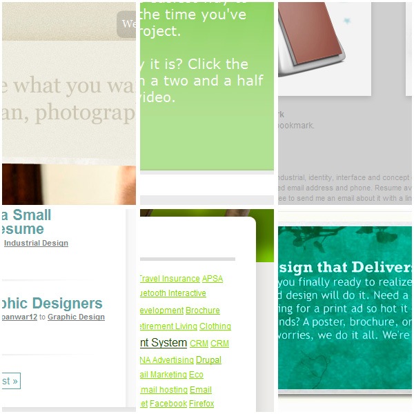 Although the overall effect might be pleasing to some eyes, it’s when you try to read the text on it that the readability problem becomes apparent. Those with 20/20 normal vision might be able to tolerate it, but obviously we should also design for those with poor vision. WCAG 1.0 specifies adequate contrast as a Priority 2 for images and Priority 3 for text:
“2.2 Ensure that foreground and background color combinations provide sufficient contrast when viewed by someone having color deficits or when viewed on a black and white screen.” [Priority 2 for images, Priority 3 for text]
Why do you think images have a higher priority than text?
Because the site visitor’s ability to enlarge the text or adjust the contrast settings in their browser (or even adjust the stylesheets client-side if they’re savvy enough) usually apply only to text, not to images. Therefore, the information on the images in your site won’t be conveyed properly if your images have inadequate contrast. Also, note that the upgraded version in WCAG 2.0 is specific and measurable:
1.4.1 Text or diagrams, and their background, must have a luminosity contrast ratio of at least 5:1. [Level 2] (for color use)
1.4.3 Text or diagrams, and their background, must have a luminosity contrast ratio of at least 10:1. [Level 3] (for contrast)
The formula for calculating the luminosity-contrast ratio is (L1 + 0.05) / (L2 + 0.05), where L1 is the luminosity of the lighter of the text or background colors, and L2 is the luminosity of the darker of the text or background colors. Now, I think a discussion on the definition of luminosity is a bit too technical for us designers, so I won’t go into that here (But if you’re interested, check out this article on luminosity contrast ratio at W3C). Suffice it to say that the W3C has determined the minimum for luminosity-contrast ratio for color-dependent information to be 5:1.
For contrast-dependent information, e.g. text, it’s 10:1. Before we go into the techniques for achieving those contrast ratios, let me share with you this color picker window from Photoshop that should help us better understand the concept of contrast.
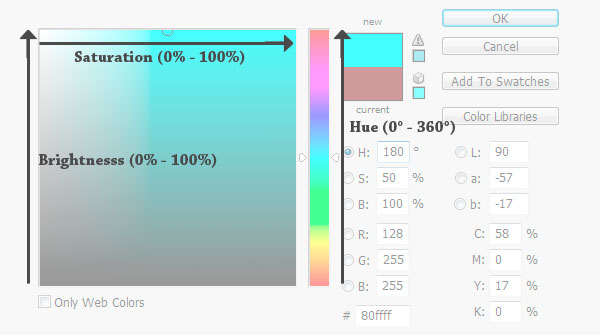 While the first problem of color usage largely deals with a color’s hue, contrast is primarily avoided by creating a large gap between the saturation and brightness (or lightness) values of a foreground and a background color or text. And that works even if they have the same hues. For example, a foreground and a background color could have the same hue value of 180o; however, their saturation and brightness values should be as far apart as possible (i.e.
100% and 20%) to ensure that they have good contrast. How far apart? The standards don’t specify, but it’s good that we have color contrast tools to achieve the minimum 5:1 and 10:1 ratios.
How to Stick to Color Contrast Standards
We didn’t discuss how to calculate and achieve the minimum W3C requirements for color contrast.
But that’s because tools are available online for us to do exactly that. Here are a couple of them:
- Colour Contrast Analyser Tool (also available as a Firefox extension)
- Colour Contrast Analyser for Web Pages
I’ll discuss the latter, but they pretty much work the same way. Additionally, you could convert your designs into grayscale using Photoshop (more on this later down the article), which would remove the colors’ saturation (i.e. every color reduced to its equivalent in the black-gray-white spectrum).
This in turn would isolate the brightness values, and help your eyes decide whether there’s good enough contrast in your design or not.
Colour Contrast Analyser (CCA)
As mentioned above, at least two websites offer their CCA tools (for free). Vision Australia’s CCA tool is available as a desktop program; that of Juicy Studio’s, as a web app and Firefox extension. If you download, install and run the one by Vision Australia listed above, you’ll see something similar to the window on the image below.
As you can see, I tested the contrast of the articles’ titles on the homepage of Design Instruct. 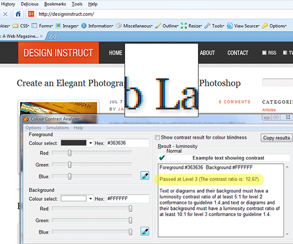 What do you know — it passed at Level 3 with flying colors (12.67)! And if you look below that score, we are reminded of the guidelines (so you don’t have to memorize it):
Text or diagrams and their background must have a luminosity contrast ratio of at least 5:1 for level 2 conformance to guideline 1.4, and text or diagrams and their background must have a luminosity contrast ratio of at least 10:1 for level 3 conformance to guideline 1.4.
You might be wondering about the scores I got for the sites on the collage at the start of this section.
(Here they are again.) Well, they average around 1.5 to 3.5 — a failing grade even for level 2 compliance. Yes, these sites are trendy and cool, no doubt — but they also are a hassle to those with poor vision.
Display in High-Contrast Mode
There are various methods for displaying your design in high-contrast mode.
Photoshop Desaturate Command
To get a quick glance of how good (or bad) the contrast in your design is, you can desaturate your design using Photoshop’s Desaturate command (Shift + Ctrl/Cmd + U). This action also removes the hue, leaving you with only the brightness values intact.
Thus, any perceptual difference caused by hue or saturation is cancelled, and only the contrast remains, which will be seen in the brightness values’ difference.
GrayBit
For live sites, there’s GrayBit, where you can just enter in the URL of your site (or any other website for that matter) and convert it to grayscale. For our purposes, this service is more for retroactively fixing a design. And obviously, regardless of how our site looks in GrayBit, we’d still need to apply a CCA tool to make sure that our sites pass the standards.
Here is Design Instruct as converted through GrayBit: 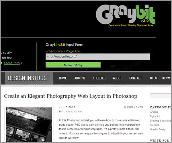 As you can see, the Design Instruct front page still looks good with colors “turned off.” The main body text is very much readable, as are the main navigation links above it. Trying this test on any of the sites in the collage I made above will still yield readable pages to the normal eye — but again, for obvious reasons, it’s best to avoid these “low-contrast, blending” design styles if you are concerned about readability, accessibility, and usability. Function over form — that’s what differentiates Design from Art.
Conclusion
All of this may or may not have been an eye-opener for you, and you might have felt it too restrictive of your artistic freedom.
Just remember: design — and in particular, web design — is different from pure art, in that the measure of its effectiveness is found not in the “ooohs” and “aaahs” you get from admiring colleagues in the industry, but in the successful communication of an idea or thought, which can be seen through increased RSS subscriptions or sales of your site’s goods. Also, as the Design Instruct website shows, a good design can go hand-in-hand with compliance to standards. Here are some books I recommend that could help you tremendously in this standards-compliance thingy.
| Recommended Books | |
 Design Accessible Web Sites Design Accessible Web Sites |
 Web Accessibility: Web Standards and Regulatory Compliance Web Accessibility: Web Standards and Regulatory Compliance |
 Web Accessibility Principles Web Accessibility Principles |
 Universal Design for Web Applications Universal Design for Web Applications |
Elsewhere on the web, here are other excellent resources:
- Web Standards Checklist — a list that you should go through before, during, and after working on a website. Each point even has a link that explores that point further.
- Effective Color Contrast — examines all the important things you need to know about color contrast, and does it with a lot of helpful graphics.
- Color Contrast Checker — similar to the CCA tools mentioned above, but also gives you the unique ability to darken or lighten a color until it passes the standards or your personal taste.
- Color References — Probably has the most extensive collection of resources that discusses everything there is to know about colors and its implication on the web.
-
 Trevin serves as the VP of Marketing at WebFX. He has worked on over 450 marketing campaigns and has been building websites for over 25 years. His work has been featured by Search Engine Land, USA Today, Fast Company and Inc.
 -

WebFX is a full-service marketing agency with 1,100+ client reviews and a 4.9-star rating on Clutch! Find out how our expert team and revenue-accelerating tech can drive results for you! Learn more
Make estimating web design costs easy
Website design costs can be tricky to nail down. Get an instant estimate for a custom web design with our free website design cost calculator!
Try Our Free Web Design Cost Calculator
Share this article


Web Design Calculator
Use our free tool to get a free, instant quote in under 60 seconds.
View Web Design CalculatorMake estimating web design costs easy
Website design costs can be tricky to nail down. Get an instant estimate for a custom web design with our free website design cost calculator!
Try Our Free Web Design Cost Calculator