
In the last few years, web designers have gradually realized that cluttering our designs with non-essential elements isn’t a good idea. Excessive design elements like meaningless stock photos, textured grunge backgrounds, convoluted navigation systems, social-sharing buttons, blog post widgets, and other types of page bloat steal attention away from the core goals of our web design. So instead of adding more stuff and more options, many of us have chosen to reduce our designs to their most basic forms.
And though we are building websites that are visually simpler than their predecessors, the results have inversely been profound.
A Few Examples of Minimalist Landing Pages
To make sure we’re on the same page, let’s quickly look at the minimalist landing pages of some successful web apps: 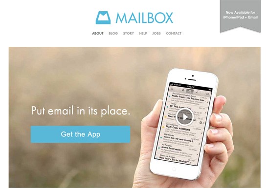 Mailbox
  TinyLetter
 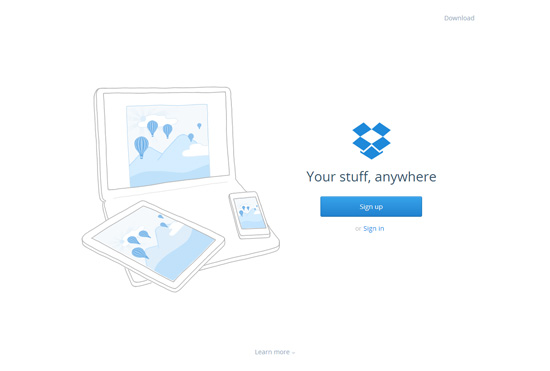 Dropbox
 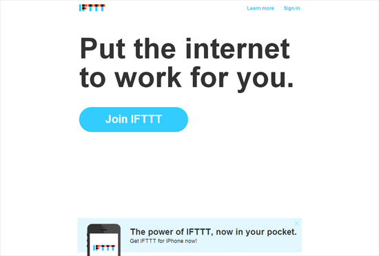 IFTTT Notice that the apps above are pretty sophisticated; they accomplish useful, innovative, and complex things for their users. Yet what’s interesting to note is they don’t have an equally complex landing page. Let’s study some great examples of minimalist landing pages and derive design patterns, tips, and ideas from them.
Minimalist Landing Pages: The Big Idea
What you’ll immediately notice about minimalist landing pages is they only one primary goal. Whether it’s to click on a sign-up button or enter your email address in a web form or download something onto your computer, there is only one well-defined action the web designer of the landing page wants her users to take.
There are no complex navigation menus on minimalist landing pages. You usually won’t find a huge array of social media buttons on them. The design is devoid of decorative stock photos whose sole purpose is to fill up blank space.
Every design element is meticulously chosen. Everything is strategically-designed to support and reinforce the desired primary action the web designer wants the site visitor to take.
Landing Page Case Study: Dropbox
The website of Dropbox is a prime example of a progressively minimalist design that demonstrates the concept of having only one primary goal in a landing page. The Dropbox landing page only has one primary call-to-action, and it’s pretty easy to spot because of how the web page is designed.
The primary goal of the design is to get site visitors to click on the Sign up button. 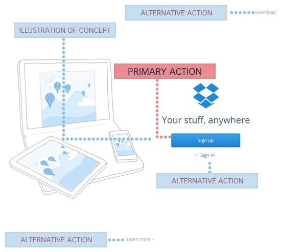 The Sign up button is the most distinctive element on the web page. Everything else is deemphasized.
Yes, there are secondary alternative actions Dropbox’s landing page visitors can take: Download the software, sign in (if you’re already a Dropbox user) or learn more about Dropbox. However, these alternative calls-to-action are designed in a way that doesn’t impede the primary goal of getting site visitors to click on the Sign up button. All non-essential elements are removed or designed in a subdued fashion.
For instance:
- The site’s name (Dropbox) isn’t even displayed on the landing page; even the name of the app proved to be a non-essential element.
- To explain how Dropbox works, they use a simple illustration that doubly serves to draw your attention towards the Sign up button.
- The tagline (Your stuff, anywhere) is short and uncomplicated.
The Dropbox landing page made a confident and bold choice as to what action it wants site visitors to take, and it was then designed in a way that emphasized on that action.
Landing Page Case Study: Mailbox
Mailbox, an app that helps its users efficiently deal with emails on a mobile device, shows us another example of a great minimalist landing page design. The primary action is to click a big, distinctively-designed button labeled Get the App that brings the user to the Mailbox page in the Apple App Store. 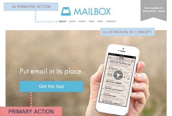 A simple in-product screenshot on the right of the primary call-to-action (that opens a product video when clicked) effectively illustrates what Mailbox is.
Alternative actions are seen at the site’s navigation menu, but the navigation menu is visually-deemphasized.
Landing Page Case Study: Karma
Karma is another excellent example of a beautiful minimalist landing page. The primary desired action on this landing page is to click on the Buy Now button. The primary action is displayed twice: once in the middle of the layout, and another at the top.
The call-to-action buttons are both green, labeled identically, and are visually similar to create a connection between them. 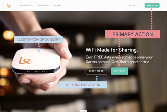 A secondary alternative action a user could take is clicking on the Learn More button. As you can see, the transparency of the Learn More button reduces its visual weight so it doesn’t steal attention away from the primary Buy Now call-to-action button beside it.
The short description above the call-to-action buttons tersely encapsulates Karma’s unique value proposition: a social-sharing WiFi connection. The high-res background photo is meaningful; the photo shows what the product looks like and gives you an idea about the size of the product (the hand holding the product is a useful contextual hint).
Essential Components of a Minimalist Landing Page
You may be seeing a reoccurring design pattern by now. A minimalist landing page has three major components:
- Primary action
- Explanation of what the product/service is
- Alternative action/s
As we go to the next section of this article and as we go through a few more examples, keep those three components in mind.
Design Tips for Minimalist Landing Pages
What follows are some tips and ideas based on reoccurring patterns we’ve seen in minimalist landing pages.
Focus on Creating a Good Visual Hierarchy
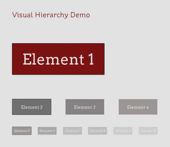
In order to draw attention to the most important parts of a landing page, the visual hierarchy should be well-composed. Visual hierarchy is the deliberate arrangement of the elements in a design so that the most important elements are seen first. Some of the main characteristics that affect a design element’s position in the visual hierarchy of a landing page are:
- Size: Bigger elements are higher in the hierarchy.
- Position in the web page: For most sites, elements at the top and at the left of a web page are higher in the hierarchy.
- Color contrast: A stronger contrast between a particular element and its background, as well as between other elements in close proximity to it, will lead to a higher position in the visual hierarchy.
- Visual complexity: A more complex aesthetic compared to surrounding elements gives the element stronger visual weight.
- Whitespace: more whitespace around the element gives it a stronger visual weight.
 In the examples that follow, take note of how size, position, color contrast, visual complexity, and whitespace are used to establish the desired visual hierarchy.
Example: Numbrs
The minimalist web design of Numbrs is a good talking point with regards to visual hierarchy. The description of the app (1) and the app’s primary call-to-action button (2) are the two most prominent elements in the web page. 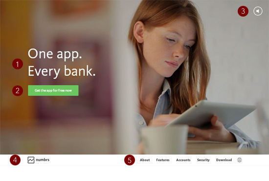 The volume control (3) is pretty high on the visual hierarchy too since you might want to turn off the audio when you visit the landing page.
The name of the site (4) and alternative actions you can take (5) are lower in the visual hierarchy.
Example: Wander
Another demonstration of good visual hierarchy composition can be seen in the minimalist landing page of Wander. There are only four foreground elements in the design. 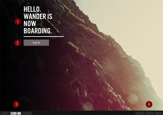 Topmost in the visual hierarchy is a statement letting people know that the site is taking in sign-ups (1).
Below the statement is a call-to-action button asking users to log in (2). Significantly much lower in the visual hierarchy are secondary alternative actions Wander’s landing page visitors can take, such as liking Wander on Facebook (3). The Facebook button also displays the number of Facebook Likes Wander has, serving a dual purpose of providing site visitors with social proof about the app.
Other secondary actions site visitors can take are viewing Wander’s social network accounts or reading Wander’s Tumblr blog (4).
Creating Visual Hierarchy in Your Web Designs
Read these guides to get tips and ideas for composing visual hierarchies:
- Working with Visual Weight in Your Designs – A guide on giving your design elements the appropriate visual weight based on their desired positions in the visual hierarchy.
- Creating Focal Points in Your Web Design – Some techniques for drawing attention to specific design elements are discussed in this article.
- Gestalt Principles Applied in Design – Gestalt is a set of human psychology theories that implies some useful techniques related to establishing a good visual hierarchy in your designs.
Make Sure the Primary Action is the Most Prominent Element
The first step is to decide what primary action you would like your site visitors to take. Is it to click on a certain button? Is it to like your Facebook page?
Is it to fill up a web form? Choose one primary action, and then commit to it fully. Then design the web page to support that primary action.
Example: enthuse.me
A good demonstration of making the primary action the most prominent element on the landing page can be seen on enthuse.me: 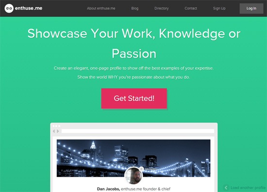 With a good visual hierarchy, it’s immediately evident that the primary action is to click on the Get Started! button.
Example: IFTTT
Notice how the primary action of the IFTTT landing page is quite obvious: 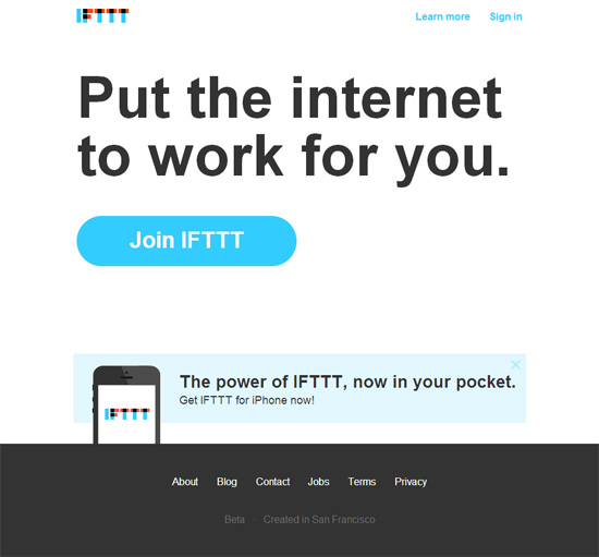
Use Colors and Typography Strategically
Web designers creating minimalist sites will only have a few tools in their arsenal: Color and typography are chief among them.
Example: Basecamp
Basecamp is an example of a minimalist landing page that uses color and typography strategically.
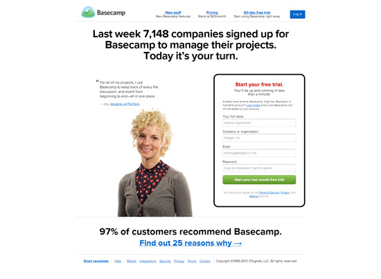 Green is used for the primary call-to-action. Blue is used for secondary calls-to-action (such as the log-in button for existing users and the link to another web page describing reasons why people use Basecamp). Big fonts and variations in the colors of design elements serve to draw your attention to relevant points of interest in the landing page.
Example: Path
Next, let’s take a look at how Path uses color and great typography to build the appropriate visual hierarchy.
A distinctive green color is used on their primary desired action, which is to fill up a web form. 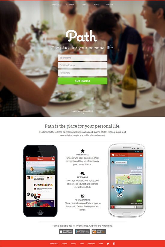 Varying font sizes, text color and text treatments effectively segment sections of interest in their landing page.
Keep Textual Content Succinct
By now, it’s a well-known fact that Internet users rarely read our site’s content. We can reasonably assume an Internet user’s patience is much shorter when he’s on the landing page of a product that he isn’t involved with yet. Minimalist landing pages must keep textual content short and easy to understand.
With fewer things to read, site visitors are more quickly prompted to take action.
Example: Contently
Contently is able to describe their web service’s value proposition in 3 words: Tell Great Stories. That is so profound, given that the web service is centered around content! There is very little text content on their landing page, reducing the likelihood of derailing the site visitor’s path towards taking action. 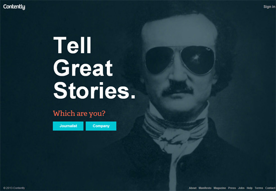
Example: Shipment
Another good demonstration of keeping text content usefully short can be seen on Shipment.
In 5 simple words — Share and review your designs — the site visitor becomes instantly aware of what Shipment can to do for him/her. 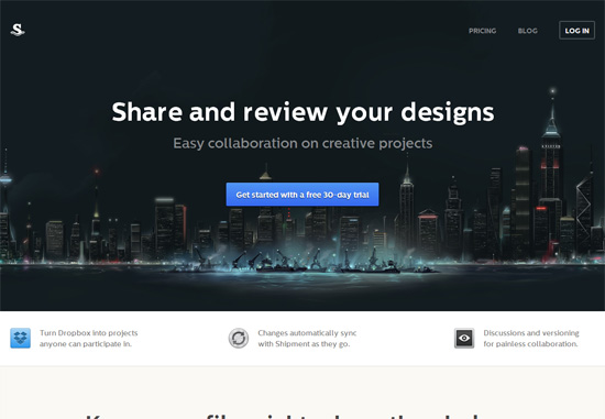
Explain the Product/Service Quickly
There are many ways to effectively illustrate how a product or service works. The key here is to keep the explanation as simple as possible.
Let’s look at a few ways you can illustrate a concept efficiently.
Example of Video Explanation: Couple
The Couple app makes use of a product video to explain how it works, taking advantage of the fact that product videos can significantly increase conversion rates. The video is progressively disclosed by clicking on the “play now” icon button: 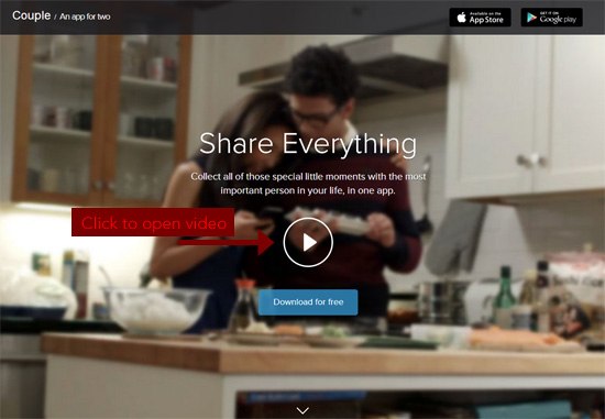 After the button is clicked, a YouTube video is displayed in a modal window. The modal window is easy to close so the user doesn’t have to watch the entire video before taking the next action.
 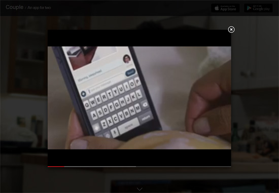 This example also aptly reveals a concept that should be applied to secondary actions and content: Progressive disclosure. When using a video, instead of showing the video immediately — which would affect the landing page’s visual hierarchy since videos have heavy visual weights due to their size and color — show the video only when the user explicitly wants to see it.
Example of Interactive Tour Explanation: Apple Mac Pro
The minimalist landing page of Apple’s Mac Pro demonstrates another popular way of describing a product: An interactive product tour.
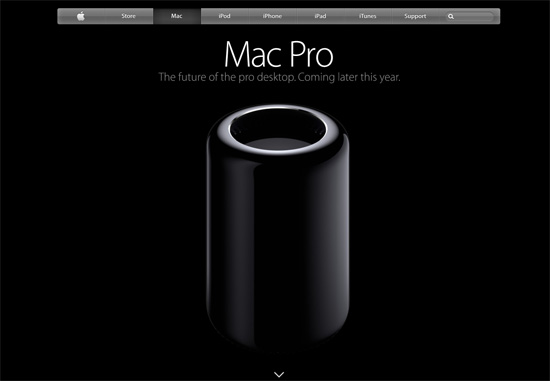 The explanation begins with a quick animation to draw your attention in, as well as to provide a hint that the web page has animated interactivity.
Example of a Static Photo Explanation: Wallmob
The high-res background photo found on the Wallmob landing page is an exemplary example of how to use a meaningful image. 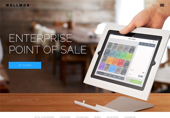 The background photo serves to illustrate what Wallmob is: A point-of-sale app for your mobile device.
Simplicity is Sophisticated
As you can see, this way of designing landing pages is very simple in concept: A minimalist landing page is goal-centered, and there’s only one goal. By removing unneeded elements, you’re given the opportunity to direct your design and production efforts — as well as the attention of your site visitors — to the things the really matter.
Read These Next:
-
 President of WebFX. Bill has over 25 years of experience in the Internet marketing industry specializing in SEO, UX, information architecture, marketing automation and more. William’s background in scientific computing and education from Shippensburg and MIT provided the foundation for MarketingCloudFX and other key research and development projects at WebFX.
 -

WebFX is a full-service marketing agency with 1,100+ client reviews and a 4.9-star rating on Clutch! Find out how our expert team and revenue-accelerating tech can drive results for you! Learn more
Make estimating web design costs easy
Website design costs can be tricky to nail down. Get an instant estimate for a custom web design with our free website design cost calculator!
Try Our Free Web Design Cost Calculator
Share this article


Web Design Calculator
Use our free tool to get a free, instant quote in under 60 seconds.
View Web Design CalculatorMake estimating web design costs easy
Website design costs can be tricky to nail down. Get an instant estimate for a custom web design with our free website design cost calculator!
Try Our Free Web Design Cost Calculator


