
 In modern web interface design, no other principle has been heralded and pushed onto us as much as the concept of user-centered design. User-centered design tells us that we should do everything we can to make our user interfaces as easy to use and as intuitive as possible. However, a big part of designing user interfaces that are easy to use also involves figuring out what things should be a bit more difficult to use.
It’s a counter-intuitive notion that’s central to effective user interface design.
Why Make Certain User Interface Items Difficult to Use?
I can think of 3 main reasons for making an interface element more burdensome to utilize:
- When using the interface element is costly to the user if used by accident
- When there’s an overall improvement to the UI as a whole
- When the cost of maintaining a feature is costly to the provider if used frequently
High Cost of an Error in Usage
When you accidentally delete a file or click on a button that you didn’t mean to, there’s going to be a cost. For example, recovering a deleted file in a traditional operating system such as Windows costs time. To get your deleted file back, you need to:
- Minimize your current application so that you can see your desktop
- Click on the Recycling Bin icon
- Locate the deleted document in your bin (or type in a search term if you have many files in your bin)
- Right-click on it to see and issue the restore command
- If you want to continue working on the document, you need to reopen it
That’s a costly mistake. Good user interfaces will have safeguards for this situation, such as obfuscating the visibility of the delete command and showing you a confirmation dialog that asks you if you really want to delete the file. Burdening the deletion process is a purposeful design choice to avoid the more costly event of accidentally deleting the document.
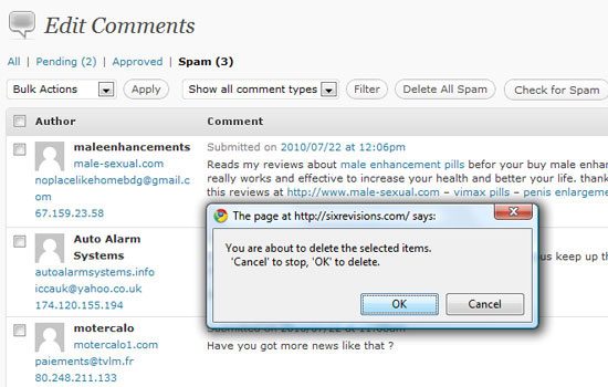
Example: Deleting Content in WordPress
In older versions of WordPress, when you deleted content by accident (such as that post draft you’ve been working on for a month), there was no simple way to recover from the mistake. There was a confirmation dialog window that asked you if you did in fact mean to delete the content, but if you’re quickly going through, say, spam comments and deleting them one by one, there will be accidents. In older versions of WordPress, when you delete something, it was irreversible.
 To fix this, WordPress added an additional feature called Trash. It works much like the Recycling Bin in operating systems that temporarily house files you’ve deleted in case you want them back.
 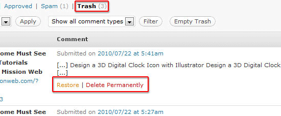 Although it’s now harder to permanently delete WordPress content since you have an additional step to go through to remove the stuff you deleted inside your Trash, by intent, the deletion process was extended and made more difficult to prevent the more costly event of accidentally deleting a post or comment.
Improving the Overall UI System
When there are a lot of interface items competing for your attention, the result is an intimidating and cognitively burdensome UI. For newer users of the system, having too much noise going on all at once can slow down their ability to learn how the system functions. But we want people to have ready access to all of these awesome features, so the tendency is to fit as many things as we can into our screens.
Fitt’s Law
To help explain the value of making some interface elements more difficult to use for the overall good of the system, I’ll borrow from Jeff Atwood’s discussion of the opposite of Fitts’ Law. Fitts’ law is a human-computer interaction (HCI) model that predicts the speed in which someone can move to an objective. It applies to any human-computer interaction situations that involve human movement and a target.
In the context of graphical user interfaces on computer screens, the model attempts to quantify the factors that improve someone’s ability to, for example, point and click on an interface element such as a call to action button. If that sounds too complicated, we can simplify the model this way: Things that are important and frequently used should be bigger and closer to the user. It makes sense: Bigger things that are closer to us are easier to get to and touch than those that are smaller and farther away.
So, if Fitts’ Law states that interface elements that are essential to the user should be bigger and closer to them — or in the context of a computer screen, easier to find and see — Atwood looks at the problem in reverse and asks, “What should we do with UI elements we don’t want users to click on?” The answer is simple. By logic, we make those UI elements more difficult to use, locate, and find by making them smaller and more distant to the user. Doing this forces us to prioritize what interface elements are more important.
In turn, this creates visual hierarchies in our UI elements that help the user understand how the system works.
Example: Freshbooks
One of my favorite apps, Freshbooks, demonstrates this point well. The web app’s design smartly implements a logical visual arrangement of its interface elements to make things easier and more intuitive.
For example, in the Expenses tab, there are 6 commands you can perform from the top interface command set:
- Add a new expense
- Archive
- Delete
- Copy
- Convert to an invoice
- Search
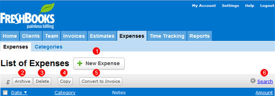 Look at the variations in size, grouping and spacing of those commands. Some are close together, some are farther down to the right, Search is deemphasized. Which command is the most important?
Which one is the least important?
Counter-Example: Microsoft Word
Just because they’re our favorite whipping boy, let me follow the trend and pick on a Microsoft product: MS Word 2007. 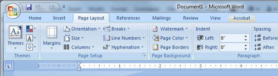 MS Word has a cluttered main menu, and there’s not a lot of thought put in, in terms of Fitt’s Law. They all seem of equal value and thus, it’s harder to find the things you need. How many times do you need to adjust your document margins or theme?
Probably just once. How many times do you need the Acrobat tab? (Never in my case).
Should all of these options be shown by default, or should they be hidden and more difficult to access for the overall good and simplification of the UI? By hiding some interface elements or by making them smaller, you are afforded with more room to work with for commands that are truly important and often used (such as styling commands for bolding and emphasizing text).
High Cost to the Provider
Some features might be too costly to us as providers if they’re used regularly.
An example of this situation is in obfuscating or burdening the customer support process so that users are encouraged to help themselves before submitting a help ticket. Let’s use a real-world analogy to explore this topic: Toilet paper in public restrooms. Toilet paper in public restrooms are typically provided free of charge as a courtesy to bathroom goers.
You can guarantee that toilet paper in these restrooms will be as rough as sandpaper and manufactured as cheaply as possible. The reason this is so is that it’s a free service. One of the ways to cut costs is to get the cheapest toilet paper possible.
But what if the public restroom operator had some spare money to spend? Should he/she improve the quality of their toilet paper? Nope.
There are other benefits to keeping toilet paper as crappy as possible. By making toilet paper difficult to use, they discourage people from taking advantage of the offering unless they absolutely need to. For instance, many would hesitate to take rolls of toilet paper home because they’re unbearable to use and they probably have better stuff waiting at home.
Some might even refrain from using public restrooms if they know that in five minutes they’ll be at home and in the comfort of their own restroom. It doesn’t take away from the user; they still have the feature (toilet paper) but they’re just less likely to use it if they can avoid it. There is no lack of feature availability, so it’s okay.
Example: Download Feature in Design Instruct
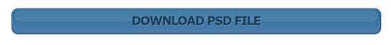
I’ll use an example closer to home. On Design Instruct, everything is free: You don’t have to pay a subscription fee to access the site, you don’t have to register to use any site feature, and you don’t have to jump through hoops to download stuff (such as Photoshop files and freebies). On similar sites that provide free downloads, they’ll often have large call to action buttons placed prominently at the top of the web page, enticing the user to download their source file.
 on Design Instruct, the download feature is at the very bottom of the tutorial, as a link with a purposefully intimidating heading (“Download Source Files”) and link name (“some_file_name”).
 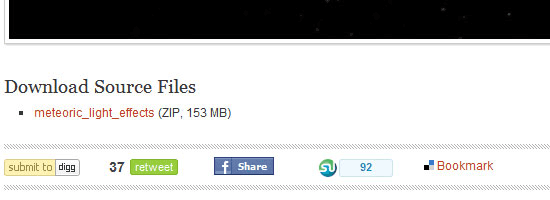 Our reasoning is to discourage the feature’s use unless you really need to. This is because the download feature, although great for our users that need it, costs us an arm and a leg in bandwidth and servers (we need a dedicated server and CDN just for these downloads).
The download option will be used more by long-time readers who are already familiar with the interface and less by one-time visitors who’ll never return to the site again. The objective here is simple: we want to prioritize our resources in such a way that the readers who’ve been with us longer are the ones that are likely to take advantage of this feature.
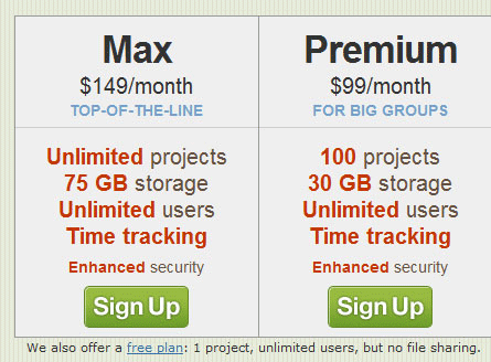
Example: Minimizing Free Signups in Basecamp
Another example where this concept can be seen is in Basecamp’s pricing page.
Basecamp offers a free plan, but they’d much prefer you sign up for their premium plans. In the screenshot below, I’d wager that many people miss the “free plan” option and find it more difficult to click on because of the option’s size and position, especially when compared to UI elements around it. Even though they want to make this option available, minimizing free signups versus premium signups is the objective of this screen.
Further Reading
Here are a few articles related to this topic.
- The Opposite of Fitts’ Law
- Visible Narratives: Understanding Visual Organization
- Visual Hierarchy – 52 Weeks of UX
References
- Fitt’s Law
Related Content
- Negative Space in Webpage Layouts: A Guide
- An Introduction to Website Split Testing
- How to Increase Conversions on any Website in 45 Minutes
-
 President of WebFX. Bill has over 25 years of experience in the Internet marketing industry specializing in SEO, UX, information architecture, marketing automation and more. William’s background in scientific computing and education from Shippensburg and MIT provided the foundation for MarketingCloudFX and other key research and development projects at WebFX.
 -

WebFX is a full-service marketing agency with 1,100+ client reviews and a 4.9-star rating on Clutch! Find out how our expert team and revenue-accelerating tech can drive results for you! Learn more
Make estimating web design costs easy
Website design costs can be tricky to nail down. Get an instant estimate for a custom web design with our free website design cost calculator!
Try Our Free Web Design Cost Calculator
Share this article


Web Design Calculator
Use our free tool to get a free, instant quote in under 60 seconds.
View Web Design CalculatorMake estimating web design costs easy
Website design costs can be tricky to nail down. Get an instant estimate for a custom web design with our free website design cost calculator!
Try Our Free Web Design Cost Calculator


