- Home
- Blog
- Web Design Make High-Impact Backgrounds for Your Designs with Photoshop
Make High-Impact Backgrounds for Your Designs with Photoshop
-
 11 min. read
-
 William Craig
 CEO & Co-Founder
- President of WebFX. Bill has over 25 years of experience in the Internet marketing industry specializing in SEO, UX, information architecture, marketing automation and more. William’s background in scientific computing and education from Shippensburg and MIT provided the foundation for MarketingCloudFX and other key research and development projects at WebFX.
In this Photoshop web design tutorial, you’ll learn about creating dynamic and high-impact backgrounds that you can use on your own web layouts. We’ll go over color/gradient techniques, lighting effects, and using textures and patterns.
Introduction
When visually designing websites, the little things are what make a design stand out. In this tutorial, I’ll show you a few ways to enhance the way your website looks.
We will also look at some examples of people that have applied each one or a combination of these techniques.
Colors/Gradients
Gradients are great if used correctly. For the most part, when you are designing a website with gradients, you should use subtle color variations. Colors and gradients can really give your website more dimension and make it pop.
Let’s start with some experimentation.
Linear Gradients
Let’s begin with the basics: linear gradients. When choosing a gradient, a good practice is to use two colors that aren’t high contrast to each other, but enough so that the effect is still obvious. We’ll use a dark blue hue.
(R:10 G:34 B:55). Click and drag down the linear gradient from the top of the header, down. This gives a subtle change that helps give the design a bit of “oomph”. 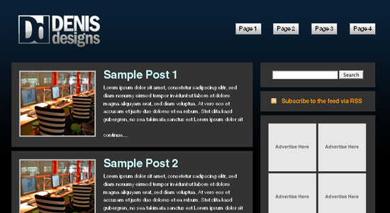 Here are some examples of websites that use linear gradients:
Ballpark
Spundo
Dermapure
Radial Gradients
Next up are Radial Gradients. Choose the Gradient Tool (G) and pick the Radial Gradient option. Click and drag a small gradient in the middle of the document (we are going to resize it).
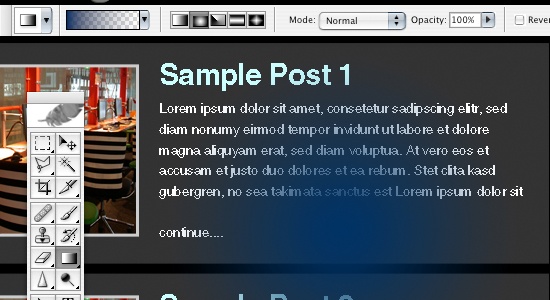 Bring the gradient to the top of the document. Use Edit > Free Transform (Ctrl + T), then use the Transform Controls to stretch out the radial gradient so the gradient reaches the edges of your website. Then move it using the Move Tool (V) so the middle of the gradient is at the very top of the document.
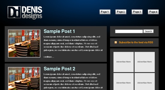 Here are a few examples of websites that use radial gradients:
Webdever

Pixeloop Media

Classic Clutch Australia
Color
Much like with the gradient, you can make your website pop by using a unique color. Sticking with our blue, we can change the entire website to this color. The only other thing I changed was the background color of the posts to give it a better contrast.
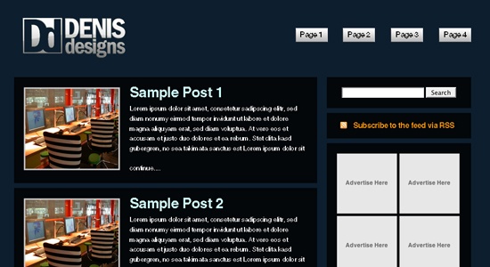 We can also do a combination of both the color and gradient.
 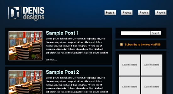 Here are some examples of websites that use solid colors:
For A Beautiful Web
Guifx
Lighting Effects
This is much like the gradients, but with a little more variation in color. To achieve this effect, start with a white background and go into Filter > Render > Lighting Effects.
Change your settings to something like what I have in the figure below. 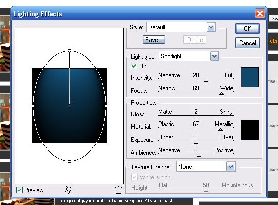 You can play around with the different settings, but the important thing to remember is that the top color is going to be the color you want to see, and the bottom color needs to be black. Change the Blend Mode to Screen.
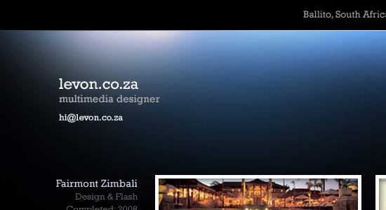
Repeat this step twice, changing colors to different shades of blue, making them smaller and moving it to the left and right sides of the document. The more you change the color, the more dynamic your background will be. 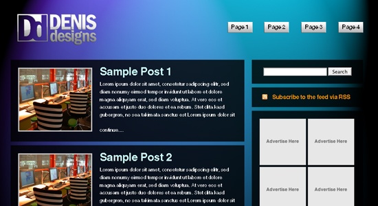 Here are a few examples that use lighting effects:
GreenLite Web Solutions

levon.co.za
RedoPC

Textures/Patterns
Textures and patterns can give your website that little something extra to make it truly stand out.
They can give your website more detail that you just can’t get out of simply using gradients and lighting effects. They can also help to change the mood and look of your website depending on what textures or patterns you decide to employ.
Textures
For this example, we’re going to use a stock texture from Unsigned Design; here is the texture file link: IMG_1283.JPG. Bring it into your Photoshop document, and resize it using Edit > Free Transform (Ctrl + T) so that it spans the entire document.
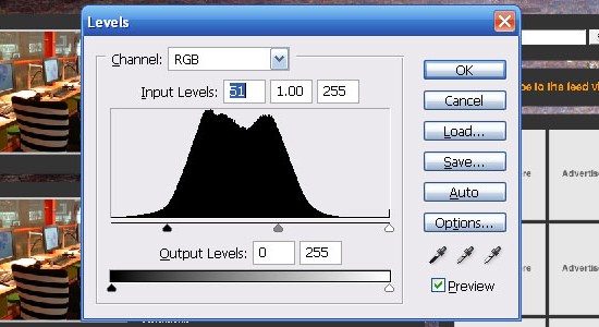
Now we are going to adjust the stock texture to darken it so it goes better with the black background. Open up the Levels Adjustment, Image > Levels > Adjustments… (Ctrl + L) and adjust the arrows so there is no open space on the left side of the graph.
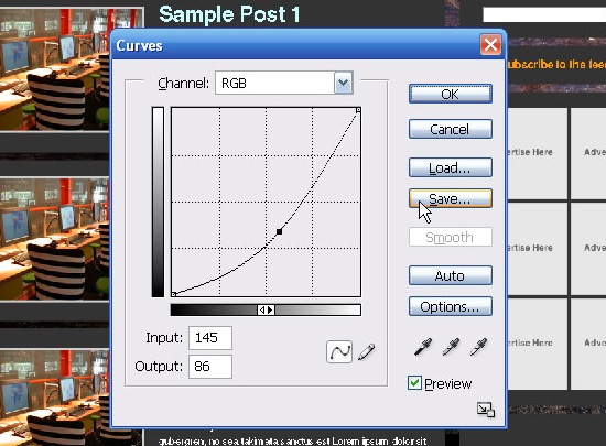
 Now open up the Curves Adjustment dialog, Image > Adjustments > Curve… (Ctrl + M) and adjust the settings to something similar to the figure below, keeping in mind that we want to have a texture that will blend well with the background.
  Let’s get rid of the hard edges so we have a smooth transition to our solid color.
Make sure you are on the texture layer and add a layer mask by clicking on the Add Layer Mask icon at the bottom of the Layers palette. Select the linear gradient from the toolbar, and with black (#000000) as your foreground color, click and drag a gradient on the left and right sides of the document, as well as the bottom of the image to the bottom of the header to give it a smooth transition. 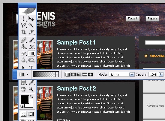
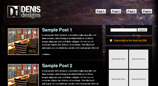 Here are some examples of good uses of textures:
2009 Sanjoaninas

Explovent

Revive Africa

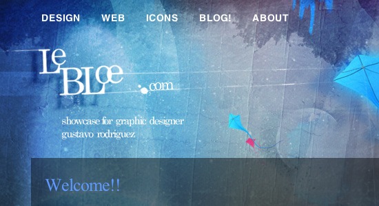
lebloe
Patterns
I’m not going to show you how to create the patterns, but if you want to learn how to, you can go check out this tutorial I wrote called “Create an awesome background using patterns”. Lets take a look at how to add patterns to our design. I am going to take the carbon fiber pattern from the tutorial I referenced above. We want to do the same kind of masking that we did with textures, but first let’s start by using your Rectangular Marquee Tool (M), then creating a box selection across the top of the document and filling it with our pattern.
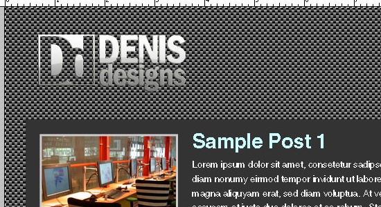 Drop the opacity of the layer down to around 20% and mask the edges similar to the method we used in the textures section above.
  We can mix it up with either of the textures or patterns by adding any of the gradient or lightings techniques to it as well.
 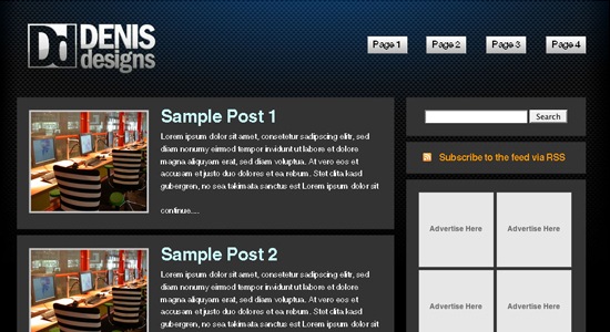 Here are some good examples of websites that use pattern:
ILLUSIO

Gabriel Nunes

Danny Diablo

Summing up
This is just a starting point.
As you can see in the examples, there are many things that you can do with these elements by mixing and getting creative with them. Try some variations with you next website layout.
Your thoughts?
What do you think about high-impact backgrounds? Additionally, if you’ve followed along this tutorial and would like to show off your work – don’t hesitate to leave a link to it in the comments!
Related content
- 20 Attractive Websites That Make Background Patterns Work
- How to Create a Sleek and Textured Web Layout in Photoshop
- How to Make a Stylish Glowing Box in Photoshop
About the Author
 Tyler Denis is a part-time freelance designer from Ashland, New Hampshire. He is also the creator/writer of the design blog Denis Designs/blog, a website dedicated to bringing quality tutorials and inspiration. You can follow him on Twitter or at his personal site, Denis Designs.
-
 President of WebFX. Bill has over 25 years of experience in the Internet marketing industry specializing in SEO, UX, information architecture, marketing automation and more. William’s background in scientific computing and education from Shippensburg and MIT provided the foundation for MarketingCloudFX and other key research and development projects at WebFX.
 -

WebFX is a full-service marketing agency with 1,100+ client reviews and a 4.9-star rating on Clutch! Find out how our expert team and revenue-accelerating tech can drive results for you! Learn more
Make estimating web design costs easy
Website design costs can be tricky to nail down. Get an instant estimate for a custom web design with our free website design cost calculator!
Try Our Free Web Design Cost Calculator

Web Design Calculator
Use our free tool to get a free, instant quote in under 60 seconds.
View Web Design CalculatorMake estimating web design costs easy
Website design costs can be tricky to nail down. Get an instant estimate for a custom web design with our free website design cost calculator!
Try Our Free Web Design Cost Calculator