
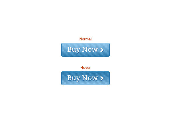
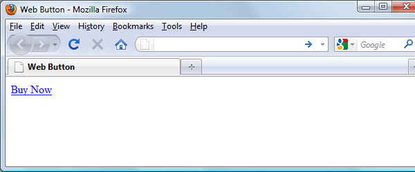
Preview
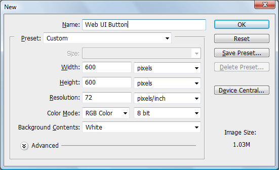
Step 1: Create the Photoshop Document
Our button will be exactly 170px wide and 50px tall, but we’ll make a bigger canvas (600x600px) so that we have some breathing room while we work (then we can just crop our work before saving it).
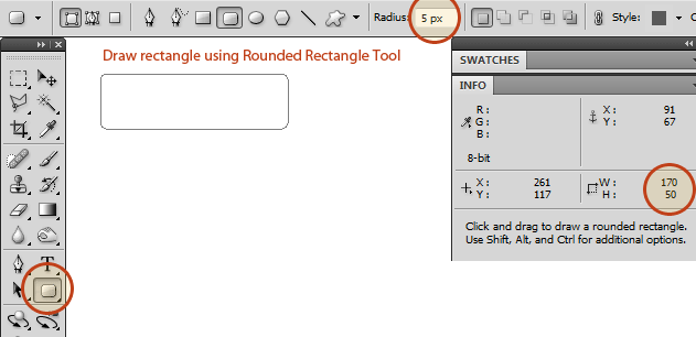
Step 2: Create the Base Shape
Use the Rounded Rectangle Tool (U) set to Shape Layers and with a Radius of 5px to create a 170x50px rectangle.
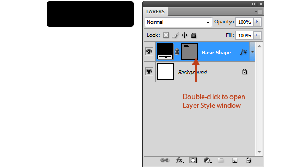
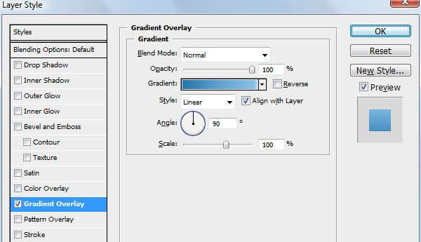
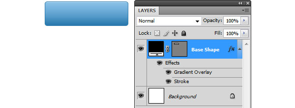
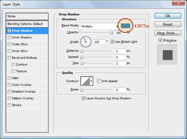
Step 3: Give the Base Shape a Layer Style
The appearance of the button will largely depend on its layer style. Doing it this way offers us flexibility for later when we want to change certain aspects of the button’s design, such as its color. In the Layers Panel, double-click the base shape layer to open the Layer Style dialog window.
We will give this layer two layer effects: a Gradient Overlay and a Stroke.
That’s it.
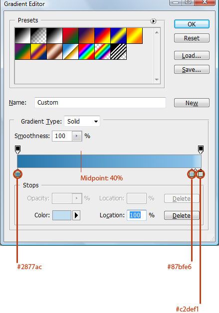
Gradient Overlay
- Color Stop #1 – Color: #2877ac, Location: 0%
- Color Midpoint #1 – Location: 40%
- Color Stop #2 – Color: #87bfe6, Location: 95%
- Color Midpoint #2 – Location: 40%
- Color Stop #3 – Color: #c2def1, Location: 100%
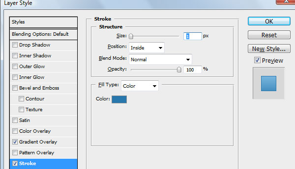
Stroke
For the Stroke layer effect, we will use the darkest blue (#2877ac) that we used from the Gradient Overlay, which will create this nice blending at the bottom of the button.
Step 4: Giving the Button a Diagonal Line Pattern
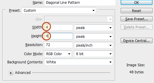
We’ll give the button a diagonal line pattern. We’ll create the Photoshop pattern from scratch. To start, create a new 4x4px Photoshop document (Ctrl/Cmd + N).
Use the Zoom Tool (Z) to zoom in close (4x4px is very hard to see without zooming in).
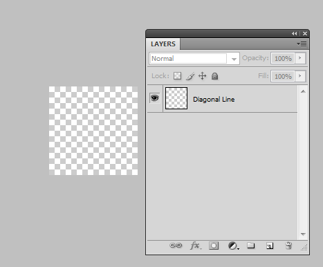
Create a new layer and delete the default white Background layer.
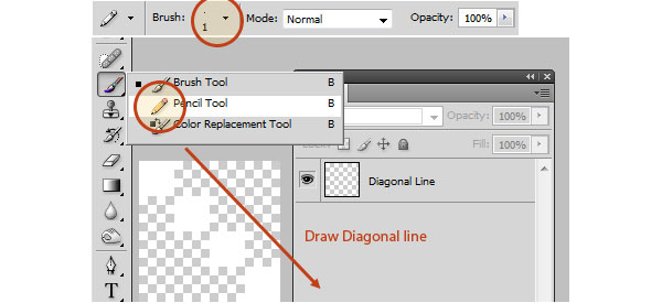
Use the Pencil Tool in the Tools Panel to draw a white diagonal line from the top-left corner to the bottom-right corner of the canvas–hold down Shift to create a perfectly straight line.
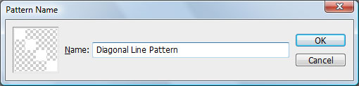
Go to Edit > Define Pattern to save our diagonal line as a pattern.
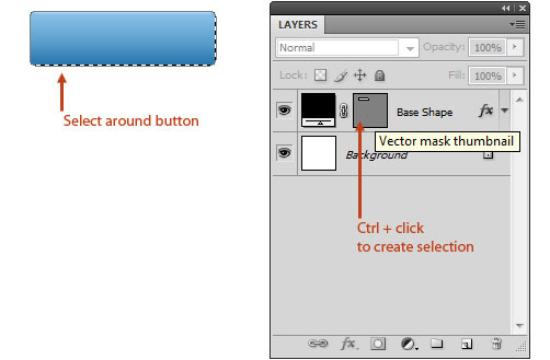
Switch back to our main document. In the Layers Panel, Ctrl/Cmd + click on the Vector mask thumbnail of the Base Shape layer to load a selection around the shape of the button (choosing Select > Load Selection does the same thing).
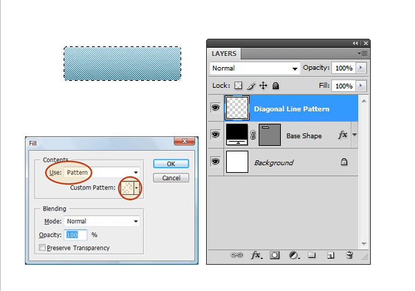
Create a new layer on top of the base shape layer for our diagonal line pattern. Make sure that you keep the selection active.
Fill the selected area with the pattern we created by going to Edit > Fill and choosing it in the Custom Pattern dropdown menu.
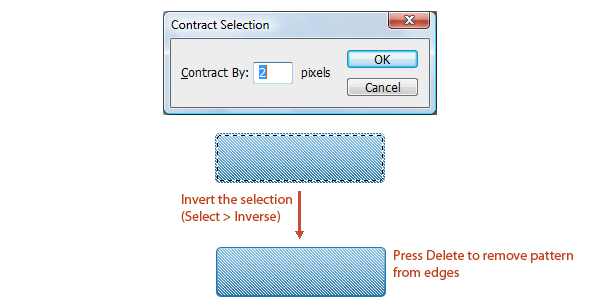
We want to trim the edges of the diagonal pattern by 2px so that it’s not covering up the stroke and the thin horizontal highlight color on top (which comes from the Gradient Overlay). Choose Select > Modify, enter 2px for the Contract By option, invert your selection (Select > Inverse), make sure you’re still on the diagonal pattern layer, and then just hit Delete to remove the selected area.
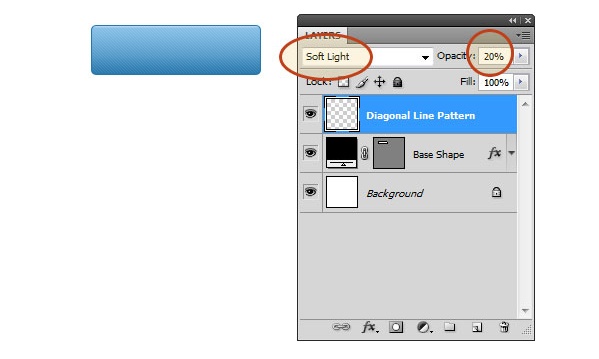
We want the lines to be subtle, so let’s switch the Blend Mode of the diagonal line pattern layer to Soft Light and reduce the layer’s Opacity to 20%.
Step 5: Add the Text
Use the Horizontal Type Tool (T) to type the text of the button; I used Museo Slab 500 at 24pt with the text color set to white (#ffffff).
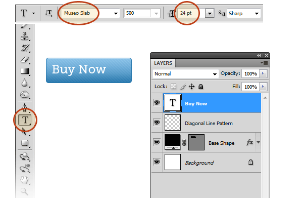
In the Layers Panel, double-click on the text layer to open up the Layer Style dialog window. Give it a drop shadow and set the color of the drop shadow to the darkest blue of our button (#2877ac).
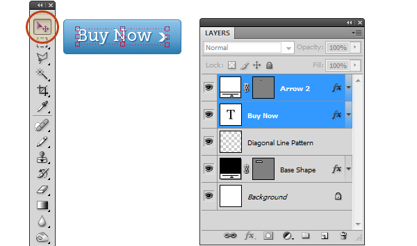
Step 6: Add an Arrow
To denote an action (perhaps to symbolize moving forward or go to the Buy Now web page), let’s add a simple icon on the button.
We’ll take a quick shortcut here: We’ll use a custom shape that comes with Photoshop, instead of drawing it ourselves. Switch to the Custom Shape Tool (U) and, in the Options Bar, find the Arrow 2 shape in the Shape dropdown menu.
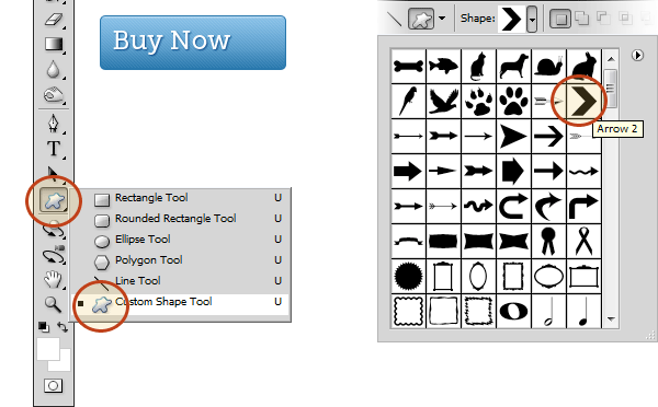
Draw the shape on the right side of the button; the dimension is 13x13px, which matches the height of the lowercase characters of our text.
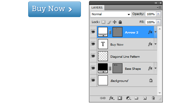
Use the Move Tool (V) to make the necessary adjustments so that the text and arrow are horizontally and vertically centered within the button.
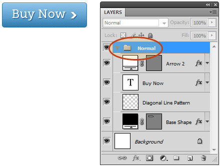
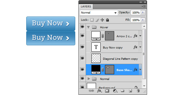
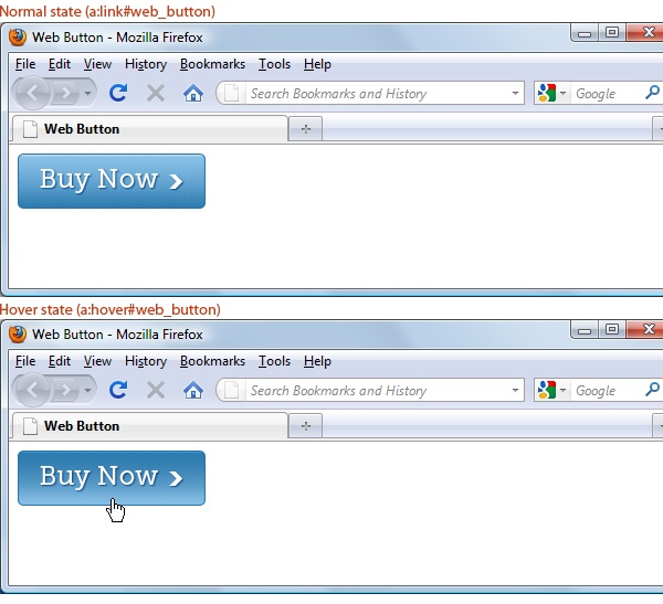
Step 7: Create the Hover State
Our button is done. However, we should create the design for the hover state of the button (i.e.
how the button will look when the user hovers over it with their mouse).
Place all the layers–except the background–in a layer group by selecting them in the Layers Panel and then pressing Ctrl/Cmd + G (or choosing Layer > Group Layers).
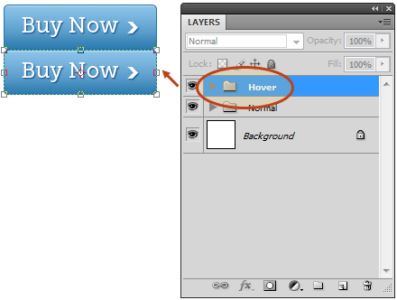
Duplicate the layer group, then move the duplicate layer group’s content right below the original button.
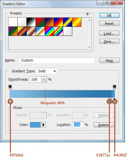
Double-click the base shape layer copy (it’s inside the hover layer group) to open up the Layer Style dialog window. Modify the Gradient Overlay layer effect so that the gradient appears to be reversed. Checking the Reverse option could work for you, but I prefer manually tweaking the gradient’s color stops for better results.
- Color Stop #1 – Color: #87bfe6, Location: 0%
- Midpoint #1 – Location: 40%
- Color Stop #2 – Color: #2877ac, Location: 95%
- Midpoint #2 – Location: 40%
- Color Stop #3 – Color: #4c9fd7, Location: 100%
Step 8: Cropping and Saving
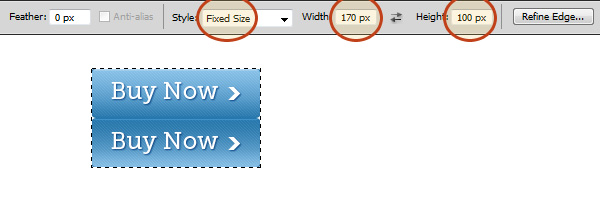
Create a selection around the two buttons using the Rectangular Marquee Tool (U); it must be precisely 170x100px because we will use these values in our CSS. What we’re creating here is called a CSS sprite; head over to my friend Chris Coyier’s tutorial on CSS sprites to learn more about them.
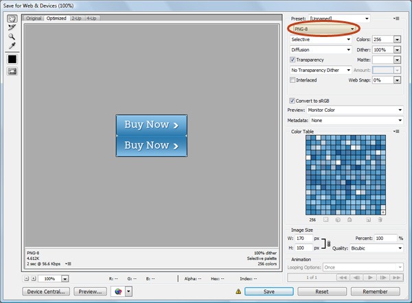
Once selected, go to Image > Crop.
Toggle off the visibility of the Background layer.
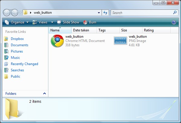
Go to File > Save for Web & Devices, choose PNG-8 with the Transparency option checked, then save it in the same folder/directory that you will be placing your HTML document into (in the next step). Save it as web_button.png.
Step 9: HTML
Create an HTML document (perhaps named web_button.html) in the same folder/directory as your web button.
Open the HTML document in your favorite source code editor (even if it’s just your operating system’s default text editor, like Microsoft Notepad).
The web button will be a link (<a>) with an id attribute of web_button.
Place the following code inside your HTML document.
<!DOCTYPE html> <html> <head> <meta http-equiv="Content-Type" content="text/html; charset=utf-8" /> <title>Web Button</title> </head> <body> <a id="web_button" href="">Buy Now</a> </body> </html>Preview the HTML document in a web browser; it will look pretty boring.
Step 10: CSS
Let’s style the #web_button hyperlink so that it uses web_button.png as its background.
Note: The best practice for CSS is that it should be in an external style sheet, referenced using the <link> tag. But for the purpose of this tutorial, we will declare our styles inside <style> tags in our HTML document since having an external style sheet for one element seems like overkill. Please follow best practices if you are using this in production; just add the style rules to your website’s main CSS file.
The explanation of how the CSS works is inline as comments.
Please read the comments to see how the CSS works.
<style type="text/css"> #web_button { display: block; width: 170px; height: 50px; background: url(web_button.png) no-repeat 0 0; /* Hide "Buy now" text by moving it beyond * the browser viewport */ text-indent: -9999px; /* Because of the outline:none property, we must visually style * the :focus pseudo-class for keyboard users */ outline: none; } /* :hover and :focus have the same style property */ a:hover#web_button, a:focus#web_button { /* -50px for the y-axis value of the background-position property * places the background on the bottom-half of the CSS sprite */ background: url(web_button.png) no-repeat 0 -50px; } </style>Preview the HTML document in a web browser, and check to make sure the :focus CSS pseudo-class has a visual representation; do this by pressing Tab repeatedly in your keyboard to navigate to the button, and making sure that it changes to our hover state when you are on the button.
Tutorial Summary
This tutorial showed you a quick and easy method for creating a flexible web UI button in Photoshop in a popular style that you see in many modern-themed websites and user interfaces. Experiment with the colors, gradients, and pattern to come up with a look that’s entirely your own.
Please post a link to your work in the comments and include it in our Flickr group — we would all love to see it!
Download Source Files
- slick_modern_web_button (ZIP, 0.03 MB)
-
 Trevin serves as the VP of Marketing at WebFX. He has worked on over 450 marketing campaigns and has been building websites for over 25 years. His work has been featured by Search Engine Land, USA Today, Fast Company and Inc.
 -

WebFX is a full-service marketing agency with 1,100+ client reviews and a 4.9-star rating on Clutch! Find out how our expert team and revenue-accelerating tech can drive results for you! Learn more
Make estimating web design costs easy
Website design costs can be tricky to nail down. Get an instant estimate for a custom web design with our free website design cost calculator!
Try Our Free Web Design Cost Calculator
Table of Contents
- Preview
- Step 1: Create the Photoshop Document
- Step 2: Create the Base Shape
- Step 3: Give the Base Shape a Layer Style
- Step 4: Giving the Button a Diagonal Line Pattern
- Step 5: Add the Text
- Step 6: Add an Arrow
- Step 7: Create the Hover State
- Step 8: Cropping and Saving
- Step 9: HTML
- Step 10: CSS
- Tutorial Summary
- Download Source Files
Share this article


Web Design Calculator
Use our free tool to get a free, instant quote in under 60 seconds.
View Web Design CalculatorMake estimating web design costs easy
Website design costs can be tricky to nail down. Get an instant estimate for a custom web design with our free website design cost calculator!
Try Our Free Web Design Cost Calculator


