
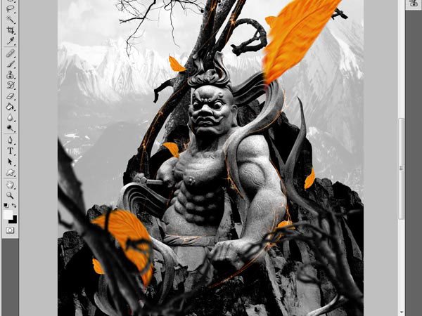
Preview
Click the image below to view the full size. 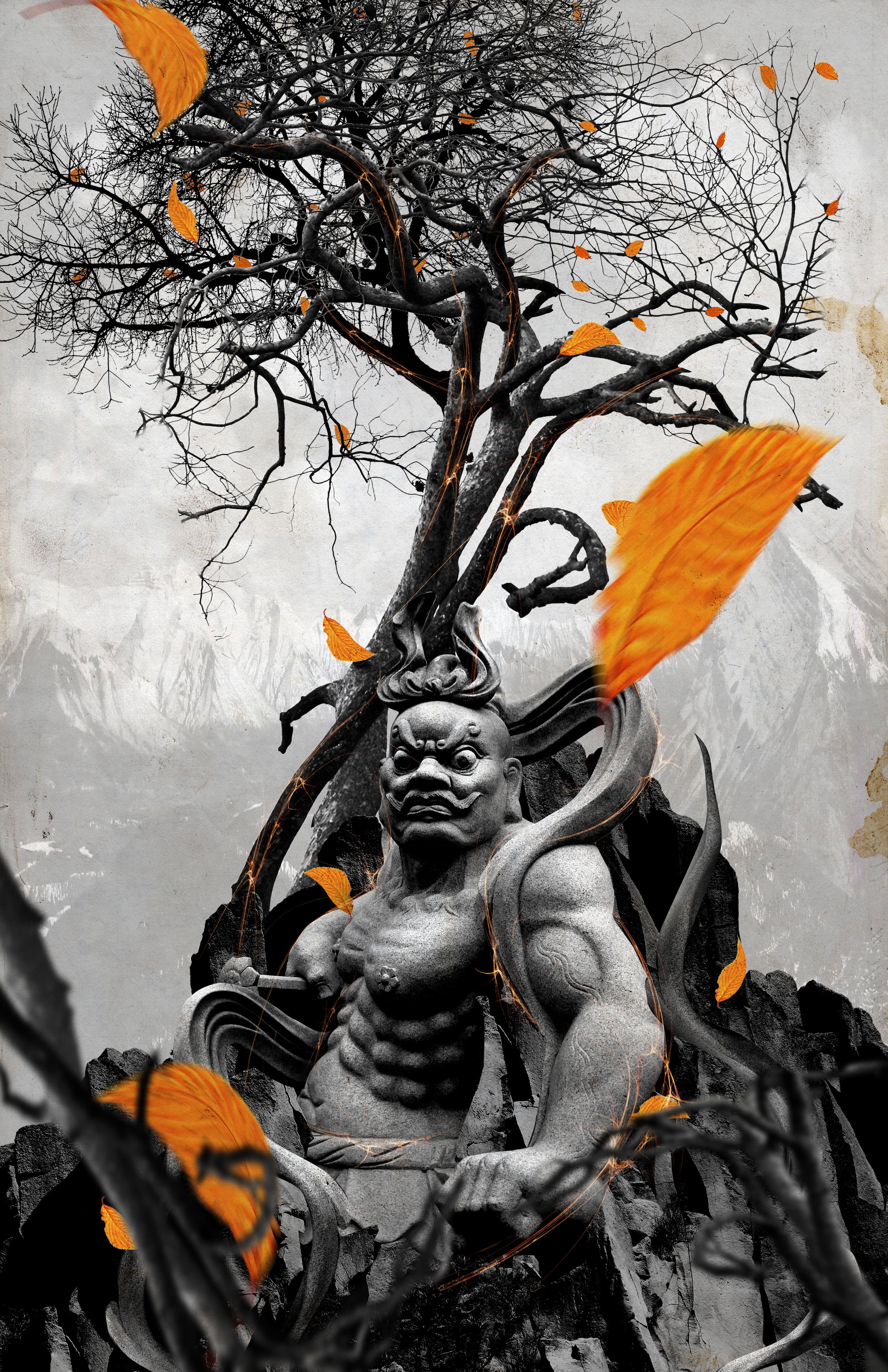
Tutorial Resources
- Stock Image: Mountain – “Mountain View Banff” by Antoine Massé
- Stock Image: Statue – “Warrior” by Leonardo Barbosa
- Stock Image: Tree 1 – “burnt tree” by Vassiliki Koutsothanasi
- Stock Image: Tree 2 – “Stark Tree” by David Ritter
- Stock Image: Leaf – “Leaf 3” by Billy Alexander
- Stock Image: Fractal – “Abstract” by Patrick Hajzler
- Stock Image: Paper texture – “Grungy paper texture v.6” by Dan Bashie Larsen
Step 1: Create the Document
Make a new document in Photoshop (Ctrl/Cmd + N). It should be 11in wide and 17in high, with Resolution set at 300pixels/inch. 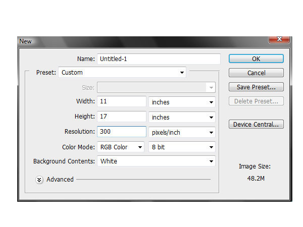
Step 2: Develop the Background
This composition will consist mainly of white, black and gray tones, so we need to set our background to a light-color tone to draw the eye of the viewer on the subject (which will be the statue and the trees).
However, keeping a certain level of detail even on non-focal points really goes a long way in giving the image the mood we are after. To begin our work, download and open the Mountain stock image listed under the Tutorial Resources section. Desaturate the stock image (Shift + Ctrl/Cmd + U).
Bring up the Levels image adjustment window (Ctrl/Cmd + L) and apply the following settings: 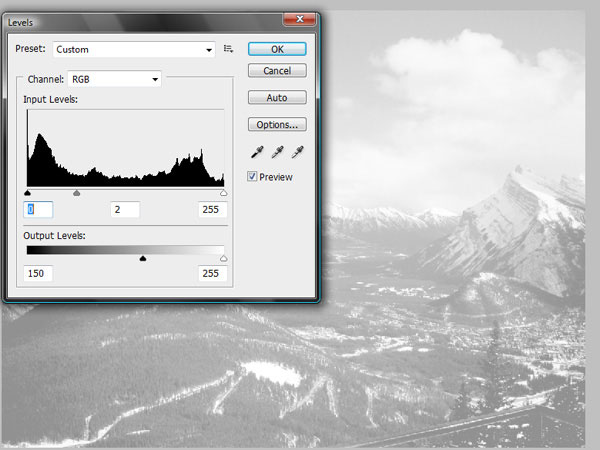 As you can see, we adjusted the levels of the stock image by taking away most of the black tones and keeping the light gray and white tones. Place the image into our main Photoshop document and then press Ctrl/Cmd + T to use Free Transform. Hold down Shift and click-and-drag the corner transform controls until we size the image such that it covers the entire canvas.
Note that you should always hold down Shift when using Free Transform to rescale an image so that you are maintaining its proportions. 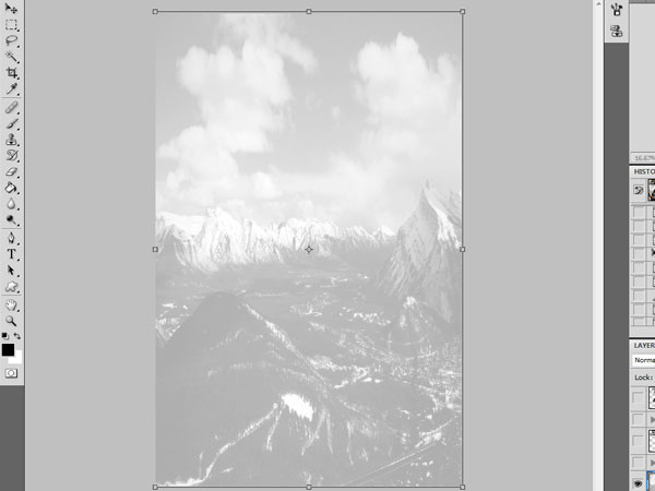
Step 3: Create the Stone Base for the Statue
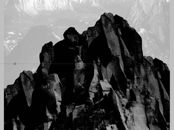
We will now develop a base for our statue to nest upon. To start, locate a stock photo of a rock or stone of your preference.
It might even be a mountain range if you wish (you can just scale it to proportion). Here are some suggestions to get you started:
- Arizona Red Rock Mountains 2
- a great mountain from my town
- Rocky beach
- Drahonice stone in the woods
- Red Rocks 1
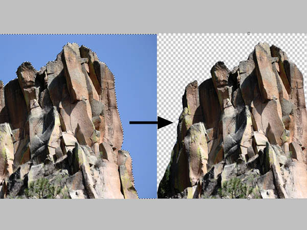
Next, we need to extract the rock or stone that we chose from its background. There are many methods for this, but my method for images with complex backgrounds (as opposed to a solid-color background) is manual selection using the Pen Tool (P). Use the Pen Tool to draw a path along the shape of the rock.
Make sure you retain as much detail as possible because this will be the base of the statue and it will be one of the more prominent elements in our comp. When you finish drawing the path with the Pen Tool, right-click somewhere inside it and choose Make Selection. Then invert your selection (Shift + Ctrl/Cmd + I) and delete the area underneath the inverted selection.
 Desaturate the image (Image > Adjustments > Desaturate). Access the Levels image adjustment window again (Image > Adjustments > Levels) and apply the following settings:
 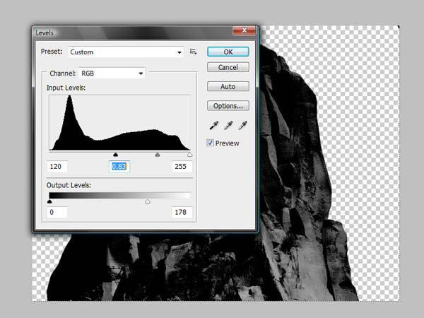 Go to Filter > Sharpen > Sharpen; the Sharpen filter will add a bit more coarseness to the rocks/stone surface and enhance its highlights. Once you’re satisfied with the base of the statue, place it on the lower part of the canvas.
Use Free Transform (Ctrl/Cmd + T) to resize the base as needed. 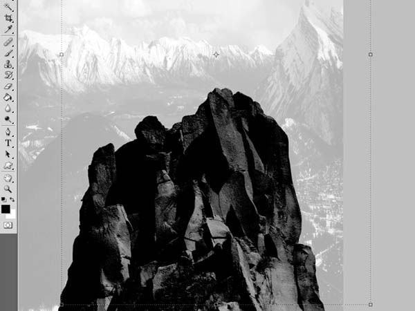 Duplicate the layer (Ctrl/Cmd + J) twice and move the duplicates behind the original stone. Place them on each of the sides at the bottom to fill the rest of the base for the statue.
Step 4: Incorporating the Statue
Download and open the Statue stock image listed in the Tutorial Resources section. Extract it from its background using the Pen Tool (P). 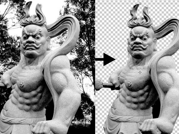 Open the Levels image adjustment window (Ctrl/Cmd + L) and apply the suggested settings below.
This Levels image adjustment will make the statue darker so that it blends better with the tone of its base and the background. 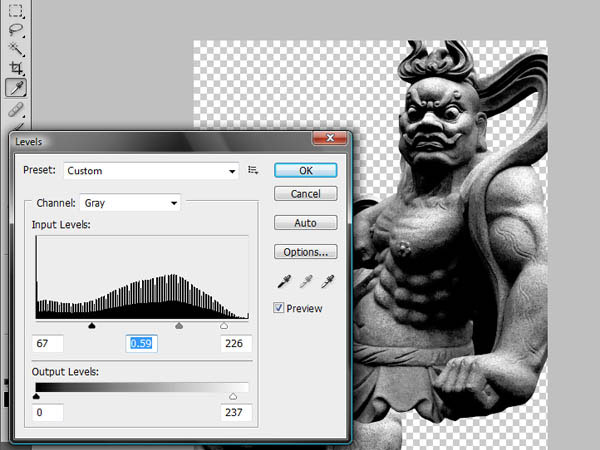 Place the statue in our main document, on top of the rock layers (its base). We are now going to mask away parts of the statue to make it appear as if it was growing out from the rocks.
First, add a layer mask to the statue layer by clicking on the Add layer mask button at the bottom of the Layers Panel. Set the layer mask’s Opacity to 30% so that we will be able to see the shapes on the rocks — this in turn will help us make our selections in the following processes. Take the Pen Tool and draw a path along some of the edges along the shapes inside the stone, trying not to cover too much of the statue.
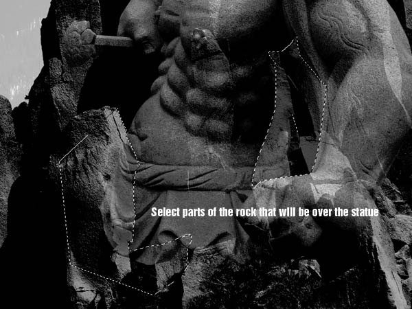 Then make a selection out of the path you drew with the Pen Tool (right-click, choose Make Selection) and fill the selection with black (Edit > Fill or Shift + F5).
 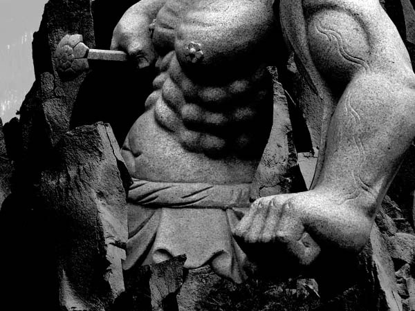 The statue still doesn’t look fully integrated with the rocks. To fix the issue, we are going to take parts of the statue and blend them into the rocks.
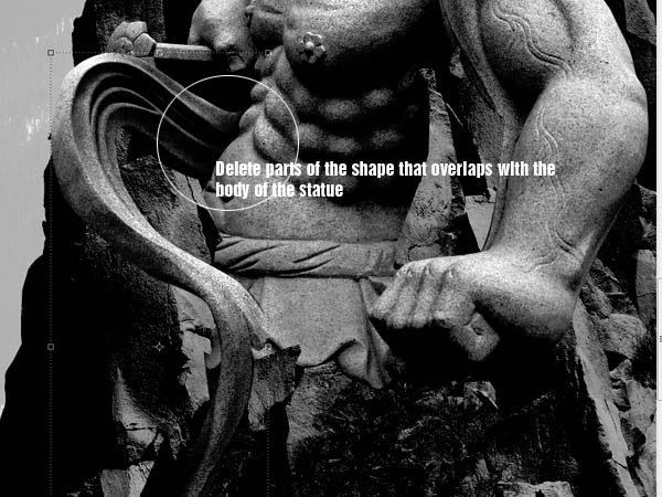
Take the Pen Tool and draw a path along the curved shape on the top right part of the statue, make a selection out of your Pen Tool’s path, then copy (Ctrl/Cmd + C) and paste (Ctrl/Cmd + V) the selected area. 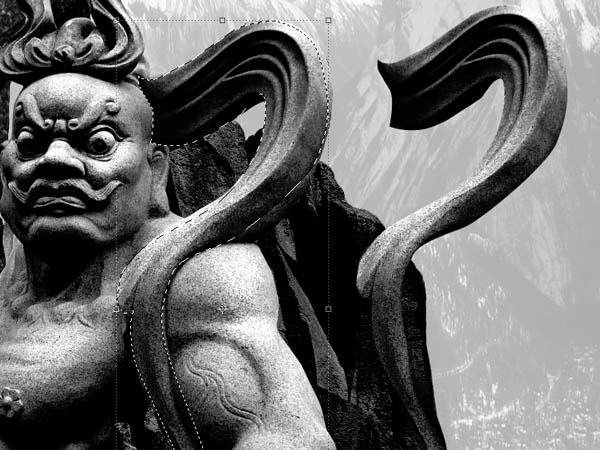 Go to Edit > Transform > Flip Horizontal and place it on the lower left side of the statue. Take the Eraser Tool (E) and delete parts overlapping the statue body.
 Duplicate the layer a couple more times and place them around the main rocks shape. Using a layer mask or the Eraser Tool (E), mask away/erase the parts that would be hiding behind the rocks or the statue. You can also rotate and use Edit > Transform > Flip Vertical for some of the shapes to give more variety to its orientations.
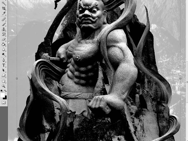 Use Levels image adjustment (Ctrl/Cmd + L) to darken some of the shapes according to the tone of the rocks.
Step 5: Working on the Trees
Download and open the Tree 1 stock image in Photoshop. Click on the only layer in the Layers Panel and press Ctrl/Cmd + J to duplicate the layer.
To extract the tree from its background, we are going to use the Color Range command, found by going to Select > Color Range. But first, we need to make all the details of the trunk and the branches perfectly black — and the rest of it white — to make a quick and detailed selection. We will need to use the Brightness/Contrast image adjustment (Image > Adjustments > Brightness/Contrast) and the Levels image adjustment until the tree is black.
Here are the settings used for the Brightness/Contrast image adjustment: 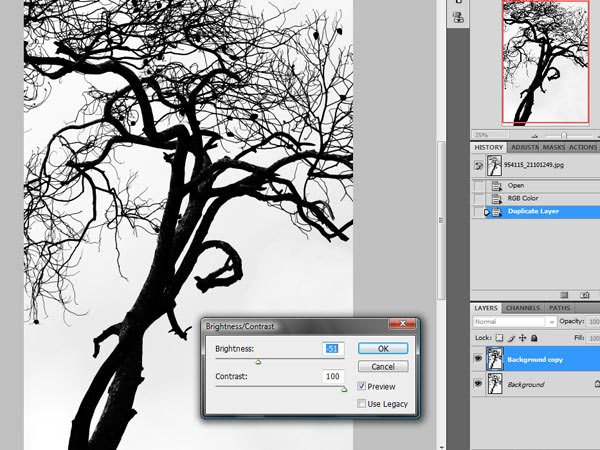 Here are the settings used for the Levels image adjustment:
 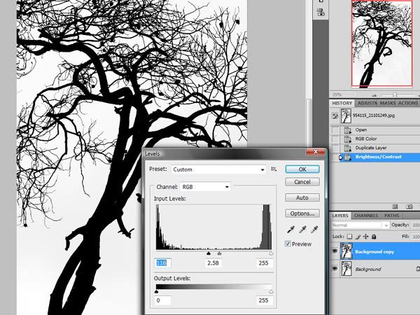 Once you are happy that the image is now black and white, go to Select > Color Range and, in the Color Range dialog window, click on the white part of the image to select it. Press OK to exit out of the Color Range dialog window.
 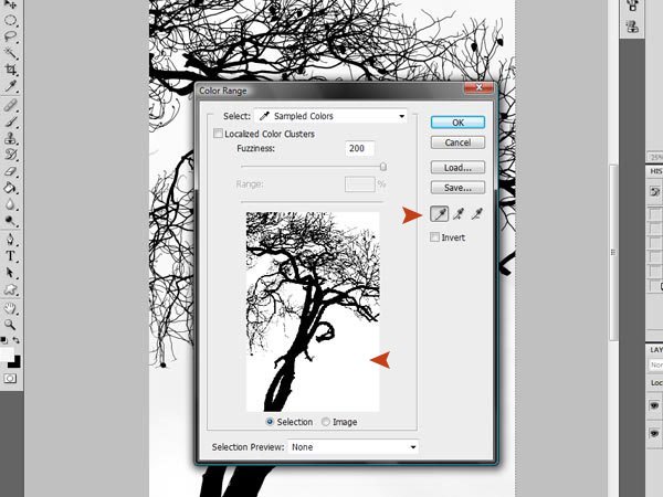 Now click on the original tree layer in the Layers Panel to ensure that it is the active layer, and then press Delete to remove the white areas under the Color Range selection.
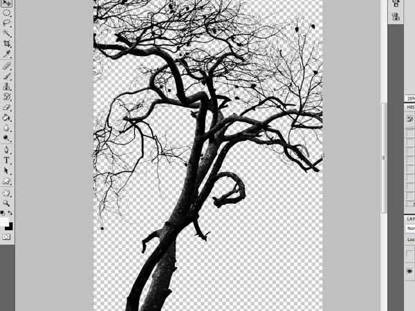 Take Eraser Tool (E) and delete some of the branches that were cut off on the edges, as well as branches that don’t look good.
 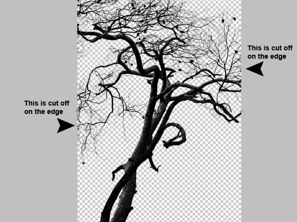 Once you are satisfied, place the tree into our main document, under the rocks layers.
 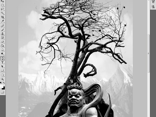 Open the Tree 2 stock image listed under the Tutorial Resources section.
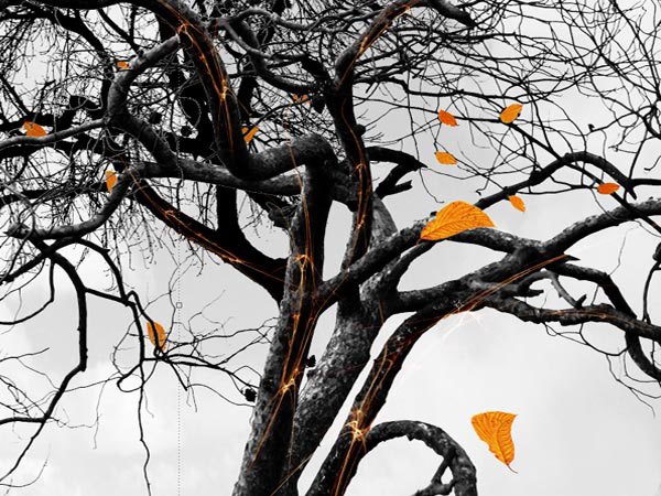
Extract the branches of the stock image from their background using the same Color Range method that we used for the first tree stock image. Once the branches have been extracted, place the tree under the tree trunk on the upper left portion of the canvas in our main document. 
Step 6: Adding Leaves for Color
In this step, we are going to add some color that will beautifully contrast against the monochromatic background, giving the image an interesting and organic look.
To start, download, open, and extract from its background the Leaf stock image listed under Tutorial Resources. Once done, place the leaf in our main document. Resize the leaf down using Free Transform (Ctrl/Cmd + T) to fit the scale of our composition.
Duplicate the leaf layer several times by pressing Ctrl/Cmd + J. Place the leaves on top of the little black leaves on the trees. 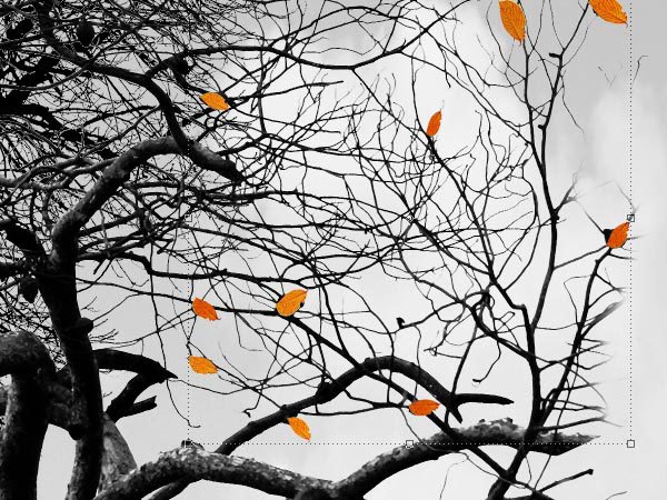 Let’s do a bit of housekeeping because our Layers Panel is getting big.
You can select all the leaves layers in the Layers Panel and group them (Ctrl/Cmd + G) or merge them into one layer (Ctrl/Cmd + E). Keep duplicating the leaves and placing some between the tree and the branches layers. 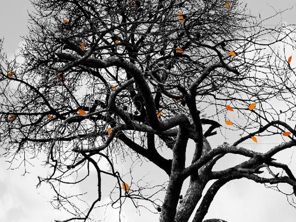 Create bigger leaves by copying the original extracted leaf and scaling it down, but not as much as the other leaves.
To give more movement to the big leaf and to give it the impression that it is blowing in the wind and falling down from the tree, go to Image > Transform > Warp and make it curve in the middle. 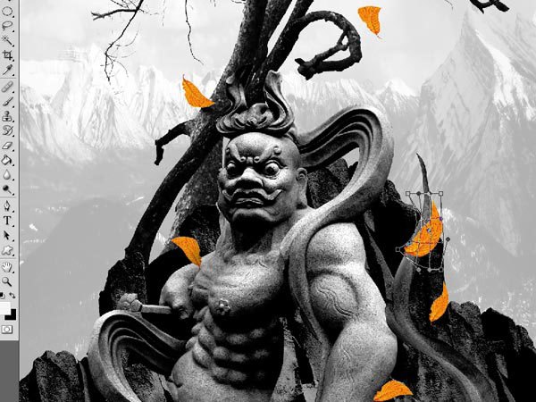 Duplicate this layer several times (Ctrl/Cmd + J) and place the duplicate layers on top of the statue and the rocks.
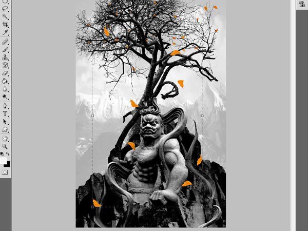
Step 7: Creating Light Streak Effects
Next, we’re going to add light streaks to give our composition an added point of interest.
It will also serve to enhance and support the touches of color that the leaves give our piece, as well as provide a stark contrast to the stillness of the entire composition theme with some moving elements. Download and open the Fractal stock image, then place it in our main document. Since it has a solid background (which is black), we can just later on mess around with layer blending modes instead of extracting the fractal from its background.
Use Image > Transform > Warp to change the shape of the fractal such that you give it flowing, curvy lines; try to match the shapes of the statue. 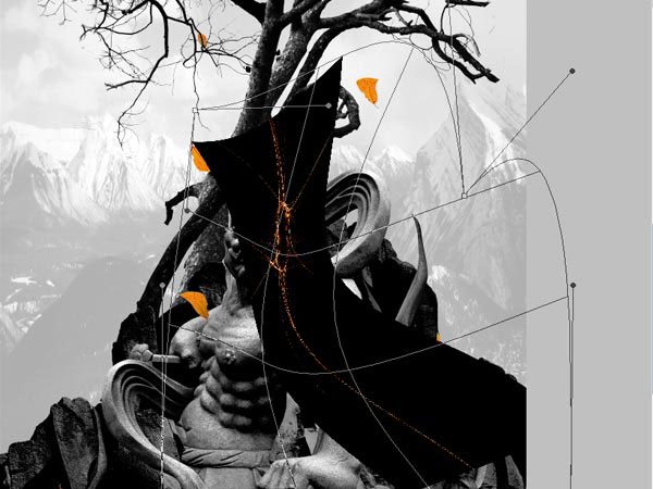 Once you’re happy with the shapes of the fractal, set the Blend Mode to Screen to remove the black background.
 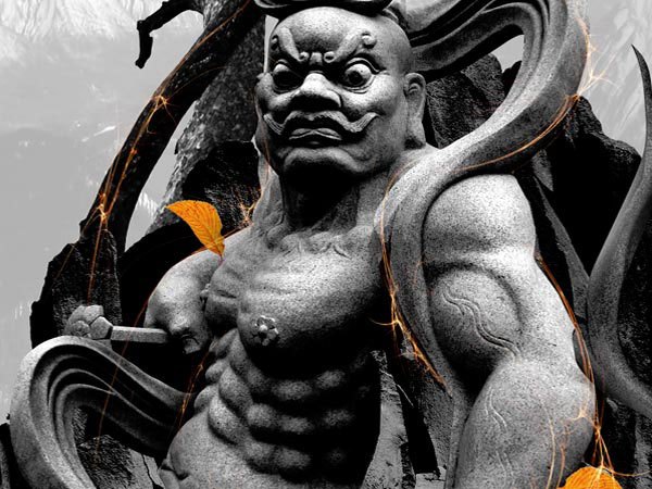 Add more light streaks throughout the piece, such as in the tree trunk and its branches using the same procedure as above.
Step 8: Adding Objects That Are Closer to the Viewer
To give our composition a nice perspective, we will add elements that are closer to the viewer’s point of view. Since they are closer, we will modify their sharpness depending on how close or far away they are, to give our piece an even greater feeling of depth. To start, duplicate the main tree layer and place it on top of all the layers.
Next, go to Filter > Blur > Gaussian Blur, setting the Radius to about 5.9px. 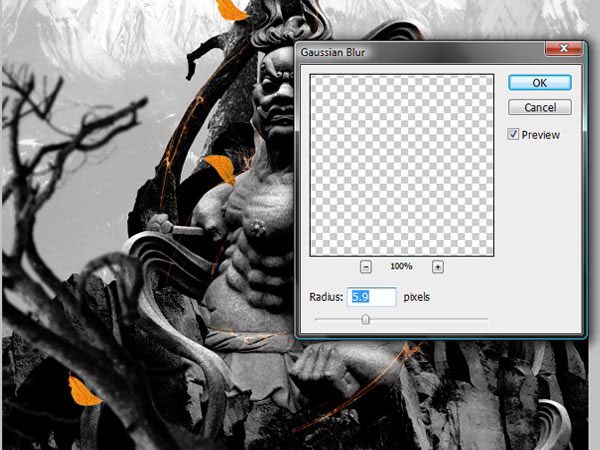 Duplicate the blurred layer once again and rotate it using Free Transform (Ctrl/Cmd + T). Place the rotated tree layer on the other side of the image.
Be sure you don’t cover too much of the main focal point, which is our statue. 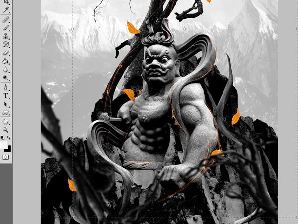 Duplicate the original leaf layer and apply a Gaussian Blur filter. Keep this leaf bigger than the other leaves so that it gives the illusion that it is closer to the viewer.
Step 9: Adding Textures
This is our final step, and the aim is to now finish off our entire image with a nice overall effect. What we will now do is add a paper texture that will give the image an old, grungy effect. First, download and open the Paper texture stock image listed under Tutorial Resources and place it in our main document.
Resize the Paper texture so that it fills the whole canvas using Free Transform (Ctrl/Cmd + T). Set the Paper texture’s Blend Mode to Multiply. There are some parts of the texture where the effect may be too strong.
To fix the harsh parts of the texture layer, you can take the Eraser Tool (E) with a soft round brush (about 500px Master Diameter and 50% Opacity) to remove them. 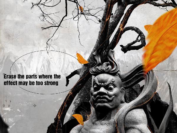
Tutorial Summary
Using Photoshop, we created a grayscale comp with hints of color to enhance the mood and details of the piece. We went over some extraction techniques to get detailed object isolations (such as the Color Range command) and how to use blur filters to give the image the feeling of movement and depth.
We relied on Levels image adjustment and Brightness/Contrast image adjustment to get the colors we want. I suggest you try different combinations of color and textures; think about new concepts where you can integrate these elements and don’t be afraid to experiment with contrasting tones even on primarily monochromatic images, where they make a huge impact. I hope you enjoyed this tutorial and please share your thoughts as well as questions in the comments!
Download Source Files
- dark_zen_composition (ZIP, 90.6 MB)
-
 Trevin serves as the VP of Marketing at WebFX. He has worked on over 450 marketing campaigns and has been building websites for over 25 years. His work has been featured by Search Engine Land, USA Today, Fast Company and Inc.
 -

WebFX is a full-service marketing agency with 1,100+ client reviews and a 4.9-star rating on Clutch! Find out how our expert team and revenue-accelerating tech can drive results for you! Learn more
Make estimating web design costs easy
Website design costs can be tricky to nail down. Get an instant estimate for a custom web design with our free website design cost calculator!
Try Our Free Web Design Cost Calculator
Table of Contents
- Preview
- Tutorial Resources
- Step 1: Create the Document
- Step 2: Develop the Background
- Step 3: Create the Stone Base for the Statue
- Step 4: Incorporating the Statue
- Step 5: Working on the Trees
- Step 6: Adding Leaves for Color
- Step 7: Creating Light Streak Effects
- Step 8: Adding Objects That Are Closer to the Viewer
- Step 9: Adding Textures
- Tutorial Summary
- Download Source Files
Share this article


Web Design Calculator
Use our free tool to get a free, instant quote in under 60 seconds.
View Web Design CalculatorMake estimating web design costs easy
Website design costs can be tricky to nail down. Get an instant estimate for a custom web design with our free website design cost calculator!
Try Our Free Web Design Cost Calculator


