

Note: Click on the Go to Source links at the end of each infographic to find the full size of the infographic.
1. Responsive Web Design Infographic
This simple illustrated responsive web design guide includes a section that displays how a single layout can flexibly change when viewed in different devices. 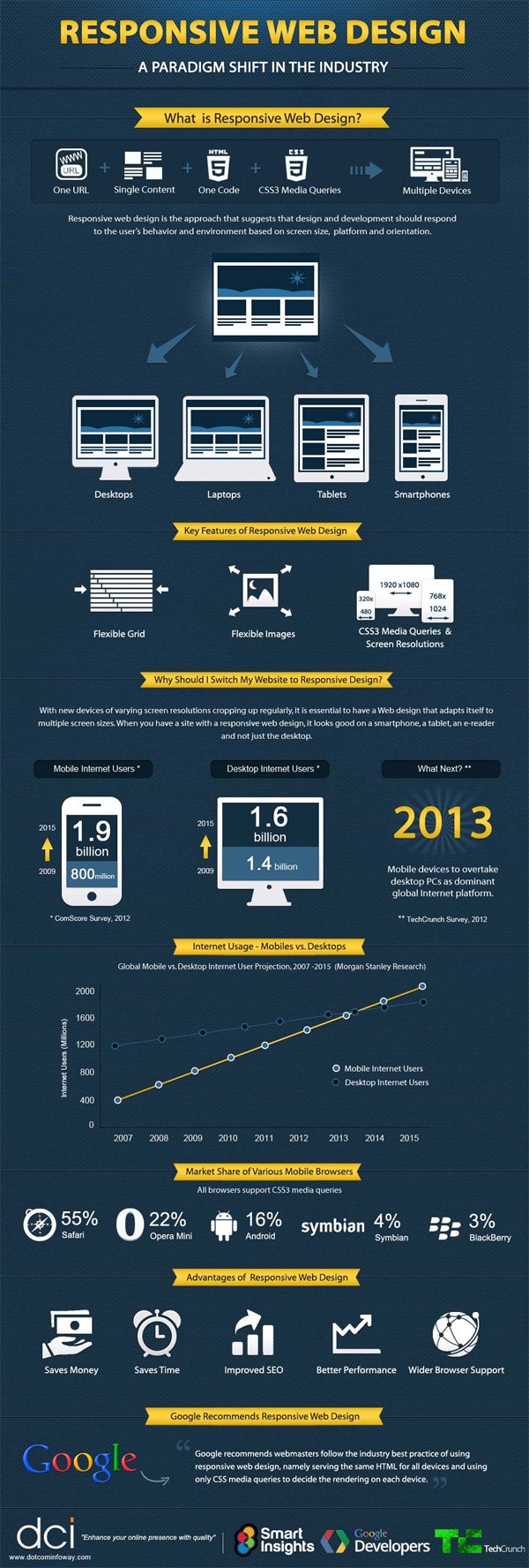
2. Responsive Website Design – What Is It? (Infographic)
This quick primer on responsive web design has a quick bullet-point-style list of reasons why responsive web design is beneficial to website owners. 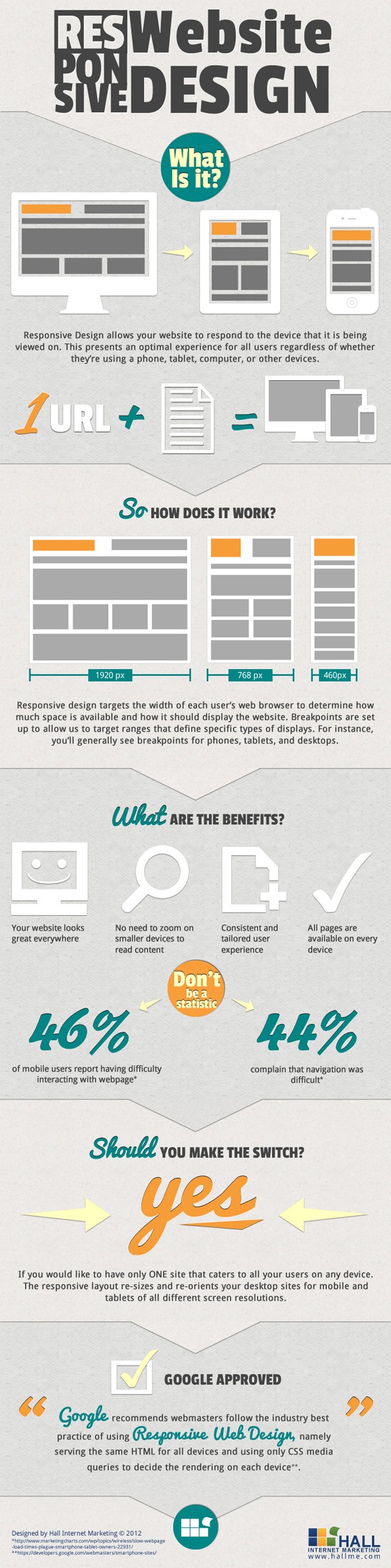
3. 10 Basic Tips About Responsive Web Design (Infographic)
This very long infographic about responsive web design outlines a few things you should keep in mind when developing responsive designs. 
4. Responsive Web Design Interactive Infographic
This interactive infographic presents useful resources, links, a definition of popular terms related to responsive web design, and more. 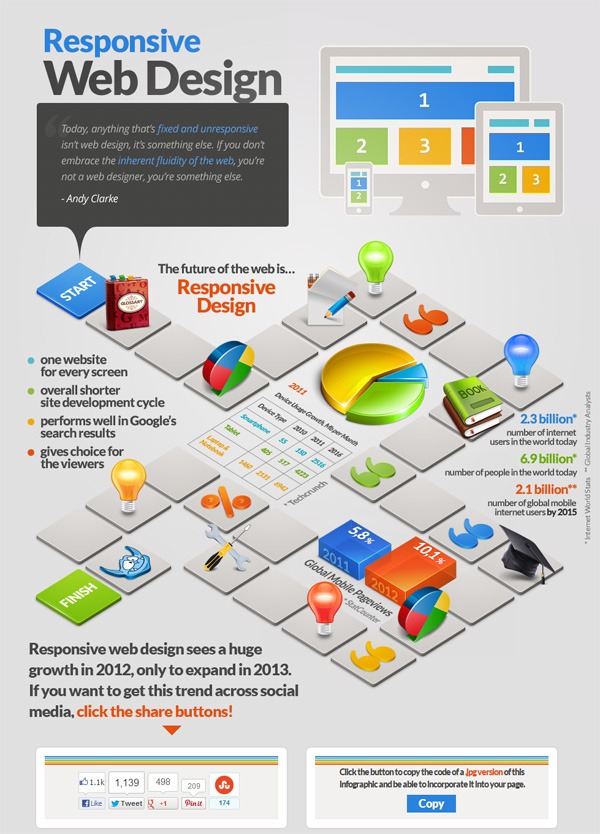
5. Responsive Web Design: What Is It? (And Why You Need It)
This is a basic primer on what responsive web design is and some relevant statistics related to mobile browsing. 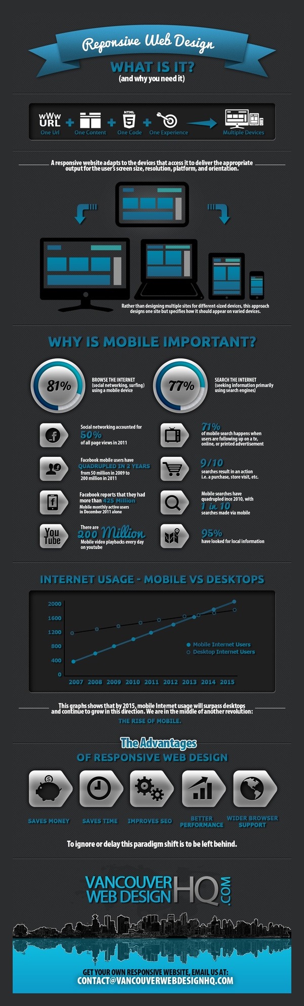 Go to Source
6. Do You Really Need Responsive Web Design? [Infographic]
There are alternatives for optimizing the experience of mobile users on your site. This infographic is a comparison of server-side solutions versus responsive web designs.
![o You Really Need Responsive Web Design? [Infographic]](https://www.webfx.com/wp-content/uploads/2021/10/07_do_you_need_responsive_webdesign_infographic-scaled.jpg)
7. Responsive Web Design [Infographic]
This succinct infographic presents a few reasons why you need a responsive web design. ![Responsive Web Design [Infographic]](https://www.webfx.com/wp-content/uploads/2021/10/08_responsive_web_design_infographic.jpg)
8. 2013: The Year of Responsive Web Design [Infographic]
90% of online consumers use multiple devices to access the Web, and thus it’s important to have a website that accommodates them, according to this infographic. ![2013: The Year of Responsive Web Design [Infographic]](https://www.webfx.com/wp-content/uploads/2021/10/09_2013_year_responsive_design.jpg)
9. Responsive Design for a Better Mobile Experience
25% of mobile device users don’t use a laptop or desktop to access the Web — a very compelling argument this infographic makes about the importance of responsive design. 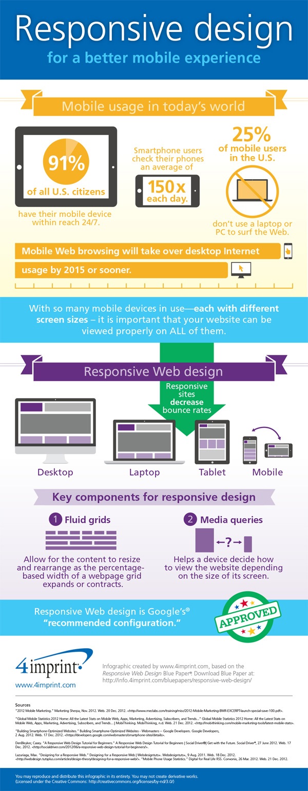
10. Responsive Design Process
This graphic is for designers and agencies that are only now getting into responsive web design. It’s a flowchart of a responsive design workflow of an actual design agency. 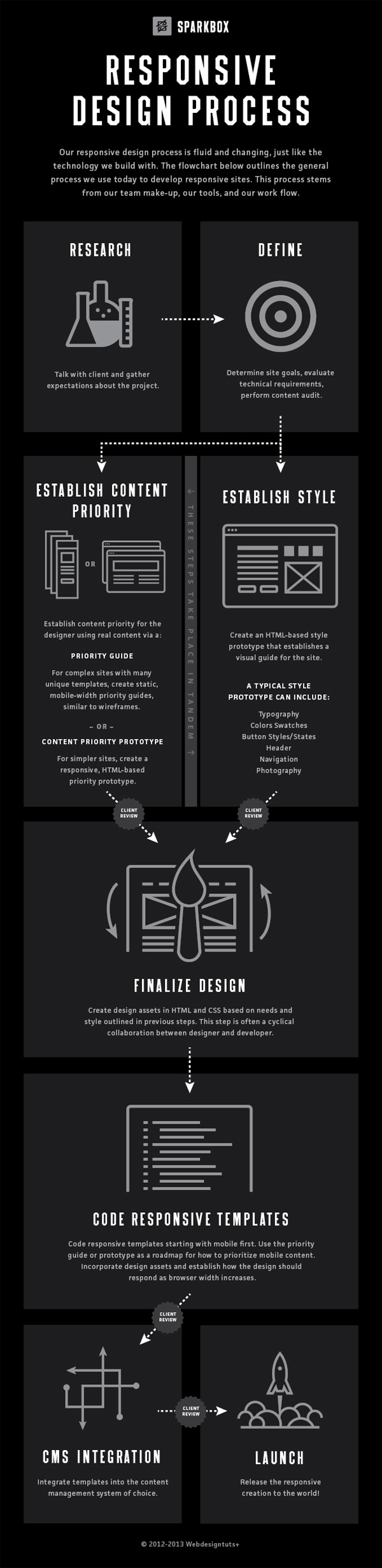
-
 Trevin serves as the VP of Marketing at WebFX. He has worked on over 450 marketing campaigns and has been building websites for over 25 years. His work has been featured by Search Engine Land, USA Today, Fast Company and Inc.
 -

WebFX is a full-service marketing agency with 1,100+ client reviews and a 4.9-star rating on Clutch! Find out how our expert team and revenue-accelerating tech can drive results for you! Learn more
Make estimating web design costs easy
Website design costs can be tricky to nail down. Get an instant estimate for a custom web design with our free website design cost calculator!
Try Our Free Web Design Cost Calculator
Table of Contents
- 1. Responsive Web Design Infographic
- 2. Responsive Website Design – What is It? (Infographic)
- 3. 10 Basic Tips About Responsive Web Design (Infographic)
- 4. Responsive Web Design Interactive Infographic
- 5. Responsive Web Design: What is It? (And Why You Need It)
- 6. Do You Really Need Responsive Web Design? [Infographic]
- 7. Responsive Web Design [Infographic]
- 8. 2013: the Year of Responsive Web Design [Infographic]
- 9. Responsive Design for a Better Mobile Experience
- 10. Responsive Design Process
Share this article


Web Design Calculator
Use our free tool to get a free, instant quote in under 60 seconds.
View Web Design CalculatorMake estimating web design costs easy
Website design costs can be tricky to nail down. Get an instant estimate for a custom web design with our free website design cost calculator!
Try Our Free Web Design Cost Calculator