
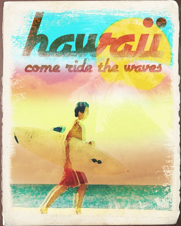
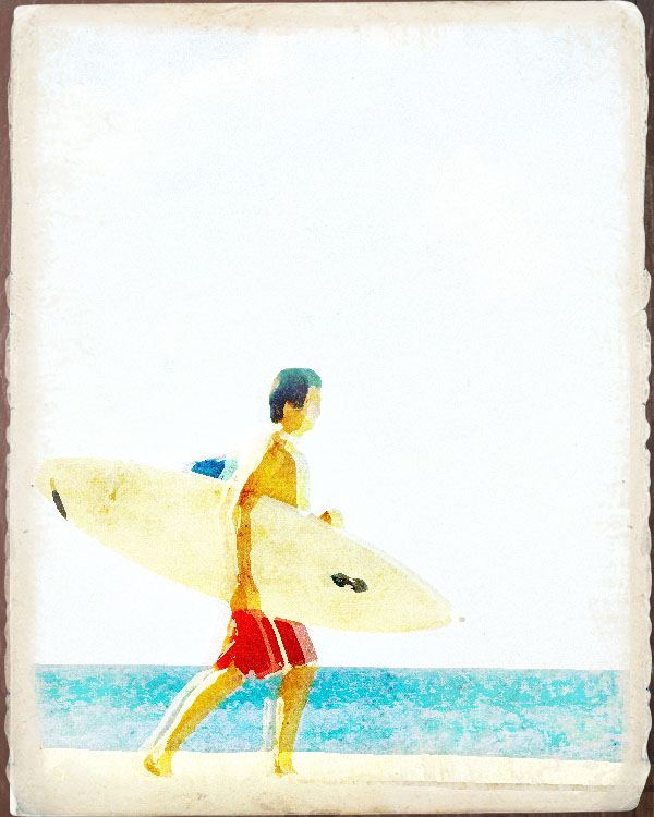
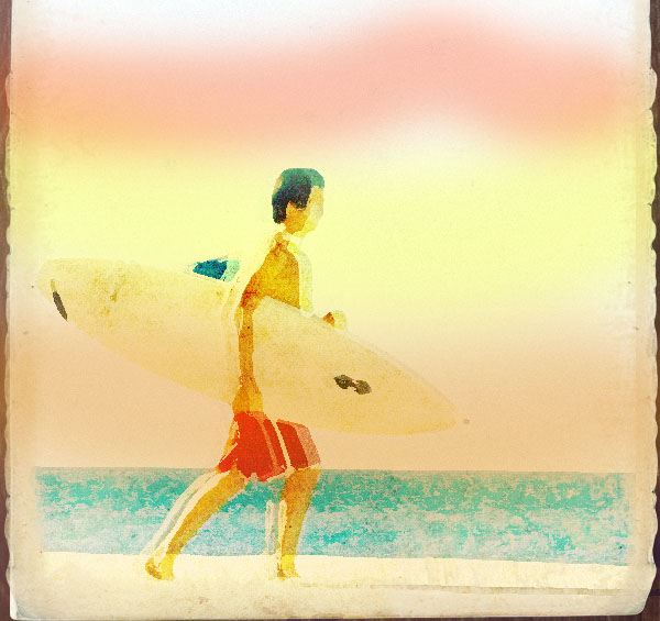
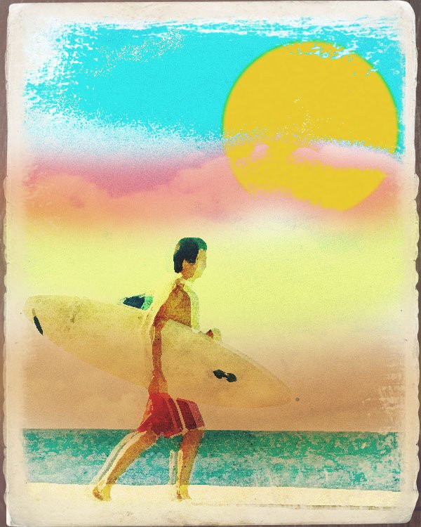
Preview
Here’s the design we’ll create together in its full size. If you’re going for a poster design, you’ll need to scale up your dimensions.
Resources Needed
- Paper Texture by Andrew C.
- Pray for Wave surfer photo by Emsago
- Sky and Clouds 3 photo by Patrick Hajzler
- cocos nucifera photo by abcdz2000
- Painted Border Brush Set by Przemyslaw
- Wood Texture #2 by Dawghouse Design Studio
- Airstream Font by Nick’s Fonts
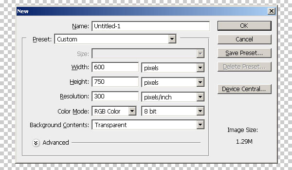
Step 1: Preparing the document
Create a new document (Ctrl/Cmd + N) in Photoshop and set the dimensions to 600px by 750px. If you intend this artwork to be a large poster, you may want to consider changing the dimensions and other settings throughout this tutorial.
Step 2: Creating the ad’s background
Get the Wooden Texture #2 from my site and place it onto our canvas. Scale the texture (Ctrl/Cmd + T) to just about the same size as the document.
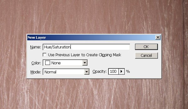
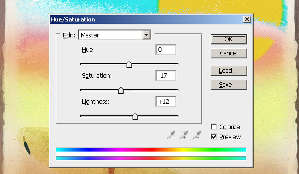
Lessen the saturation of the wood’s color by first using a Hue/Saturation adjustment layer (Layer > New Adjustment Layer > Hue/Saturation) and then a Brightness/Contrast adjustment layer (Layer > New Adjustment Layer > Brightness/Contrast).
Here are the settings for the Hue/Saturation adjustment layer:
And then here are the settings for the Brightness/Contrast adjustment layer:
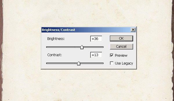
We can also just use the Image Adjustment tools such as Image > Adjustments > Hue/Saturation or Image > Adjustments > Brightness/Contrast but what’s great about putting these effects as adjustment layers is that that you’re able to adjust them later on if you decide to.
Step 3: Creating the ad’s paper
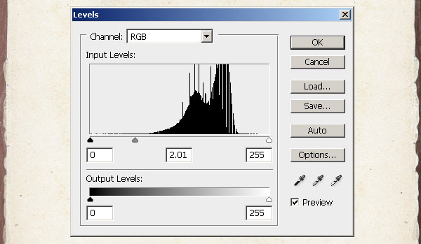
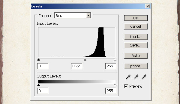
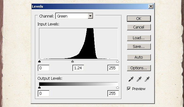
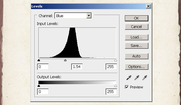
Get this paper texture and once again place it onto our canvas. Notice that our paper currently has a lot of contrast so we will need to lessen this by using Levels (Layer > New Adjustment Layer > Levels) and Brightness/Contrast (Layer > New Adjustment Layer > Brightness/Contrast).
Apply the settings shown in the images below.
Note: make sure you apply these different settings for the 4 different Channels under Levels.
Step 4: Adding and wearing out the surfer photo
Download this surfer photo and place it onto our canvas. Change this photo’s Blending Mode to Vivid Light and Opacity to 29%.
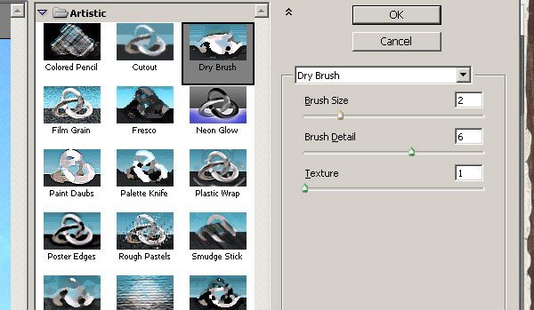
We will now be adding some effects to our photo by using Photoshop’s Smart Filters Tool (Filter > Convert for Smart Filters).
The great thing about Smart Filters is that you are able to modify them later on in case you need to. Add a Dry Brush Filter (Filter > Artistic > Dry Brush) with these settings:
Step 5: Grunging up the edges
Let us now make sure that the surfer photo stays within the paper texture. To do that, first load the Painted Borders brush set into Photoshop.
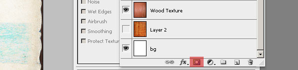
Click on the little Mask icon at the bottom of the Layers Panel to add a layer mask.
Make sure that our Foreground color is set to #000000 and Background color is set to #ffffff.
Using any of the brushes from the Painted Borders brush set, mask off the sides of the surfer photo.
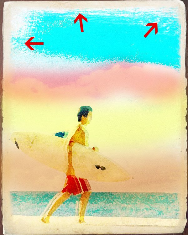
Refer to the photo below. The red areas show which areas and how much you need to erase.
Try using different brushes each time you erase. One of the key things when using grunge brushes is not to repeatedly use one brush at the same time.
Try using different brushes at random.
Step 6: Adding a little more wear and tear
Duplicate our masked surfer photo layer (Ctrl/Cmd + J). Note that the Smart Filters in this photo will also be duplicated automatically.
Change this photo’s Blending Mode to Overlay and Opacity to 100%.
Let us again add some effects by using Filter > Noise > Add Noise with these settings:
Step 7: Some final wear and tear touches
Again, duplicate the surfer photo then right-click on the duplicated layer and choose Rasterize Layer. Then get rid of this layer’s mask.
Using any ordinary feathered brush tip, erase almost all of the surfer photo except the surfer itself and move it a few pixels to the left.
Now this may seem like an unnecessary effect but note that little touches to the design that we may sometimes overlook always add to its entire beauty.
Step 8: Adding the colors
Now we’re going to add some colors on separate layers.
Step 8A: Adding the color Gray
First, let us add the bottommost color.
Using an ordinary feathered brush tip, set its size to about 300px and color to #aeabae (grayish).
On a new layer, brush over the bottom area of the artwork and change this layer’s Blending Mode to Difference.
Step 8B: Adding the color Flesh
Second, we add the color #f1d19f (flesh colored). Create a new layer. Using the same brush change its radius to about 200px.
On a new layer, brush over the area on top of the grayish color’s layer and change its Opacity to 94%.
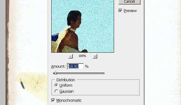
Go to Filter > Noise > Add Noise to add some slight noise to the color. Set the Noise Amount to 3, Distribution to Uniform and the Monochromatic option must be checked.
Step 8C: Adding the color Yellow
Third, we add the color #fafeac (yellow) on a new layer. Repeat the same step as Step 8B but set this layer’s Blending Mode to Multiply and Opacity to 33%.
Also, we need to make sure that we add the yellow above the flesh color.
Step 8D: Adding the color Red
Finally, we add the color #fe4c0f (red) on a new layer. Repeat the same step as Step 8B but set this layer’s Blending Mode to Normal, Opacity to 31%. Also, we need to make sure that we add the red above the yellow color.
Step 9: Adding the clouds
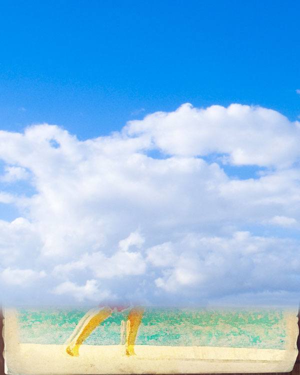
Open this sky and cloud photo in Photoshop.
Using the Marquee Tool (M), select just a portion of the clouds and copy it onto our canvas.
Change the clouds layer’s Blending Mode to Color Burn. Grunge up the edges of this layer just like in Step 5, but this time, make it more grungy and erase off more areas as shown below:
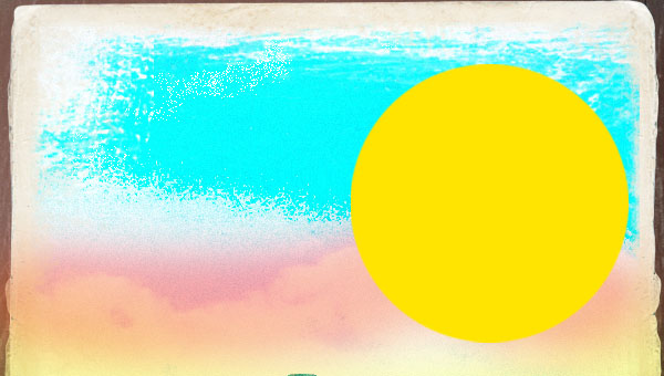
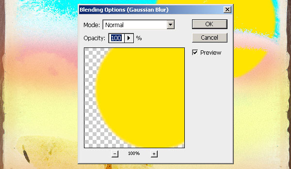
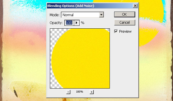
Step 10: Drawing the sun
What’s a beach without a sun? On a new layer, using the Elliptical Marquee Tool (M), draw a circle and fill it with the color #fde401 using the Paint Bucket Tool (G).
Once again, using Smart Filters, add some effects to our sun.
Choose Filter > Gaussian Blur with these settings.
Next, apply some noise (Filter > Add Noise).
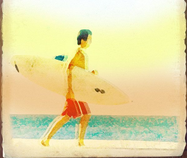
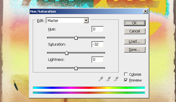
Step 11: Touching up the colors
Create a new layer and using the Paint Bucket Tool (G), fill it with the color #0b3239. Grunge up the sides of this layer again just like what we did in Step 5. Change this layer’s Blending Mode to Overlay.
Now notice that the colors on our artwork seem to be too strong so we need to lessen its saturation. Go to Layers > New Adjustment Layer > Hue/Saturation and apply these settings:
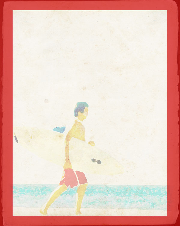
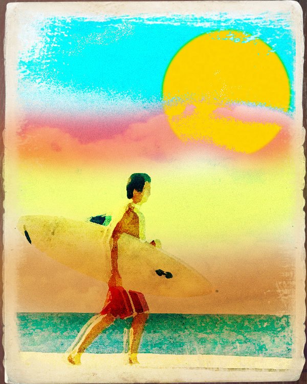
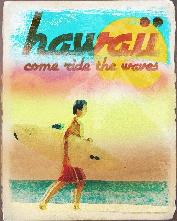
We should now have something like this:
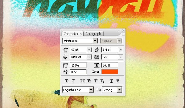
Step 12: Adding the title
Select the Type Tool (T). Set its font to Airstream and color to #ff4e00.
Type the word Hawaii on top area of our artwork. Use these settings for the Type.
Rasterize this text layer and set its layer’s Blending Mode to Linear Burn.
Lessen the saturation of our text. Select the text of this layer by holding the Ctrl/Cmd key and clicking on the text.
Go to Layer > New Adjustment Layer > Hue/Saturation and apply these settings:
Step 13: Adding the subtitle
Select the Horizontal Type Tool (T). Set its font to Airstream as well and color to #ff4e00. Type the words come ride the waves underneath our main title.
All character settings remain the same except that we need to set the font size smaller than the main title.
Rasterize this text and set its layer’s Blending Mode to Linear Light.
Using the Eraser Tool (E) and its brush set to any of the Painted Borders brushes we downloaded, erase off some areas of the text.
We should now have something like this:
Step 14: Adding the coconut tree
One of the many things we can find in beautiful beaches are coconut or palm trees; at least on tropical island beaches. Let’s add one to our artwork but let us not make it too prominent. Open up this stock image: cocos nucifera and place it onto our canvas.
Next, Flip it (Edit > Transform > Flip Horizontal) and Scale it (Edit > Transform > Scale) down a little bit.
Crop out the coconut from its background by using the Magic Wand Tool (W).
Change this layer’s Blending Mode to Linear Dodge and Opacity to 29%.
Make sure that the coconut tree does not exceed our paper by again masking out the excess areas.
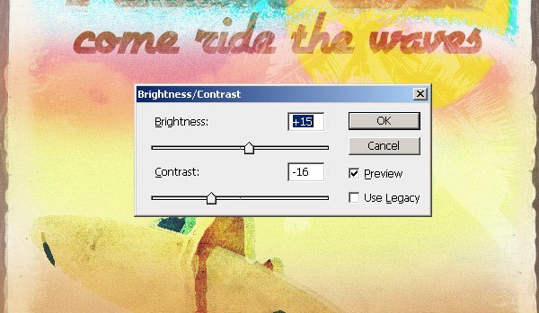
Step 15: Final color touch up
Our artwork may appear too dark, so to wrap up, let’s lessen the saturation of the entire artpiece by placing an adjustment layer as the topmost layer of our Photoshop document by going to Layer > New Adjustment Layer > Brightness/Contrast and applying these settings:
Conclusion
We have now successfully created a worn out, low-saturation-colored vintage beach ad in Photoshop.
Now you don’t just have to look at those beautiful vintages ads as you sure have learned some tips and tricks on how to create one of your own!
-
 Trevin serves as the VP of Marketing at WebFX. He has worked on over 450 marketing campaigns and has been building websites for over 25 years. His work has been featured by Search Engine Land, USA Today, Fast Company and Inc.
 -

WebFX is a full-service marketing agency with 1,100+ client reviews and a 4.9-star rating on Clutch! Find out how our expert team and revenue-accelerating tech can drive results for you! Learn more
Make estimating web design costs easy
Website design costs can be tricky to nail down. Get an instant estimate for a custom web design with our free website design cost calculator!
Try Our Free Web Design Cost Calculator
Table of Contents
- Preview
- Resources Needed
- Step 1: Preparing the Document
- Step 2: Creating the Ad’s Background
- Step 3: Creating the Ad’s Paper
- Step 4: Adding and Wearing out the Surfer Photo
- Step 5: Grunging Up the Edges
- Step 6: Adding a Little More Wear and Tear
- Step 7: Some Final Wear and Tear Touches
- Step 8: Adding the Colors
- Step 9: Adding the Clouds
- Step 10: Drawing the Sun
- Step 11: Touching Up the Colors
- Step 12: Adding the Title
- Step 13: Adding the Subtitle
- Step 14: Adding the Coconut Tree
- Step 15: Final Color Touch Up
- Conclusion
Share this article


Web Design Calculator
Use our free tool to get a free, instant quote in under 60 seconds.
View Web Design CalculatorMake estimating web design costs easy
Website design costs can be tricky to nail down. Get an instant estimate for a custom web design with our free website design cost calculator!
Try Our Free Web Design Cost Calculator


