
 In this Photoshop web design tutorial, you’ll learn how to create a full web page layout that combines the sleek and textured look-and-feel using a combination of beginning to intermediate Adobe Photoshop techniques.
Final Result
Here’s what you’ll be working to create. You can view the large version here. 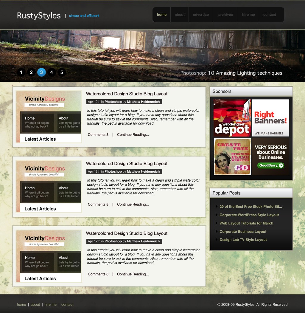
Download
You can download the source files of this tutorial (PSD and stock photos).
- photoshop_sleek_textured.zip (ZIP file, 9.3 MB)
Setting up the Photoshop document and background
1 The first thing we want to do is to create a new document with the dimensions of 1024×1050. 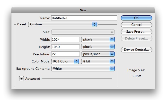 2 The next step is to go ahead and change your background color. Using your Paint Bucket Tool from your tools pallet, fill your background layer with #F0EEDB. 3 Next we want to add a image to our background. I found a great photo on deviantart at and you can download it here.
You’ll need to resize it to fit your document, and copy it a couple times to fill your document. To save that step you can go ahead and get a larger version of the image in our source files. 4 Once you have the image on your document, go ahead and lower its opacity to about 82% and it will look something like this: 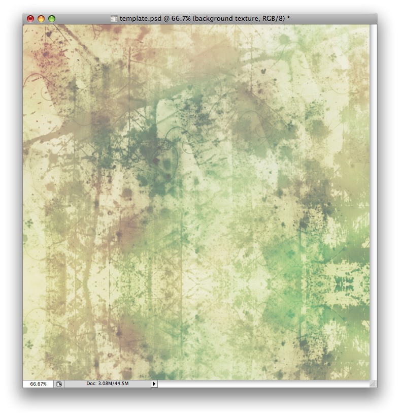
Creating the layout’s header
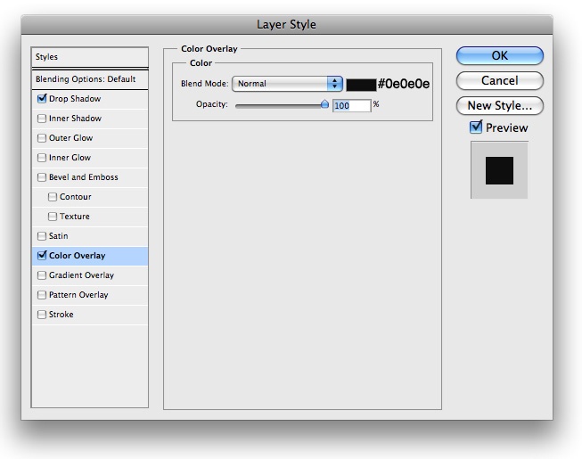
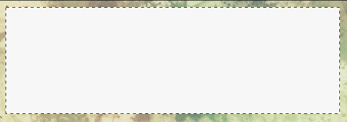
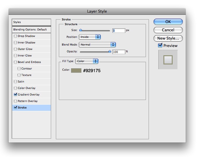
5 Now let’s go ahead and get started on our header. Using your Rectangle Marquee Tool make a selection similar to the following, about a pixel from the top of your document and fill it with #000000 6 Next we want to go ahead and insert the following blending options onto that layer by right-clicking our layer and choosing to blend options from the drop-down menu: 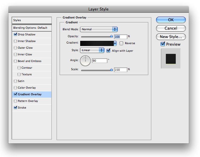
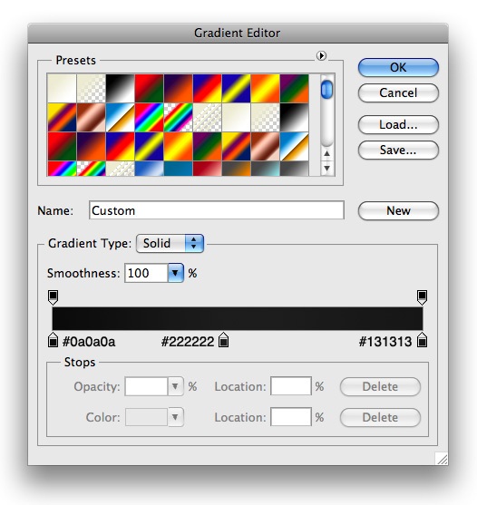
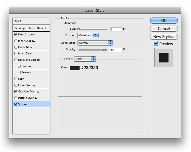 7 Lower the opacity to your layer to about 95% so a bit of the background fades through, and your document should look something like this:
 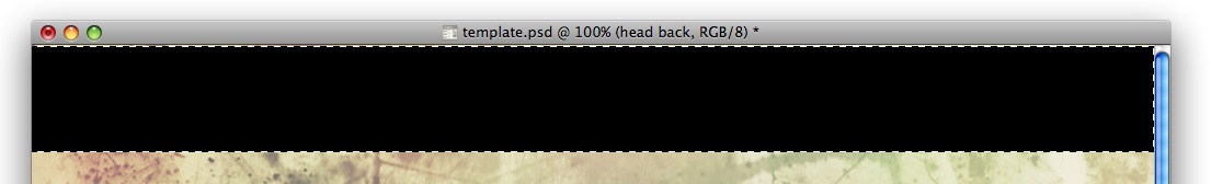 8 The next step is adding a logo to our header. I went with the font Geneva CY. Go ahead and place your text in a similar way to the following and make a nice little 1px wide line next to it.
 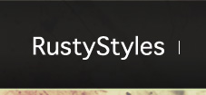 9 Now go ahead and add these blending options to your text layer, and to the 1px wide line you created.
10 Then go ahead and use a simple font like Helvetica to add a tagline with the font color #25B2F8. Your final result should look like this for your logo: 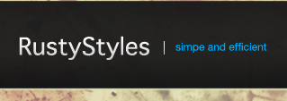
Creating the navigation: background
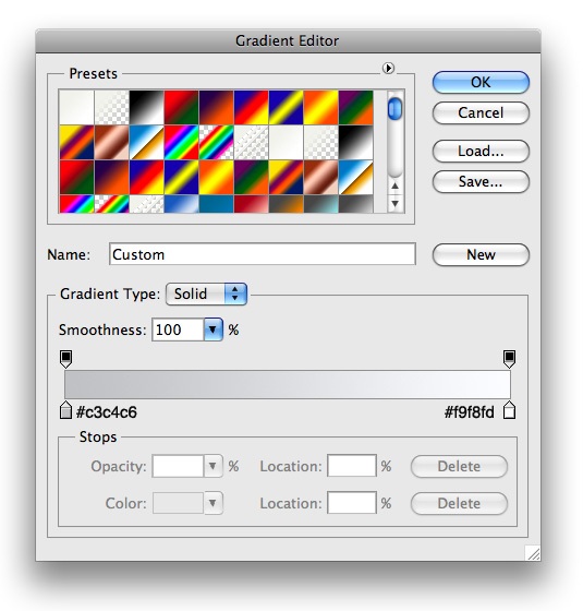
11 Next it’s time to make a navigation for our site. Using your Rounded Rectangle Tool, go ahead and make a rounded rectangle similar to the following on the right side of your header. 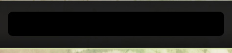 12 Now we want to insert the following blending options onto its layer.
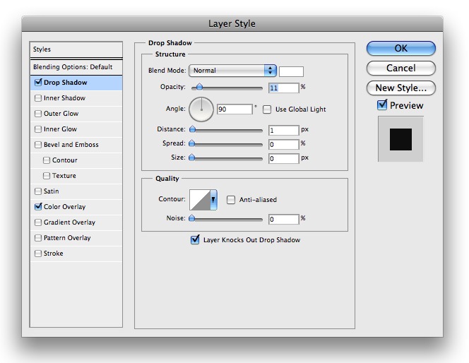
 13 It should look something like this after your complete
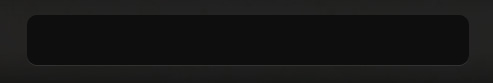
Creating the navigation: adding the text
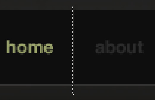
14 Lets go ahead and add some text, shall we? For our active link we want to use the color #ABAE80, and for our other links we will use the color #393939. Lay it out similar to the following: 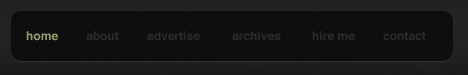 15 Next we want to go ahead and divide our links up. Using your Rectangle Marquee Tool, make a 1px wide selection in between all of your links and go to Edit > Clear on your Rounded Rectangle Layer.
Header complete!
16 Once you do that in between all of your links, your header is complete, and it will look something like the following: 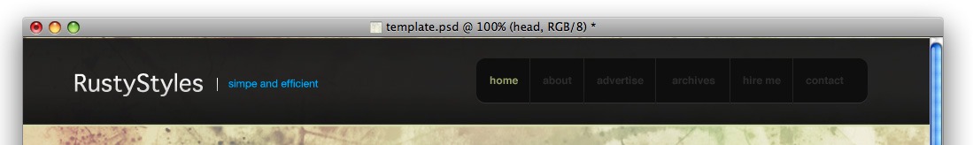
Working on the photo banner: setting up the texture
17 Next we want to go ahead and work on our banner. In essence, we are making a sort of “slide show” of different posts that could be displayed. I found a great stock photo over at SXC which can be found here. Go ahead and resize it on your document and select a part of the image you find the most appealing about the size as the following: 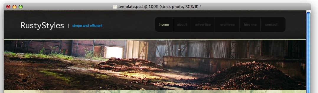 18 Now we want to add a slight border to the bottom of our stock photo, so insert the following blending options onto your stock photos layer:
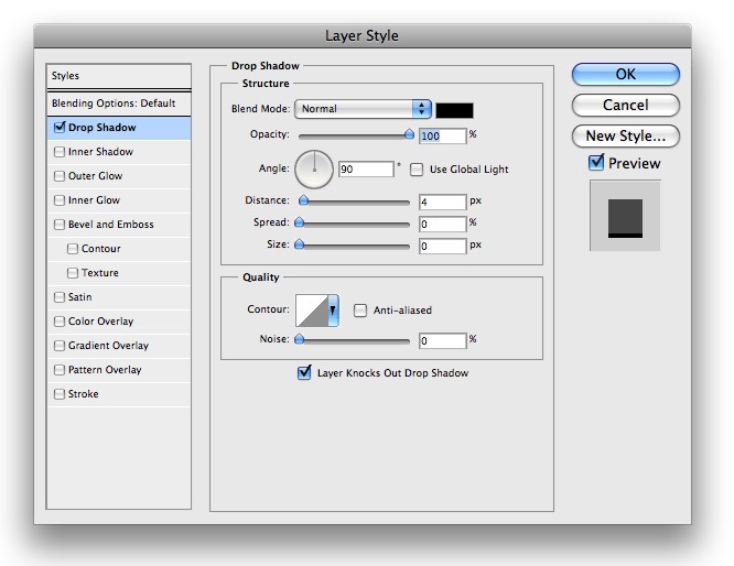
Working on the photo banner: putting in the image title
19 We are going to want our title to be displayed on the image showing what post it is representing on our slideshow. Before we add the text we want to add a nice little background for it. Using your Rectangle Marquee Tool, make a selection similar to the following and the bottom of the image and fill it with #000000.  20 Now go ahead and lower the opacity to about 59% and you should have something that looks similar to the following:
  21 Now we can add our title. For the Category title, I used #FFFFFF for my font color, but lowered the Opacity of its layer to 60%. For the title I used the same method, but only lowered it to 85%. You image will look something like this:
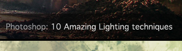
Working on the photo banner: designing the post preview numbers
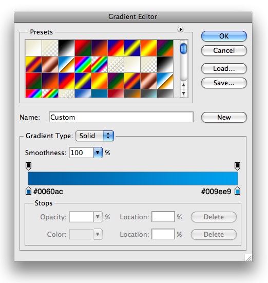
22 On the left side I went ahead and added a spot for you to choose which post is being viewed. All I did was use my Elliptical Marquee Tool to make circles and fill them with black and placed white text inside. 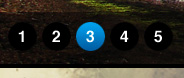 23 For my active number 3 circle, I used the following blending options on its layer:
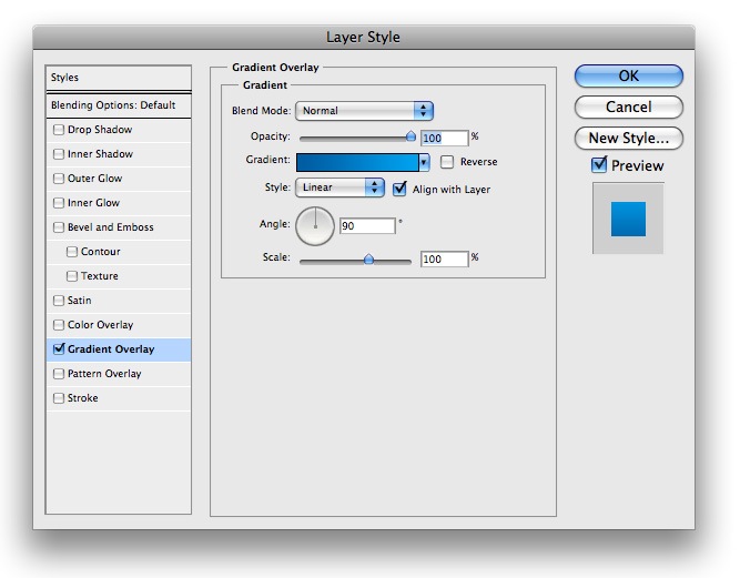
Website photo banner completed!
24 At this point your header will be complete and should look something like this: 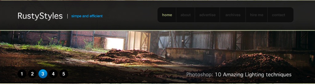
Designing the post teasers
25 Now it is time to move onto how our posts will be displayed. Using your Rectangle Marquee Tool make a selection similar to the following and fill it with #FFFFFF.
 26 Next we want to go ahead and insert the following blending options onto its layer:
Post teaser design completed!
27 All we do now is just lay out how we want our post. For my heading I used the color #211213 and standard #000000 for the description. Go ahead and lay it out similar to the following using your Text Tool 
Creating the layout’s sidebar: the heading box
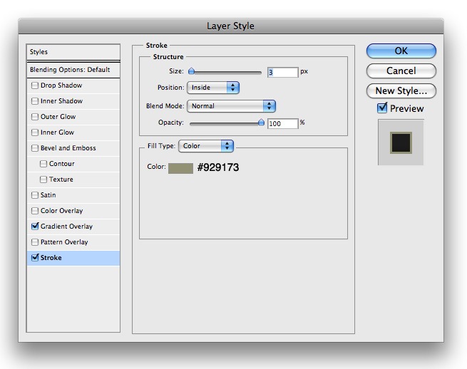
28 You can go ahead and use that layout for the rest of your posts. Next we want to move onto our sidebar. The first thing we want to do is to create a heading box. So using your Rectangle Marquee Tool, make a selection similar to the following and fill it with #000000.  29 Now insert the following blending options onto its layer:
 30 Your results should look like the following:
 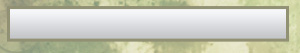 31 Now lets add some text. Add your title with the font color #323232 and use the following blending options on its layer:
 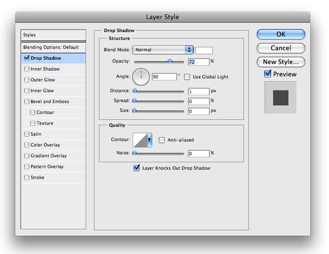 32 You will get something that looks like this:
Creating the layout’s sidebar: the sidebar content boxes
33 Next we need to make a box to place our content it. Using your Rectangle Marquee Tool yet again, make a box similar the following and fill it with #000000. 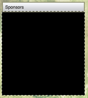 34 Next go ahead and insert the following blending options onto your layer:
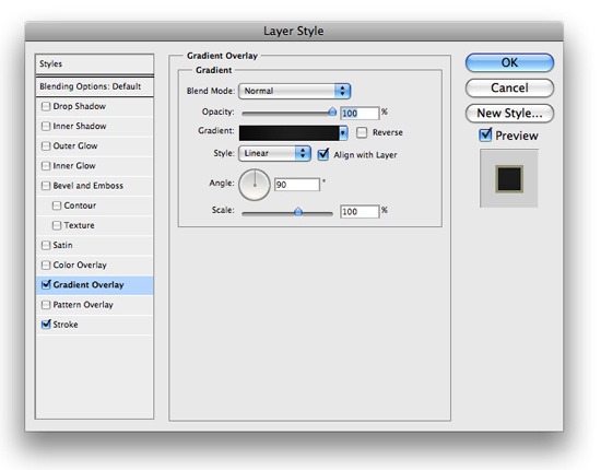

 35 Go ahead and add some content and repeat those steps and you will get something similar to the following:
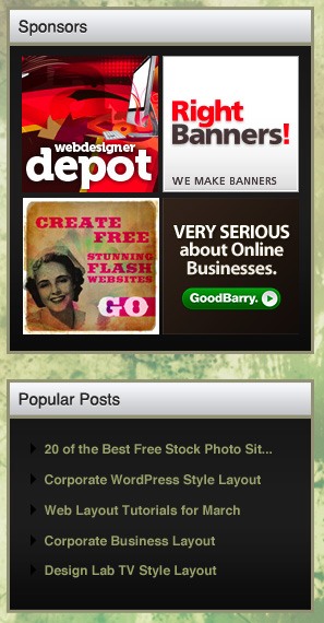
The layout’s footer
36 We are almost done! The last step is to add a footer. Using your Rectangle Marquee Tool, make a selection similar to the following at the bottom of our document and fill it with #000000.
![]() 37 Now go ahead and insert the following blending options onto its layer:
37 Now go ahead and insert the following blending options onto its layer: 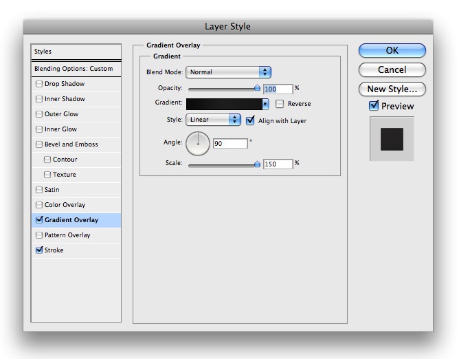


Congratulations – you’re done!
38 Just add some text, and that is it! Your template is complete. When it is all said and done, your final results should look like the following:
Summary
I hope you enjoyed this tutorial and found it useful to use on a future web design! These tutorials should give you the vital skills that people look for in a web designer! Your clients, whether a college or an artist, should be impressed if you can give them a unique, visually appealing, and easy to use website.
-
 President of WebFX. Bill has over 25 years of experience in the Internet marketing industry specializing in SEO, UX, information architecture, marketing automation and more. William’s background in scientific computing and education from Shippensburg and MIT provided the foundation for MarketingCloudFX and other key research and development projects at WebFX.
 -

WebFX is a full-service marketing agency with 1,100+ client reviews and a 4.9-star rating on Clutch! Find out how our expert team and revenue-accelerating tech can drive results for you! Learn more
Make estimating web design costs easy
Website design costs can be tricky to nail down. Get an instant estimate for a custom web design with our free website design cost calculator!
Try Our Free Web Design Cost Calculator
Share this article


Web Design Calculator
Use our free tool to get a free, instant quote in under 60 seconds.
View Web Design CalculatorMake estimating web design costs easy
Website design costs can be tricky to nail down. Get an instant estimate for a custom web design with our free website design cost calculator!
Try Our Free Web Design Cost Calculator


