
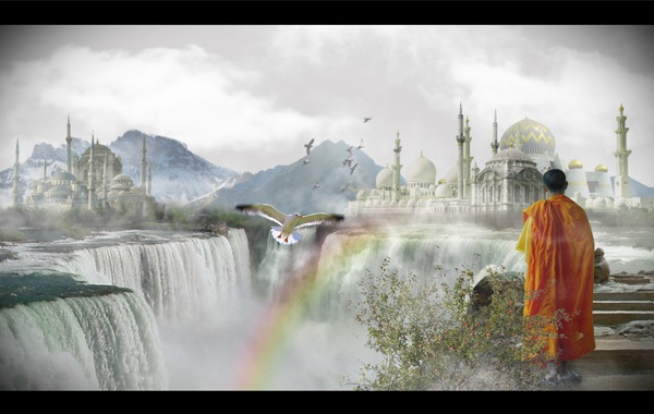
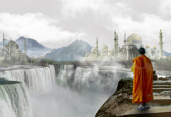
Preview
Tutorial Resources
Here are various resources suggestions for you to use. Do not feel obligated to use them and feel free to experiment.
Reference/Inspiration Images
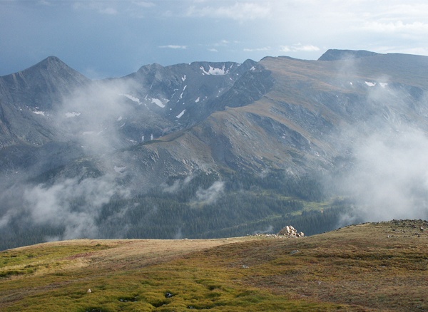
- Rocky Mountains National Park landscape
- Paisaje de montañas /Mountains landscape
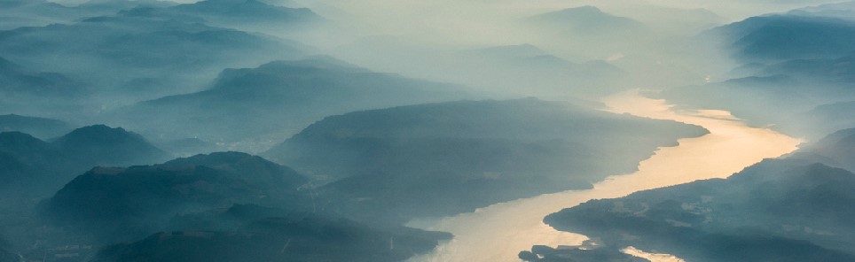
- Niagara Falls Ice Mass
Waterfalls
- American Falls
- Niagara Falls, New York 4
Mosques for the Temple Cities
- Grand Mosque
- blue mosque istanbul
- ortakoy mosque
- Sheikh Zayed Masjid
- Blue Mosque 4
- istanbul
- Sultanahmet Mosque-2
- Mosque
Hills and Mountains
- New Mexico Landscapes
- New Mexico Landscapes (2)
- New Mexico Landscapes (3)
- Up in the mountains 2
- Tasman Glacier
Path Way
- Arches 2
Monk
- Laos meditation
Tree
- Apple tree 2
Seagull
- Seagull
Flock of Birds
- Homing pigeons
Introduction
Traditionally, matte paintings were made by artists using paints or pastels on large sheets of glass for integrating with the live-action footage in film. As the ages passed, the technology has developed and helped in creating some groundbreaking matte paintings for the films like Avatar, Indiana Jones, created by artists such as Linwood G. Dunn and Norman Dawn.
To see more matte paintings, visit the gallery section of MattePainting.Org.
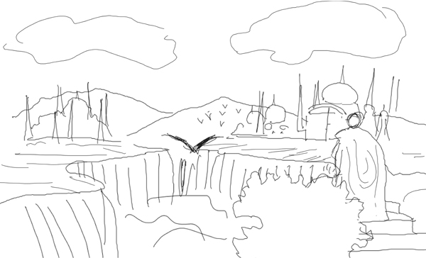
Step 1: Sketching the idea
Before starting the matte painting scene, make a rough sketch of the world that we are going to create. It does not have to be pretty, it just gives us a rudimentary picture of how to lay out our scene.
Step 2: Look for images to use as inspiration and reference
It’s good to use some reference images that could help us in our matte painting for colour correction and for the depth of field. These images might not be used in the scene, but rather, are just to serve as our guide for how things look in the real world. You can have them open in Photoshop and/or another simple image viewer that you can look to whenever you need a reference point.
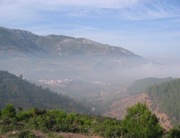
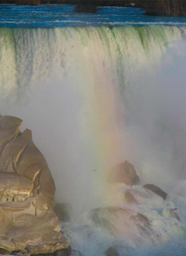
Here are a few reference images used in composing the scene:
Rocky Mountains National Park landscape
Paisaje de montañas /Mountains landscape
Niagara Falls Ice Mass
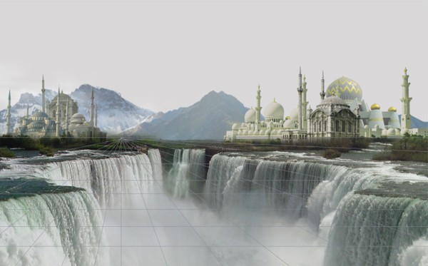
Step 3: Creating the perspective
The first step is to make sure that our perspective, angles and vanishing points are accurate. We will be bringing in various stock imagery at different sizes and angles, so we need a sort of guide to make sure that they fit together well. First thing’s first, create our main Photoshop canvas with the canvas size set to 1680x1050px.
Mark a vanishing point on the canvas and draw a series of lines from that point with the Line Tool (U), as shown. This will just be a reference layer that we can switch on and off. 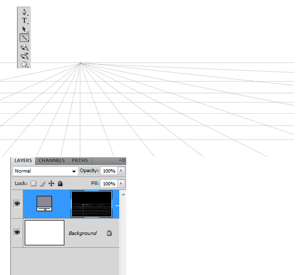
Step 4: Make the waterfalls
Import the American Falls stock image on to the canvas and transform it (Ctrl/Cmd + T) to fit the perspective with the Move Tool (V), using the lines we created as our guide.
Keep the work organized by naming the layer something intuitive like “niagara 1”. Then erase the edges of the waterfalls using the Eraser Tool (E). 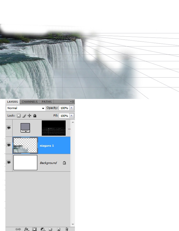 In the similar way, import another view of Niagara Falls (you can use the Niagara Falls, New York 4 from the Resources listing) and place it under the “niagara 1” layer. Name this layer “niagara 2”.
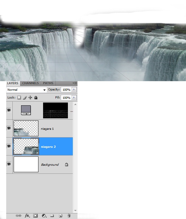
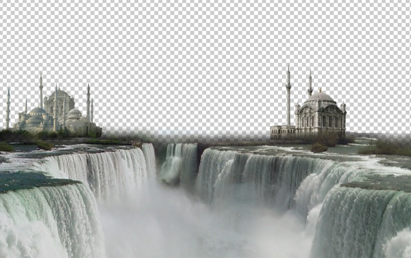
Step 5: The making of the first Temple City
Now import a mosque image (you can view a collection in the Resources listing—I used the Grand Mosque stock image for this part), move it to a location according to our sketch and name the layer as “mosque 1”. Use the Perspective Transform command (Transform > Perspective) to tweak and align the mosque to our vanishing point grid. Note: for each object that we place into our composition, you will need to extract them from their background using your favorite method (such as using the Polygonal Lasso Tool to trace around their edges). I leave it up to you to do this for each image that we import.
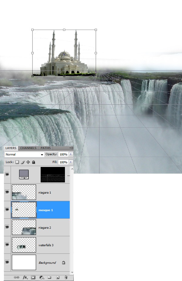 Similarly, import another mosque and place it above the “mosque 1” layer, then name the layer as “mosque 2”. Here, I chose blue mosque istanbul but this process of building our mythical Temple City into our scene is very subjective, and you should feel free to experiment with your own stock images.
 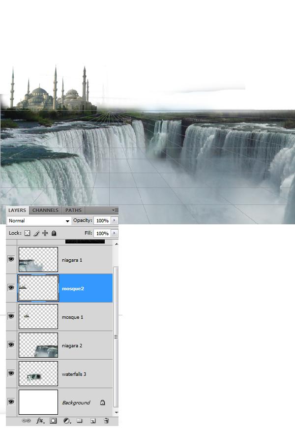 Now import another mosque and place it below the “mosque 1” and “mosque 2” layers. This time, I used the ortakoy mosque image.
Keep our work consistent by naming the layer “mosque 3”. 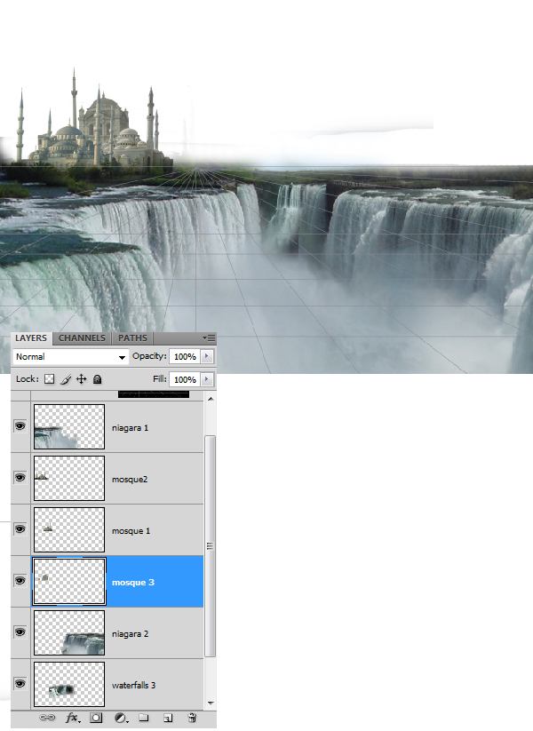
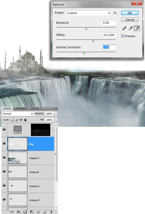
Step 6: Adding some fog
Make a new layer above all the layers named “fog 1” and add some fog into it using the Brush Tool (B) with a soft brush tip. Make sure that the colour selected is white (#ffffff). Experiment with various brush tips as well as the Flow and Opacity brush options if the fog is too prominent.
Additionally, you can lower the Opacity of the layer.
Step 7: Colour correction through exposure adjustment
Once the fog is added, merge all the mosque layers into one by selecting them in the Layers Panel and then pressing Ctrl/Cmd + E. On the newly-merged mosque layer, change the exposure values by going to Image > Adjustments > Exposure.
Here are suggested settings:
- Exposure: 0.00
- Offset: +0.1204
- Gamma correction: 1.13
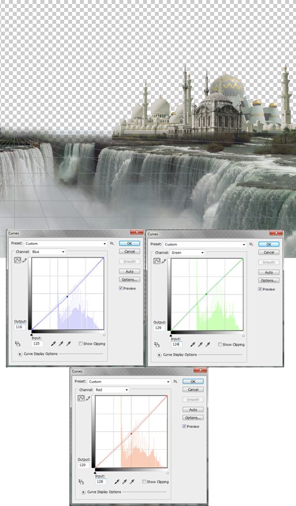
Step 8: The making of the second Temple City
In this step, we will make yet another Temple City, at the opposite side of the scene. This will be the exact same process as the step for the making of the first Temple City. Use your favorite mosques from the resource listing or experiment with your own structures.
 In order to blend the structures into the scene, we have to set the Curves and the Exposure values.
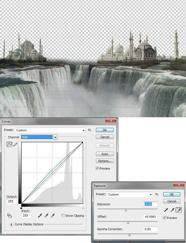

Step 9: Create the mountain backdrop
Import a hill image that you think will be a good match for our matte style scene (I used the New Mexico Landscapes stock image from the Resources listing). Erase the sky in the image before importing it on to our main canvas.
After copy and pasting it into our scene, name this layer as “hill 1”. 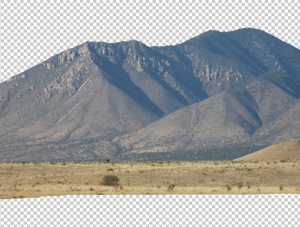 Now place the “hill 1” layer behind the second Temple City as shown.
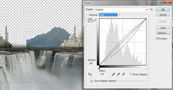
 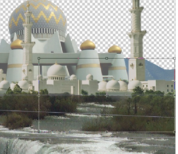 Import another hill image (see the Resources listing for suggestions—here we can use the New Mexico Landscapes (2) stock image) and name it “hill 2”. Move the second hill beside “hill 1” with the Move Tool (V). As shown in the reference/inspiration images, the mountains that are furthest from our standpoint look dimmer and paler. To be able to do this to our matte scene, adjust its Curves (Image > Adjustments > Curves) to the values shown below.
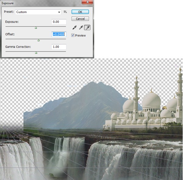
 Now, to make the mountain look dimmer, use the Exposure image adjustment (Image > Adjustments > Exposure). Here are suggested settings for adjusting the exposure of the image:
- Exposure: 0.00
- Offset: +0.0469
- Gamma Correction: 1.0
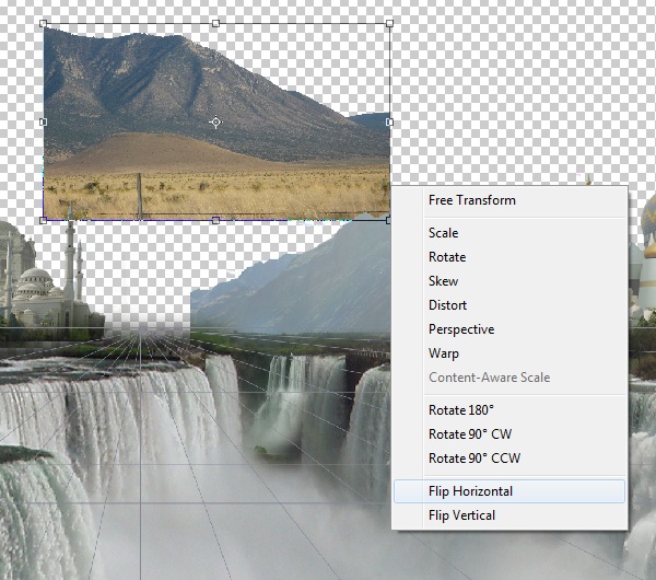
 Since the “hill 2” mountain is cut off on its left, we have to digitally extend it using another image. Import the extension image of the hill—New Mexico Landscapes (3) from the Resources listing —and flip it horizontally using the Flip Horizontal Transform command (Transform > Flip Horizontally or right-click on the image and choose Flip Horizontal). Scale as needed to match “hill 2” using the Free Transform command (Ctrl/Cmd + T) and try to match it seamlessly.
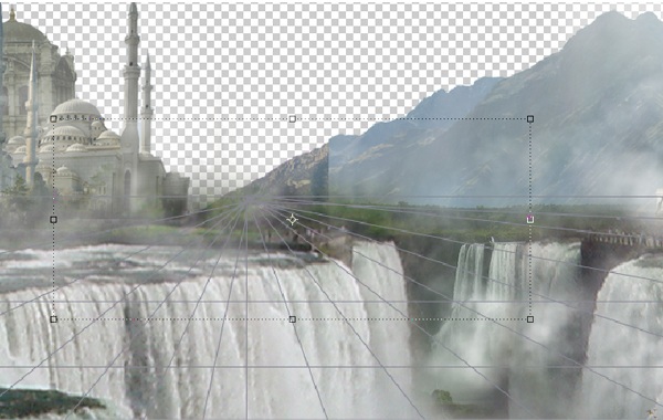 Colour correct the hill extension layer by changing the curve levels (Image > Adjustments > Curves). For further colour correction and matching, use the Exposure image adjustment (Image > Adjustments > Exposure) to change the Offset value to +0.1204.
 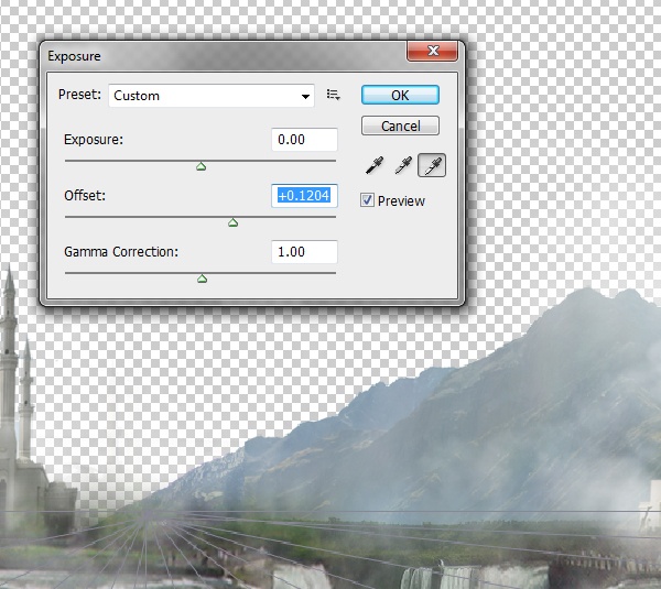 Let’s make it colder by importing a vastly different mountain from the Nevada desert mountains: Up in the mountains 2 and Tasman Glacier.
 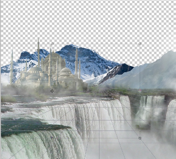 Again, adjust the Exposure of the image, this time setting Offset at +0.1857.
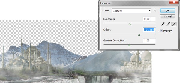
Step 10: Adding the sky
To make the scene look realistic, we will need a sky. For artistic purposes, we can use a grey, overcast sky to give the scene a darker mood. Also, you would not expect to find a rainbow (which we will paint in later) when it is bright and sunny outside.
Make a new layer for the sky beneath all the layers and fill the layer with grey colour (#d9d8d8) using the Paint Bucket Tool (G). 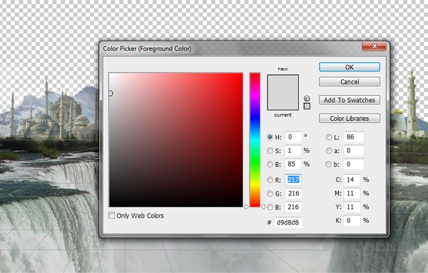
 Now add clouds using a brush tip of clouds (you can check out this one and install it) with a white foreground colour (#ffffff).
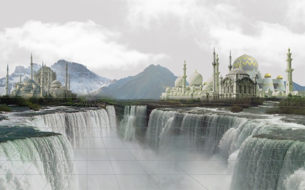
Step 11: Adding more fog
Since the scene contains huge waterfalls, there must be some fog covering the view.
Make a new layer above all the layers and add some fog using a soft brush tip with a white foreground colour (#ffffff). 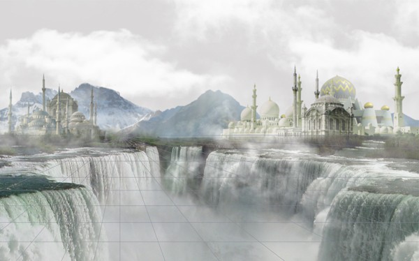
Step 12: Making the pathway to the Temple Cities
Now we need to make a pathway to the cities so that people can get to them—a pathway which is carved out of rock (Arches 2 from the Resources listing). Cut the portion of the stock that we need using the Lasso Tool (L) and place it onto our main canvas.
Position it as per the sketch we made at the first step. 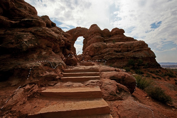
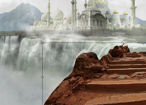
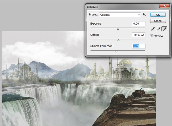
Step 13: Correct the colour of the pathway
Correct the colour the pathway using Curves (Ctrl/Cmd + M). 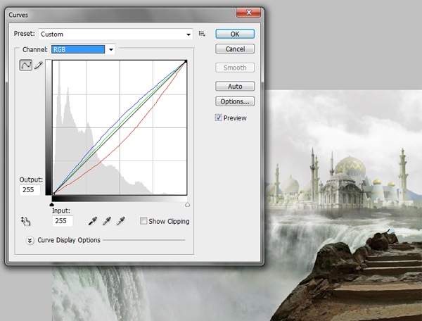 Now change the pathway’s Exposure values.
Here are suggested settings:
- Exposure: 0.00
- Offset: +0.0102
- Gamma Correction: 1.09
Step 14: Add our monk
Cut out the monk from its original image using the Pen Tool (P), right-clicking on the path and choosing Make Selection. 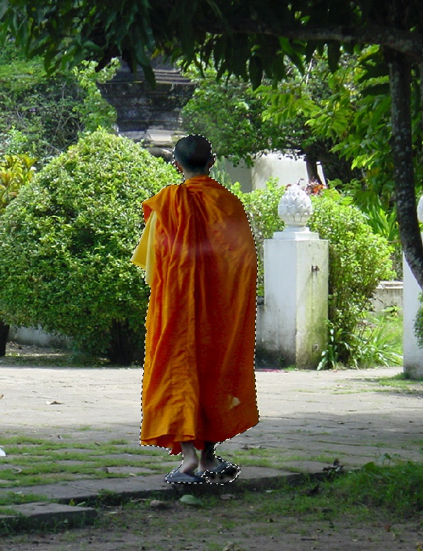 Then import it into the canvas. Resize our monk to fit the scale of our scene using Free Transform (Ctrl/Cmd + T).
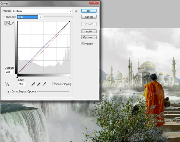
Colour correct the monk using the curves and the Exposure values. 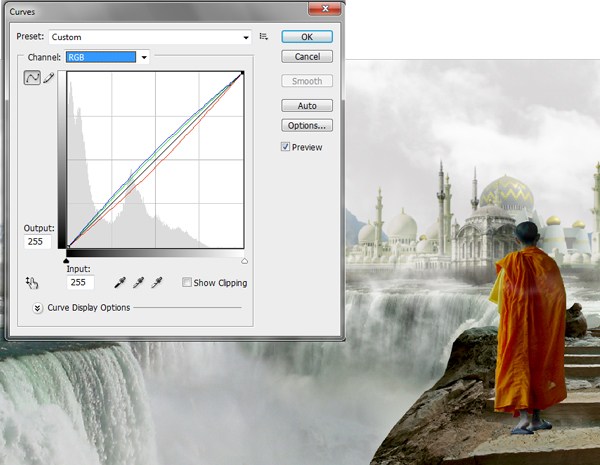 Make a new layer under the monk layer for the shadow of the monk. Using the Brush Tool with a soft-tipped paint brush, add some black colour to resemble the shadow of the monk and set the opacity to 40%.
Step 15: Cutting out the tree from its background
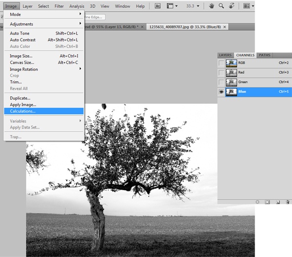
Now we are going to incorporate an apple tree into our scene, but because the stock’s background and the tree’s branches are a bit more complex, I’ll share with you a method of how you can effectively cut it out from its background. First step is to open the Apple tree 2 stock in Photoshop (included in the Resources listing). Go to the Channels Panel (if you do not have it open, go to Window > Channel first) and then hide all of the channels except the Blue channel. Afterwards, go to Image > Calculations.
 Select Blue in the Channel option drop down list for Source 1 and Source 2, as well as set Blend to Multiply.
 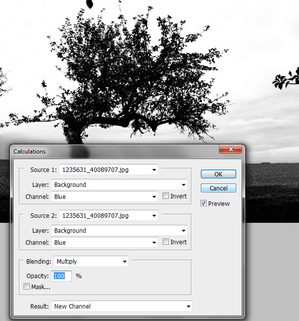 Now go to Select > Load Selection and select “Alpha 1” in the drop down list of Channel which will create an selection around our tree. Turn on all of the Channels again.
Copy (Ctrl/Cmd + C) and paste (Ctrl/Cmd + V) the tree into our main canvas, placing it over the “monk” layer. 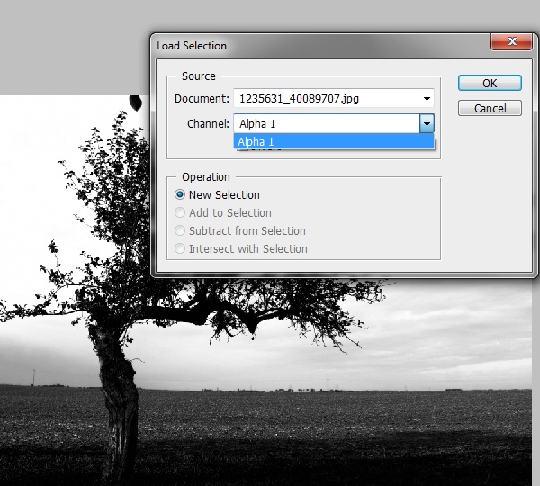 If done correctly, you will have saved some time manually cutting out the tree from its background.
Step 16: Use Curves to correct the colour of the tree
Use the Curves image adjustment (Ctrl/Cmd + M) to colour correct the tree, making it match our scene.
Step 17: Add fog on the tree and monk
In the same method as previously mentioning in this tutorial, add some fog that covers the tree and some part of monk. 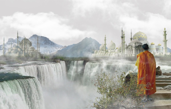
Step 18: Import the seagulls into the composition
Import a seagull or an interesting bird (such as Seagull from the Resources listing) into our matte scene and resize it to fit our perspective. Place the seagull in the desired position using the Move Tool (V).
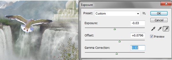
Once the image is placed in the position, go to Image > Adjustments and change the Curve levels and the Exposure values. 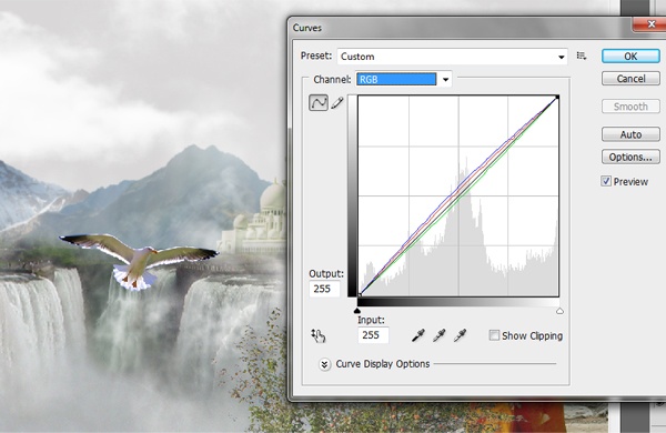
 Now using the Lasso Tool (L), select the wings and the edges of the tail of the seagull and feather the edges to 40px. Add a radial blur (Filter > Blur > Radial Blur) with Amount set to 12.
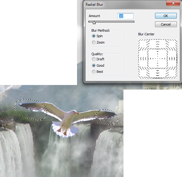
Step 19: Add distant birds
Now import the flock of birds into our matte scene (Homing pigeons from the Resources listing) and name its layer “birds flock”. 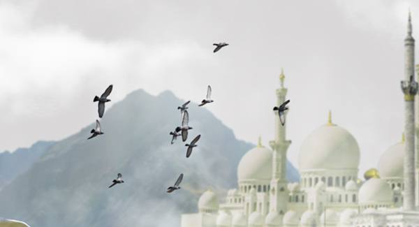 Let us soften up the edges of our flock of birds. Having the “birds flock” layer selected, run the Gaussian Blur filter on it (Filter > Blur > Gaussian Blur) with the Radius set at 1.5 pixels.
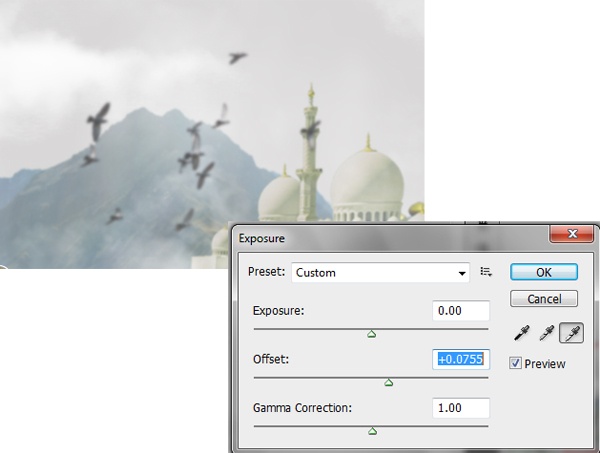
 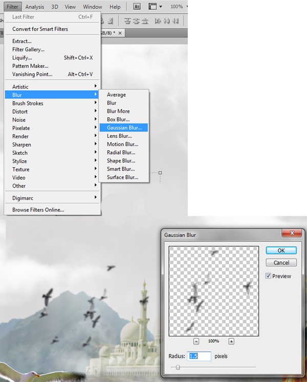 After, change the Exposure values (Image > Adjustments > Exposure) of the “birds flock” layer to the following values:
- Exposure: 0.00
- Offset: +0.0755
- Gamma Correction: 1.0
 Place the “seagull” and “birds flock” layers under all the fog layers.
Step 20: Paint the rainbow
As the last step, we are going to paint the rainbow. As seen in the reference/inspiration images that we used in the beginning, there was a rainbow near the waterfalls.
So let’s add one in our matte painting style scene. Make a new layer for the rainbow (name the layer “rainbow”). Press B to activate the Brush Tool, set the brush tip to a soft, round brush, the Master Diameter (the size of the brush) to 18px, and then select an orange foreground colour (#ff940a).
Now select the Pen Tool (P) and make an arc; we’re using the Pen Tool first because it is easier to create a good arc with its Bezier curves than doing it freehand with the Brush Tool. 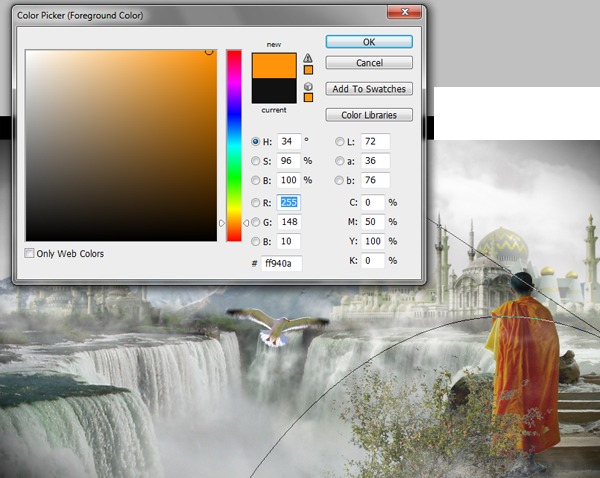 After creating the arc path, right-click on the path and pick Stroke Path.
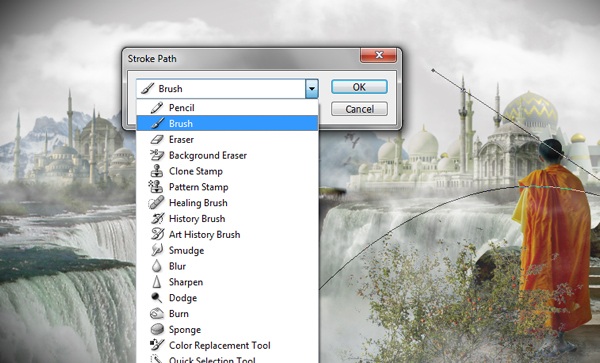
 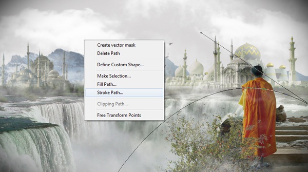 Select Brush for the Stroke Path option.
 Similarly, add a few more colours like red, yellow and green.
 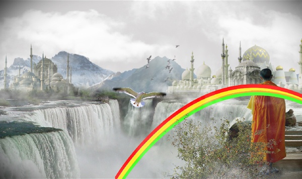 Still on the “rainbow” layer, add a Gaussian Blur filter (Filter > Blur > Gaussian Blur) with the Radius set to 26.1 pixels to soften up its edges and also to blend the colors together. Place the rainbow layer under the fog, “monk” and “tree” layers.
To give it a bit more transparency, reduce opacity to about 75%.
Tutorial Summary
Thank you for following along. In this Adobe Photoshop tutorial, I shared with you many tips and techniques for composing a surreal and matte-painting-like scene.
I discussed a technique for using images as reference and inspiration, having them open in Photoshop or an image viewer just as a grounding point for our work. You saw the need for making a vanishing point grid to help us align the stock imagery that we bring into our matte painting style scene. We used a variety of processes to ensure that the elements we use in the scene are consistent in colour; particularly, we relied heavily on Curves and Exposure image adjustments.
We covered a technique of cutting out a complex object (an apple tree) from its complex background using the Channels Panel and the Image Calculations command. I also showed you an easy way of painting a rainbow into a scene. If you have questions, thoughts and opinions, please do not hesitate to share them in the comments!
Download Tutorial Source Files
- matte_painting_tutorial (ZIP, 16.3 MB)
-
 Trevin serves as the VP of Marketing at WebFX. He has worked on over 450 marketing campaigns and has been building websites for over 25 years. His work has been featured by Search Engine Land, USA Today, Fast Company and Inc.
 -

WebFX is a full-service marketing agency with 1,100+ client reviews and a 4.9-star rating on Clutch! Find out how our expert team and revenue-accelerating tech can drive results for you! Learn more
Make estimating web design costs easy
Website design costs can be tricky to nail down. Get an instant estimate for a custom web design with our free website design cost calculator!
Try Our Free Web Design Cost Calculator
Table of Contents
- Preview
- Tutorial Resources
- Introduction
- Step 1: Sketching the Idea
- Step 2: Look for Images to Use As Inspiration and Reference
- Step 3: Creating the Perspective
- Step 4: Make the Waterfalls
- Step 5: the Making of the First Temple City
- Step 6: Adding Some Fog
- Step 7: Colour Correction Through Exposure Adjustment
- Step 8: the Making of the Second Temple City
- Step 9: Create the Mountain Backdrop
- Step 10: Adding the Sky
- Step 11: Adding More Fog
- Step 12: Making the Pathway to the Temple Cities
- Step 13: Correct the Colour of the Pathway
- Step 14: Add Our Monk
- Step 15: Cutting out the Tree from Its Background
- Step 16: Use Curves to Correct the Colour of the Tree
- Step 17: Add Fog on the Tree and Monk
- Step 18: Import the Seagulls into the Composition
- Step 19: Add Distant Birds
- Step 20: Paint the Rainbow
- Tutorial Summary
- Download Tutorial Source Files
Share this article


Web Design Calculator
Use our free tool to get a free, instant quote in under 60 seconds.
View Web Design CalculatorMake estimating web design costs easy
Website design costs can be tricky to nail down. Get an instant estimate for a custom web design with our free website design cost calculator!
Try Our Free Web Design Cost Calculator


