
 In this step-by-step web development tutorial, you will learn how to convert a beautiful and eye-grabbing grunge theme web layout–created from Photoshop in a previous tutorial–into a working HTML and CSS template. This the second part of a two-part tutorial series that shows you how to create a grunge web design using Photoshop, and then give you instructions on how to convert the design mockup into a fully-functioning web page using standards-based HTML and CSS.
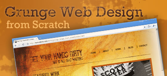
Final Result
Below, you’ll see a preview of what we’re about to create together. Click on the image to see a live demonstration of the HTML/CSS web page layout. 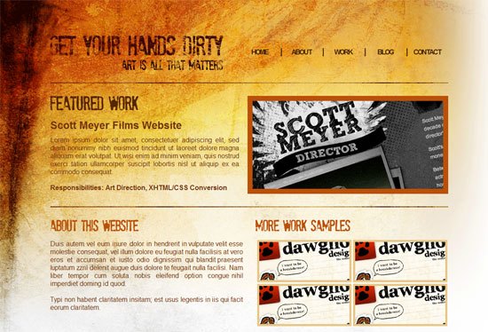
Download the source files
The source files in this tutorial are released under the GNU GENERAL PUBLIC LICENSE so that you may study and/or use them for your own projects.
- grunge-web-design-from-scratch.zip (ZIP file, 15.2 MB)
Setting up the files
1 Create a new folder on your computer called grunge layout. This will contain all of our files associated with our layout. 2 Within the grunge layout folder, create another folder called images; this will contain all our template images.
3 Using your favorite code editor, create a blank HTML and CSS document, and then save the HTML document as index.html and the CSS document as styles.css in the grunge layout folder. 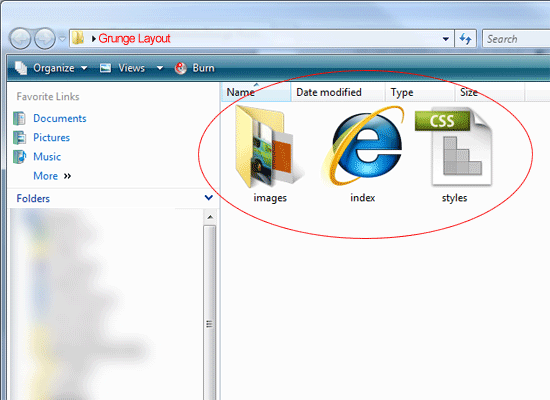
Working on the design’s background
The background is the trickiest part of the layout. Because of the way it was designed, the website is going to have to be left aligned.
Also with the background being so big, the file size can be a big issue for fellow 56k modem users. 4 To start, open up the Photoshop (PSD) file that was provided with the download of this tutorial. It’s inside the folder called _photoshop_source_file, and it’s called grunge-design-from-scratch-psd.
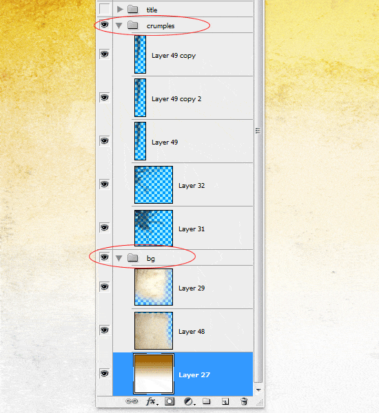
5 Within the Layers Panel (F7 to toggle the Layers Panel), locate all the background elements. The elements should be in two layer groups: bg and crumples. Turn off the visibility of all the layers except the ones in those two groups.
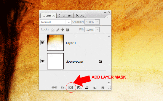
 6 Make a marquee selection around the whole canvas (Ctrl + A), and then choose Edit > Copy Merged (Shift + Ctrl + C) to copy the selected area. Once copied to the clipboard, create a new Photoshop document, File > New (Ctrl + N), and paste it into the new document. 7 Add a layer mask to the background image within the new document by clicking on the Add layer mask icon at the bottom of the Layers Panel.
 8 Once you’ve added the layer mask, choose the Gradient Tool (G) from the Tools Panel. In the Options bar, set the gradient colors black (#000000) to white (#FFFFFF), and set the gradient type to linear gradient.
 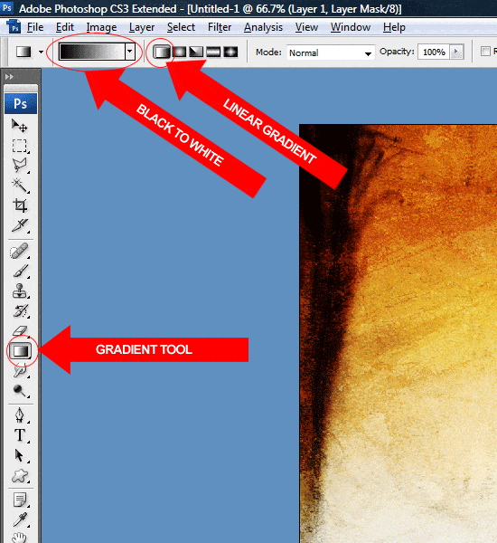 9 Drag the gradient from the right side of the canvas towards the left.
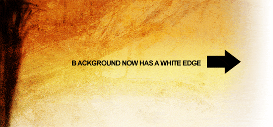
Use a short stroke. See the following figure on how to accomplish this. 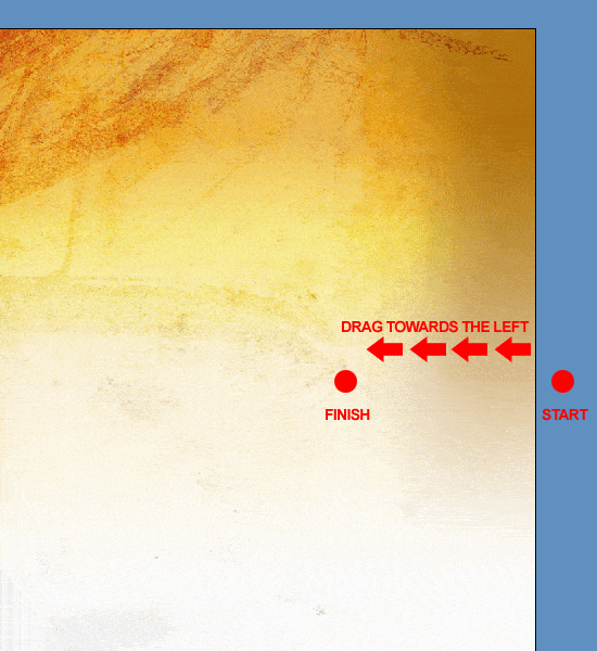 10 The background should now have a white edge allowing us to blend into the background.
 11 Finally, save the image as a .gif by choosing File > Save for Web & Devices (Alt + Shift + Ctrl + S) in your images folder, using the file name of bg.gif.
Slicing the headings
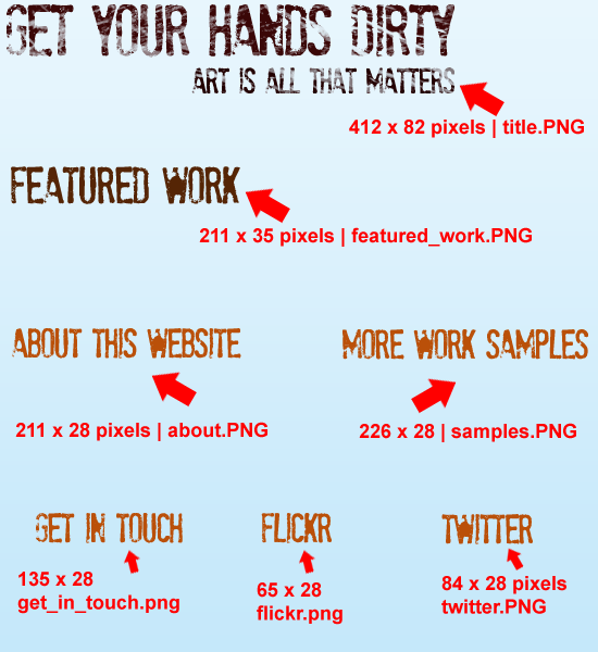
12 Using the Rectangular Marquee Tool (M), make a selection around each heading, as well as the website’s main title. Save each heading on a transparent background in .PNG format. Save each heading inside the images folder with a suitable name (see the following figure to determine the file names used in this tutorial).
Starting the HTML markup
13 Now that we have a few images to work with, we can begin to mark up some of our HTML. Open up your index.html file and your styles.css file in your favorite source code editor. 14 Inside your HTML document, add your website title and link your style sheet using the normal method.
<title>Get Your hands Dirty [...]</title> <link href="styles.css" rel="stylesheet" type="text/css" />
15 In the body of the document (<body>) create a div with an ID of #container.
Inside this div, create two more divs. Set the ID property of the first one to title, and the second one to navigation. Inside our title div, we’ll add a simple h1 tag with our site title. Inside the h1 tag, add a link to the name of your site (<a>).
We’ll be using some CSS background text image replacement for our title. The navigation is then built in the same way using a simple list. Note that the last list item in the primary navigation has a special class called #nodivider, this is so that the last item doesn’t have a vertical divider on it’s right.
You’ll also notice the links are in reverse order; this is because the links will be floated right.
<div id="container"> <!--TITLE STARTS--> <div id="title"> <h1><a href="#">Get Your Hands Dirty</a></h1> </div> <!--TITLE ENDS--><!--NAVIGATION STARTS--> <div id="navigation"> <ul class="navlinks"> <li><a href="#">contact</a></li> <li><a href="#">blog</a></li> <li><a href="#">work</a></li> <li><a href="#">about</a></li> <li class="nodivider"><a href="#">home</a></li> </ul> </div> <!--NAVIGATION ENDS-->
In the following figure, you should see a preview of the structure of our web page. 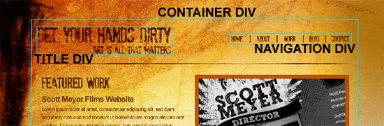
Resetting CSS margin and padding
16 Now that we have our basic HTML structure, we can begin to add some CSS styles. We’ll start with a simple margin/padding CSS reset which resets the margin and padding to 0. There are many ways of resetting CSS styles, and we encourage you to look into more advanced and robust methods of CSS Reset.
* { margin: 0px; padding: 0px; }The body’s CSS
17 Now, we’ll code the style attributes for the web page’s body. We set the background color to white and add our background image (bg.gif). We then set our background to no-repeat.
Finally, the background’s position will be top left.
body { background: #fff url(images/bg.gif) no-repeatlefttop; font-family: Arial, Helvetica, sans-serif; color: #73360d; text-align: justify; }The CSS for #container div
18 The CSS for our container looks like the subsequent code block. The container will have a fixed width of 950px which should be sufficient for the amount of space we will be using. We give the container top and left margins.
The web layout’s position will be left-aligned, so we float the container to the left.
#container { width: 950px; margin: 85px 0 0 120px; float: left; }Coding the CSS for the site title
19 Now, we’ll work on the CSS for the site title (logo). The #title div will have a fixed width of 82px and height of 412px, matching the dimensions of our design mockup. Also, the div is then floated left.
#title { height: 82px; width: 412px; float: left; }Inside our title div, we have a h1 tag.
We don’t actually want the HTML text to be displayed and the h1 tag’s text so we hide it by setting the text-indent attribute to -9999px.
h1 { text-indent: -9999px; float: left; }We can now set the CSS background of the a tag inside our h1 tag to the logo in the design mockup. Even though the text has been moved -9999px off to the side of the user’s monitor, the link is still there. We set the display attribute to block, as well as add a fixed width of 82px and height of 412px, equal to the parent h1.
The actual title image (title.png) that we sliced earlier on in our Photoshop document is then assigned as its background.
h1 a { display: block; background: url(images/title.png) no-repeat left top; float: left; height: 82px; width: 412px; }Slicing the navigation’s vertical separating divider
20 There’s quite a few styles to deal with regarding the navigation, but first we need to head back to Photoshop and slice up our little separating divider. 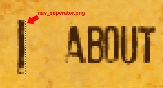 21 Make a selection around one of the dividers using the Rectangular Marquee Tool (M) and then choose Edit > Copy Merged (Shift + Ctrl + C). 22 Create a new Photoshop document with a transparent background, File > New (Ctrl + N), and then paste (Ctrl + V) the divider into it.
23 Save this new document for the web as a PNG file, File > Save for Web & Devices (Alt + Shift + Ctrl + S) with the file name of nav_seperator.png inside your images folder.
Styling the main navigation
24 Now, we’ll work on our navigation’s CSS. We first style our #navigation div, giving it a fixed width of 538px and a fixed height of 82px. The fixed height is the same height as our navigation separator image.
#navigation { float: left; width: 538px; height: 82px; }For the navigation list items (li), we remove the default bullets by assigning the list-style-type CSS property to none.
We also display each link as a block element which is then floated right. Set a fixed width of 100px for each list item, which should provide sufficient space for the text, leaving decent margins on each side of our vertical navigation separator image. Then, we set our separator image as their background, and position it left.
Finally, we give each list item a top margin of 30px to center them vertically.
.navlinks li { list-style-type: none; display: block; float: right; width: 100px; text-align: center; margin-top: 30px; background: url(images/nav_seperator.png) left no-repeat; }Next, we need to style our navigation link’s text. The text-decoration CSS property is set to none which removes the line from underneath each link. We bold the text and transform them to uppercase for visual style.
Finally, we attempt to follow the font styles in the design mockup by assigning a font-size value of 16px and letter-spacing to a negative value to squish the letters together a little bit.
.navlinks li a { text-decoration: none; color: #432303; font-weight: bold; text-transform: uppercase; font-size: 16px; letter-spacing: -2px; }The next style rule is for when the user hovers over a list item link. We don’t want anything fancy, just a simple color change.
.navlinks li a:hover { color: #902b03; }Finally, we write the style for the vertical navigation separator. The list item link (Home) in the HTML code gets a class of .nodivider which simply removes the so that it doesn’t have a divider image on it’s left.
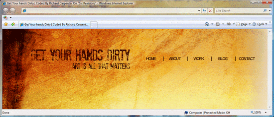
.navlinks li.nodivider { background-image: none; }If you test the web template now, you should have something like this.
Horizontal dividers
25 On our Photoshop design mockup, there were two or three big dividers going all the way across the layout, separating each content area. We’ll now implement these guys into our template. To start, switch over to Photoshop.
26 Using the Rectangular Marquee Tool (M), make a selection around one of the dividers; the dimension of the marquee selection should be 950px by 2px. To make this selection more accurate, in the Options bar, set the Style to Fixed and then enter 950 for the width and 2 for the height. 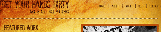 27 Once you’ve made the selection, choose Edit > Copy Merged (Shift + Ctrl + C).
28 Create a new Photoshop document, File > New (Ctrl + N) and paste (Ctrl + V) the horizontal divider into it. 29 Save this new Photoshop document as a PNG file, File > Save for Web & Devices (Alt + Shift + Ctrl + S) in the images folder, under the file name: divider.png.
Adding the horizontal dividers to the web layout
30 To include the divider into our template, we just need to create empty divs with the class of .divider.
<div class="divider"></div>
Styling the horizontal divider divs
31 The divider image you created earlier is added as a background of the .divider divs, and floated left. We then apply a fixed width of 950px and height of 2px, exactly like the dimensions of divider.png.
Finally, we add top and bottom margins to add some space.
.divider { float: left; height: 2px; width: 950px; margin: 30px 0 30px 0; background: url(images/divider.png) no-repeat; }Creating the featured area
32 The featured area is made up of three divs. First, we have our main div called #featured, which contains the two other divs. Inside #featured div, we have two divs called #featured-text and #featured-image. #featured-text will contain our h2 heading . Our text content uses <p> tags, add your own content in the HTML document, this tutorial uses lorem ipsum dummy text.
Finaly, the #featured-iomage div will simply have our featured image inside it. Be sure to optimize your featured image so it reduces the page load time. 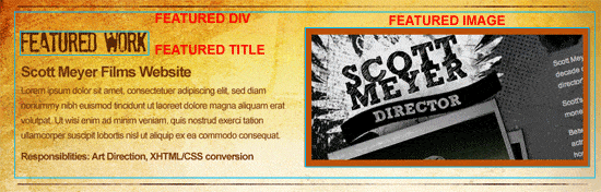 Here is the HTML markup for the featured area.
<!--FEATURED AREA STARTS--> <div id="featured"> <!--FEATURED TEXT STARTS--> <div id="featured-text"> <h2 class="featured-work">Featured Work</h2> <h3>scott meyer films website</h3> <p>Lorem ipsum dolor sit amet, consectetuer adipiscing elit[...]/p> <p><strong>Responsibilities: Art Direction[...]</strong></p> </div> <!--FEATURED TEXT ENDS--><!--FEATURED IMAGE STARTS--> <div id="featured-image"> <img src="images/featured_example_image.gif" alt="Featured Image" /> </div> <!--FEATURED IMAGE ENDS--> </div> <!--FEATURED AREA ENDS-->
Coding the featured area CSS
33 Let’s start styling the featured area.
Read the descriptions below to understand what our CSS is doing. The #featured div should be floated to the left, and should have a fixed width of 950px, equal to our #container div. The fixed height should be the same height as our featured image (which is 234px).
#featured { float: left; height: 234px; width: 950px; }The #featured-text div should have the same height of its parent div (#featured).
It’s floated to the left so that it displays inline with the #featured-image div. We set the width to 451px (#featured-image has 479px) which will give us a 20px gutter in between the two divs (remember that the width of #featured is 930px).
#featured-text { float: left; height: 234px; width: 451px; }Our h2 tags have a class of .featured-work; this is where another CSS background text image replacement comes into play (we indent our text to the left of the user’s monitor where it can’t be seen). The fixed width and height are the same dimensions as the actual image.
h2.featured-work { background: url(images/featured_work.png) no-repeat; height: 35px; width: 211px; text-indent:-9999px; margin-bottom: 20px; }For level 3 headings, we transform the text so that every word is capitalized.
h3 { margin-bottom: 10px; font-size: 25px; text-transform: capitalize; }The #featured-image div is floated to the right so that it displays inline with the #featured-work div.
The width of this div is 479px so that we have a 20px gutter in between it and #featured-work.
#featured-image { float: right; width: 479px; height: 234px; }To cap off our featured area CSS, we give images inside #featured-image a background color and some padding.
#featured-image img { background-color: #ba5009; padding: 12px; }Testing your work in your web browser now should give you something like the following figure. 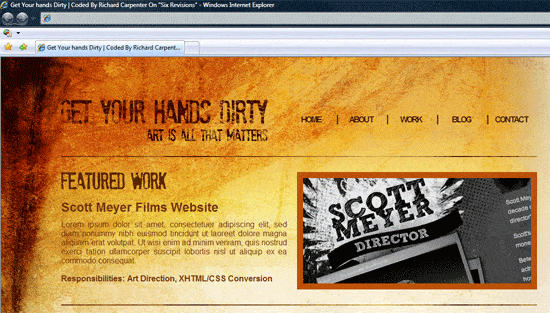
Coding the HTML of the content area
34 Our content area underneath the featured area is coded using two simple divs. Each div is unique to each side (.content-box-left and .content-box-right). Inside each div, there will be an h2 tag with a specific class assigned to them so that we may perform some more CSS background image text replacements on them. Study the HTML structure of the content area, below.
<!--CONTENT BOX LEFT STARTS--> <div class="content-box-left"> <h2 class="about-website">About This Website</h2> <p>Duis autem vel eum iriure dolor in hendrerit acilisi.[...]</p> <p>Typi non habent claritatem insitam; est usus legentis[...]</p> </div> <!--CONTENT BOX LEFT ENDS--><!--CONTENT BOX RIGHT STARTS--> <div class="content-box-right"> <h2 class="samples">More Work Samples</h2> <img src="images/sample01.gif" alt="Sample Image" /> <img src="images/sample01.gif" alt="Sample Image" /> <img src="images/sample01.gif" alt="Sample Image" /> <img src="images/sample01.gif" alt="Sample Image" /> </div> <!--CONTENT BOX RIGHT ENDS-->
Coding the CSS for the content area
35 Study the CSS and descriptions below to understand the code involved for the content area.
.content-box-left and .content-box-right have a fixed width of 460px which leaves a 30px gutter in the middle for separation. We float them to the left and right so that they’re displayed inline relative to each other.
.content-box-left { float: left; width: 460px; } .content-box-right { float: right; width: 460px; }Each h2 class (.about-website and .samples) has their own specific background image applied to them, which relates to the headings we created by slicing them from the Photoshop design mockup earlier on in this tutorial. Again, we indent the HTML text way to the left to hide them.
h2.about-website { background: url(images/about.png) no-repeat; height: 28px; width: 211px; text-indent:-9999px; margin-bottom: 20px; } h2.samples { background: url(images/samples.png) no-repeat; height: 28px; width: 226px; text-indent:-9999px; margin-bottom: 20px; }Finally, any images inside the .right-content div will have borders around them, created by giving them 5px padding on each side.
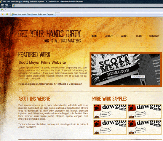
.content-box-right img { background-color: #e7c788; float: left; padding: 5px; margin: 0 0 4px 4px; }Test the layout in your browser and you should have something like this.
Adding more content boxes to the template
36 At the bottom of the layout, there are three more content areas. Were going to make things easier on ourselves by using one (.content-box-small) for all of them. To start, simply create three divs in the HTML document, and assign them a class of .content-box-small.
The HTML markup looks like the following code block.
<!--BOX #1--> <div class="content-box-small"> <h2 class="get-in-touch">Get In Touch</h2> <p>Email: [email protected]</p> <p>Phone: 820-1892-0129</p> </div> <!--BOX END--><!--BOX #2--> <div class="content-box-small"> <h2 class="flickr">Flickr</h2> <img src="images/flickr_example.gif" alt="Flickr Example" /> <img src="images/flickr_example.gif" alt="Flickr Example" /> <img src="images/flickr_example.gif" alt="Flickr Example" /> <img src="images/flickr_example.gif" alt="Flickr Example" /> <img src="images/flickr_example.gif" alt="Flickr Example" /> <img src="images/flickr_example.gif" alt="Flickr Example" /> </div> <!--BOX END--><!--BOX #3--> <div class="content-box-small"> <h2 class="twitter">Twitter</h2> <p>"Creating a tutorial for six revisions"</p> <p>"Creating a tutorial for six revisions"</p> <p>"Creating a tutorial for six revisions"</p> <p>"Creating a tutorial for six revisions"</p> </div> <!--BOX END-->
Coding the CSS for the extra content boxes
37 Now, we’ll move onto styling the extra content boxes. Study the CSS below, and read their respective descriptions. The .content-box-small class has a fixed width of 305px and a right margin of 10px.
The margin adds sufficient spacing in between each div. We also give images inside these divs a border by giving them padding.
.content-box-small { float: left; width: 305px; margin-right: 10px; } .content-box-small img { float: left; background-color: #ba5009; padding: 5px; margin: 0 10px 10px 0; }Next, we perform CSS background image text replacement on the headings.
h2.get-in-touch { background: url(images/get_in_touch.png) no-repeat; height: 28px; width: 135px; text-indent:-9999px; margin-bottom: 20px; } h2.flickr { background: url(images/flickr.png) no-repeat; height: 28px; width: 65px; text-indent:-9999px; margin-bottom: 20px; } h2.twitter { background: url(images/twitter.png) no-repeat; height: 28px; width: 84px; text-indent:-9999px; margin-bottom: 20px; }Test your work in a web browser, what you should see is something like the following figure. 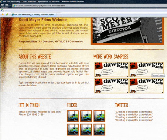
Slicing the footer
38 Finally, we’ll slice the footer from our Photoshop design mockup.
Head over to our Photoshop document. 39 Using the Rectangular Marquee Tool (M), make a selection with a width of 950px and a height of 43px, around the footer. Use the following figure as a guideline on how to create the marquee selection.
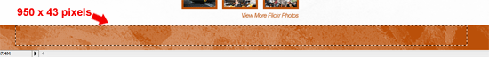 40 Once you’ve made the marquee selection, choose Edit > Copy Merged (Shift + Ctrl + C). 41 Create a new Photoshop document, File > New (Ctrl + N) and paste the copied footer into it. 42 Save the new Photoshop document as a PNG file, File > Save for Web & Devices (Alt + Shift + Ctrl + S) inside your images folder, with the name footer.png.
Coding the footer’s HTML
43 With the footer CSS background image sliced and ready to go, let’s jump back to our HTML document.
The markup for the footer is pretty simple, just a div with an ID of footer.
<!--FOOTER STARTS-->
<div id="footer"> <p>Copyright © yoursite.com | All Rights Reserved 2009</p> </div> <!--FOOTER ENDS-->
Coding the footer’s CSS
44 We’ll apply footer.png as a div background of #footer div and give p tags inside it some visual styles. The footer’s fixed width and height match that of the image we just created. The 40px top margin pushes the footer down and away from the content area above.
The 13px top margin of #footer p pushes the text down so that it is vertically centered.
#footer { background: url(images/footer.png) no-repeat; float: left; height: 43px; width: 950px; margin-top: 40px; }#footer p { color: #fff; text-align: center; margin-top: 13px; }
Congratulations, you’re finished!
If you’ve followed along our tutorial, you should have something that looks like the following figure. Click on it to see a live demonstration of the web template. This design tends to be extremely successful for a few industries.
Obviously, you wouldn’t use this design for a hotel or law firm, but for an artist or director, it looks amazing.
The “Grunge Web Design” Tutorial Series
This tutorial is the first part of a two-part tutorial series that shows you how to create a grunge web design in Photoshop, then how to code the grunge web design mockup into a standards-based (X)HTML template.
- Part 1: How to Create a Grunge Web Design Using Photoshop
- Part 2: How to Code a Grunge Web Design from Scratch
Related Content
-
 President of WebFX. Bill has over 25 years of experience in the Internet marketing industry specializing in SEO, UX, information architecture, marketing automation and more. William’s background in scientific computing and education from Shippensburg and MIT provided the foundation for MarketingCloudFX and other key research and development projects at WebFX.
 -

WebFX is a full-service marketing agency with 1,100+ client reviews and a 4.9-star rating on Clutch! Find out how our expert team and revenue-accelerating tech can drive results for you! Learn more
Make estimating web design costs easy
Website design costs can be tricky to nail down. Get an instant estimate for a custom web design with our free website design cost calculator!
Try Our Free Web Design Cost Calculator
Share this article


Web Design Calculator
Use our free tool to get a free, instant quote in under 60 seconds.
View Web Design CalculatorMake estimating web design costs easy
Website design costs can be tricky to nail down. Get an instant estimate for a custom web design with our free website design cost calculator!
Try Our Free Web Design Cost Calculator


