
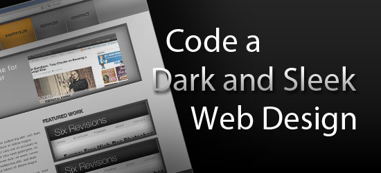
In this web development tutorial, you will learn, step-by-step, how to create a beautiful dark and sleek web layout using standards-based HTML and CSS. Along the way, you will witness how to use CSS Sprites and CSS Text Image Replacement.
This is the second part of a tutorial series that shows you how to create the web layout in Photoshop and then how to code the Photoshop design. If you haven’t already, please check out the first part of the series called: “Create a Dark and Sleek Web Layout Using Photoshop“.
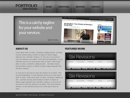
Final Result
Click on the following image to preview the working demo of the design we will be creating together.
Download
You can download the source file archive of this tutorial which contains the Photoshop file we’ll be using for our web graphics, and working examples of the web design.
- dark_and_sleek_layout.zip (0.83MB)
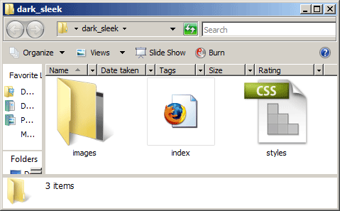
Setting up the File Structure
1 Create a new folder in your computer called dark_sleek. This will contain all of our working files. In thiss folder, create a folder called images which will contain our web graphics.
Also, create index.html, which will be our HTML template, and styles.css, which is our stylesheet.
Preparing the PSD File
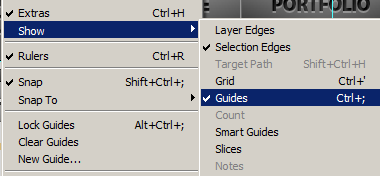
2 Open the PSD file called dark_and_sleek_psd.psd that inside the source files you downloaded in Photoshop.
3 Make sure to turn on Guides to help make selection of items in the PSD easier by going to View > Show > Guides and making sure that there is a check mark beside Guides. To toggle the Guides on and off easily while workin, press Ctrl + ;.
Creating the Body Background
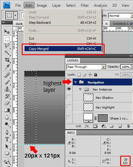
4 In Photoshop, use the Rectangular Marquee Tool (M) to select a 20px x 121px selection starting from the top-left of the canvas. Make sure that you are on the highest layer, then use Edit > Copy Merged (Shift + Ctrl + C) to copy the selection.
5 Place the copied selection in a new document using File > New…
(Ctrl + N). Save this as a JPG file by using File > Save for Web (Alt + Shift + Ctrl + S) as body-bg.jpg inside the images folder.
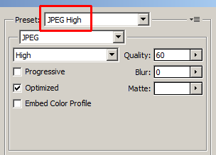
Note: From now on, we will be saving all objects as JPG files for consistency. You may choose a different file format such as PNG or GIF to optimize your images for page response times, but for the purpose of simplicity, we will be saving all of our web layout graphics in the same format: JPG with the Preset set to JPEG High.
Creating the Logo
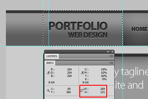
6 Use the Rectangular Marquee Tool (M) to select a 269px by 121px selection around the logo.
View the following figure to see how this selection should be made. It’s important that your selection is accurate.
7 Making sure that you are on the highest layer, Edit > Copy Merged (Shift + Ctrl + C), and then place the copied selection in a new document, File > New… (Ctrl + N).
Save this for the web as logo.jpg inside the images folder.
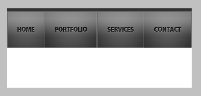
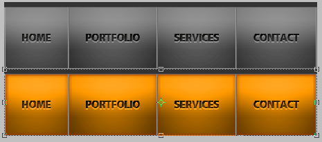
Creating the Navigation CSS Sprite
For the navigation, we will use a CSS background Sprite. Tyler Denis, who taught you how to make the web layout in Photoshop in the first part of the series, provided us with several options for the Mouse over colors. We will use the Orange Highlight for this tutorial, but feel free to use any of the other colors such as the White Highlight or Blue Highlight (this will make sense in just a bit).
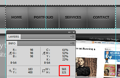
8 Use the Rectangular Marquee Tool (M) to make a 565px by 121px selection exactly like the following figure.
9 Making sure you are on the highest layer, Edit > Copy Merged, create a new document, File > New…
(Ctrl + N), and paste the copied selection on the new document.
10 Switch over to the new document that you pasted the navigation to (in step 9). We will make the canvas bigger, doubling its height, so that we can accommodate the Orange Highlight version of the navigation. To expand the canvas, go to Image > Canvas Size…
(Alt + Ctrl + C) to open up the Canvas Size dialog box. In the Canvas Size dialog box, enter 242px for the Height value and click on the top middle anchor so that the canvas expands at the bottom.
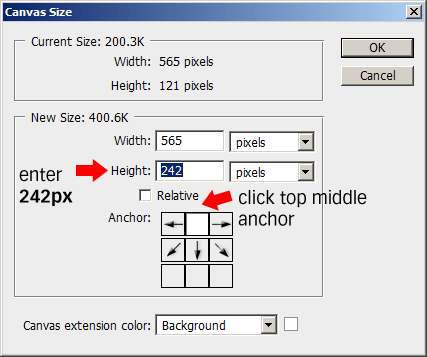
Your new document should now look like the following figure with a space at the bottom for the Orange Highlight version of the navigation:
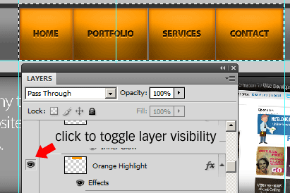
11 Switch back to our web layout mockup document, dark_sleek_psd. Turn on the Orange Highlight layer which is inside the Navigation layer folder > Nav Instances folder.
To turn on the visibility of this layer, click on the left-side of the layer to toggle its layer visibility which should change into an icon of an eye. If you did this correctly, the navigation menu should now have an orange background.
12 The selection that you did in step 9 should still be active, but if you accidentally deselected your selection, don’t worry, use Edit > Reselect (Shift + Ctrl + D) to get it back. Edit > Copy Merged with the highest layer active, and paste the copied selection in the document that we created in Step 10.
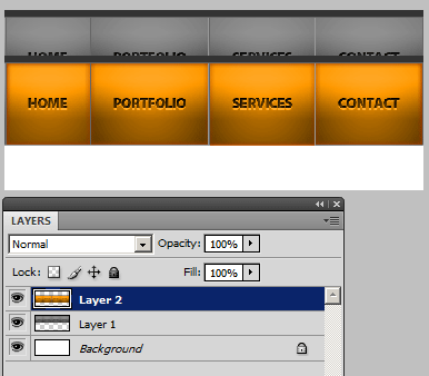
13 Move the Orange highlight to the bottom of the canvas using the Move Tool (V) and your arrow keys.
14 Save the document for the web (File > Save for the web…) inside the images folder and name it nav-sprite.jpg.
Creating the “Featured Area” Section
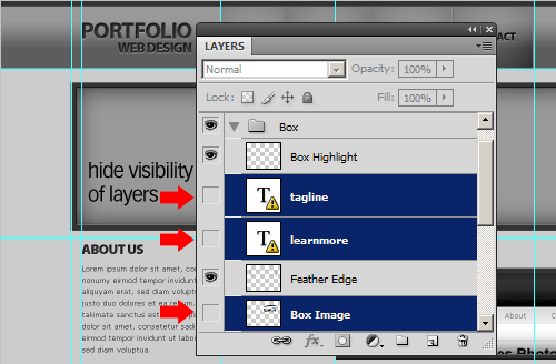
15 To start, toggle the visibility of the tagline text layer, learnmore text layer, and Box Image layer inside the Box folder.
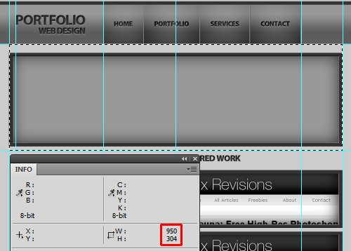
16 Make a 950px by 304px selection using the Rectangular Marquee Tool (M) exactly like the following figure.
17 With the highest layer active, Edit > Copy Merged (Shift + Ctrl + C), create a new document: File > New…
(Ctrl + N), and paste the copied selection onto the new document. Save this as bg-featured.jpg.
Creating the Content Heading Text
Now we will slice the text for the content’s headings (i.e. “About us” and “Featured Work”).
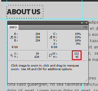
18 Make a selection around the “About Us” text using the Rectangular Marquee Tool (M); the size of this selection should be 122px by 45px.
Refer to the following figure to see how to make the selection.
19 Edit > Copy Merged (Ctrl + Shift + C) the selection, File > New… (Ctrl + N), and paste the selection inside the document. Save the document as text-about.jpg inside the images folder.
20 Do a similar selection around “Featured Works”, with a selection dimension of 200px by 45px; refer to the following figure for as a reference.
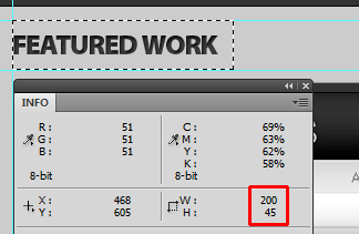
21 Edit > Copy Merged (Ctrl + Shift + C) the selection, File > New…
(Ctrl + N) to create a new document and paste the copied selection inside the new document. Save the document as text-featured.jpg inside the images folder.
Creating the Featured Works Background
Now we’re going to create the background for Featured works images.
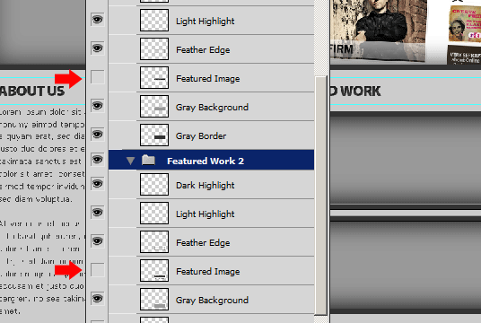
22 To start, turn off the visibility of the Featured Image layer inside the FeaturedWork > Featured Work and FeaturedWork > Featured Work 2 folders in the Layer palette so that we’re left with just the background only.
23 Make a selection around one of the Featured Works boxes using the Rectangular Marquee Tool (M); it should be 475px by 166px in dimension (use the following figure as a reference).
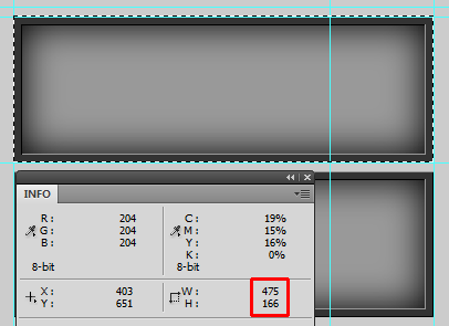
24 Edit > Copy Merged (Ctrl + Shift + C), create a new document using File > New… (Ctrl + N), and paste the copied selection in the new document.
Save this document as featured-work-bg.jpg. We’re now done with Photoshop, so it’s time to move onto HTML and CSS!
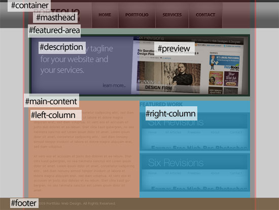
The Web Page Structure
Let’s envision the structure of our web layout so that you can gain a clear understanding of how everything will work. In the following figure, you can see our web layout structure:
Some Basic Preparation and a Note on CSS Reset
25 Open up index.html in your favorite text editor or IDE.
Link to styles.css, our web page stylesheet.
26 First, we should reset all of our styles. There are many methods available for CSS Reset – and you should find one that is robust and fully-featured. Six Revisions uses a modified hybrid of Eric Meyer’s CSS Reset and YUI Reset CSS.
You can read more about CSS Reset in an article I wrote called “Resetting Your Styles with CSS Reset“.
The following technique we will use for CSS Reset is the universal selector margin/padding reset: a method that does the job, but isn’t the ideal method of resetting your styles. For the purpose of brevity, I chose to use this for this tutorial but I encourage you to explore proper means of resetting your styles (again – check the article I wrote above to learn more about the topic). In styles.css, use the following style rule.
* { margin:0; padding:0; }27 With that out of the way, let’s lay out our HTML.
Our HTML is as follows:
<body> <div id="container"> <!-- #masthead --> <div id="masthead"> <h1><a href="#">Portfolio Web Design</a></h1> <ul> <li id="home"><a href="">Home</a></li> <li id="portfolio"><a href="#">Portfolio</a></li> <li id="services"><a href="#">Services</a></li> <li id="contact"><a href="#">Contact</a></li> </ul> </div> <!-- #featured-area --> <div id="featured-area"> <div id="description"> <p>This is a catchy tagline for your website and your services.</p> </div> <div id="preview"></div> </div> <!-- #main-content" --> <div id="main-content"> <div id="left-column"> <h2 id="about-us">About Us</h2> <!-- insert about us content --> </div> <div id="right-column"> <h2 id="featured-work">Featured Work</h2> <div class="featured"> <div class="content"> <!-- can contain images or text --> </div> </div> </div> </div> </div> <!-- #footer --> <div id="footer"> <p>©2009 Portfolio Web Design. All Rights Reserved.</p> </div> </body>
We will talk about each part in more detail in the following section.
The Body Background
28 Next we deal with tiling the masthead background horizontally. We the body background to body-bg.jpg and repeat it horizontally starting from the top left corner.
We also give our web page a light gray background color. We also give paragraphs in the page some styles to change it from the browser default.
body { background:#ccc url(images/body-bg.jpg) repeat-x 0 0; } p { font:normal 13px/20px Verdana, Geneva, sans-serif; color:#333; padding:0; margin:10px 0 10px 0px; }Centering the Design
29 The width of our layout will be fixed at 950px. We place all of our content except for #footer inside a div called #container.
We center the design using the margin CSS property.
#container { width:950px; margin:0 auto; }Implementing the Logo in the Design
The #masthead contains two sections: the logo and the navigation. For the navigation, we’re going to use CSS sprites for the mouse hover change. Since we will be using CSS sprites for the rollover and because the menu items have different widths, we need to give each list item IDs so that we can reference them.
The structure of our masthead section is:
<div id="masthead"> <h1><a href="#">Portfolio Web Design</a></h1> <ul> <li id="home"><a href="">Home</a></li> <li id="portfolio"><a href="#">Portfolio</a></li> <li id="services"><a href="#">Services</a></li> <li id="contact"><a href="#">Contact</a></li> </ul> </div>
30 The logo will contain our site’s title, “Portfolio Web Design”. We will make this <h1> element a block element, float it to the left so it displays besides the main navigation, give it the proper size dimensions, and then indent the text to the very far left where you can’t see it, effectively hiding the text.
<h1><a href="#">Portfolio Web Design</a></h1>
#masthead h1 { display:block;float:left; width:269px; height:121px; text-indent:-9999px; }31 Next, we style its child <a> element which will contain the logo as its background. We give it the same width and height as its parent so that the entire area is clickable, convert it to a block element, and also give it an outline property of none so that when you click on the logo, you don’t see gray borders around it that extends to the left of the page.
#masthead h1 a { display:block; width:100%; height:100%; background:url(images/logo.jpg) no-repeat 0 0; outline:none; }Putting in the Navigation Menu
32 Now we’re moving into the navigation menu that’s on the right of the logo. The HTML structure is an unordered list of links with list items having IDs so that we can reference them later to set the appropriate width and appropriate CSS backgrounds.
First we display the unordered list as a block element, float it to the left to display it right beside the logo, give it the appropriate width and height, remove the default bullets by setting the list-style property to “none”, and finally placing our navigation sprite (nav-sprite.jpg) as it’s background.
#masthead ul { display:block; float:left; height:121px; list-style:none; background:url(images/nav-sprite.jpg) no-repeat 0 0; }33 Now we style the list items: we float the list items to the left so they display side by side, make them into block elements, and since we already know that their heights are the same, we declare this here. Since their widths are different, we need to give them their own IDs so that we can specify their widths (as well as their background for the mouse over effect).
#masthead ul li { display:block; height:121px; float:left; }34 Since the navigation menu’s widths are different, we declare style rules for each of them with the correct dimensions.
#home { width:115px; } #portfolio { width:160px; } #services { width:144px; } #contact { width:147px; }35 For the child <a> elements inside the list items, we display them as block elements with the same height and width as their parents so that the entire area is clickable. Then we also hide the text way to the left using the text-indent property and remove the gray outline that appears when they are clicked by setting the outline property to “none”.
#masthead ul li a { display:block; width:100%; height:100%; text-indent:-9999px; outline:none; }36 Time to deal with the mouse over effect.
We set the appropriate background position for the a:hover style of each link. When done correctly, hovering over a menu item will change the background color to orange.
li#home a:hover { background:url(images/nav-sprite.jpg) no-repeat 0 -121px; } li#portfolio a:hover { background:url(images/nav-sprite.jpg) no-repeat -115px -121px; } li#services a:hover { background:url(images/nav-sprite.jpg) no-repeat -275px -121px; } li#contact a:hover { background:url(images/nav-sprite.jpg) no-repeat -419px -121px; }Coding the Featured Area Section
The Featured Area section is contained in a div called #featured-area. Inside #featured-area there are two divs that are displayed side-by-side: #description#, which contains the tagline of our site or any other text content you’d like to say, and #preview, which can contain an image of your choosing.
37 Since the masthead is floated to the left, it’s best to clear the float of #featured-area.
We give it a fixed height so that it extends the full height of the background regardless of how short the content is, and then set the background of #featured-area to bg-featured.jpg.
#featured-area { clear:both; height:304px; background:url(images/bg-featured.jpg) no-repeat 0 0; }38 Next we give #preview and #description margins to give them the proper layout alignment, and set their widths, as well as float them so that they display side by side.
#description { width:455px; margin:55px 0 55px 20px; float:left; } #preview { width:445px; margin:55px 20px 55px 0; float:right; }39 We style the paragraph inside #description so that it’s large and displays as white color.
#description p { font:bold 30px/32px "Lucida Sans Unicode", "Lucida Grande", sans-serif; color:#fff; }Coding the Main Content Area
40 The main content area section consists of a left and right column: #left-column contains the mockup’s “About Us” content and the #right-column contains the “Featured Work” content; these two guys are inside a div called #main-content. The styles are basic, floats to display the two columns side-by-side and some basic styling for the paragraph elements.
#main-content { width:100%; float:left; } #left-column { width:430px; margin-left:20px; float:left; } #right-column { width:475px; float:right; }CSS Text Image Replacement
41 For the “About Us” and “Featured Work” text – we use CSS Text Image Replacement technique similar to the logo where we intent the text to the left where they can’t be seen and use the appropriate images as backgrounds (text-about.jpg and text-featured.jpg).
h2#about-us { display:block; width:100%; height:45px; text-indent:-9999px; background:url(images/text-about.jpg) no-repeat 0 0; } h2#featured-work { display:block; width:100%; height:45px; text-indent:-9999px; background: url(images/text-featured.jpg) no-repeat 0 0; clear:both; }Featured Work Boxes
42 The Featured Work boxes can contain images or text. The HTML structure is:
<div class="featured"> <div class="content"> <!-- can contain images or text --> </div> </div>
43 We set featured-work-bg.jpg as the background of .featured divs and we place the content of these boxes inside the div with a class of .content.
We also give .featured some padding so that the div.content will not have content run to the edge of the featured-work-bg.jpg border.
div.featured { width:100%; height:166px; padding:10px 0 0 10px; background: url(images/featured-work-bg.jpg) no-repeat 0 0; } div.featured div.content { width:455px; height:146px; }The Footer
44 The footer section is very simple, it has a width of 100% so that its background spans the entire width of the page. Inside #footer div, we use a block-displayed <p> element that is the same width as #container, and use its margin property to center it on the design.
#footer { clear:both; background-color:#333; } #footer p { margin:0 auto; padding:0; width:950px; color:#ccc; height:50px; line-height:50px; }Finished!
If you followed through the tutorial, you should have something that looks like the following preview (click on the image below to go to the live demo page).
“Dark and Sleek Web Layout” Series
This is the second part of a two-part series that teaches you how to create a dark and sleek web design mockup in Photoshop and then you how to code it into a functional web page template.
To make sure you don’t miss any of these types of tutorials, please subscribe to the RSS feed which will notify you right away as soon as tutorials and Six Revisions articles are published.
- Part 1: Create a Dark and Sleek Web Layout Using Photoshop
- Part 2: How to Code a Dark and Sleek Web Design from Photoshop
Questions?
If you find anything on this tutorial confusing, please leave a comment and we’ll help you to the best of our abilities. If you spot any mistakes or places where instructions could be better, please do leave us a note as well.
Related Content
-
 President of WebFX. Bill has over 25 years of experience in the Internet marketing industry specializing in SEO, UX, information architecture, marketing automation and more. William’s background in scientific computing and education from Shippensburg and MIT provided the foundation for MarketingCloudFX and other key research and development projects at WebFX.
 -

WebFX is a full-service marketing agency with 1,100+ client reviews and a 4.9-star rating on Clutch! Find out how our expert team and revenue-accelerating tech can drive results for you! Learn more
Make estimating web design costs easy
Website design costs can be tricky to nail down. Get an instant estimate for a custom web design with our free website design cost calculator!
Try Our Free Web Design Cost Calculator
Share this article


Web Design Calculator
Use our free tool to get a free, instant quote in under 60 seconds.
View Web Design CalculatorMake estimating web design costs easy
Website design costs can be tricky to nail down. Get an instant estimate for a custom web design with our free website design cost calculator!
Try Our Free Web Design Cost Calculator


