- Home
- Blog
- Web Design Google’s Redesigned Identity Gets it Right
Google’s Redesigned Identity Gets it Right
-
 3 min. read
-
 Trevin Shirey
 VP of Marketing
- Trevin serves as the VP of Marketing at WebFX. He has worked on over 450 marketing campaigns and has been building websites for over 25 years. His work has been featured by Search Engine Land, USA Today, Fast Company and Inc.
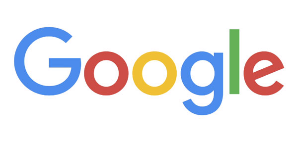
Last night, as I was doing my nightly run around the internet, I noticed Google’s new logo in a favicon of a new tab I had just opened. “That’s not a Google tab,” I thought. What is that?!
So I clicked on the tab and low and behold, it was indeed a Google results page but the Google logo on the top left was very different. At first, I thought it was just another Google doodle so I clicked it to see what it was all about. Little did I know that Google had in fact redesigned their identity.
An obligatory quirky Google animation played, erasing the old logo which was then replaced by the new logo we see today.  I stared at the new logo for a few minutes and a mix of emotions washed over me and questions soon followed. “Do I like this?” “Is this the right direction?” “Does it look good?” I thought about it for a few more minutes and I the answer to all these questions was a resounding “Yes.” The thing about logos (especially for companies as large and as ubiquitous as Google) is that people often form bonds with them without even noticing it.
And when a logo is redesigned or changed in any way, you’re more than likely going to have some strong reactions, one way or another. I know I did. Think about the logos you grew up with and try to imagine how you felt when they changed or when they were redesigned.
Yahoo! redesigned their logo a couple of years ago and it was met with criticism. Spotify just changed the color of their logo and many people expressed their discontent.
These logos and symbols carry lots of meanings and associations and even a slight change can automatically alter those meanings for us. And a change we’re not comfortable with ultimately brings negative feelings and thus, negative impressions. So what then, is the difference between a successful redesign and a doomed one?
Impressed with Google’s recent redesign, I set out to learn more about what went into their process and I came upon this blog post from the Google Design team which offers some insight into their approach to the new redesigned identity. The 4th item on their brief immediately caught my eye:
A refinement of what makes us Googley, combining the best of the brand our users know and love with thoughtful consideration for how their needs are changing.
It is a simple statement that immediately addresses what any good redesign should be about. Taking the best of what we know and feel about an organization and considering what we will need moving forward.
A logo redesign (whether it’s for a small company or a huge corporation) isn’t about just “a new coat of paint.” It isn’t just about finding the perfect balance, flow, legibility, and whatever graphic design lingo you want to throw around. No, a graphic redesign — at its core — is about something much simpler (or more complex, depending on how you look at it). It’s an acknowledgment of the past with an eye towards the future.
It’s about taking your best qualities as an organization and refining it to remain relevant for the things to come. I think this is why Google’s redesign has left a positive impression on me. After learning of Google’s restructuring into Alphabet recently, I was indeed a little worried about what kind of company Google was going to become.
Given that “Search” is one of the most powerful forces on the internet for quite some time now, Google’s redesign feels like an affirmation — or at least a statement — that Google will still be the Google we know… but slightly different. With the new logo, Google remains quirky and fun and lighthearted but a little grown up.
At least it seems that way for now. What do you guys think of the new redesign? Discuss in the comments below.
-
 Trevin serves as the VP of Marketing at WebFX. He has worked on over 450 marketing campaigns and has been building websites for over 25 years. His work has been featured by Search Engine Land, USA Today, Fast Company and Inc.
 -

WebFX is a full-service marketing agency with 1,100+ client reviews and a 4.9-star rating on Clutch! Find out how our expert team and revenue-accelerating tech can drive results for you! Learn more
Make estimating web design costs easy
Website design costs can be tricky to nail down. Get an instant estimate for a custom web design with our free website design cost calculator!
Try Our Free Web Design Cost Calculator


Web Design Calculator
Use our free tool to get a free, instant quote in under 60 seconds.
View Web Design CalculatorMake estimating web design costs easy
Website design costs can be tricky to nail down. Get an instant estimate for a custom web design with our free website design cost calculator!
Try Our Free Web Design Cost Calculator


