

Last week, Google began sending out emails as well as Webmaster Tools notifications letting webmasters know if their sites were up to par with current mobile usability standards. Pages that are not coded to provide a friendly mobile experience may be ranked lower for smartphone users as Google experiments with this as an SEO signal. If you’re received one of these messages, you probably want to know what to do next.
Here’s how to address the mobile usability warning from Google.
What the messages look like
This is what the mobile usability warning in Webmaster Tools looks like: 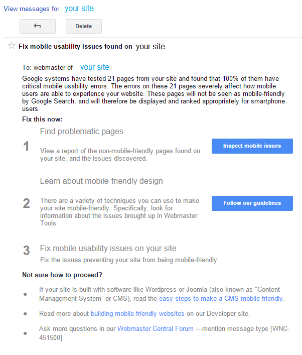 The warning starts off by telling us how many pages on your site have critical mobile usability errors. When you click on “Inspect mobile issues,” you will see a table showing the type of usability error as well as the number of pages on your website with that error:
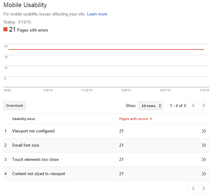
What’s a critical mobile usability error?! That sounds important!
Even with more than 58% of American adults owning smartphones, thousands of businesses still neglect the importance of responsive design and creating a friendly experience for anyone who accesses their site on a mobile device.
For example: 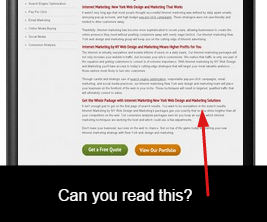 We could try expanding the page on our smartphones to zoom in a bit, but that already creates a poor user experience. Even though our website might look and render perfectly on a desktop browser, it’s a completely different environment when screen sizes change. Quite simply, this is why responsive web design has become a necessity in the industry. It maintains the feel, looks, and style of the business/brand; it creates unity.
But let’s get back to these pesky errors. There are three common errors you will most likely run into if you have received a mobile usability warning. Let’s take a look at them as well as the steps you can take to fix them as soon as possible.
3 common mobile usability errors
Small font size
The fix: set a base font size of 16px.
Then create classes such as ‘.small’ and ‘.large’ to designate when larger or smaller sizes should be rendered.
Viewport not configured
The viewport is what controls how a website will display on a mobile device. Without a viewport configured, a mobile device will render the content of a page at a typical desktop width (resulting in screens that look a lot like my example above).
The fix: configure a viewport so pages include a meta viewport in the head of the document. For example:
meta name=viewport content="width=device-width, initial-scale=1"
Additionally, you’ll want to size content to the viewport – i.e; you don’t want to create absolute widths for images.
Instead, use relative widths such as:
width:100%
Touch elements too close
The fix: while we are slowly becoming masters of handling mobile technology, touch elements or tap targets (your buttons, menus, pop-up triggers, etc.) are often way too tiny for accurate tapping. Here’s an interesting tidbit: the average adult finger pad size is about 10mm wide (just under ½ an inch) so a minimum tap target size of roughly 48 CSS pixels tall/wide is recommended. Spacing out the less important links and having them slightly smaller is recommended as well.
Helpful advice from Google
At the very bottom of Google’s mobile usability warning error message, we see a few tips for those who are completely unsure of how to proceed further.
They offer:
- Tips to make a CMS mobile-friendly (a CMS is a Content Management System, such as WordPress or Joomla)
- General knowledge and guides for building mobile-friendly websites
- A support forum for webmasters
Let’s recap, shall we?
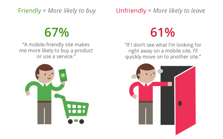
People who shop and browse on smartphones are extremely unlikely to do any business with you if your site does not provide a seamless mobile experience. Here’s a quick stat:
One of the big concerns with mobile usability errors is that Google is now devaluing sites that do not address their errors.
This means a reduction in the potential leads and visitors from mobile users. The main goal for sites that received this warning from Google is to eliminate any and all mobile usability issues and create an effortless, intuitive experience for mobile users.
Have any questions about the mobile usability warning and what it means? Have you received this particular error in Webmaster Tools? Let me know your thoughts or any questions you have in the comments.
UPDATE: As of April 21, mobile usability is now a Google ranking factor, meaning that if you received one of these warnings and did not take action, your chances of attracting organic search traffic could be affected.
For more information on how to make sure that your website’s rankings won’t suffer, check our more recent blog post.
-
 Trevin serves as the VP of Marketing at WebFX. He has worked on over 450 marketing campaigns and has been building websites for over 25 years. His work has been featured by Search Engine Land, USA Today, Fast Company and Inc.
 -

WebFX is a full-service marketing agency with 1,100+ client reviews and a 4.9-star rating on Clutch! Find out how our expert team and revenue-accelerating tech can drive results for you! Learn more
Make estimating web design costs easy
Website design costs can be tricky to nail down. Get an instant estimate for a custom web design with our free website design cost calculator!
Try Our Free Web Design Cost Calculator
Share this article


Web Design Calculator
Use our free tool to get a free, instant quote in under 60 seconds.
View Web Design CalculatorMake estimating web design costs easy
Website design costs can be tricky to nail down. Get an instant estimate for a custom web design with our free website design cost calculator!
Try Our Free Web Design Cost Calculator