

A popular web design trend this year is the “ghost button”, which is simply a button with a border and a transparent background color. You can read more detailed discussions about the ghost button design trend on SitePoint and DesignModo. In this tutorial, I’ll show you how to create several styles of ghost buttons using CSS.
Examples of Ghost Buttons
Before we get started, let’s look at some real-world examples of ghost buttons:  We Are Heckford
 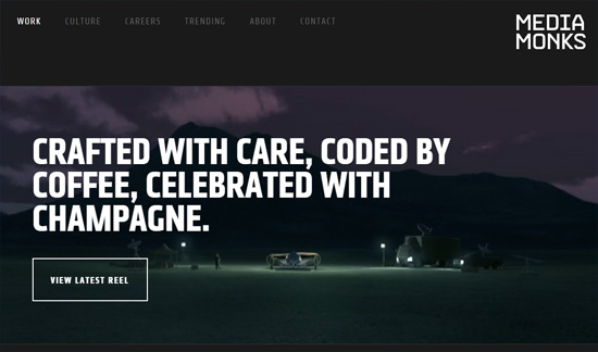 MediaMonks
  VIZIO
VIZIO 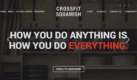 CrossFit Squamish
 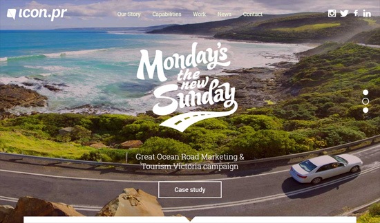 Icon PR
 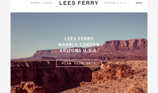 Lees Ferry
 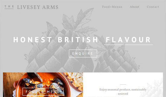 The Livesey Arms
 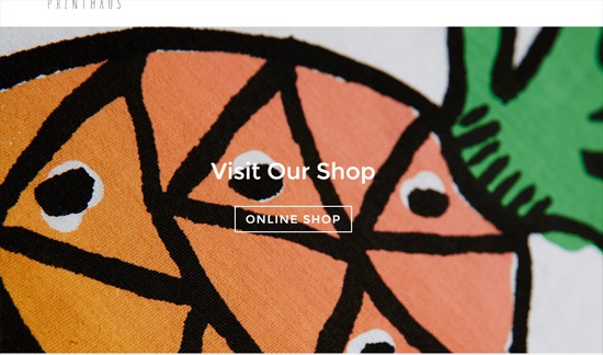 dotsprint.co.uk
 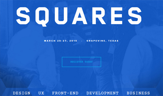 Squares Conference
  Haigh & Hastings
  Decibel Digital
Ghost Button Design Trends
Looking at the ghost buttons above, we can see some prominent commonalities among them.
- Photographic backgrounds: Ghost buttons look excellent on top of background photos. It allows the user to see the background image through the button, which is an interesting visual effect.
- White is a popular ghost button color: Ghost buttons can be any color you want, and you should choose colors that fit the look-and-feel of your design project, but the overwhelming trend is to give them a white border and white text.
- CSS transitions: We can enhance the interaction experience of our ghost buttons using subtle CSS transition effects.
Ghost Buttons Demo
I created eight variations of ghost buttons inspired by the ones I’ve seen. You can see all of them in one page: View demo 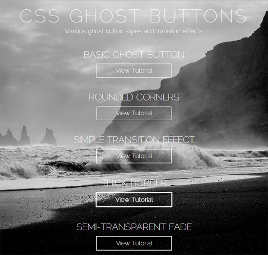
HTML
For this tutorial, I used an HTML <a> element to represent the ghost buttons.
<a class="ghost-button" href="#">Ghost button text</a>CSS
Let’s go through the 8 ghost button variations, which I’ve labeled as:
- Basic ghost button
- Rounded corners
- Simple transition effect
- Thick border
- Semi-transparent fade
- Border color fade
- Full color fade
- Size transition effect
1. Basic Ghost Button
Here’s the CSS to make our <a> element look like a ghost button.
.ghost-button { display: inline-block; width: 200px; padding: 8px; color: #fff; border: 1px solid #fff; text-align: center; outline: none; text-decoration: none; }Those are the foundational CSS properties that make the ghost button look the way it does. In the other variations, we just have to modify the above properties or add new properties.
There should be a visual indication whenever the user hovers or activates the ghost button. To achieve this, we’ll create style rules for the hover and active states using the :hover and :active pseudo-classes.
.ghost-button:hover, .ghost-button:active { background-color: #fff; color: #000; }2. Rounded Corners
Some ghost buttons have rounded corners. This is easily done by adding a border-radius property.
.ghost-button-rounded-corners { display: inline-block; width: 200px; padding: 8px; color: #fff; border: 1px solid #fff; border-radius: 5px; text-align: center; outline: none; text-decoration: none; } .ghost-button-rounded-corners:hover, .ghost-button-rounded-corners:active { background-color: #fff; color: #000; }3. Simple Transition Effect
To make the ghost button more interesting, we can apply a subtle transition effect whenever the user hovers or clicks on it. In this variation, we use the CSS transition property to fade in/fade out the border and background color of the ghost button.
.ghost-button-transition { display: inline-block; width: 200px; padding: 8px; color: #fff; border: 2px solid #fff; text-align: center; outline: none; text-decoration: none; transition: background-color 0.2s ease-out, color 0.2s ease-out; } .ghost-button-transition:hover, .ghost-button-transition:active { background-color: #fff; color: #000; transition: background-color 0.3s ease-in, color 0.3s ease-in; }4. Thick Border
In certain instances, you might want a thicker ghost button so that it has a heavier visual weight. All we need to do to achieve this is to increase the border-size property value from 1px to, say, 3px.
.ghost-button-thick-border { display: inline-block; width: 200px; font-weight: bold; padding: 8px; color: #fff; border: 3px solid #fff; text-align: center; outline: none; text-decoration: none; transition: background-color 0.2s ease-out, color 0.2s ease-out; } .ghost-button-thick-border:hover, .ghost-button-thick-border:active { background-color: #fff; color: #000; transition: background-color 0.3s ease-in, color 0.3s ease-in; }5. Semi-Transparent Fade
In this ghost button variation, we allow some of the background image to show through the button when the user hovers over it. This leads to an interesting visual effect, especially when you have a good background image. We achieve this effect by using the rgba()function in the :hover and :active style rule.
The color we use for the background and border is white with 40% opacity, which is represented like so:
rgba(255, 255, 255, 0.4) However, since the rgba()function is a new CSS feature, not all browsers will support it so we should declare solid colors using hexadecimal notation as fallbacks.
.ghost-button-semi-transparent { display: inline-block; width: 200px; padding: 8px; color: #fff; border: 2px solid #fff; text-align: center; outline: none; text-decoration: none; transition: background-color 0.2s ease-out, border-color 0.2s ease-out; } .ghost-button-semi-transparent:hover, .ghost-button-semi-transparent:active { background-color: #fff; /* fallback */ background-color: rgba(255, 255, 255, 0.4); border-color: #fff; /* fallback */ border-color: rgba(255, 255, 255, 0.4); transition: background-color 0.3s ease-in, border-color 0.3s ease-in; }6. Border Color Fade
A popular transition effect in some of the ghost buttons I have encountered is fading the border and text color to another color. This is quite easy to do with the CSS transition property.
.ghost-button-border-color { display: inline-block; width: 200px; padding: 8px; color: #fff; border: 2px solid #fff; text-align: center; outline: none; text-decoration: none; transition: border-color 0.3s ease-out, color 0.3s ease-out; } .ghost-button-border-color:hover, .ghost-button-border-color:active { color: #66d8ed; border-color: #66d8ed; transition: border-color 0.4s ease-in, color 0.4s ease-in; } 7. Full Color Fade
For a more distinct transition effect, we can fade in another color for the border and background. Again, we use the CSS transition property, but this time we will transition the background-color property as well.
.ghost-button-full-color { display: inline-block; width: 200px; padding: 8px; color: #fff; background-color: transparent; border: 2px solid #fff; text-align: center; outline: none; text-decoration: none; transition: color 0.3s ease-out, background-color 0.3s ease-out, border-color 0.3s ease-out; } .ghost-button-full-color:hover, .ghost-button-full-color:active { background-color: #9363c4; border-color: #9363c4; color: #fff; transition: color 0.3s ease-in, background-color 0.3s ease-in, border-color 0.3s ease-in; }8. Size Transition Effect
Another way to animate ghost buttons is by expanding its size when the user hovers over it and then contracting it back when the user hovers out. We can accomplish this effect quite simply by adding 20px to the width, height, line-height properties when the user hovers over the button. For this transition effect, I felt that the 0.3s transition speed I’ve been using in the other variations felt too sluggish, so I lowered the value to 0.1s to make the transition faster.
.ghost-button-size-transition { display: inline-block; width: 200px; height: 25px; line-height: 25px; margin: 0 auto; padding: 8px; color: #fff; border: 2px solid #fff; text-align: center; outline: none; text-decoration: none; transition: width 0.3s ease-out, height 0.3s ease-out, line-height 0.3s ease-out; } .ghost-button-size-transition:hover, .ghost-button-size-transition:active { width: 220px; height: 45px; line-height: 45px; transition: width 0.1s ease-in, height 0.1s ease-in, line-height 0.1s ease-in; }Summary
The ghost button design trend is currently quite popular. As you’ve seen, it’s easy to create ghost buttons using CSS. The source code of the demo page is on GitHub in case you want to review it or download it: View source on GitHub Download source on GitHub
Related Content
-
 President of WebFX. Bill has over 25 years of experience in the Internet marketing industry specializing in SEO, UX, information architecture, marketing automation and more. William’s background in scientific computing and education from Shippensburg and MIT provided the foundation for MarketingCloudFX and other key research and development projects at WebFX.
 -

WebFX is a full-service marketing agency with 1,100+ client reviews and a 4.9-star rating on Clutch! Find out how our expert team and revenue-accelerating tech can drive results for you! Learn more
Make estimating web design costs easy
Website design costs can be tricky to nail down. Get an instant estimate for a custom web design with our free website design cost calculator!
Try Our Free Web Design Cost Calculator
Share this article


Web Design Calculator
Use our free tool to get a free, instant quote in under 60 seconds.
View Web Design CalculatorMake estimating web design costs easy
Website design costs can be tricky to nail down. Get an instant estimate for a custom web design with our free website design cost calculator!
Try Our Free Web Design Cost Calculator