
 Details make a world of difference when distinguishing between ordinary and extraordinary. A luxury car may have the same number of wheels, seats, windows and doors as a traditional vehicle, but what sets it apart from the competition is the time spent on the details. Heated leather seats, a push-to-start engine, keyless entry, automated parking and extensive digital consoles add value to an expensive, new car.
The same principle holds true in web design. Web designers who take the time to dive into the details that make a difference will reap the rewards of designs that hold more value. The key word here is value. There is no guarantee of a direct correlation between the time invested into creating a website and the value that the result has.
Some details are more important than others, and it’s important to be able to determine which details make an impact.
Details That Add Value
The type of details we want to spend extra time on improves our work beyond the aesthetic levels. We want to focus on visual tweaks that can change the user experience profoundly, such as in the way users perceive the site’s theme and message or how they navigate a site.
The average website visitor, one whose not experienced in creating websites, will not be able to point out the nuances that improve their experience, but if those details were removed, a noticeable difference in perception and usability will be revealed. Those are the details we want to invest time in. So how exactly does a design detail add value to a website?
The trick is in the user experience. Web designers should have an excellent understanding of how negative space, contrast, shape, color and all the different visual elements play a role in how people use and perceive a website design. What can be surprising is just how few pixels a designer needs to manipulate before they start to make a difference that has a much larger impact.
What are some of these differences?
Looking Closer
I feel the most comfortable in Photoshop when I’m zoomed in to 500% or closer. It just feels like home.
Let’s dig into some design work that does a good job of guiding our experience with subtle details. I’ll use the Concentrate website as a working example; it seems like an appropriate place for us to devote our concentration on first. Starting with a high-level view, we can see a creative visual wordplay that is being made on the Concentrate site.
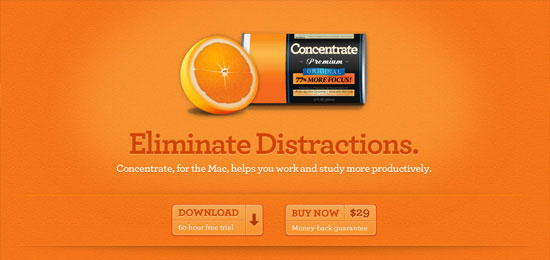 Beyond the can of orange juice concentrate, we see an orange-themed color palette and a background that does a pretty good job of imitating the texture of an actual orange fruit. Digging a little deeper, we see that CSS3 has been used to provide some shadowing for text to increase contrast against its background. To truly appreciate the details, we need to dig a little deeper.
Pixel Perfection
True details are applied down in the pixel-level. We see this on the Concentrate site, around the call to action buttons near the top of the web page layout. First, the shadow behind the buttons lifts up this section of the page.
The simple two single-pixel lines at the top and bottom of the area is a simple design trick that gives this area greater visual distinction amongst the other elements of the page. 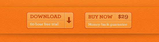 One of the single-pixel lines is more noticeable because it’s bright orange. This provides contrast between both the drop shadow and the background, but what really helps is the second, darker orange line.
These two single-pixel lines work together to cordon off this top section. 
The Difference
The difference is best demonstrated when those lines are no longer a part of the web design. Below, I’ve removed those lines to show you how big a difference two pixels can make.

Subtle Shadows
Drop shadows are no stranger to web designs. Most websites utilize them early and often to simulate depth on a flat, 2-dimensional medium. Shadows and highlights can improve the way our site is experienced in delicate, but powerful, ways.
As we adopt CSS3 in our designs, it’s easy to get excited about all of the grandiose differences it can make. To me, though, the truly exciting news is how much detail work can be translated from image editing software directly to the code of our websites. Staying on the Concentrate site, we see an excellent example of how text shadows can be used in a subtle and effective way to make a site’s content easier to read.
The CSS3 text-shadow property is used in two ways here. First the red headlines have received a lighter shadow to give an embedded/inset look on a color choice that otherwise would not work nearly as well. The second shadow in play is behind the paragraph text, simply giving the white color a bit of a lift off the page.
The Difference
Compare the above screenshot with the same page rendered in Internet Explorer 8 (which doesn’t support the text-shadow property), and we see a site that is much harder to read.  It is worth pointing out that this site is selling Mac software, which naturally raises significantly less concern on what IE users are seeing.
Navigation Nuance
Apart from improving readability and emphasizing possible site actions, details go a long way in site navigation.
The most important part of any web page is the ability your user has to navigate to another page. After all, links are what make the web what it is in the first place, so why not spend a little extra time on navigability? For this example, we shift our focus to the Lipperhey site.
 Apart from a good color selection for the navigation active state, we see that this design adds some interesting details to its primary navigation bar. The Home button stands out for a few reasons beyond the color change. First, we can see that it drops down just a few pixels from the navigation bar.
In addition, a shadow has been added behind the button and is given a slight adjustment in perspective. These two details together give the perception of added dimension to this link, indicating its importance and active state. 
The Difference
Reviewing the same navigation without the mentioned details, we find that a lot of the excitement is gone and our active link has an entirely different look-and-feel to it.

Moving Forward with the Details
We explored one of the ways that some of our new abilities in CSS3 can help add value to our designs (text-shadow). But the power of CSS3 doesn’t end with shadows. CSS3 animation, in the form of things such as the transform and transition properties, can give us an additional tool for detailing work.
When used correctly, CSS3 animations harness a huge ability to efficiently add motion to our site elements without needing the assistance of Flash or JavaScript. In terms of details, animations allow us to provide users with fluid feedback on all kinds of input. Adding a transition animation to link hover states or button clicks, for example, can tell the user that they are hovering on (or touching, in the case of touchscreen mobile devices) an active element.
The beauty of working with site details is that, through progressive enhancement, we can still provide value to a segment of our audience without alienating those who choose to use outdated browsers. The key here is that we use all of these techniques to add value to an already solid web design. Leaning on any of these techniques without a fundamentally solid design is most certainly placing your cart before the horse.
Where else can detail be added to a site to increase its value? What types of detail techniques have you had success with in your past projects?
Related Content
- Create a Zoomed In Effect in Photoshop
- Take Your Web Designs to the Next Level
- Feedback. The Creativity Killer.
-
 President of WebFX. Bill has over 25 years of experience in the Internet marketing industry specializing in SEO, UX, information architecture, marketing automation and more. William’s background in scientific computing and education from Shippensburg and MIT provided the foundation for MarketingCloudFX and other key research and development projects at WebFX.
 -

WebFX is a full-service marketing agency with 1,100+ client reviews and a 4.9-star rating on Clutch! Find out how our expert team and revenue-accelerating tech can drive results for you! Learn more
Make estimating web design costs easy
Website design costs can be tricky to nail down. Get an instant estimate for a custom web design with our free website design cost calculator!
Try Our Free Web Design Cost Calculator
Share this article


Web Design Calculator
Use our free tool to get a free, instant quote in under 60 seconds.
View Web Design CalculatorMake estimating web design costs easy
Website design costs can be tricky to nail down. Get an instant estimate for a custom web design with our free website design cost calculator!
Try Our Free Web Design Cost Calculator


