
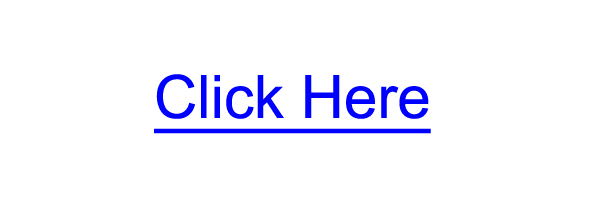
A hyperlink (aka link) is the most basic interface on websites. In fact, we can trace hyperlinks back to the origins of the web, with Tim Berners-Lee’s ENQUIRE, where each new page had to link to another. Links connect all of our content together and come in many forms; from links contained in a paragraph to a list of links that we’ve come to know as navigation menus.
This article is a discussion on designing hyperlinks, offering a few tips and best practices for designing them.
We will conclude with a small showcase of exceptional hyperlink designs on live sites.
Why Is Hyperlink Design So Important?
Links are the most basic interactive component between a user and a web page: A user clicks on a link, and in turn, they are presented with another web page. They’re so important, yet easily get lost in the midst of newer and shinier UI elements like web forms, animated tooltips, and call-to-action buttons (which are essentially links styled to look like something else). Links are so ubiquitous that we often overlook them in our designs.
Basic Principles of Designing Hyperlinks
Before we go any further, it might be wise to cover basic things you should know about hyperlinks.
Hyperlink States
When conceptualizing link designs, it’s important to consider and know the link states you have to work with.
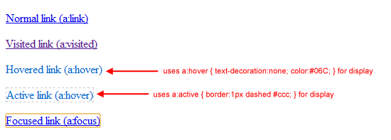
There are 5 states that <a> elements can have:
a:link– this is the normal state of a hyperlinka:visited– this is when the link has been visited beforea:hover– this is when the user hovers their mouse over a linka:active– this is when the user clicks on the link (or presses the Enter key on a focused link)a:focus– this is when the user uses the Tab key to navigate to hyperlinks
The technical term for these states is pseudo-classes. It’s important to note that web browsers treat these states differently by default. For example, in Firefox, :active and :focus are displayed with a dashed gray border around them, controlled with the outline property.
Whereas, in Google Chrome (and other WebKit browsers), :active links will have no style and :focus links will have a yellow border around them by default.
Here are examples of each link state (shown in Google Chrome 6.0):
It’s best to have a style for each state so that the user is aware of the status of each hyperlink on a web page. For example, hovering over a link and having it look a different way (e.g. changing its color) improves the perception that it can be clicked.
Popular CSS Properties for Styling Hyperlinks
There are many link style properties you can take advantage of for designing hyperlinks.
Some popular CSS properties pertaining to the visual appearance of links include:
color– The color of the hyperlinktext-decoration– Setting this tononeremoves the default underlinebackground-color– If used in the:hoverstate, can make the link’s background color changeoutline– Setting this tononeusing thea:focusedselector removes the default gray border around active and focused links in Mozilla and the yellow or blue border in WebKit (Chrome and Safari); this is not advised because the border helps with web accessibilityfont-weight– Another distinguishing method for hyperlinks is setting them to boldborder– If you need more control outside oftext-decoration: underline, try giving your hyperlinks a bottom border (experiment with thickness, color and style)
There are plenty more of CSS properties you can tweak, but the above seems to be the most common.
Below, you can see different styles of hyperlinks on Flickr. The text “Your Photostream” changes background-color when you hover over it. The main menu links are styled as bolded and without underlines.
The “Recent Activity” link looks the most like the standard blue, underlined hyperlink.

Hyperlink Design Best Practices
Here are a handful of suggestions and commonly held best practices when dealing with the style and design of hyperlinks.
Keeping Link Styles Simple Isn’t a Bad Thing
I think we can all still relate to seeing the standard blue, underlined hyperlink. It’s the default style of hyperlinks and they work well.
Good hyperlinks should be distinctive from other types of text in a web page. According to several findings by usability researcher Dr.
Nielsen, hyperlinks are most effective when they are a different color from other types of text in a web page and when they are underlined to denote that the text is clickable. Nielsen also suggests that the color of unvisited links should be “vivid, bright, and saturated.” It goes without saying that the converse of these ideas are also true. It’s best to avoid underlining text for things other than links, and not using normal text that is the same color as your links.
Style Link States Differently
Earlier on, we talked about the 5 different link states.
To avoid confusing your users and to speed up visual recognition of hyperlinks on a web page, it’s best to provide different styles for each link state.
Don’t Remove Outlines on Active and Focused Links
By default, most browsers will style hyperlinks when they are clicked or focused on. For example, in Firefox 3.6, the default style for a:active is coloring the link red and surrounding it with a red dashed outline. The default style for a:focus, which you can see for yourself by using your Tab key, is a blue dashed outline.
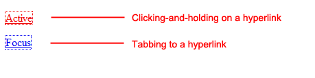
Both of these visual elements are used to aid in accessibility.
People who cannot use a mouse need to tab to hyperlinks in order to activate them (using the Enter/Return key). Imagine having to tab through 100 links in a web page (which is not as uncommon as you might think, the front page of our web design blog has close to 200 links). Would it not be difficult to see which link you are on if there was no visual cue for them?
The same is true for active links; a different style gives users the visual feedback that they were able to successfully click on the link.
Keep Hyperlinks Consistent
Many principles of usability and psychology support the notion that things that are similar in function should look the same.
For example, Gestalt psychology — which applies to human perceptions of design — suggests the concept of similarity; that is, “[w]e group things perceptually if they appear similar to one another.”
To avoid the situation where users having to think whether a particular text is a link or not, it is a good idea to keep hyperlinks and regular text styled consistently.
Reserve Common Hyperlink Styles for Hyperlinks
The accepted and most recognizable convention for hyperlinks is that it is blue and underlined. Therefore, to avoid confusion, you should avoid coloring your normal text as blue and underlined.
Showcase of Hyperlink Designs
Here are a few great hyperlink designs to take a look at. I hope that these can inspire you to rethink the significance and possibilities of your own hyperlink designs.
Web Designer Wall
Web Designer Wall is a popular design blog created by Nick La.
The site’s hover effects for links on the site’s sidebar feature a pencil-style circle around the text. It’s unique and adds an additional level of intricacy to the entire site design. La even offers a tutorial on how you can recreate a similar effect.
You can also notice some creative hover effects on links in the navigation and blog posts.
Carsonified
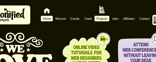
Carsonified connects web designers and developers together through conferences held year-round all around the world. Their website is an excellent display of consistency and similarity principles applied to links. You can move your mouse all throughout the page and see their unique hyperlink effects displayed in a similar fashion as their site logo.
The most prominent area would be the top navigation menu that boasts an icon set for each link.
Far Coast
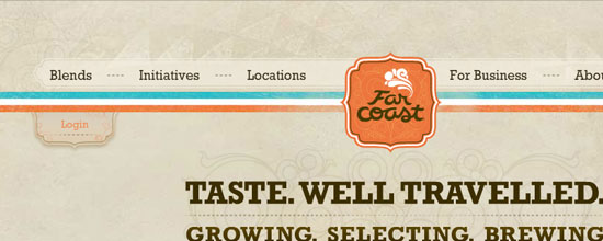
Far Coast has their entire website designed in Flash. After the initial page load, you’ll notice all of their links perform a fade-in effect when moused over. This visual reaction to mouse hovers gives users the idea that link elements are interactive, which is in line with the best practice of styling different link states to provide the perception of clickability.
WordPress.org
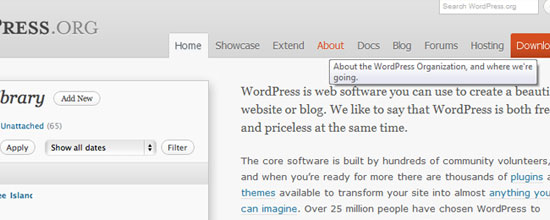
You can see consistency of hyperlinks applied everywhere throughout the official WordPress site.
Their main menu links look great and use CSS3 text-shadow to give them that extra touch of detail. The main menu links also have descriptive title attributes to help users learn more about a particular link when they hover their mouse over them.
Retinart
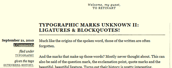
Retinart is a freeform blog containing creative thoughts on graphic design and digital art. The design boasts an interesting hyperlink hover effect that reflects the background and text color over each other — a classic technique that works really well on this particular blog design especially because of the limited color scheme.
This helps achieve an even stronger visual grouping of links as well.
Unmatchedstyle
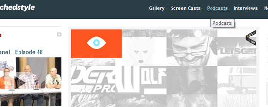
This web design gallery is just one of many that you can find all over the web. The site’s simple design and impressive layout allows for easy browsing through their collection. An element of interest would be the navigation links toward the top of the page that display a creative underlined effect on mouseover.
made my day
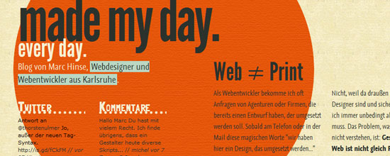
This is the personal blog of web designer Marc Hinse.
His page boasts a number of interesting hyperlink effects, all of which seem perfectly placed. Check them out and notice how the hyperlink states fit into the blog’s overall design theme.
Build Conference
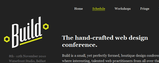
The Build Conference is held for designers and developers and is hosted in Ireland. Their site has a unique effect added to their main navigation links that fades in on mouseover using CSS3 transition properties.
LogoPond
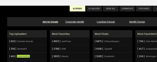
The gleaming fountain of all logo and branding inspiration, LogoPond has some great link styles.
The most notable are in the footer area where you can discover links to popular pages throughout the site. On hover, you get a flipped background and text effect similar to the Retinart blog.
Suikerdraakje
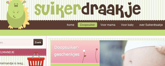
Suikerdraakje is an e-commerce store selling baby supplies and toys. Their design is remarkable and features many illustrations to fill out whitespaces in the layout.
Their main navigation links display a rounded corner background shift on mouse over — one of the few sites to display this effect.
Nintendo
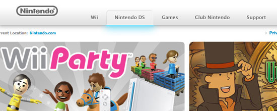
Nintendo has always been at the forefront of innovation, and you can see this on their corporate site. In the context of hyperlinks, their main navigation links fade into a light blue glow underneath when you mouse over them, reminiscent of the blue LEDs on the Wii.
Stephen Caver Blog
Stephen Caver’s blog theme is very impressive and makes good use of hyperlink design and best practices. When you move your cursor over his blog posts, you’ll notice the links in each area will light up.
This technique is simple to implement with a small bit of JavaScript and adds the interactivity your users may appreciate.
MapBox
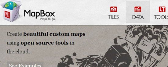
MapBox is a newer web application that boasts a handsome “Web 2.0” design. You can see some very neat effects all throughout the site, most notably their heading links that hold a nice hover effect.
Dribbble
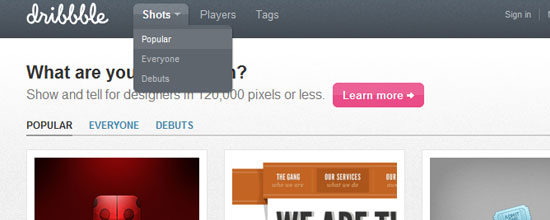
With Dribbble being a site targeted towards designers, it would only make sense that their site design should be remarkable. Their hyperlinks display so many unique and customized effects all around the design layout that it’s hard to pinpoint one area to concentrate on.
G4TV
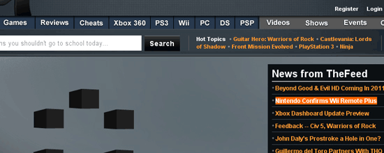
G4TV is the cutting edge of video game and technology news.
The site has a diverse design containing many unique hyperlink design states. Check out their main navigation and sidebar content specifically.
Related Content
-
 President of WebFX. Bill has over 25 years of experience in the Internet marketing industry specializing in SEO, UX, information architecture, marketing automation and more. William’s background in scientific computing and education from Shippensburg and MIT provided the foundation for MarketingCloudFX and other key research and development projects at WebFX.
 -

WebFX is a full-service marketing agency with 1,100+ client reviews and a 4.9-star rating on Clutch! Find out how our expert team and revenue-accelerating tech can drive results for you! Learn more
Make estimating web design costs easy
Website design costs can be tricky to nail down. Get an instant estimate for a custom web design with our free website design cost calculator!
Try Our Free Web Design Cost Calculator
Share this article


Web Design Calculator
Use our free tool to get a free, instant quote in under 60 seconds.
View Web Design CalculatorMake estimating web design costs easy
Website design costs can be tricky to nail down. Get an instant estimate for a custom web design with our free website design cost calculator!
Try Our Free Web Design Cost Calculator


