
An information dashboard is a single-page display that presents key performance indicators in real-time. To make its content easier to read, a modern dashboard will often utilize information graphics such as charts and tables. When designed well, a dashboard should help you quickly see critical information and discover data patterns.
Below are some tips and techniques for designing user-friendly dashboards.
Display the Information Logically
We know from usability studies that when we are shown a web page, our eyes generally start at the top-left region of the page. As we read the contents of the screen, our eyes move from left to right. A good dashboard design takes advantage of this natural reading pattern.
As a solid design strategy, place the most important and urgent information at the top-left region of the sales dashboard. Lower-priority and infrequently-changing information should be placed towards the bottom region of the dashboard. Let’s look at the dashboard below, a case where content wasn’t arranged in a logical fashion: 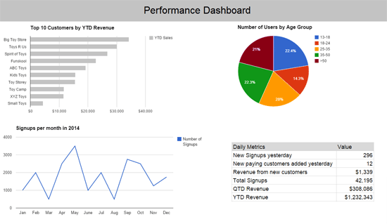 The information in the two upper charts, “Top 10 Customers by YTD Revenue” and “Number of Users by Age Group”, doesn’t change frequently.
On the other hand, the most frequently-changing information, “Signups per month” and “Daily Metrics”, are placed at the lower portion of the dashboard, a location that’s not optimal for the charts. In the situation above, every day the user accesses the dashboard, they will need to go through the first two charts that don’t change frequently before they get to information that changes on a regular basis.
Highlight Important Information
You should be able to look at a dashboard and have your eyes immediately be drawn to the most critical information on the page. Visual techniques can be used to achieve this.
(Read Creating focal points in your web design for tips and tricks.) Color is powerful in highlighting important information. For instance, if we use light and neutral colors for most parts of dashboard, we could make specific sections stand out by using dark or saturated colors. When looking at the following dashboard, take note of where your eyes first naturally go to: 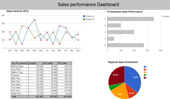 Perhaps your eyes were drawn to the line graph at the top-left region of the dashboard, or pie chart at the bottom-right region because they were colorful.
Group Related Information Together
Grouping related information helps users understand and discover connections within them.
In the same token, positioning connected information far apart can cause confusion and make it harder to holistically evaluate them. Consider the following dashboard: 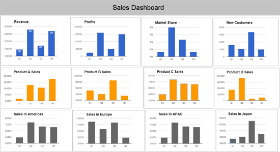 In the dashboard shown above, you can see an implied grouping of charts based on color scheme and positioning:
- The first row shows overall sales metrics
- The second row shows product sales metrics
- The third row shows regional sales metrics
As you can see, smart use of color and positioning helps users understand and compare related information easily. When components on a dashboard look similar, people tend to see them as being related. We must be aware that this can be a double-edged sword because similar-looking dashboard components might unintentionally suggest relationships that don’t actually exist in the data.
Let’s look at the dashboard below: 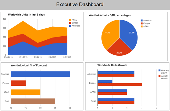 The sameness of colors suggests there’s a shared meaning among the dashboard components. The two colors (blue and red) do in fact share the same meaning in three of the charts — blue represents the Americas and red represents Europe — but this meaning does not hold up in the fourth chart, where blue represents “Quarterly Growth” and red represents “Annual Growth”.
Use Colors Sparingly and Strategically
Because dashboards are often densely packed with information, the visual content must be kept as simple as possible. Using too many colors can result in a lot of visual noise.
Colors can be used to highlight key information and to show information relationships, as we have already seen. By using too many colors, their effectiveness in helping users understand the contents of the dashboard will be reduced. Also, some colors immediately demand our attention, while others are less eye-catching.
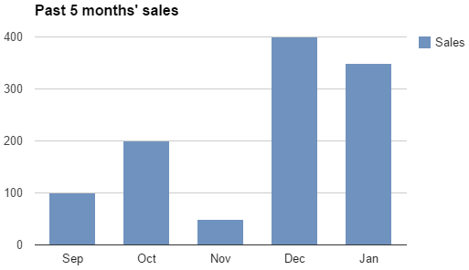
When a color makes a particular dashboard component stand out from other components, we naturally pay attention to that component and subconsciously attempt to assign a meaning as to why it’s different from the rest. (Read Gestalt principles applied in design learn why this happens.) The two charts below present the same data. 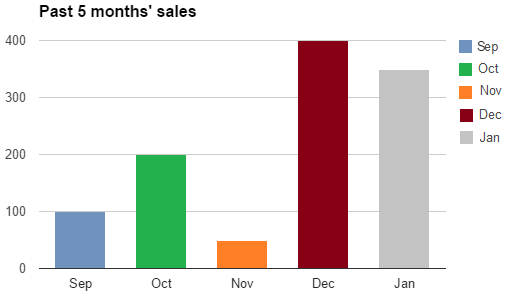
 In the first chart, the additional colors don’t convey any new information.
In addition, it subconsciously tempts us to find meaning in the different colors: “Does red mean something bad happened in December?”, “What positive event happened in October?” In the second chart, the single color correctly gives us an indication that all the bars measure the same metric (i.e. sales volume), and it helps us quickly make comparisons and discover trends within the data.
Choose the Right Type of Information Graphics
One of the most common design mistakes that happens when presenting information in visual form is the chart type used isn’t appropriate or isn’t the most effective. Making an error in chart type selection will convey the wrong message.
It might lead to confusion and false assumptions about the information being shown. The two charts below present the same data. 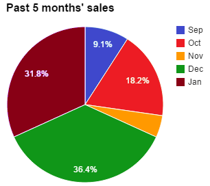
 In the first chart, the viewer ends up wasting time between looking at the legends and the corresponding pie slices.
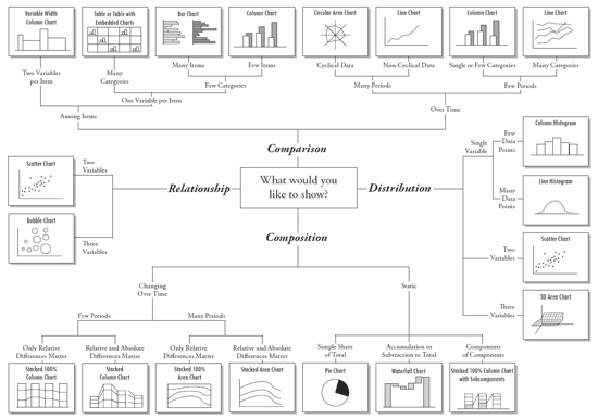
It’s the incorrect chart type to use in this situation. In the second chart, you can see that the appropriate type of chart makes the data presentation much more efficient and effective. Here’s a handy diagram that will help you choose the right type of information graphics to use in your dashboard.
Allocate Screen Space to Information Based on Importance
The size of a dashboard component is a naturally strong indicator of its importance. Pieces of information are not all of equal importance, so they shouldn’t be allocated the same screen space. If a particular section of information is relatively less important than others, try to give it less space.
Provide Context
Numbers, tables and charts are incomplete unless you mention the context in which they are measured.
The right context for key performance indicators helps us understand their meaning. Descriptive chart titles, for example, help us understand what we are looking at as well as what we need to look for. The following dashboard chart misses to inform the viewer of the proper context in which to view the data with: 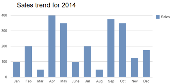 With a slight tweak of the chart’s heading, the same chart now tells the viewer something that may not be obvious at first:
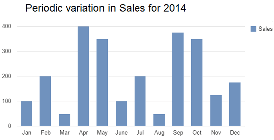
Conclusion
When designed well, information dashboards can serve as an indispensable tool for gauging performance and making decisions.
On the other hand, a poorly designed dashboard can lead to confusion, wasted time and inaccurate data interpretation.
Related Content
-
 President of WebFX. Bill has over 25 years of experience in the Internet marketing industry specializing in SEO, UX, information architecture, marketing automation and more. William’s background in scientific computing and education from Shippensburg and MIT provided the foundation for MarketingCloudFX and other key research and development projects at WebFX.
 -

WebFX is a full-service marketing agency with 1,100+ client reviews and a 4.9-star rating on Clutch! Find out how our expert team and revenue-accelerating tech can drive results for you! Learn more
Make estimating web design costs easy
Website design costs can be tricky to nail down. Get an instant estimate for a custom web design with our free website design cost calculator!
Try Our Free Web Design Cost Calculator
Share this article


Web Design Calculator
Use our free tool to get a free, instant quote in under 60 seconds.
View Web Design CalculatorMake estimating web design costs easy
Website design costs can be tricky to nail down. Get an instant estimate for a custom web design with our free website design cost calculator!
Try Our Free Web Design Cost Calculator


