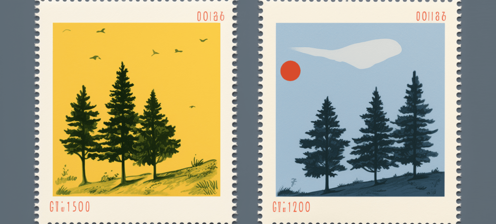
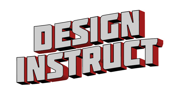
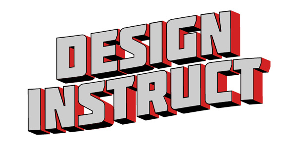
Preview
Click on the image to see it in full size. 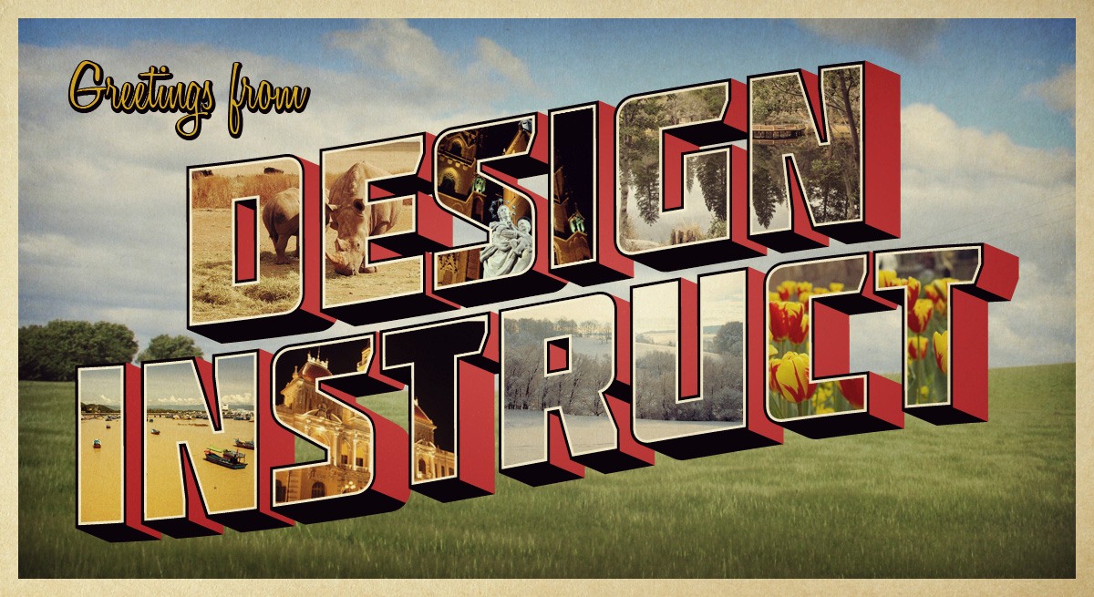
Tutorial Resources
- Font: Molot (Font Squirrel)
- Stock photo: Field 4 (stock.xchng)
- Stock photo: Rhino 3 (stock.xchng)
- Stock photo: Winter Landscape (stock.xchng)
- Stock photo: Lake Fulmor (stock.xchng)
- Stock photo: City Flowers (stock.xchng)
- Stock photo: Nha Trang (stock.xchng)
- Stock photo: Ho Chi Minh City (stock.xchng)
- Stock photo: Mary (stock.xchng)
- Font: Honey Script (Font Squirrel)
- Texture: Paper Texture (Unsigned Design)
Step 1: Finding Inspiration
We are going to start off by getting some examples of actual retro postcards that have a similar theme to what we are going for, with the 3D looking text as our focal point. I went to Google Images and searched for old postcards of New England and Florida for inspiration. If you have a favorite vacation spot of your own, search for it.
These are what I found: 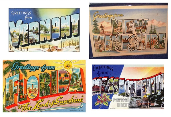 Looking at these, we can find some elements that we want to pull out of each, as well as elements that are consistent throughout. Some of the things we will be using are the black stroke with the white stroke inside of it, the 3D text, and the “Greetings from” text at the top left.
Step 2: Setting Up the Text
Now that we have some references, we can open up a 1200x655px document in Illustrator.
This size comes out to be equivalent to 11x6in, which is a one of a few common sizes for postcards. You can go to Designers Toolbox to find more dimensions of postcards. Use the Type Tool (T) with the Molot font to write “DESIGN INSTRUCT” on the artboard.
Molot is a good, bold font that also has a retro look-and-feel to it. 
Step 3: Adding a Bend to the Text
A few of the postcards we saw in our research have text that bends, and I liked that style, so we are going to mimic that a little bit. We can make our text bend by going to Effect > Warp > Rise.
Change Bend to 12%. 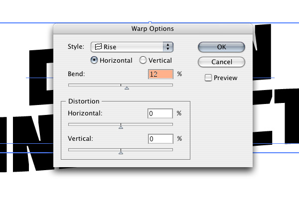 What we end up with is text that looks wavy.
 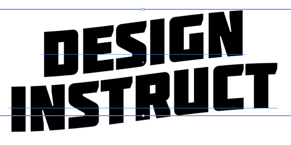 Go to Object > Expand Appearance.
This will change our text into point and line shapes, which will be easier to work with for the next steps.
Step 4: Change the Stroke and Fill Colors
I like the idea of having the strong contrast of the red and black shadows like in the Massachusetts postcard, so let’s pull that concept out and into our design. All we need to do for now is change the Stroke of the text to red (#D22323) and the Fill to white (#FFFFFF).
We’ll complete this look in the next steps. 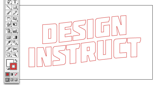
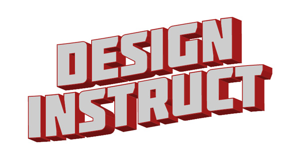
Step 5: Make the Text 3D
To make the 3D text, go to Effect > 3D > Extrude & Bevel. Adjust the Extrude & Bevel options so that your text has an angle similar to what is shown below, with the text facing up and to the left.
Set Extrude Depth to 80pt as well. 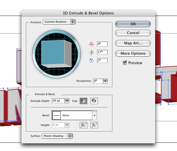
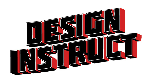
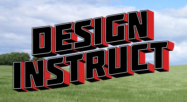
Step 6: Adding a Black Stroke
Go to Object > Expand Appearance to convert our 3D text into vector points and lines. With the 3D text selected, ungroup it by going to Object > Ungroup.
Around each letter should be a red stroke. Click on each one and change their color fills to black. 
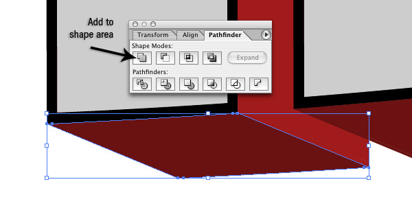
Step 7: Add a Black Shadow
Next, we want to start adding in the black part of our shadow.
Depending on the font you use, you may have some extra pieces on each side of the letter. 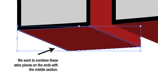 First, make sure the Pathfinder Panel is visible; if it’s not, go to Window > Pathfinder. We want to select all the pieces using the Selection Tool (V) and then, in the Pathfinder Panel, click on the Add to Shape Area button.
Afterwards, change the Fill color to black. Do this for each side that is facing down. You can ignore the curved shapes for now.
Step 8: Adjusting the Curvature of the Letters
Now we can adjust the bends manually on some characters. We’re going to work on the shapes of the “D”, “R”, and “S”. First, select the curve shape, and then duplicate it by going to Edit > Copy (Ctrl/Cmd + C) and then Edit > Paste in Front (Ctrl/Cmd +F). Change the color of the duplicate object to black. Switch to the Pen Tool (P) and click on the anchor points shown below to delete them.
Delete the anchor points until you get half way through the curve. 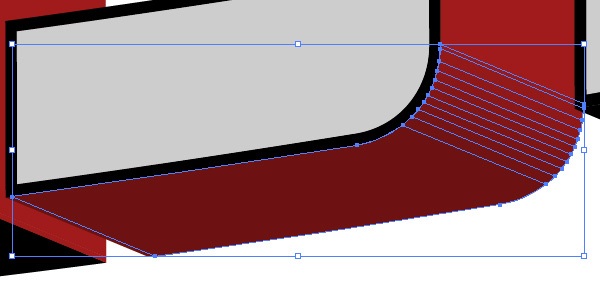
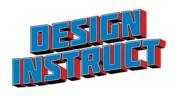
Step 9: Connecting the Red Shadows
Like we did is Step 7 (with the black shadows), we want to select all the red shapes that are next to each other and connect them with the Add to Shape Area command in the Pathfinder Panel. Change the Fill color of the red (#D22323) that we used earlier on.
Step 10: Adding a White Stroke
We want to create a white stroke inside the text, so first, what we want to do is select all the letter faces by holding Shift and clicking on each one to add them to the selection. After selecting all of them, change their Fill color to white. 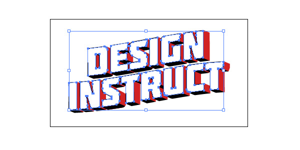 Now go to Object > Path > Offset.
Change the Offset to -2px. Change the color of the new shape created by the Offset command to a blue color.
Step 11: Bringing the 3D Text into Photoshop
We can now bring the text into Photoshop.
To start, create a new 1200x655px document in Photoshop. Bring our text into the Photoshop document by copying it from Illustrator and pasting it into the new Photoshop document. Adjust the size of the text so that it fits comfortably within the canvas.
 Note: Typically, if we are creating a postcard for print, we want to make the document 300 dpi, but for this tutorial, we are going to keep it at 72dpi for file size purposes. To read more about preparing your artwork for print, please read our guide to preparing files for print.
Step 12: Getting Rid of the Blue Parts
Using the Magic Wand Tool (W) with Tolerance at 30, click on the blue part of the text.
Then go to Layer > New > Layer to create a new layer and then fill the selection with black using the Paint Bucket Tool (G). Don’t deselect yet. While we still have the selection, go to Select > Modify > Expand.
Expand the selection by 2px. Switch back to the original text layer and fill the selection with white. This will get rid of the blue color, and we will use the layer with the black fill as a mask for our images later on.
Step 13: Preparing the Background Image
We can now start adding in some photos. Let’s start with the background of our postcard. We are going to use the Field 4 stock photo because it’s a simple image that won’t detract a lot of attention away from our foreground (our 3D text).
Download and open up the field photo in Photoshop. Next, we’re going to adjust the colors of the background image — do so by going to Image > Adjustment > Curves; adjust the curves to what I have below: 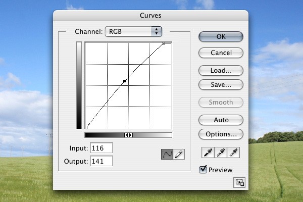 Now we want to adjust the color of the grass to give it a more faded appearance, which will go well with our retro theme. Go to Image > Adjustment > Replace Color.
Hold down Shift and click on the green areas in the canvas until you have selected everything. Press OK when you’re satisfied with the color replacement adjustment. 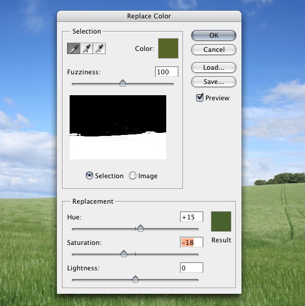 Time to bring the processed field photo into our main Photoshop document; place it as a layer behind the text.
Step 14: Adding the Letters
Let’s start placing photos inside the 3D letters. We are going to do one photo per two letters. Let’s start off with the Rhino 3 stock photo.
Open it up in Photoshop, then bring it into our document. Ctrl-click/Cmd-click on the layer with the black letters (created in Step 12) to load a selection around the letters. Choose the Polygonal Lasso Tool (L) from the Tools Panel, hold down Alt/Option, and then create a shape around all the letters except the first two letters (“D” and “E”).
This will remove the selection around everything except the first two letters. In the Layers Panel, click on the rhino layer and go to Layer > Add Layer Mask >Reveal All. This will make it so the rhino image just shows up within the “D” and “E” letters.
To change the size of the image, click on the link icon between the layer and the mask, then click on the layer. This will allow you to change the size of it using Free Transform (Ctrl/Cmd + T) and move it around within the mask. 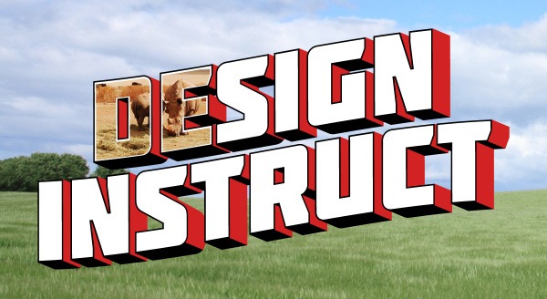 Repeat the same process for the other letters.
You can use the stock images referenced in the Tutorial Resources section above, or use photos of your preference. 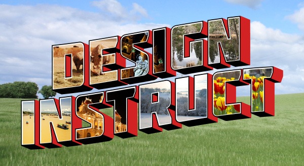
Step 15: Adding a Border to the Canvas
Go to Layer > New > Layer to create a new layer. Go to Select > All (Ctrl/Cmd + A) to load a selection around the canvas.
Go to Edit > Stroke, change the Color to white (#FFFFFF), Width to 20px and Location to Inside. 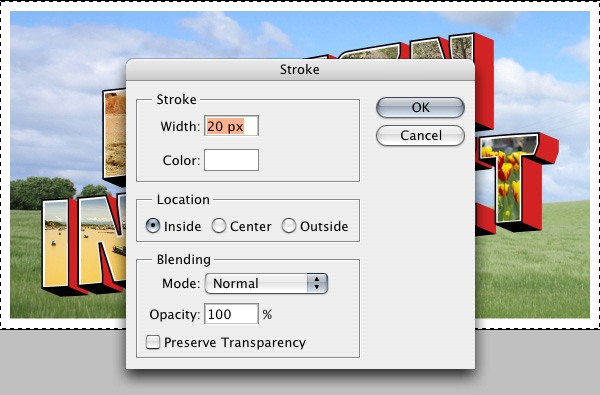
Step 16: Add Greeting Text
Use the Horizontal Type Tool (T) to write out “Greetings From” with the Honey Script font. Change the color to a yellow; you can sample a yellow color from one of the photos using the Eyedropper Tool (I).
We are also going to add a bold, black shadow to the greeting text. With the “Greetings From” text layer the active layer in the Layers Panel, go to Layer > Layer Style > Drop Shadow and then use the following settings: 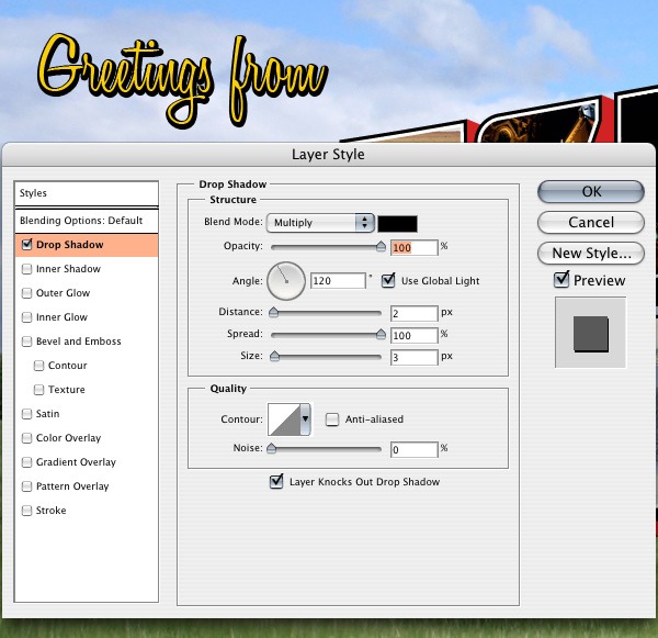
Step 17: Bringing in Some Texture
Now we are going to bring in this Paper Texture to give our piece an aged look. Once you’ve placed it in the Photoshop document, change its layer’s Blend Mode to Linear Burn and Opacity at 50%.
We are going to lighten up the texture a little bit, so go to Image > Adjustments > Curves and using the following settings: 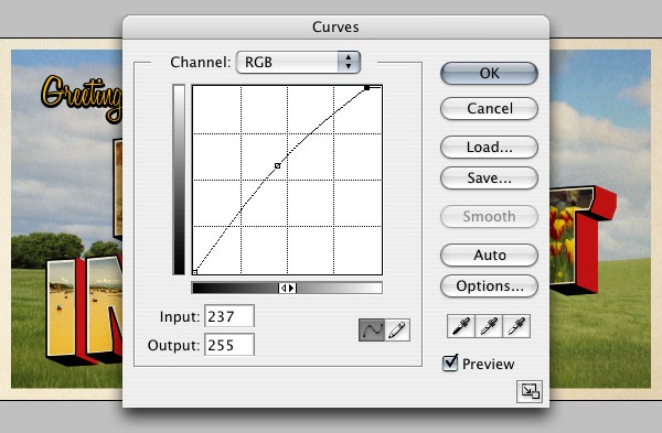
Step 18: Adjusting the Color
Let’s perform some color adjustments. Go to Layer > New Adjustment Layer > Hue/Saturation; use the settings shown in the image below: 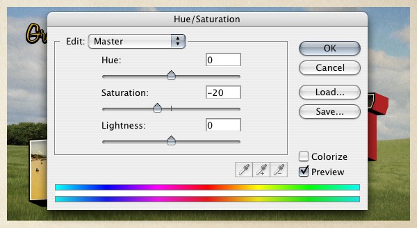 Now go to Layer > New Adjustment Layer > Gradient Map and use the settings shown below:
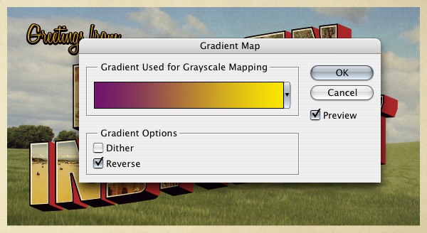
Step 19: Creating a Subtle Vignette
Select the Rectangular Marquee Tool (M) and, in the Options Bar, change Feather to 60px. Create a new layer then drag a box around the whole canvas.
Go to Select > Inverse and fill the inverted selection with black in the new layer, then change the layer’s Blend Mode to Overlay. 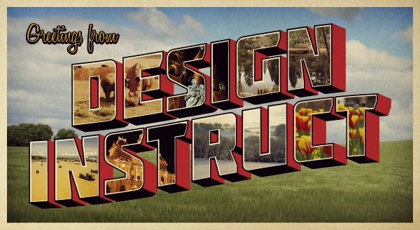
Step 20: Adding Some Light
Finally, we are going to add a little bit of light in the middle of the postcard. Click on the Gradient Tool (G) and, using a white-to-0%-opacity radial gradient, create a small circle with the Gradient Tool in a new layer.
Using Free Transform (Ctrl/Cmd + T), stretch the radial gradient to each side. Afterwards, change the Blend Mode to Soft Light. 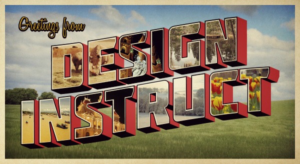
Tutorial Summary
In this tutorial, we created a retro-styled postcard with the help of Illustrator and Photoshop.
We gathered inspiration from existing postcard images, used Illustrator’s powerful vector-drawing capabilities (including the 3D Extrude & Bevel effect) and finished the piece in Photoshop using its handy photo-editing functions. Below is a preview of the final result:
Download Source Files
- retro_3dtext_postcard (ZIP, 11.30 MB)
-
 Trevin serves as the VP of Marketing at WebFX. He has worked on over 450 marketing campaigns and has been building websites for over 25 years. His work has been featured by Search Engine Land, USA Today, Fast Company and Inc.
 -

WebFX is a full-service marketing agency with 1,100+ client reviews and a 4.9-star rating on Clutch! Find out how our expert team and revenue-accelerating tech can drive results for you! Learn more
Make estimating web design costs easy
Website design costs can be tricky to nail down. Get an instant estimate for a custom web design with our free website design cost calculator!
Try Our Free Web Design Cost Calculator
Table of Contents
- Preview
- Tutorial Resources
- Step 1: Finding Inspiration
- Step 2: Setting Up the Text
- Step 3: Adding a Bend to the Text
- Step 4: Change the Stroke and Fill Colors
- Step 5: Make the Text 3D
- Step 6: Adding a Black Stroke
- Step 7: Add a Black Shadow
- Step 8: Adjusting the Curvature of the Letters
- Step 9: Connecting the Red Shadows
- Step 10: Adding a White Stroke
- Step 11: Bringing the 3D Text into Photoshop
- Step 12: Getting Rid of the Blue Parts
- Step 13: Preparing the Background Image
- Step 14: Adding the Letters
- Step 15: Adding a Border to the Canvas
- Step 16: Add Greeting Text
- Step 17: Bringing in Some Texture
- Step 18: Adjusting the Color
- Step 19: Creating a Subtle Vignette
- Step 20: Adding Some Light
- Tutorial Summary
- Download Source Files
Share this article


Web Design Calculator
Use our free tool to get a free, instant quote in under 60 seconds.
View Web Design CalculatorMake estimating web design costs easy
Website design costs can be tricky to nail down. Get an instant estimate for a custom web design with our free website design cost calculator!
Try Our Free Web Design Cost Calculator