
There are many ways you can present numerical, chartable data by styling elements using CSS and data visualization tools. Using CSS to style your data prevents you from relying on static images and increases your content’s accessibility.
Below, you’ll read about 8 excellent techniques for styling elements into beautiful, accessible charts and graphs.
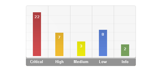
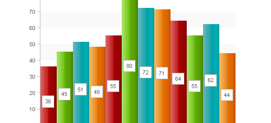
1. CSS for Bar Graphs
 View Demo
This tutorial showcases three ways of graphing data. The Basic CSS Bar Graph example involves a <div> to contain the graph, and styling a <strong> element as a block element and using percentage widths to adjust the width. A great modification of this technique is to use a paragraph <p> element instead of a <strong> tag for semantically-correct HTML.
The two other examples use a definition list and unordered list to graph multiple bars.
2. Accessible Data Visualization with Web Standards
 View Demo #1 – View Demo #2 – View Demo #3
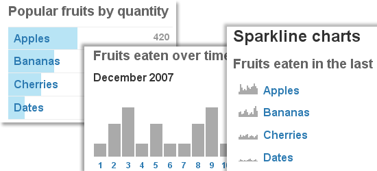
Author Wilson Miner discusses the concept of accessible, standards-compliant techniques for data visualization mentioning the benefits, limitations, and alternatives in brief. The A List Apart article shows you three data visualization techniques using a basic structure of unordered lists.
3. CSS Vertical Bar Graphs
Eric Meyer shows us another technique for graphing vertical bar graphs using unordered lists similar to the “CSS for Bar Graphs” technique from Apples To Oranges.
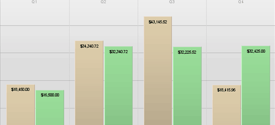
4. Creating a Graph Using Percentage Background Images
In this technique, you use pre-made background images to shade in the appropriate data. The downside of this technique is that you’re limited by the pre-filled background images that you have and making more to suit your needs will increase the amount of classes you assign to your data – increasing the file size of both your CSS and HTML file as well as increasing the number of HTTP connections needed to render the page because of the background images.
5. Pure CSS Data Chart
This example uses a definition list for mark-up. A <span> element inside the <dd> definition list item serves as the element that gets adjusted in height to shade the appropriate area. An <em> element is used to display the numerical representation of the shaded area, absolutely-positioned in the middle of the bar.
6. CSS Scatter Plot
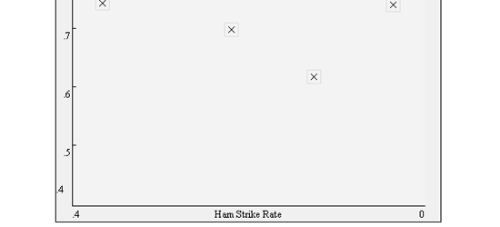
A scatter plot is another great way to graph two-dimensional data. In the example, each data point is clickable, so a possible modification to this technique is to use a modal window that displays extra information about a particular data point.
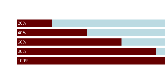
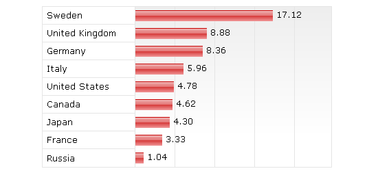
7. Definition List Bar Chart
This technique shows two examples of styling definition lists into horizontal bar charts. Each definition list item is assigned a class that adjusts its width using percentage units.
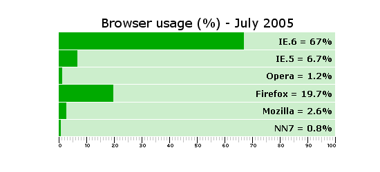
8. Accessible Bar Chart
This technique showcases a method for semantic, accessible bar charts by using a table as the basic structure of the bar graph and using CSS to stretch a background image to its appropriate width.
Related Posts
-
 President of WebFX. Bill has over 25 years of experience in the Internet marketing industry specializing in SEO, UX, information architecture, marketing automation and more. William’s background in scientific computing and education from Shippensburg and MIT provided the foundation for MarketingCloudFX and other key research and development projects at WebFX.
 -

WebFX is a full-service marketing agency with 1,100+ client reviews and a 4.9-star rating on Clutch! Find out how our expert team and revenue-accelerating tech can drive results for you! Learn more
Make estimating web design costs easy
Website design costs can be tricky to nail down. Get an instant estimate for a custom web design with our free website design cost calculator!
Try Our Free Web Design Cost Calculator
Share this article


Web Design Calculator
Use our free tool to get a free, instant quote in under 60 seconds.
View Web Design CalculatorMake estimating web design costs easy
Website design costs can be tricky to nail down. Get an instant estimate for a custom web design with our free website design cost calculator!
Try Our Free Web Design Cost Calculator


