
 In the first part of this series, we discussed some fundamental concepts pertaining to CSS typography. Now we are going to cover some excellent techniques, tips, tricks and best practices for dealing with typography on websites. This is the second part of a three-part series of guides on CSS typography that will cover everything from basic syntax to best practices and tools related to CSS typography.
- CSS Typography: The Basics
- CSS Typography: Techniques and Best Practices
- CSS Typography: Examples and Tools
Better Web Typography with @font-face
For normal text blocks, using smart font stacks (as discussed in the first part) is a good idea, but for headings and short text blocks, more interesting fonts can be used with the help of @font-face. When implemented correctly, @font-face is compatible with a wide range of browsers — yes, even IE. Just include a copy of the font’s file on your web server and use the @font-face rule in your CSS code as follows:
@font-face { font-family: CurlzMTRegular; src: url(fonts/CurlzMTRegular.eot); }Then just use the font-family declared above with your CSS:
h1, h2, h3, h4, h5, h6 { /* Always use a font stack, even with custom web fonts! */ font-family: CurlzMTRegular, Helvetica, Arial, sans-serif; }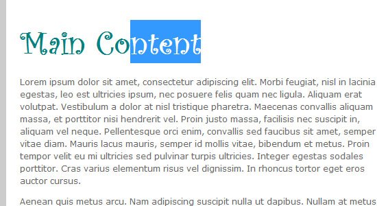 While IE4+ does support
 @font-face, the font does need to be in the .eot file format. Easy enough — just run any font of your choice through this converter first: ttf ? eot Convertor.
For more information on @font-face, please read the following:
For easier implementation of @font-face, check out Font Squirrel’s @font-face generator.
Vertical Rhythm
Designing web typography is all about legibility and readability. A leading factor for great legibility and readability is how the text flows vertically on the page. Is the text too squished together, or is it too far apart?
This is where an understanding and practical implementation of vertical rhythm can come in handy. Vertical rhythm is the spacing and arrangement of text as the user reads down the page. 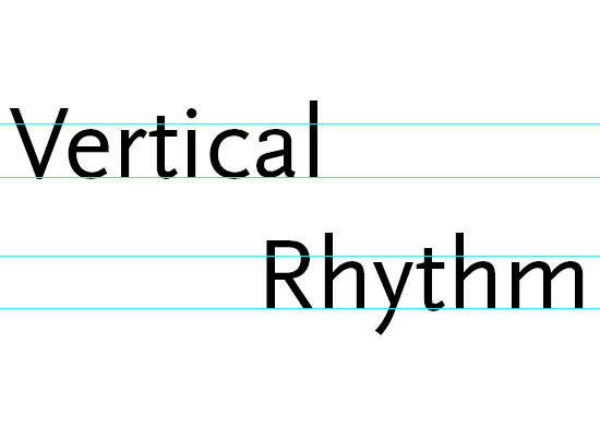 Source: Get The Eye Vertical rhythm deals primarily with
 font-size and line-height, but also top/bottom margins and padding.
The concept of vertical rhythm is simple: Line heights, margins, and padding should all be equal or within even proportion. Here’s an example:
p, ol, ul, blockquote, pre, code { line-height: 18px; margin-bottom 18px; /* 1.5em provides good vertical spacing ( = 150% of the font-size) */ line-height: 1.5em; margin-bottom: 1.5em; }Consider top margins and padding with blocks of text (e.g. paragraphs, lists, block quotes), as well as with images and other block-level elements.
Try to use the same line-height or use multiples of it (e.g.18px, 32px, 64px, and so on for the example above). Even proportions are easy to do with a bit of math. Let’s try to figure out what the line-height should be in the following example.
h1 { font-size: 2em; line-height: ?; }If the line-height for the body is set to 1.5em, then we just need to divide that by our font-size to maintain the proportion: 1.5em/2em = 0.75em.
h1 { font-size: 2em; line-height: 0.75em; }For font sizes bigger than the line-height, line-height must be decreased to match the baseline grid.
For font sizes smaller than the line-height, we must increase the line-height. We can determine the line-height for smaller font sizes with the same bit of math. Let’s try this again, but this time, our font-size is smaller than the body element’s line-height.
h2 { font-size: .7em; line-height: ?; }If the body‘s line-height is still 1.5em, then we’ll take it and divided by our font-size: 1.5em/.7em = 2.14em.
h2 { font-size: .7em; line-height: 2.14em; }For more information on creating baseline or vertical rhythm in web page layouts, look through the resources listed below.
There is also a handy vertical rhythm generator, just in case you don’t want to do all that math.
- Compose to a Vertical Rhythm
- Get the Eye – Vertical Rhythm
- Setting Type on the Web to a Baseline Grid
Working with Text and Whitespace CSS Properties
@font-face and vertical rhythm can sometimes get overwhelming, so let’s slow things down a bit and get back to some basic techniques.
Text CSS Properties
The CSS text property group contains several properties for dealing with the style of text. Having a good understanding of these properties can help bring blocks of text in your designs to a more user-friendly level. Here are some text CSS properties (their names are self-evident to what they’re for):
text-align: values can beleft,center,right, orjustifytext-decoration: values can beoverline,line-through, orunderlineorblinktext-transform: values can beuppercase,lowercase, orcapitalize
Let’s see how one of these properties works by way of an example. In the following example, we will indent the beginning of all paragraphs:
p { text-indent: 3em; }
Text Direction
You can set the direction of the text by using the direction property. The default direction is ltr, which is short for left to right.
Suppose we wanted to reverse that, then we can set direction to rtl.
p { direction: rtl; }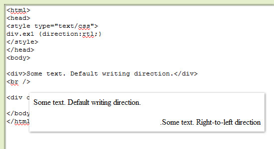 The
The direction property is not very popular because it has a very specialized purpose, but it can come in handy when working with other written languages. Many middle eastern languages, for example, are read right to left.
White-space, Letter-spacing, and Word-Spacing
These properties provide spacing between words and letters. The white-space property controls how text wraps inside of its parent element.
Values can be normal, nowrap, pre, pre-line, pre-wrap and inherit. The word-spacing property affects the space in between words. Values can take any CSS unit of measurement (such as 0.5em or 5px).
The letter-spacing property is similar to the word-spacing property, however, it deals with the spacing in between individual characters instead. Values of this property can take any CSS unit of measurement.
Text Shadows
CSS3 gives us a few more CSS properties for use on web typography. One property that’s a new addition to CSS is text-shadow.
Here’s the style rule for giving paragraphs a nice text shadow.
p { text-shadow: 1px 1px 1px #000; } From: Neutron Creations To create inset text, you can use negative values as such:
h1 { /* Use negative offsets to create inset text. */ text-shadow: #000 -1px -1px 0;}To see text-shadow in action, check out this tutorial on how to create inset typography using CSS3.
CSS Typography Best Practices
What follows is a review of best practices that we’ve already covered, as well as a few additional ones. The key concept to keep in mind is that CSS typography is all about creating readable type that improves the user experience.
Serif or Sans serif?
There isn’t any conclusive study that indicates one group of type is more legible than the other.
What affects legibility the most are the CSS properties we have discussed, such as font-size and letter-spacing. For serif fonts, use more line-height, letter-spacing, and perhaps even word-spacing because serif fonts need some space to breathe and express their curvatures. For sans serif fonts, the simpler font style can allow for tighter spacing and smaller font sizes with the least negative effect on legibility.
Semantic Markup
Always use proper markup.
For example, use <strong> instead of <b> and <em> instead of <i>, then use CSS to style them. Use headings (h1-h6) appropriately: to delineate sections of your content into logical groups. Using <h2> after <h1> means that the section that follows is a sub-section of <h1>.
Use CSS to style them any way you want, but keep your markup semantic. Use HTML tags to add value to the content of the HTML document, and use CSS to visually style them. For example, use <small> instead of <p class="smalltext">.
Create Baseline Styles
It’s always good practice to reduce the guessing game that browsers play when they can’t find a style rule for a particular element.
Don’t forget to style basic HTML elements.
h1, h2, h3, h4, h5, h6 { } p { } ol, ul { } a { } blockquote { } pre, code { } small { }Use 1.5em for Line-Height
1.5em is the most common and recommended baseline line-height; it states that the line-height is +50% of the text’s font-size, giving blocks of text some vertical breathing room. This isn’t to say that any other line-height value is bad; but when in doubt, 1.5em is a safe bet. Using a relative unit of measurement for line-height also takes out the math involved in having to figure out the corresponding line-height, as shown in this example:
p { font-size: 12px/1.5em; }For a 12px font-size, an 18px line-height could be used to achieve the exact same result, but then you would have to recalculate what that value would be if your font-size changes for other elements.
Use Shorthand CSS
Always use shorthand wherever you can as it’s the conventional way of writing CSS nowadays.
Here is the shorthand structure for the font property:
font: [font-style] [font-size]/[line-height] [font-family 1, font-family 2, ..., font-family n]
For example:
p { font: normal 12px/1.5em Arial, Helvetica, sans-serif; }Conclusion
In this part, we covered some techniques, tricks, and best practices for CSS typography. In the next part, we will present you with some examples of great CSS typography as well as some tools that you can use to make your life easier.
- CSS Typography: The Basics
- CSS Typography: Techniques and Best Practices
- CSS Typography: Examples and Tools
Related Content
-
 President of WebFX. Bill has over 25 years of experience in the Internet marketing industry specializing in SEO, UX, information architecture, marketing automation and more. William’s background in scientific computing and education from Shippensburg and MIT provided the foundation for MarketingCloudFX and other key research and development projects at WebFX.
 -

WebFX is a full-service marketing agency with 1,100+ client reviews and a 4.9-star rating on Clutch! Find out how our expert team and revenue-accelerating tech can drive results for you! Learn more
Make estimating web design costs easy
Website design costs can be tricky to nail down. Get an instant estimate for a custom web design with our free website design cost calculator!
Try Our Free Web Design Cost Calculator
Share this article


Web Design Calculator
Use our free tool to get a free, instant quote in under 60 seconds.
View Web Design CalculatorMake estimating web design costs easy
Website design costs can be tricky to nail down. Get an instant estimate for a custom web design with our free website design cost calculator!
Try Our Free Web Design Cost Calculator


