

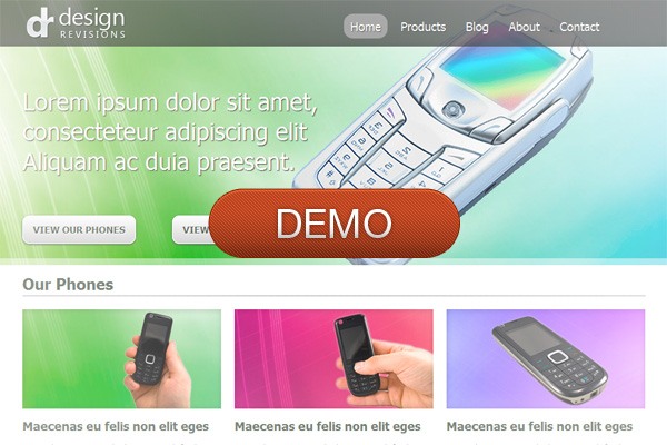
Preview

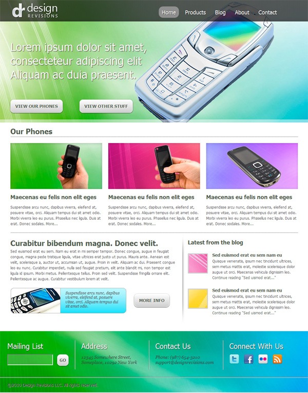
Demo
This tutorial is Part 2 of a tutorial series that walks you through the design and coding of a vibrant and professional web layout. Part 1 dealt with designing the web layout in Photoshop.
- Part 1: Create a Vibrant Professional Web Design in Photoshop
- Part 2: Code a Vibrant Professional Web Design with HTML5/CSS3
Groundwork
Let’s begin by laying out some groundwork.
HTML5
We’ll use HTML5 for our markup. If you’re not familiar with HTML5 yet, check out the following resources below:
- The Only HTML5 Resources You Need for Getting Up to Speed
- HTML5 differences from HTML4
- Dive Into HTML5
CSS3
We’ll use a few CSS3 properties to make our lives a little easier in styling the layout. This means not having to use background images for rounded corners and instead using the border-radius property to achieve the same thing in less time and with less markup and page weight (making our web page faster). Here are some resources to read and review regarding CSS3:
- Basic CSS3 Techniques That You Should Know
- CSS3 Techniques You Should Know
- 3 Advanced CSS3 Techniques You Should Learn
960 Grid System Framework
We’ll use the 960 Grid System CSS framework in laying out the structure of the web page. Check out this crash course guide called The 960 Grid System Made Easy.
Gut-Check
To minimize your head-scratching moments as you read through this HTML5/CSS3 tutorial, I recommend that you read up on the resources I’ve suggested above. I’ll still explain here and there as we go along, so don’t worry if you’re not an expert with these upcoming standards, but I’ll also assume that you already know at least the fundamentals of HTML5 and CSS3. Also, the 960 Grid System is an integral part of this tutorial, and it’ll take you just a few moments of your time to learn it if you read the guide I referenced above.
Step 1: Create the Basic Containers and References
If you’re ready, let’s proceed by completing the HTML5 markup first, without giving any thought to styling at this point to make sure that our markup is semantic and logically arranged for screen-reading users. Let’s start by first creating the main containers for the different sections, and referencing our stylesheets:
<!DOCTYPE HTML> <html lang="en"> <head> <meta charset="UTF-8"> <title>Slick Web Layout</title> <link rel="stylesheet" href="css/reset.css" /> <link rel="stylesheet" href="css/text.css" /> <link rel="stylesheet" href="css/960.css" /> <!--[if lt IE 9]> <script src="http://html5shim.googlecode.com/svn/trunk/html5.js"></script> <![endif]--> </head> <body> <header id="main-header"> <h1 id="logo"><a href="#">Design Revisions</a></h1> <nav id="main-nav"><h1>Main page navigation</h1></nav> </header> <section id="featured"> <div id="descrp"></div> </section> <section id="more-products"> <h1>Our phones</h1> <div class="product"></div> <div class="product"></div> <div class="product"></div> </section><!--#more-products--> <section id="more-blurb"> <div id="blurb"></div> <div id="blog"></div> </section> <footer id="main-footer"> <section class="footersub"></section> <section class="footersub"></section> <section class="footersub"></section> <section class="footersub"></section> <section id="copyright-info"></section> </footer> </body> </html>
Code Explanation
I placed all stylesheets inside a directory called css/. You will need to download the 960 Grid System, extract the contents from the ZIP archive and place 960gs.css inside the your CSS folder.
This is a vital part to the web design process. The reset.css of our document is not the reset stylesheet that comes with the 960 Grid System. As of this writing, the 960 Grid System is not yet updated for HTML5, so some HTML5 structural tags (e.g.
<header>, <footer>) are not yet covered by it. The reset.css comes from the one proposed by Richard Clark of HTML5 Doctor, which I found sufficient for the job. Here is the HTML5 Reset Stylesheet for you to download.
I’ve included the HTML5-enabling script, HTML5 shiv, which you can see inside IE conditional comments. HTML5 shiv was created by Remy Sharp to prevent IE browsers (8 and lower) from breaking when using these new HTML elements. We’re serving it directly off Google Code to take advantage of their infrastructure and increase the chances the script’s already cached in the user’s browser (speeding up the perceived performance of our web page for those users).
The rest should be pretty self-explanatory: using <nav>, <header>, <section>, <footer>, and so on for the different containers of our layout.
Step 2: Add Some Content
We can now insert the content inside our containers, now that we have the basic structure of our HTML document.
<body> <header id="main-header"> <h1 id="logo"><a href="#">Design Revisions</a></h1> <nav id="main-nav"> <h1>Main page navigation</h1> <ul> <li><a href="#" class="current">Home</a></li> <li><a href="#">Products</a></li> <li><a href="#">Blog</a></li> <li><a href="#">About</a></li> <li><a href="#">Contact</a></li> </ul> </nav> </header> <section id="featured"> <div id="descrp"> <h1>Lorem ipsum dolor sit amet, consecteteur adipiscing elit Aliquam ac duia praesent.</h1> <p class="button"><a href="#">View our phones</a></p> <p class="button"><a href="#">View other stuff</a></p> </div> </section> <section id="more-products"> <h1>Our phones</h1> <div class="product"> <figure> <img src="img/phone1.jpg" width="300" height="150" alt="phone number one" /> <figcaption> <h3>Maecenas eu felis non elit eges</h3> <p>Suspendisse arcu nunc, dapibus viverra, eleifend at, posuere vitae, orci. Aliquam tempus dui sit amet odio. Morbi viverra leo eu purus. Phasellus nec ligula. Duis at erat. Donec sodales.</p> </figcaption> </figure> </div> <div class="product"> <figure> <img src="img/phone2.jpg" width="300" height="150" alt="phone number two" /> <figcaption> <h3>Maecenas eu felis non elit eges</h3> <p>Suspendisse arcu nunc, dapibus viverra, eleifend at, posuere vitae, orci. Aliquam tempus dui sit amet odio. Morbi viverra leo eu purus. Phasellus nec ligula. Duis at erat. Donec sodales.</p> </figcaption> </figure> </div> <div class="product"> <figure> <img src="img/phone3.jpg" width="300" height="150" alt="phone number three" /> <figcaption> <h3>Maecenas eu felis non elit eges</h3> <p>Suspendisse arcu nunc, dapibus viverra, eleifend at, posuere vitae, orci. Aliquam tempus dui sit amet odio. Morbi viverra leo eu purus. Phasellus nec ligula. Duis at erat. Donec sodales.</p> </figcaption> </figure> </div> </section><!--#more-products--> <section id="more-blurb"> <div id="blurb"> <h1>Curabitur bibendum magna. Donec velit.</h1> <p>Sed euismod erat eu sem. Nam eu erat in mi semper tempor. Donec congue, augue in feugiat congue, magna pede tristique ligula, vitae ultrices erat justo ut purus. Mauris ante. Aenean est velit, scelerisque a, auctor ut, accumsan ut, augue. Proin in velit. Aliquam ac dui. Praesent congue leo eu nunc. Curabitur imperdiet, nulla sed feugiat pretium, elit ante blandit mi, non tempor est ligula id ipsum. Morbi metus. Pellentesque tellus. Proin sed velit. Suspendisse fringilla ornare elit. Pellentesque ac augue. Curabitur vestibulum lorem at velit.</p> <div id="blurb-widget"> <img src="" width="" height="" alt="" /> <p>Suspendisse arcu nunc, dapibus viverra, eleifend at, posuere vitae, orci. Aliquam tempus dui sit amet odio.</p> <p class="button">more info</p> </div><!--#blurb-widget--> </div><!--#blurb--> <div id="blog"> <h1>Latest from the blog</h1> <article> <h1><a href="#">Sed euismod erat eu sem nam eu</a></h1> <p>Quisque venenatis, ipsum nec tincidunt ultrices, sem metus mattis erat, molestie scelerisque dolor augue ut orci. Maecenas vehicula dignissim leo. <a href="#">Continue reading...</a></p> </article> <article> <h1><a href="#">Sed euismod erat eu sem nam eu</a></h1> <p>Quisque venenatis, ipsum nec tincidunt ultrices, sem metus mattis erat, molestie scelerisque dolor augue ut orci. Maecenas vehicula dignissim leo. <a href="#">Continue reading...</a></p> </article> </div><!--#blog--> </div><!--#more-blurb--> <footer id="main-footer"> <section class="footersub"> <h1>mailing list</h1> <input type="email" /> </section> <section class="footersub"> <h1>address</h1> <p>12345 Somewhere Street, Someplace, 10292 New York</p> </section> <section class="footersub"> <h1>contact us</h1> <p>Phone: (987) 654-3210</p> <p>[email protected]</p> </section> <section class="footersub"> <h1>connect with us</h1> <p class="icon"><a href="#"><img src="" width="" height="" alt="" /></a></p> <p class="icon"><a href="#"><img src="" width="" height="" alt="" /></a></p> <p class="icon"><a href="#"><img src="" width="" height="" alt="" /></a></p> <p class="icon"><a href="#"><img src="" width="" height="" alt="" /></a></p> </section> <section id="copyright-info"> <small>©2010 Design Revisions LLC. All rights reserved.</small> </section> </footer> </body> </html>
Code Explanation
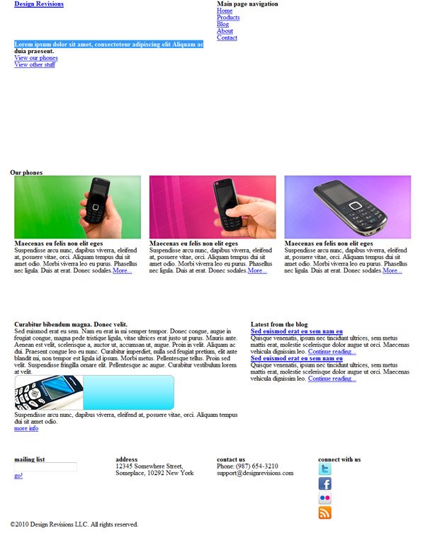
Nothing too exciting here; just some dummy content to fill out our page. This is a good point to stop and look at how our site looks unstyled to see how accessible it will be when read by screen-readers. 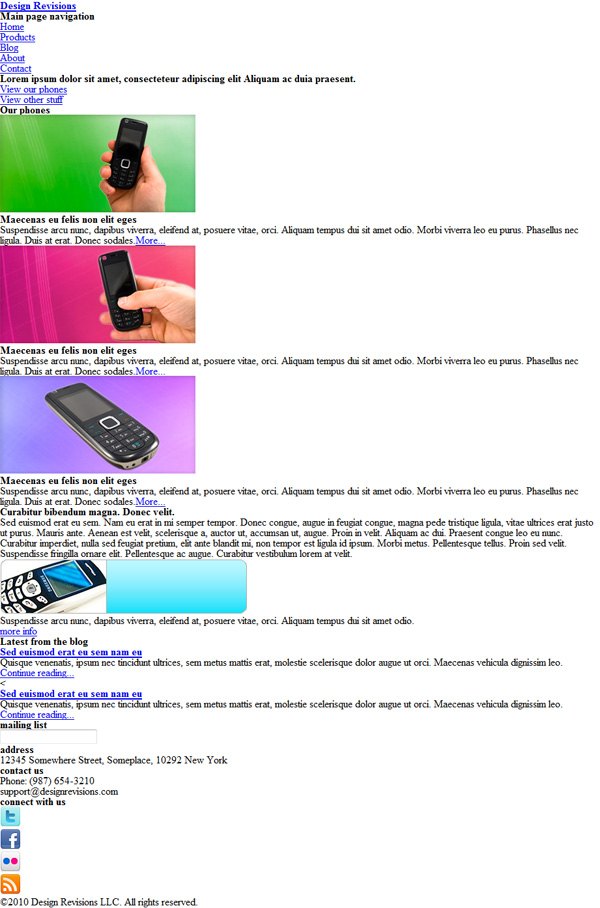 Example 1: HTML document without CSS Keep in mind that we need to be flexible with our final markup, as we’ll most likely need to tweak it later on to achieve the look of our original design.
Step 3: How the 960 Grid System Will Be Implemented
With the markup finished, let’s now take a look at how we’ll apply the 960 Grid System classes to our design.
The layout we created in Part 1 has 5 major sections: the header, Featured, More Products, More Blurb, and the footer. You’ll also see that these major sections are further sub-divided into several sub-sections. Here is a basic guide on how we will implement 960 GS.
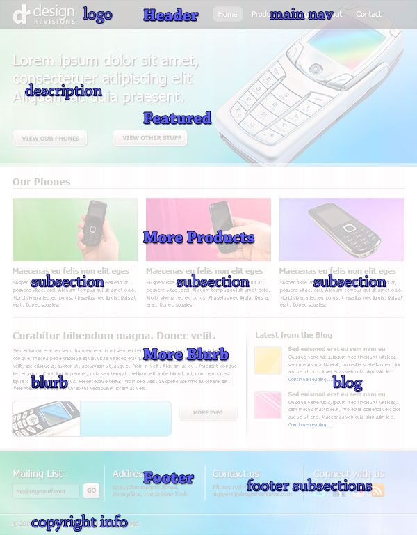
Layout Explanation
We’re using 960 GS’s 12-column variant, so we need to add a container_12 class to the containers of each section in our markup later. For the header, we can see that the site name/logo occupies 2 columns; and after that, 4 blank columns (before the navigation area starts). We’ll give the site name/logo sub-section a class of grid_2 suffix_4 (note the class double-declaration).
The navigation occupies 6 columns of width, so we’ll give it a grid_6 class.  Our Featured section has two areas: the description at the left (with the buttons), and the large phone at the right. Although both occupy 6 columns, and each could be given a class of
 grid_6, I decided to set the large phone as a background image using CSS, and just let the description and the buttons stay in the markup.
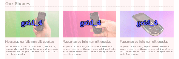
We’ll give the left section a class of grid_6 suffix_6.  In our More Products section (it has the heading of “Our Phones”) it’s easy to see that each phone and its description occupy 4 columns each. We’ll assign
 grid_4 to each of these sub-sections.
 The More Blurb section has two sub-sections: the blurb section, which contains a further blurb-widget sub-section (not shown below) and the blog sub-section. The blurb-widget sub-section spans 7 grids (
grid_7), and the blog sub-sections, 5 grids (grid_5). 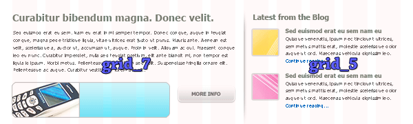 Finally, we’ll give our 4 footer sub-sections a class of
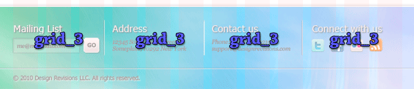
 grid_3 each, as each is occupying 3 columns.
 I’ll be referring to these classes later on, and if you need a refresher, just scroll back up here. If all of that sounded like a foreign language to you, read this guide on 960 GS.
Step 4: Slicing the PSD
Let us grab some graphics from our PSD layout in Part 1, which you can download if you don’t want to run through the Photoshop part of this tutorial series.
Basic PSD Slicing Technique
- Load a selection around the area with the Rectangular Marquee Tool (M)
- Copy it (Ctrl/Cmd + C)
- Create a new Photoshop document (Ctrl/Cmd + N); the Width and Height of the canvas of the new document will automatically be filled in with the dimensions of the copied area that’s in your clipboard
- Paste the copied area into the new document
- Go to File > Save for Web & Devices (Alt/Option + Shift + Ctrl/Cmd + S) and save it into the image directory (which I have called img/)
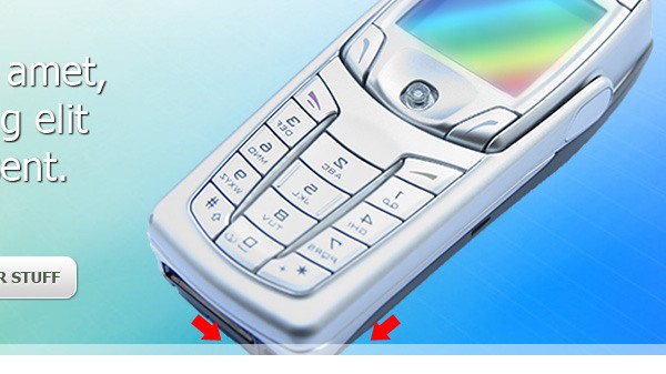
Slicing the Site Name/Logo
First, consider our site name/logo: We’ll use PNG-24 as our image format for alpha transparency (if you care about IE6 and lower, you can use a JavaScript library like IE PNG Fix to support it). 
Slicing the Background Artwork
Next, let’s slice the background artwork in the header/Featured and footer sections (header/Featured slice shown below). Nothing special to note here except that you should maintain the background images’ sizes: 1920x400px for the header, and 1920x for the footer.
You’ll also have to turn off some layers to isolate the background. 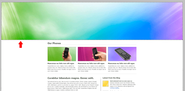
What About the UI Buttons?
You can either save the button as JPGs and set them as CSS background images or use CSS3 properties for gradients and rounded corners. We’ll do CSS3 of course; it’s more fun.
Slicing the Phone Images
There are 5 phone images in this layout, and we need to save each one of them for the web, along with the thumbnails in the blog section. Save the large phone as a PNG file to maintain its transparent background, save the 3 phones in the More Products section and the one at the More Blurb section with their backgrounds as JPEGs. 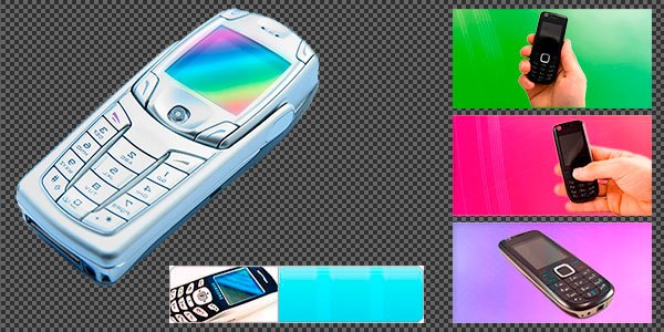
Slicing the Dividers/Separators
Finally, we also need to save the vertical separator in the More Blurb section as an image.
We can probably do this in CSS3 using box-shadow and gradient properties with some loss in the design comp’s fidelity, but let’s go the traditional route for this one so that we can get this detail exactly the way it is in the design. 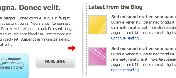 As for the horizontal and vertical dividers in the footer, we could simply replicate that effect through CSS3, so there’s no need to slice those.
What You Should Have
After all that slicing and dicing, you should have the following (similarly named) images in your img/ directory:
- logo.png
- header-bg.jpg
- footer-bg.jpg
- large-phone.png
- phone1.jpg, phone2.jpg, phone3.jpg, phone-widget.jpg thumbnail1.jpg, thumbnail2.jpg
- vert-separator.jpg
If you would like to know about saving images for the web in the context of Photoshop, read The Comprehensive Guide to Saving Images for the Web. If you would like to know about PNG, read the Web Designer’s Guide to PNG Image Format.
Step 5: Implementing the 960 GS Classes
Now that we have our images ready, let’s start assigning the classes to our containers, and visualize how our document would look with the 960 GS classes applied. First, review the 960 GS classes we planned out in Step 3 if you need to, and then let’s apply them to our markup.
I’ll remove some of the HTML elements so that we can better visualize our 960 GS containers. Note that only the relevant code will be shown from now on so we can focus on the particular section of the project.
<body> <header id="main-header" class="container_12 clearfix"> <h1 id="logo" class="grid_2 suffix_4"><a href="#">Design Revisions</a></h1> <nav id="main-nav" class="grid_6"><h1>Main page navigation</h1></nav> </header> <section id="featured" class="container_12 clearfix"> <div id="description" class="grid_6 suffix_6"> <h1>Lorem ipsum dolor sit amet, consecteteur adipiscing elit Aliquam ac duia praesent.</h1> <p class="button"><a href="#">View our phones</a></p> <p class="button"><a href="#">View other stuff</a></p> </div> </section> <section id="more-products" class="container_12 clearfix"gt; <h1>Our phones</h1> <div class="product grid_4"> ... </div> <div class="product grid_4"> ... </div> <div class="product grid_4"> ... </div> </section><!--#more-products--> <section id="more-blurb" class="container_12 clearfix"> <div id="blurb" class="grid_7"> ... <div id="blurb-widget"> ... </div> </div> <div id="blog" class="grid_5"> <h1>Latest from the blog</h1> ... </div> </section> <footer id="main-footer" class="container_12 clearfix"> <section class="footersub grid_3"> ... </section> <section class="footersub grid_3"> ... </section> <section class="footersub grid_3"> ... </section> <section class="footersub grid_3"> ... </section> <section id="copyright-info" class="container_12"> ... </section> </footer> </body> </html>
 Example 2: HTML document with 960 GS classes applied Not very pretty. But hey, with just a few 960 GS classes assigned to our containers, our design components are now starting to line up (mostly) according to our design.
Step 6: Setting Heights of Containers with CSS
Let’s take our site build a bit further. Through CSS, I’ll assign heights to our containers to bring our web page closer to the original design comp.
#hfwrap {height:400px;} #main-header {height:70px;} #more-products {height:360px;} #more-blurb {height:320px;} #main-footer {height:200px;}Note that I added a wrapping div around the header and Featured sections (#hfwrap) where we can attach our large background image later.
 Example 3: Containers with heights Just let your imagination work for a little bit and you’ll see that already we’ve got the proper containers in place. All we have to do now is style each of the sections further to achieve the exact look of our design. And that’s what we’ll do next.
Step 7: Styling the Header
You probably noticed from the start that we have graphical elements outside of our 960px boundaries (e.g.
the large background images in the header and footer, the dark background of the logo and navigation, and so on). So how do we deal with these elements since we are obviously confined to just a width of 960px? One way of solving this problem is by determining how many elements over 960px need to be accounted for, and then creating wrapping divs outside the 960 GS containers so that they won’t be affected by the fixed widths of the system.
In our example, we have a large background image that spans the header and Featured sections. Also, we have a dark horizontal bar that serves as a background for our site name/logo and navigation menu. Thus, we could add 2 properly-placed wrapping divs, like so:
<div id="hfwrap"> <div id="lnwrap"> <header id="main-header" class="container_12 clearfix"> ... </header> </div><!--lnwrap--> <section id="featured" class="container_12 clearfix"> ... </section> </div><!--hfwrap-->
As an aside, #hfwrap stands for header-featured wrapper, while #lnwrap for logo-navigation wrapper. Hey, they make sense to me!
We can now set our first two background images (the abstract art in the header, and the dark background of the dark bar at the top) to these wrapping divs:
#hfwrap {width:100%; background:url(img/header-bg.jpg) no-repeat; height:400px} #lnwrap {width:100%; background:url(img/nav-bg.png) repeat-x;}Let’s set the style for our site name/logo and navigation. For the header part of our page, here’s our CSS:
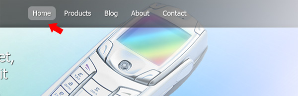
/* @header =======================*/ #logo { background:url(img/logo-site-hl.png) no-repeat; text-indent:-7777em; } #logo a { display:block; width:167px; height:71px; } #main-nav h1 {text-indent:-7777em;} #main-nav li { float:left; display:inline; margin: 5px 5px 0 5px; text-transform:capitalize; } #main-nav li a { display:block; padding:5px 10px; color:#fff; font:18px/1.5 Tahoma, Geneva, sans-serif; text-decoration:none; text-shadow:1px 1px 1px #333; filter:dropshadow(color=#333, offx=1, offy=1); } #main-nav .current a, #main-nav li:hover > a { background:#8f8f8f; -webkit-border-radius: 0.8em; -moz-border-radius: 0.8em; }Code Explanation
We use the text-shadow and border-radius CSS3 property for the hover effects on the navigation. This saves us from messing around with background images and extraneous markup that’s needed to support flexible rounded corner elements.
 Example 4: Header with CSS
Step 8: Working on the Featured Section
Up next: The description beside the large phone and the two buttons below them. As I’ve mentioned earlier, I decided to make the large phone a background image so we’ll create another container to hook the image to. We’ll also create pure CSS3 buttons that looks very similar to our design (with very little loss in the fidelity of our design).
First, here’s how I’ve modified the HTML for the Featured area:
<div id="hfwrap"> <div id="hfwrap2"> <div id="lnwrap"> <header id="main-header" class="container_12 clearfix"> <h1 id="logo" class="grid_2 suffix_4"><a href="#">Design Revisions</a></h1> <nav id="main-nav" class="grid_6"> ... </nav> </header> </div><!--lnwrap--> <section id="featured" class="container_12 clearfix"> <div id="descrp" class="grid_6 suffix_6"> ... </div><!--#descrp--> </section> </div><!--hfwrap2--> </div><!--hfwrap-->
Code Explanation
I just added a new container, #hfwrap2, directly below #hfwrap.
I tried using CSS3 multiple background images for this, but I can’t get it to work on Chrome 7 and Firefox 3.6. At least this “old-school” technique still works! It would now be easy to show our large phone background image:
#hfwrap2 { height:400px; width:100%; background:url(img/large-phone.png) no-repeat 76% 0; }The let’s add some code for our main description text:
/* @featured =======================*/ #descrp { position:relative; top:60px; } #descrp h1 { font:normal 36px/1.25 Tahoma, Arial, Helvetica, sans-serif; color:#fff; text-shadow: #333 1px 1px 1px; } #descrp p { padding-top:60px; float:left; margin-right:55px; }Step 9: Creating CSS3 UI Buttons
Let’s create the UI buttons using CSS.
.button a { padding:10px 15px; text-transform:uppercase; font:14px/1.5 Tahoma, Geneva, sans-serif; font-weight:bold; display:block; text-align:center; color:#505b4d; /*background gradients */ background:#cfcfcf; background:-webkit-gradient(linear, left bottom, left top, color-stop(0, rgb(207,207,207)), color-stop(1, rgb(255,255,255))); background:-moz-linear-gradient(center bottom, rgb(207,207,207) 0%, rgb(255,255,255) 100%); /* border radius */ -webkit-border-radius: 0.8em; -moz-border-radius: 0.8em; border-radius: 10px; border:1px solid #fff; /* text shadow */ text-shadow: 1px 1px 0px #fff; /* box shadow*/ -moz-box-shadow: 0 1px 3px #333; -webkit-box-shadow: 0 1px 3px #333; box-shadow: 0 1px 3px #333; } .button a:hover { background:#fff; background:-webkit-gradient(linear, left top, left bottom, color-stop(0, rgb(207,207,207)), color-stop(1, rgb(250,250,250))); background:-moz-linear-gradient(center top, rgb(207,207,207) 0%, rgb(250,250,250) 100%); } .button a:active { margin-top:1px; } :focus {outline:none;}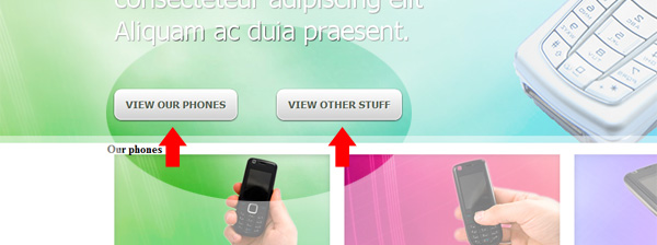
Code Explanation
The code above is lengthy for just one element of the design. But bear in mind that it beats serving an image and is easier to change and maintain than an image button.
The main things are that we use the gradient property for the color gradient fill, box-shadow for the drop shadow, and border-radius for rounded corners we had in the PSD layout comp. We also style the :hover, :active, and :focus pseudo-classes so that we visually present different states of the button as the user interacts with it; a good practice (especially :active and :focus for people with motor impairments that prevent them from using a traditional point-and-click device like a mouse). Here is the a comparison between the :hover state and normal state:  If you would like to read a more in-depth tutorial on creating CSS3 buttons, read this tutorial on creating CSS3 call-to-action buttons.
Step 10: Create the White Translucent Band
I had to figure out a way to create the 10px-high translucent white band at the bottom of the Featured section.
 My first thought was to add a
 border-bottom to the container that displays inward (much like an inside stroke in Photoshop); but alas, I didn’t find such a feature in CSS. So what I did was just to create a container (#hfwrap3), give it a height of 10px less than the #hfwrap height, and set the translucent border-bottom to it. It’s not the most ideal solution because it requires an extra wrapping div, I know, but it works.
Here’s the markup:
<div id="hfwrap"> <div id="hfwrap2"> <div id="hfwrap3"> <div id="lnwrap"> ... </div><!--lnwrap--> <section id="featured" class="container_12 clearfix"> ... </section> </div><!--#hfwrap3--> </div><!--#hfwrap2--> </div><!--#hfwrap-->
The CSS for the translucent white band for the empty #hfwrap3 container:
#hfwrap3 {height:390px; width:100%; border-bottom:10px solid rgba(255, 255, 255, 0.5)}Code Explanation
To get the translucency effect of the white band, we use the RGBA color value notation on the bottom-border property to set the color.
The RGBA color value has a function notation that has the format: rgba([red], [green], [blue], [alpha]) where the [red], [green], and [blue] parameters can be 0–100% or 0–255 and alpha — which controls the opacity of the color — can have the value between 0–1. So in the code above, at 0.5, our white band has an opacity value of 50%, giving it the translucent effect that we want. 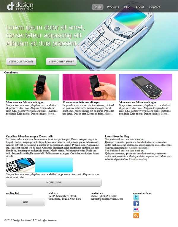 Example 5: Header and Featured complete
Step 11: Styling the More Products Section
The CSS for the #more-products section is quite simple:
/* @more-products =======================*/ #more-products h1 { padding:10px 0 0 0; border-bottom:1px dotted #333; margin:0 10px 20px; font:bold 24px/1.5 Tahoma, Geneva, sans-serif; color:#505b4d; text-transform:capitalize; } .product h3 { padding:10px 0; font:bold 18px/1.5 Tahoma, Geneva, sans-serif; color:#505b4d; } .product p { font:normal 12px/1.5 Tahoma, Geneva, sans-serif; color:#4f4f4f; padding:0 0 20px 0; } #more-products span { display:block; border-bottom:1px dotted #333; margin:0 10px; }Code Explanation
There’s nothing remarkable about the CSS above, maybe except how the dotted border was achieved. 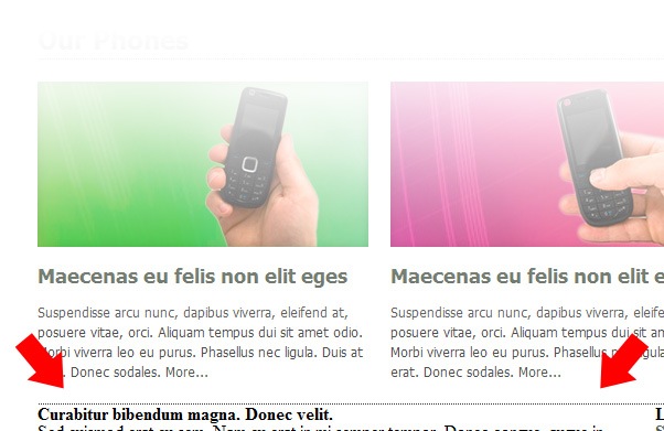 I had to add
 <span> elements for it, set it to display: block, and declare border-bottom values for it instead of placing the bottom border in #more-products itself.
This is because the border’s endpoints extend beyond the 3 photos’ edges (since it contains them), thus breaking the photos’ alignment with it. I had to attach it to an element that’s a child of the #more-products container for it to align perfectly with the photos. 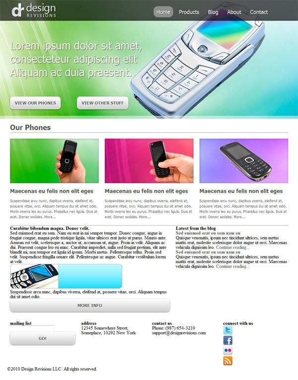 Example 6: Featured section with its content elements styled
Step 12: Working on the More Blurb Section
The blurb area on the right of the More Blurb section is pretty straightforward: just a heading followed by a text description, then an image and a short description of the image (the widget) that rotates, with a button beside it.
Ideally, you should have several items listed in the widget (which you could then rotate using JavaScript), but for our example, I’ll just use one widget to represent them. We won’t cover the JavaScript aspect of that in this tutorial.
/* @more-blurb =======================*/ #more-blurb #blurb h1 { padding:15px 0 0 0; font:bold 24px/1.5 Tahoma, Geneva, sans-serif; color:#505b4d; } #more-blurb p { font:normal 12px/1.5 Tahoma, Geneva, sans-serif; color:#4f4f4f; padding:0 0 20px 0; } #blurb-widget ul {float:left;} #blurb-widget .button { float:right; margin:20px 20px 0 0; } #blurb-widget ul li { position:relative; height:80px; } #blurb-widget ul li p { position:absolute; font:normal italic 12px/1.2 Georgia, "Times New Roman", Times, serif; top:10px; padding:0 20px 0 180px; }Code Explanation
Again, nothing fancy here if you’re already familiar with “old-school” CSS. It’s worth mentioning, though, that I did a lot of trial and error just to come up with the precise values for the padding, margins, etc.
of the elements, to achieve the look of our design. 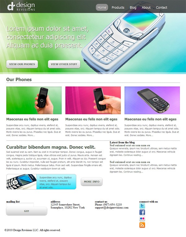 Example 7: More Blurb complete
Step 13: Working on the Blog Section
And for the blog section: Here we have two thumbnails for each post, with the post title and a short excerpt of the two most recent blog posts. No fancy stuff here.
#blog #blogwrap h1 { margin:22px 0 0 0; font:bold 18px/1.0 Tahoma, Geneva, sans-serif; color:#505b4d; } #blog {background:transparent url(img/vertsep.png) no-repeat 0 0;} #blog #blogwrap { padding:0 0 0 20px; } #blog .thumb { margin:0 10px 0 0; border:3px solid #d1d1d1; -webkit-border-radius: 2px; -moz-border-radius: 2px; border-radius: 2px; } #blog .thumb { float:left; margin:5px 0 0 0; } #blog .entry { margin:20px 0 0 80px; } #blog #blogwrap .entry h1 a:link { margin:0 auto; font:bold 14px/1.5 Tahoma, Geneva, sans-serif; color:#505b4d; } #blog #blogwrap .entry h1 a:visited, #blogwrap .entry p a:visited { color:#898A88; } #blog #blogwrap .entry h1 a:hover, #blogwrap .entry p a:hover { color:#505b4d; background-color:#FF9; }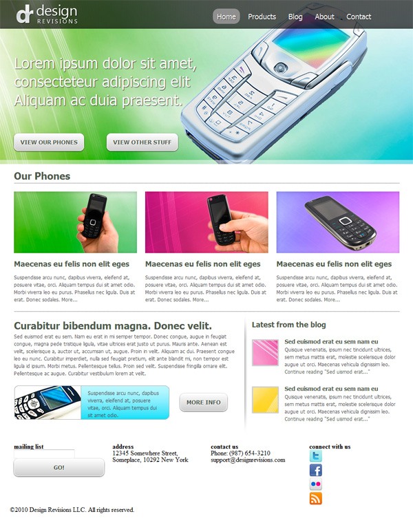 Example 8: Blog section complete
Step 14: Completing the Footer Section
We finally come to the last section: the footer.
We need to style two main components: the 4 sub-sections, and the copyright area at their bottom. Let’s attach the background image for the whole footer (similar to the one we have for the #header-featured section above). To accomplish the task, let’s create a wrapper div for the whole section, named #footerwrap.
<div id="footerwrap"> <footer id="main-footer" class="container_12 clearfix"> ... </footer><!--#main-footer--> <footer id="copyright-info" class="container_12"> ... </footer><!--#copyright-info--> </div><!--#footerwrap-->
Next, let’s create the horizontal separator between the 4 sub-sections and the #copyright-info. To achieve the effect, we need to assign a dark bottom border to a container above, and a lighter top border to a container below.
But again, since we’re using the 960 GS framework, we need to attach these borders to containers outside of elements assigned container_12 classes. To achieve that effect, I created two containers (#fsubwrap1 and #fsubwrap2) that each wrap around the #main-footer and #copyright-info elements:
<div id="footerwrap"> <div id="fsubwrap1"> <footer id="main-footer" class="container_12 clearfix"> ... </footer> </div><!--#fsubwrap1--> <div id="fsubwrap2"> <footer id="copyright-info" class="container_12"> ... </footer> </div><!--#fsubwrap2--> </div><!--#footerwrap-->
With the wrappers in place, it’s now easy to recreate the horizontal divider effect using pure CSS:
#fsubwrap1 { width:100%; height:150px; border-bottom:1px solid #777; } #fsubwrap2 { width:100%; height:50px; border-top:1px solid #dedede; }Next, let’s style the vertical separators between each footer sub-section. Initially, I just gave each of these sub-sections a footersub class, and planned to create the general styling that would apply to each one of them. However, due to how the vertical separators appeared — between the sub-sections but with no separator to the left of the first or the right of the last sub-section — I found it easier to control the CSS by giving them each a unique ID instead:
<footer id="main-footer" class="container_12 clearfix"> <section id="fsub1" class="grid_3"> ... </section> <section id="fsub2" class="grid_3"> ... </section> <section id="fsub3" class="grid_3"> ... </section> <section id="fsub4" class="grid_3"> ... </section> </footer>
With additional adjustments to the margins and padding, here are our CSS style rules to achieve the vertical separator effect:
#fsub1, #fsub2, #fsub3, #fsub4 { margin:30px 0 0 0; } #fsub1, #fsub2, #fsub3 { border-right:1px solid #777; } #fsub2, #fsub3, #fsub4 { border-left:1px solid #dedede; padding:0 0 15px 20px; } #fsub1 { padding:0 0 10px 0; }Finally, we go to the contents of the sub-sections:
#fsub1 h1, #fsub2 h1, #fsub3 h1, #fsub4 h1 { padding:0 0 10px 0; font:normal 24px/1.5 Tahoma, Geneva, sans-serif; text-shadow: #333 1px 1px 1px; color:#fff; text-transform:capitalize; } #fsub1 p, #fsub2 p, #fsub3 p, #fsub4 p { font:italic 14px/1.2 Georgia, "Times New Roman", Times, serif; color:#404040; } #fsub1 input { float:left; background:rgba(255,255,255, 0.2); padding:7px 5px; } ::-webkit-input-placeholder { color:#404040; } :-moz-placeholder { color:#404040; } #fsub1 .button a { float:right; padding:7px; margin:0 20px 0 0; } #fsub1 .button a:hover { background:#fff; background:-webkit-gradient(linear, left top, left bottom, color-stop(0, rgb(207,207,207)), color-stop(1, rgb(250,250,250))); background:-moz-linear-gradient(center top, rgb(207,207,207) 0%, rgb(250,250,250) 100%); } #fsub1 .button a:active { margin-top:1px; } #fsub1 input[placeholder] { font:italic 14px/1.2 Georgia, "Times New Roman", Times, serif; } #fsub4 .icon { float:left; padding:0 15px 0 0; }Code Explanation
We use the new HTML5 input type email that also allows a placeholder attribute to be placed in it so that we don’t need any JavaScript to hide and show sample inputs and instructions (e.g. “[email protected]” or “Type your email address here”) . What’s great about this input type is that it auto-validates the user’s input to check if it is in an email format, which means we don’t need JavaScript or server-side validation.
What’s cool with this is that we can style the placeholder attribute independently, so that it looks different from the text the user types in, by relying on attribute selectors (i.e. input[placeholder] {property:value}). If you wanted to be cool, you can also style the :focus pseudo-class and give it CSS3 transition properties to fade the text in and out slickly without any JavaScript (we’re not doing that here, but I want to give you some ideas on how to take it further).
The contents in the other 3 sub-sections can be pretty much styled using “old-school” CSS. And the final styling we’ll do is for the contents of the #copyright-info sub-section. Again this is all pretty much classic CSS, with some text-shadow thrown in:
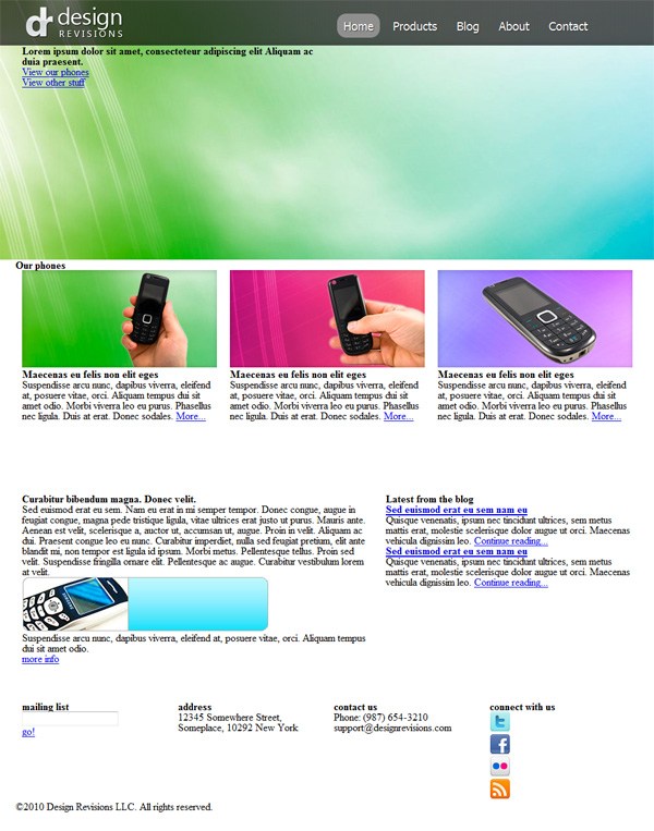
#fsubwrap2 #copyright-info small { display:block; font:normal 14px/1.2 Tahoma, Geneva, sans-serif; color:#333; text-shadow:1px 1px 0px #bbb; margin-top:15px; }And we’re done!
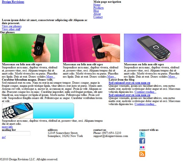
 Example 9: Finished web page
A Note on Cross-Browser Support
As you followed this tutorial, you probably used the latest Chrome or Firefox browser (being the geeks that you are) to check our progress as we wrote the code for our markup and styling. Unfortunately, at the time of writing, around 50% of Internet users still use browsers that aren’t future-standards compliant (i.e. they don’t support CSS3/HTML5 yet).
Keep that in mind as you create your own web pages; you should use your judgment on whether or not certain HTML5 elements/CSS3 properties are good ideas to use on a production site. Make sure that you’re thinking about progressive enhancement, which is important in this transition period in our industry (with new specs, the Mobile Web, and desktop apps moving into the Web space). For this tutorial, I had the luxury of deciding not to support browsers that haven’t implemented/will not implement HTML5/CSS3 or that don’t have PNG alpha transparency support (IE6 and lower).
But, in the real-world, you have to think about your users and you have to make many compromises in order to best serve their experience. So this tutorial’s product is more of a proof-of-concept — of how HTML5/CSS3 will make our jobs more awesome once our users move to browsers that support them — rather than a production-ready site build.
Explore HTML5/CSS3 Frameworks and Tools
Fortunately, some benevolent geeks have done some excellent work for us, to create frameworks and tools for this transitional period. I’m talking about the people behind projects like CSS3 PIE, HTML5 Boilerplate and Modernizr.
Check these out when you have the chance — they can really help speed up development and reduce headaches. These frameworks are great to use for clients especially those with larger sites such as colleges.
Tutorial Summary
As you’ve seen in this tutorial, there is nothing you can design in Photoshop that you can’t translate into HTML/CSS if you have the fundamental background knowledge of how HTML/CSS works.
With browser support for the new HTML5 elements and CSS3 properties getting better and better in browsers, our tasks will become easier, and our capabilities to deliver richer user experiences will be extended greatly. As an employee for a digital marketing service, this is important to know because you should be able to complete this for your clients. If you encountered any questions or thoughts you’d like to share as you went through our tutorial, I encourage you to leave your comments below.
This tutorial is Part 2 of a tutorial series that walks you through the design and coding of a vibrant and professional web layout. Part 1 dealt with designing the web layout in Photoshop.
- Part 1: Create a Vibrant Professional Web Design in Photoshop
- Part 2: Code a Vibrant Professional Web Design with HTML5/CSS3
Download Source Files
- vibrant_professional_webdesign_code (ZIP, 0.26 MB)
-
 Trevin serves as the VP of Marketing at WebFX. He has worked on over 450 marketing campaigns and has been building websites for over 25 years. His work has been featured by Search Engine Land, USA Today, Fast Company and Inc.
 -

WebFX is a full-service marketing agency with 1,100+ client reviews and a 4.9-star rating on Clutch! Find out how our expert team and revenue-accelerating tech can drive results for you! Learn more
Make estimating web design costs easy
Website design costs can be tricky to nail down. Get an instant estimate for a custom web design with our free website design cost calculator!
Try Our Free Web Design Cost Calculator
Table of Contents
- Preview
- Demo
- Groundwork
- Step 1: Create the Basic Containers and References
- Step 2: Add Some Content
- Step 3: How the 960 Grid System Will Be Implemented
- Step 4: Slicing the PSD
- Step 5: Implementing the 960 GS Classes
- Step 6: Setting Heights of Containers with CSS
- Step 7: Styling the Header
- Step 8: Working on the Featured Section
- Step 9: Creating CSS3 UI Buttons
- Step 10: Create the White Translucent Band
- Step 11: Styling the More Products Section
- Step 12: Working on the More Blurb Section
- Step 13: Working on the Blog Section
- Step 14: Completing the Footer Section
- A Note on Cross-Browser Support
- Tutorial Summary
- Download Source Files
Share this article


Web Design Calculator
Use our free tool to get a free, instant quote in under 60 seconds.
View Web Design CalculatorMake estimating web design costs easy
Website design costs can be tricky to nail down. Get an instant estimate for a custom web design with our free website design cost calculator!
Try Our Free Web Design Cost Calculator