
Our instinctive dislike for forms originates from having to fill out seemingly endless paper forms, many of which require a Master’s degree in Form Content Filling to understand and fill out correctly the first time. Unfortunately, in the offline world, getting some answer wrong would mean having to fill out the form in full and sending it again, usually days apart.  Online, we have the opportunity to not only resubmit forms countless times, but also as web developers, we can provide people with much more relevant feedback at various stages of using a web form.
Through hints and validation, we can create forms that are a lot more user-friendly than their offline counterparts. And in some cases, we can make forms that people might even enjoy filling out.
Hints in Web Forms
Validation is frequently used to provide users with a response on what information they should have entered when an error occurs.
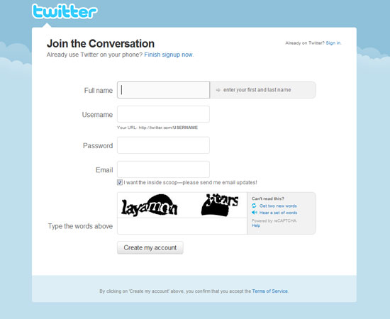
By using a number of helpful hints, we can provide much of this information before they even enter their name. By showing more information before a user submits a form, we can reduce the chance of an error happening. Information available prior to submission can come in three forms: Labels: These should quickly describe what information should be entered into an input field—this could be their username, password, email, etc.
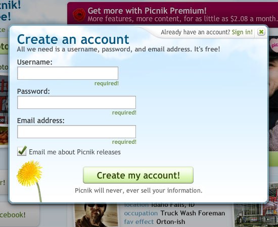
Required or optional information: an input field should be denoted as required or optional, usually by an asterisk (*) or any cues or text-based hints that tell the form user they can’t leave a field blank. Help hints: Help hints function to give the user additional tips on how to format their information. For example, a help hint might tell a user what the password requirements are (as shown below).
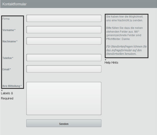
Alignment of Labels
Of course, all information should be placed in such a way that it is clearly associated to a given input field, but the alignment of a label can actually affect not only a successful submission, but also the speed of completion. The alignment of a label is typically either left, right or top; there are benefits and disadvantages to each alignment: Top labels: Positioning a label at the top of input fields improves the association between the label and field, but does tend to give the impression of a longer form. Right labels: Labels at the right of the input fields reduces the vertical space of the web form, and improves the association between the label and input.
However, right labels can reduce the readability and scanability of web forms. Left labels: Labels at the left of form fields can make for easier reading of the labels, and also makes the web form vertically shorter. However, it tends to affect the association of labels to inputs.
 Choosing the alignment of labels in a form can depend on the type of web form you are creating, the available space you have for your web form and which of the disadvantages are of greater concern to you in the given situation.
Labels inside Inputs
Some forms will use placeholders to indicate suitable examples of information within an input field, but in some instances, when screen real estate is at a premium, developers will use labels within the input fields. This doesn’t pose too many issues on shorter forms, but as the form grows, this becomes an issue.
By using the label within the input, it means that once a user enters any data, the label disappears and cannot be referred back to when reviewing the form either before or after submission. 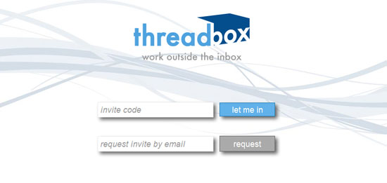 Hints within inputs should be used only where sufficient information still exists to indicate an input’s purpose or requirements after the user has entered their information and the original hint has disappeared. Additionally, labels inside input fields can be troublesome if done incorrectly, as they often rely on client-side scripting such as JavaScript.
One potential solution to the downsides of labels within inputs is using the sliding labels technique—proposed by CSSKarma—where the labels move to the side and remains visible when the user focuses and enters text into the fields. However, this technique still doesn’t solve space limitations.
Dynamic Hints
If space is at a premium or your form looks too cluttered with hints beside each input field, then you can make them dynamic.
A hint can appear as a tooltip based on user action either when the user focuses on the input field or when the user hovers over a help icon placed near the input field. Using dynamic hints allows for more descriptive information to be communicated as the character limit isn’t restricted by the available space around the input field. 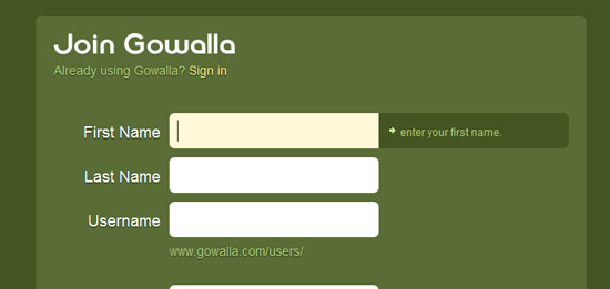
Data Validation in Web Forms
Given sufficient and correct use of hints, it may be possible that the majority of users will never see any validation, but this does not mean validation is not vitally important.
Validation provides a safety net for many users as well as a system to ensure the website is gathering the correct information required. The structure on which the web is constructed allows us two methods by which we can validate a user input:
Server-side Validation
When using server-side validation, any information entered by the user is sent to the server to be checked rather than anything happening locally on an individual’s own computer. With the exception of using Ajax server-side form validation, this is a slower form of validation as it requires the user to first submit the form and then wait for the server to validate the data before reloading the page in order to provide a response.
However, what you lose in speed, you gain in security, as this process is not easily bypassed like client-side validation.
Client-side Validation
Although HTML5 will change the way we undertake client-side validation, JavaScript is commonly the language used for client-side validation today. Because users can disable JavaScript in their browser, a website cannot rely solely on JavaScript as a method of validation.
Instead, client-side validation should be seen as an extra layer on top of server-side validation.
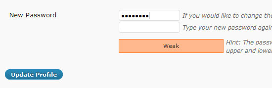
Real-time Validation
Real-time validation is one of these server-side validation disadvantages that client-side validation allows us to solve. Although client-side validation can be activated via a submit button too, there is also the opportunity to use real-time validation as users enter data into the form.
Real-time validation is where JavaScript can be used to provide an instant response to a user action. So rather than having to fill out the entire form and pressing submit, the user gets an instant response as they are typing so that they can make immediate corrections if necessary. One example of real-time validation would be a password strength indicator where each key stroke triggers the validation and sends a response to indicate to a user how weak or strong that website thinks the password they have chosen is.
The Good, the Bad and the Ugly of Web Form Validation
Validation isn’t all bed of roses.
The Good
Just why do we use validation exactly? It’s not exactly the easiest thing to code, especially if you duplicate the work by using client-side and server-side web form validation.
For users: Of course, it’s pretty obvious that we do validation for our users. By using validation correctly, we create a user-friendly form that makes the process as easy and quick as possible. For obtainingcorrect information: It might create a usable experience for users but it also ensures the website receives the correct information it requires and in the format necessary to store it in a database for future use.
For spam protection: By validating for specific information, we can cut out some of the spam that a form may otherwise receive. However, keep in mind that any validation we put in place for spam should never affect the user experience. Remember that users are unconcerned with the level of spam you may receive.
The Bad
Validation isn’t all good though, as developers and clients alike have been known to abuse forms, forgetting the original purpose of the form and creating something that isn’t all too user-friendly: Unusual required fields: Rather than creating a form with only the information a user truly needs to continue, we enter optional fields. Sometimes these are useful for the user, such as extra address fields or additional information text areas. In other cases they might help site owners gather such information as “Where did you hear about us?” When these traditionally optional fields are required by the validation, they create a barrier for completion and causes the user to wonder why such information is requested of them.
Restrictive formats: Where possible, we will ensure users enter information in the format we expect. But at times, validation goes too far and constricts the user to a given format that causes validation errors where they shouldn’t exist. This usually forces a user to jump through hoops to meet the specific criteria laid out to suit the system.
One example would be the requirement of no spaces in a phone number. This is something that should be amended by the code, not the user. Another example of this is having too many requirements for the type of password you need (e.g.
“Must have three numbers, a capital letter, and must be between 6-12 characters only”).
The Ugly
As we all know, some malicious users on the Web are out to cause mischief by bringing down websites. When developers are a little lax with their validation, it allows some of these people the opportunity to abuse exploits like cross-site scripting (abbreviated as XSS) to break a website or gain access to areas or information they shouldn’t be accessing.
It’s an unfortunate reality of the web, and something that can be addressed with validation techniques. By protecting your site against such attacks you ensure the website is always live for you and your users and that your users’ information is always safe. For more information on XSS, visit XSS (Cross Site Scripting) Cheat Sheet on ha.ckers.org.
Validation Responses
Simply outputting hints and validation isn’t enough. Design plays its part too, helping communicate and reinforce the messages any validation is outputting. Many different factors help towards ensuring that a user, if they do get an error on their first attempt, can correct their submission and get the form sent in second time around.
Colour
Colour is a great design element to use in order to reinforce a message. Commonly, red would be used in the instance of an error, and green for success. The use of colour clearly indicates to a user even before they read any textual responses that result from form validation.
Colour can be used in multiple ways within a web form to highlight a particular error. As well as using colour for any validation response, you can reinforce what specific inputs have errors by using colour to alter the label, border or background of a given input field. However, it’s best to get a balance as we’re only trying to clearly indicate errors to a user, not beat them over the head with them.
As much as colour is a useful tool to communicate a given message, it can never be used independently to convey a message for accessibility reasons. Blind, low-vision and colour-blind users will have issues in determining where errors have occurred if colour was the only method for indicating where errors have occurred. 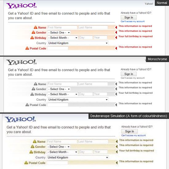
Positioning
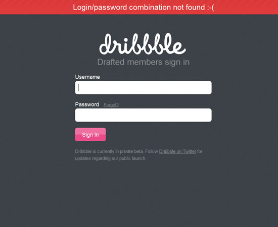
How you position any validation elements can also have an effect on how usable a form is, especially when it comes to longer forms: Top of the page: This is a validation response placed at the top of the page, most frequently directly above the form.
For server-side validation without Ajax, this is great for screen-reader users if done correctly, because it can be the first element they read when the page reloads. Inline: Any validation placed in close proximity to the input where an error has occurred is considered “inline”. This can work well for real-time validation and for longer web forms. 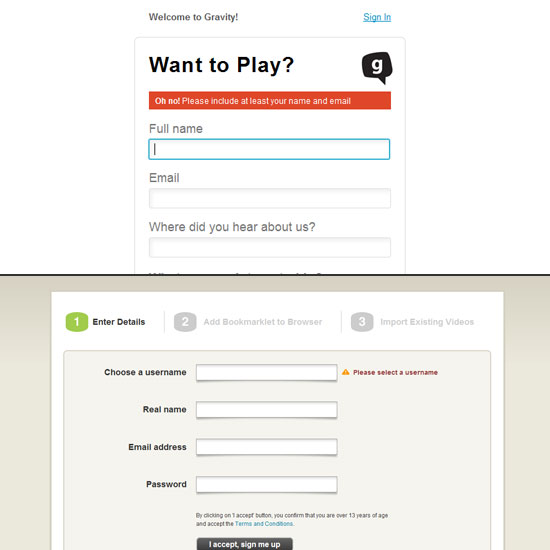 If you have a long form that disappears below the fold, then using both of these techniques is a good idea. For example, if an error occurred towards the bottom of the form, and you use both techniques, then the user may quickly see a response that clearly gives them a hint for correcting the mistake when scrolling through the form.
If you are using real-time validation, then the use of a top of the page response would be unnecessary, as the user would only require inline validation in this instance.
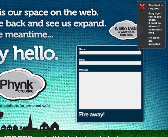
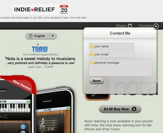
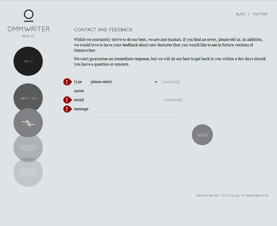
Using Icons and Visual Cues
Although they aren’t as instantly recognizable as colour, icons are again a way of communicating a message before a user has a chance to read any textual response. Icons are a great way of displaying inline validation where screen real estate is at a minimum, but only works to reinforce any textual response at the top of the page.
Examples of good icons to use in validation would be a tick mark (checkmark) for success, or a red cross (X) for an error.
Other Styling Techniques for Validation Responses
There is a wealth of other style elements that you can add to particular responses, such as borders, font weights, backgrounds, etc. The use of these would depend on the positioning of your errors, how you are displaying the errors, and what suits the design of your website.
Although any response messages should have a level of differentiation with surrounding elements in order to be recognizable—there is no reason they should not be symbiotic to the rest of the website design.
Web Form Validation Response Messages
Styling and positioning only helps indicate that an error has occurred, and where it has occurred. It is the textual responses the website outputs that communicate what is necessary to a user.
Any error message should communicate the following as best it can: List all errors: To make sure a user gets the form on the next attempt, all the errors should be displayed in close proximity to each other for convenience. This allows the user to go to that list, instead of hunting it down throughout the web form. Where the errors are: An error response should mention what input field the error relates to.
When referring to an input, you would traditionally use the label of that input as this is how users will identify with particular inputs best. How an error may be fixed: If the error is complex —more intricate than simply letting the user know they missed a required field—it’s always best to communicate what the solution might be. If a telephone number can’t accept alphabetic characters, then tell the user.
If a user didn’t enter their email address in the correct format, you might show them an example of what the correct format is.
Sticky form information
When submitting a form with errors, a user will expect that the form enable them to adjust their previous responses, rather than having to fill out the entire form again. Not having the form retain previous user entry could lead to dropped forms.
Making sure the data a user has entered is “sticky” allows them to more easily understand the error that has occurred.
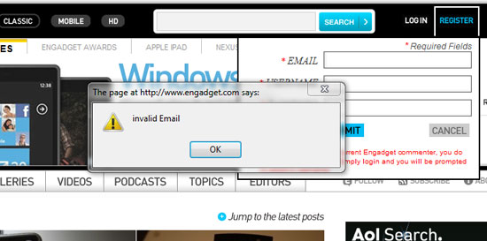
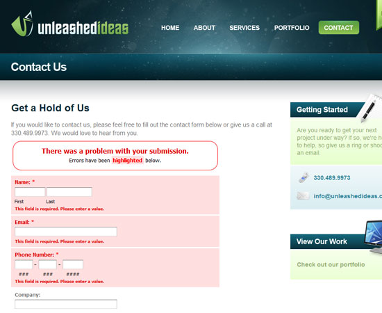
Don’t Use Alert Dialog Boxes for Validation Responses
Primarily used with client-side validation, Alert dialog boxes issue problems for users, often creating a barrier for completion. Here are a few reasons why: Alert dialog boxes are temporary: When an alert box is displayed, it must first be closed before returning to the form.
Once closed, the only way to view the error again is to re-submit the form. This gives the user no information to refer back to. Unless you are catering exclusively to people with extraordinary memory skills, it is a safe assumption to say that most Web users have a short attention and memory span.
Alert dialog boxes are troublesome for a submitted form with multiple errors: When using alert boxes and popup windows, it is common that only the first error found is displayed, rather than a full list of errors. The form is then re-submitted by the user multiple times to discover multiple different errors. Alert dialog boxes are text-only: Alert boxes can only display text to communicate a message so no other design elements can be used to create a different style depending on an error or success message.
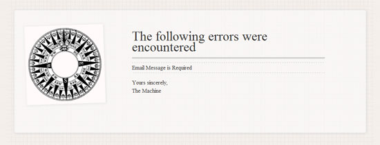
Don’t Use Error Pages for Validation Responses
Another poor form of validation is when using error pages. This is where the form sends the information to a separate page to validate, and any errors that do exist get output on this page without the original form. This means the user must navigate back to the form where they may lose the information they previously entered, as well as the errors they need to correct.
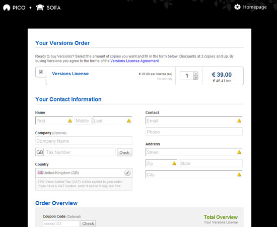
Examples of Good Forms with Hints and Validation

Conclusion
Forms are can be a complex feature of any website for both the developer and user, but they are the only method in which the user and the website can interact with one another. This is why web forms have to be given careful consideration—unusable forms can seriously affect your business and your profits. Sometimes the effort that goes into a web form and validation design is minuscule, even on the best-designed sites.
Outputting a text error simply isn’t enough—you need ensure it provides sufficient information in both content and design to achieve the best user experience. So rather than thinking of your form and validation as just another thing to get finished, consider spending more time creating web forms that are as perfect as the rest of your website.
Related Content
- 25 Stylish Examples of Web Forms
- Five Simple but Essential Web Usability Tips
- 10 Simple Web Accessibility Tips You Can Do Today
About the Author

-
 President of WebFX. Bill has over 25 years of experience in the Internet marketing industry specializing in SEO, UX, information architecture, marketing automation and more. William’s background in scientific computing and education from Shippensburg and MIT provided the foundation for MarketingCloudFX and other key research and development projects at WebFX.
 -

WebFX is a full-service marketing agency with 1,100+ client reviews and a 4.9-star rating on Clutch! Find out how our expert team and revenue-accelerating tech can drive results for you! Learn more
Make estimating web design costs easy
Website design costs can be tricky to nail down. Get an instant estimate for a custom web design with our free website design cost calculator!
Try Our Free Web Design Cost Calculator
Share this article


Web Design Calculator
Use our free tool to get a free, instant quote in under 60 seconds.
View Web Design CalculatorMake estimating web design costs easy
Website design costs can be tricky to nail down. Get an instant estimate for a custom web design with our free website design cost calculator!
Try Our Free Web Design Cost Calculator


