
The pull-to-refresh interaction design pattern has become a staple in mobile apps. It allows users to check and see if there’s new content available, and to refresh the screen if there is. The pull-to-refresh interaction is found in apps that need to constantly push out new content to its users.
Here’s the pull-to-refresh interaction in the Twitter app: 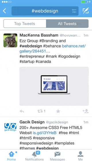 Instagram also utilizes the pull-to-refresh interaction to let its users update the screen with new photos:
 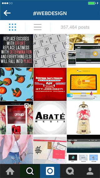 Here’s the last example. It’s from the social fitness app called Fitocracy. This one’s more verbose.
It displays the time and date of when the content was last updated: 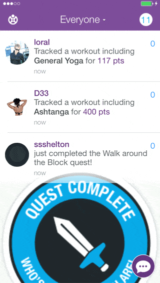 Having the pull-to-refresh feature is convenient for users because they’re able to update the screen whenever they choose. However, pulling down and releasing the screen is such a substantial gesture. It demands a whole lot more physical effort compared to other touch gestures like tapping or swiping.
The interaction thus needs to be more productive in order to compel people to use it more often.
Augmented Pull-To-Refresh
In the Google Chrome app, the functionality of the pull-to-refresh gesture has been expanded with the ability to perform two other actions: Open a new browser tab or close the current tab. Like the standard pull-to-refresh design pattern, pulling down on the screen and then letting it go will just refresh the screen:  However, if you pull down > swipe right > release, Chrome will close the current tab.
Alternatively, swiping left will open a new tab instead.  This augmented pull-to-refresh interaction is more rewarding. Pulling down on the screen gives users three possible actions to choose from, instead of just one. This interaction design in Chrome also makes regularly-used actions easier to get to.
For example, the normal method of opening a new browser tab requires two distinct tap gestures. Additionally, it has a higher cognitive demand because the user has to negotiate a menu in order to find the “New Tab” item amongst a list of 10 items.  In contrast, opening a new tab with the augmented pull-to-refresh interaction is much more efficient since the same task can be done with just one smooth gesture.
What do you think about this interaction design? Let’s talk about it in the comments.
Related Content
- Mobile UI Design Patterns: 10 Sites for Inspiration
- User Interface Patterns for Dealing with Interactive Content
- Karma as a Social Interaction Design Pattern in Websites
- 6 Popular Content Presentation Design Patterns
- Guide to Website Navigation Design Patterns

-
 President of WebFX. Bill has over 25 years of experience in the Internet marketing industry specializing in SEO, UX, information architecture, marketing automation and more. William’s background in scientific computing and education from Shippensburg and MIT provided the foundation for MarketingCloudFX and other key research and development projects at WebFX.
 -

WebFX is a full-service marketing agency with 1,100+ client reviews and a 4.9-star rating on Clutch! Find out how our expert team and revenue-accelerating tech can drive results for you! Learn more
Make estimating web design costs easy
Website design costs can be tricky to nail down. Get an instant estimate for a custom web design with our free website design cost calculator!
Try Our Free Web Design Cost Calculator
Share this article


Web Design Calculator
Use our free tool to get a free, instant quote in under 60 seconds.
View Web Design CalculatorMake estimating web design costs easy
Website design costs can be tricky to nail down. Get an instant estimate for a custom web design with our free website design cost calculator!
Try Our Free Web Design Cost Calculator


