
Apple announced earlier this year that it has officially reached the 1 billion active devices milestone, setting it apart from many of its competitors. However, according to recent reports, the iPhone only occupied about 15.3% of 2016’s first quarter new smartphone market share compared to Samsung’s 24.5%. In fact, the iPhone has been behind Samsung for quite a while now when it comes to selling smartphones worldwide.
But this still doesn’t reflect iPhone owners’ web usage year after year in the United States. According to our own research below, we found that roughly 47% of all mobile web users in the United States are iPhone users.
iPhone/Samsung Galaxy Market Share
WebFX monitors web traffic from over 1500 Google Analytics profiles. This allows us to dig into datasets like service provider market share and even mobile device market share.
Since the beginning of 2016, we’ve compiled nearly 30 million users and the mobile devices they used to access the websites we monitor. Apple iPhones and Samsung Galaxies made up nearly two-thirds of the 30 million mobile device users we analyzed. What we found was that the iPhone took the largest piece of the market not only this year so far, but also the last two years we analyzed.
The Samsung Galaxy line of phones, the second largest brand of smartphone in our dataset, came in just below 20% of the market share for 2016, and even less the two years before. 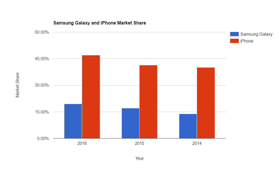
2016 iPhone Market Share in the United States
However, this data isn’t quite consistent across every region of the United States. In fact, each state reflects a slightly different story.
The map below shows the iPhone market share of each state: 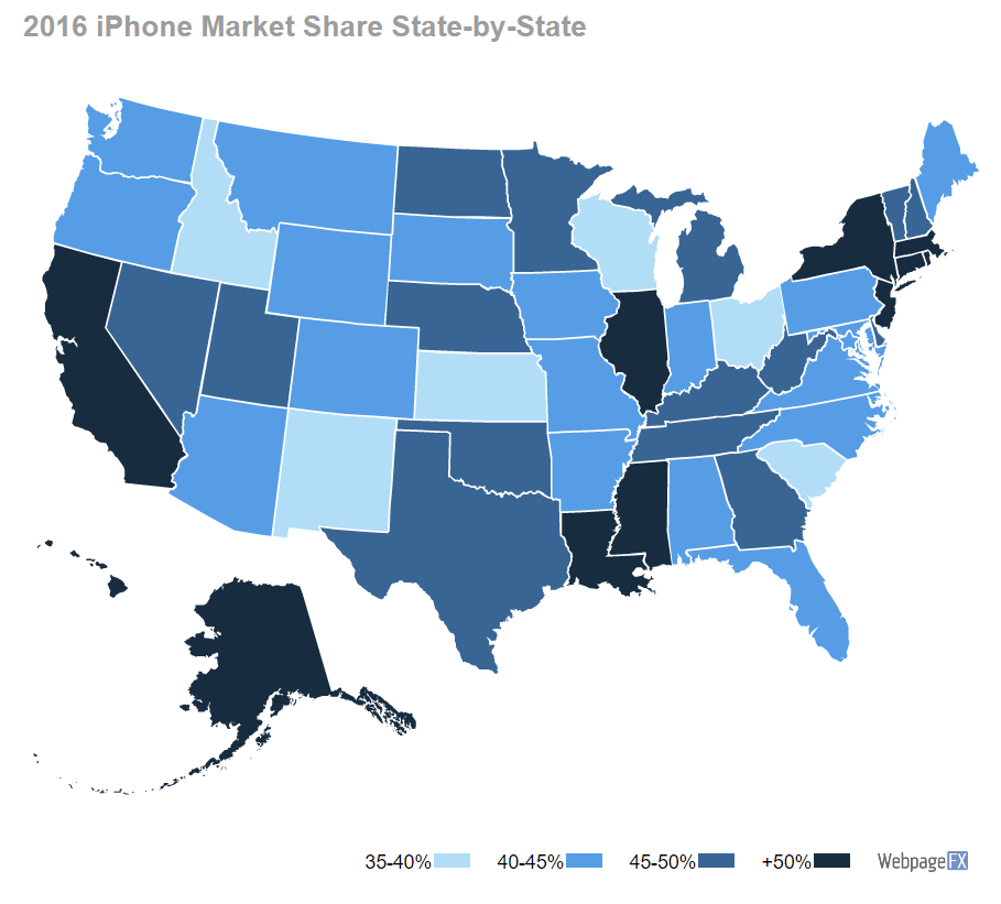 The data indicates that there are actually 11 different states where more than 50% of the market share is occupied by iPhone. Mississippi’s iPhones win the market share contest with 56.75%, along with Rhode Island and Illinois with 55.79% and 54.27%, respectively. New Mexico makes the bottom of the list with iPhones occupying just over a third of the smartphone market share at 36.86% As mentioned before, Samsung Galaxy usage averages out to 19.46% with Wisconsin earning the top spot at 24.81% and Vermont finishing last at 9.54%
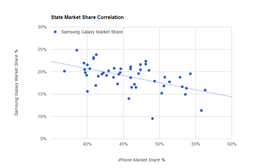
iPhone Market Share Correlations
Where this information gets even more interesting is observing where these numbers correlate. On each of the graphs below, each of the dots represent a different state, based on our market share data.
The more iPhones, the fewer Samsung Galaxies
It may not be surprising to hear that there is a noticeable correlation between iPhone market share and Samsung Galaxy market share, meaning the more a state uses iPhones, the less they use Samsung Galaxies.
Samsung Galaxy – the poor man’s iPhone?
We’ve taken this research a step further, as previous reports have, and analyzed the correlations between the average household income of each state and device usage. iPhone usage has a slight correlation with higher income states, while Samsung Galaxy usage has a slight correlation with lower income per capita states. In other words, the poorer states tended to have a higher Samsung Galaxy market share and the wealthier states have a higher iPhone market share.
Higher Income States Use iPhones
iPhone Market Share vs. Mean Income In correlation to each states’ mean income reported from the 2015 census data, we found that there is a positive correlation between iPhone market share and higher income states. 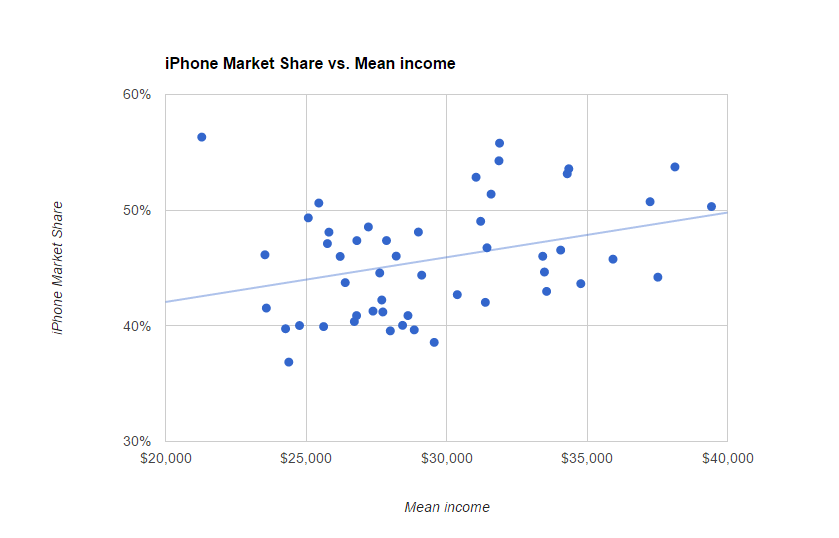
Lower Income States Use Samsung Galaxies
Samsung Galaxy Market Share vs. Mean Income The exact opposite happens with Galaxy smartphones, as there is a slight correlation with Samsung Galaxy usage and lower income states. The higher income states tend to use Samsung Galaxies less, while low-income states use them more. 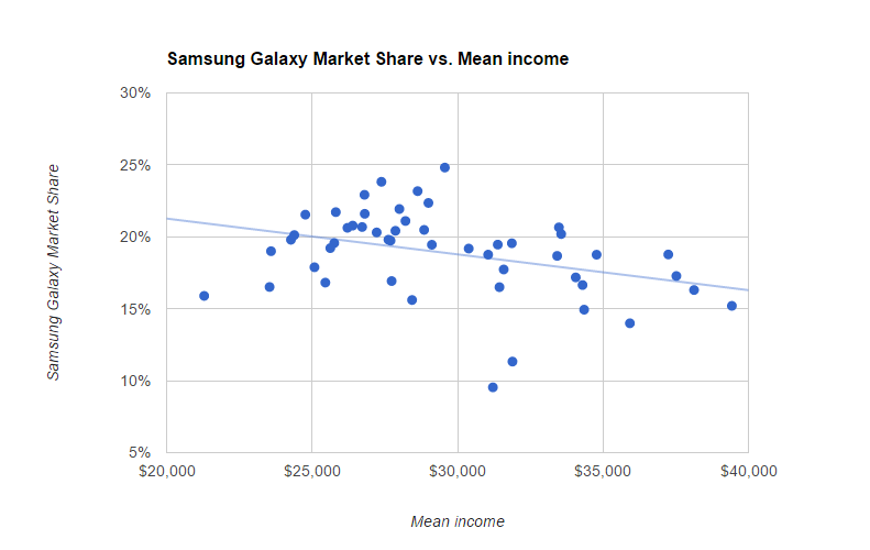 So, what device are you using right now to read this blog post?
Do you fit in the observations we found above? If so or if not, let us know along with any of your own thoughts in the comments below! If you’d like more information on the data and correlations from above, please take a look at our data in this spreadsheet!
-
 Dan is a marketer for WebFX who likes everything tech, marketing, and startups. Follow him on Twitter @ShafferDan.@ShafferDan
 -

WebFX is a full-service marketing agency with 1,100+ client reviews and a 4.9-star rating on Clutch! Find out how our expert team and revenue-accelerating tech can drive results for you! Learn more
The Internet in Real Time
Ever wonder how much is going on at once on the Internet? It can be tough to wrap your mind around it, but we’ve put together a nice visual that’ll help! The numbers show no sign of slowing down either.
Find out More
Share this article

Ready to Drive Results for Your Business?
See how WebFX uses SEO, PPC, Social Media, and Web Design to Drive Revenue for Businesses.
Get InspiredThe Internet in Real Time
Ever wonder how much is going on at once on the Internet? It can be tough to wrap your mind around it, but we’ve put together a nice visual that’ll help! The numbers show no sign of slowing down either.
Find out More


