
If you’re looking to earn the highest possible conversions on one of your Google Ads, an effective landing page is crucial. Without one, you could miss out on countless sales — and let’s be honest, who wants to miss out on conversions? Especially when you’re paying for that ad that the customer clicked on.
On this page, we’ll focus on what makes a landing page effective, and some inspiring examples to help you create the most high-quality landing page possible.
What is a landing page again?
So you have a Google Ads account.
You’ve made bids on all the keywords that you want to have an ad for, and you’re currently ranking for five keywords. You have five different ads in search results with users clicking them left and right, but where do the ads take them?
Landing pages are where users “land” when they click on your ad in search results — it’s where they can take action to purchase the product or service that they saw in your ad. In general, there are a few things that every landing page should have to ensure that they’re as effective as possible.
Elements of a landing page
Let’s talk about the most important elements of a landing page that work together to ensure that users take action.
1. An image of your product
One of the most powerful features of a landing page is the image. The image should match the one that visitors saw on the ad because, after all, that’s the product that they’re interested in. For example, if your ad features a pair of faux fur slippers, your landing page should feature them as well.
This lets users know that they’ve come to the right place to purchase the product they saw in the ad.
2. A unique selling point (USP)
A USP tells customers why this product is the best choice they could make for a product of this sort. The main headline of your landing page should be the first part of your USP. For example, it could be something like, “the coziest slippers known to man.” Continue sprinkling elements of your USP throughout the landing page to further explain why your product is the best.
This can be done with a subheading and a closing statement.
3. The benefits of your product
Somewhere on your landing page, explain to users the benefits of your product. This is where you’ll convert them into a paying customer. You can give them details such as the material of the slippers, the sizes they come in, the price, or a statement saying the product can only be bought online.
You can even get creative and say that “you won’t be able to live without these slippers once you have them!” That’s definitely a unique benefit! No matter what kind of benefits you provide, they should all help to push users further down the conversion funnel, or one step closer to buying the product.
4. A call-to-action (CTA)
Perhaps the most important part of a landing page is the call-to-action or the CTA. This is the part of the landing page where users will provide their contact information so that you have permission to contact them in the future, either about the product that the ad shows or other products that you sell. A CTA can help you obtain a variety of important information, so you can decide what steps to take to make the site visitor into a paying customer.
Some important information that you can collect from a CTA includes:
- Name
- Email address
- Dropdown menu asking what the customer is interested in
- Phone number
- An indication of whether the user wants to sign up for email newsletters
- A button that says “BUY NOW”
Any combination of these fields can make for a successful CTA, but you should always have a button that offers a next step for users.
Inspiring landing pages
Take a look at some of these extremely well-done and inspiring landing pages. After each image, we’ll explain what these companies did right.
1. Charlotte Russe
When you search “faux fur slippers” in Google, Charlotte Russe is one of the paid ads that show up above organic search results. When you click on the ad, here’s the page that users land on. 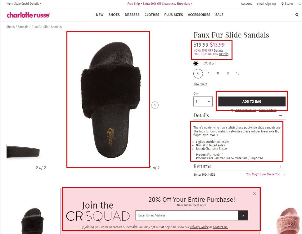 As you can see, the landing page has not one, but two images of the product front and center.
It also features a description section where users can learn about the slipper before purchasing and a great CTA button. Not to mention, the CTA says “Add to bag,” which makes it even easier for users to complete an action and convert. There’s even a coupon at the bottom of this landing page!
2. Home Chef
Look at this landing page for Home Chef. It showed up as a paid ad in Google and was above organic results. 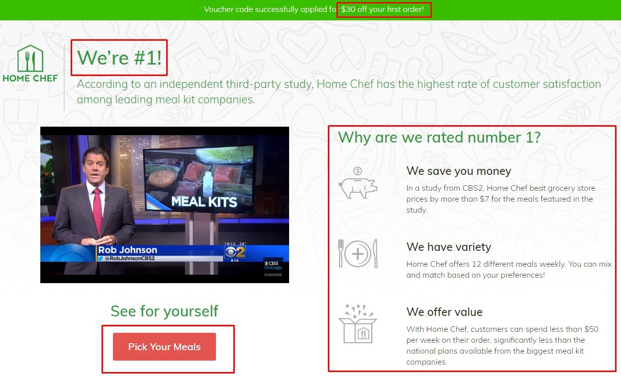 This landing page has everything users need to become a paying customer.
Instead of offering an image, this landing page features a video that helps explain the newfound popularity of Home Chef services. It describes the cost savings and the convenience, which are great USPs. As if the video wasn’t enough, this landing page also features a section titled, “Why are we rated number 1?” in which the company tells their customers why they’re great.
The CTA, “Pick your meals,” stands out on the page and makes it easy to complete the sale.
Sounds pretty enticing, don’t you think?
3. Pro Flowers
This landing page is bursting with USPs! Check out the landing page we arrived at when we clicked on a Pro Flowers ad. 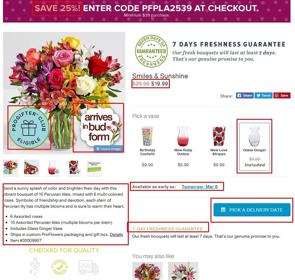 This inspiring landing page has so many USPs that it would be hard for any visitor to not buy this product.
The image shows the beautiful flowers along with the USP that they arrive in bud form — guaranteeing that the flowers will be fresh for at least seven days. They even assure it on another part of the page.
They also show that the glass vase is included at a $9.99 value. Everybody loves to save!
The page has numerous other USPs like the earliest delivery date, the flowers included, and the sale prices. The CTA button encourages users to “pick a delivery date.”
4. Bed Bath & Beyond
This product, an ultrasonic jewelry cleaner, appeared as a paid ad in Google results. Take a look at the landing page. 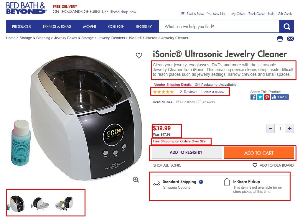 It features four images of the product — one of which was featured in the original ad.
This page also includes many USPs including what the device does, customer reviews, standard shipping options, and in-store pickup options. The CTA offered is to simply add the product to your cart, making it easy to purchase the product hassle-free.
Are you inspired?
These are some of our favorite landing pages because they encourage us to buy the products shown in the ads. They also tell us the reasons why they’re the best using USPs and make it easy for us to purchase the product with CTAs.
-
 Sam has been writing for WebFX since 2016 and focuses on UX, crafting amazing website experiences, and digital marketing In her free time, she likes to spend time on the beach, play with her cats, and go fishing with her husband.
 -

WebFX is a full-service marketing agency with 1,100+ client reviews and a 4.9-star rating on Clutch! Find out how our expert team and revenue-accelerating tech can drive results for you! Learn more
Try our free Marketing Calculator
Craft a tailored online marketing strategy! Utilize our free Internet marketing calculator for a custom plan based on your location, reach, timeframe, and budget.
Plan Your Marketing Budget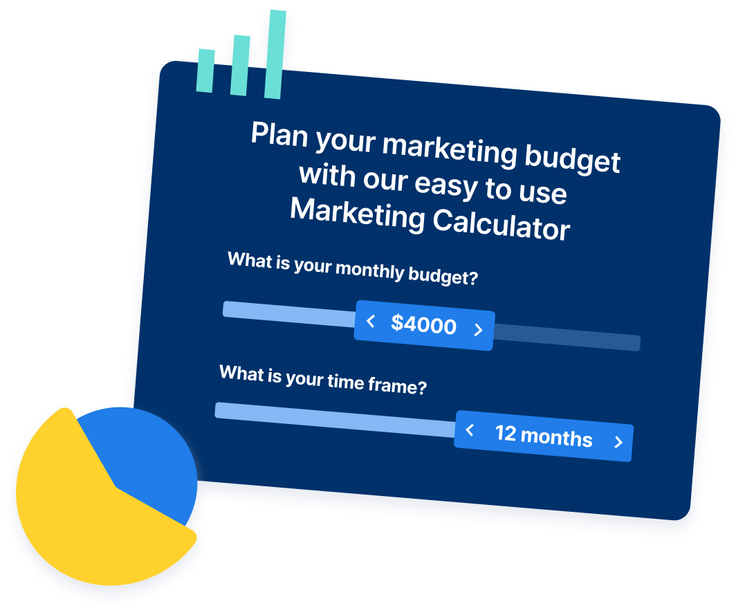
Share this article

Looking for More?
Get expert ideas, industry updates, case studies, and more straight to your inbox to help you level up and get ahead.
"*" indicates required fields
Try our free Marketing Calculator
Craft a tailored online marketing strategy! Utilize our free Internet marketing calculator for a custom plan based on your location, reach, timeframe, and budget.
Plan Your Marketing Budget


