-
 7 min. read
-
 WebFX Team
 Digital Marketing Agency
- The WebFX team is made up of more than 450 subject matter experts in digital marketing, SEO, web design and web development, social media, and more. Together, they’ve helped WebFX’s clients earn more than $3 billion in revenue from the web — and that’s just in the past five years. @webfx
I don’t know about the rest of you, but I love to look at visual representations of my analytics data whenever possible. Line graphs, pie charts, scatter charts…they all do a pretty good job of presenting data in a relational way. But wouldn’t it be great if there was a way to visualize your data and then interact directly with the results over time to dynamically discover unique patterns and trends?
Well, you’re in luck because there is! It’s a powerful feature within Google Analytics called motion charts.
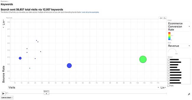
Motion charts allow for the analysis of large amounts of data across several parameters and provide a powerful way to visualize that data in five dimensions (x-axis, y-axis, size and color of dots representing data points, and time). In fact, technically, it’s even possible to increase the chart to deal with eight dimensions if you select combination metrics (e.g., conversion rate, bounce rate, and pages per visit).
Now for those of you who have some advanced experience using Google Analytics, the value of motion charts may not be that big of a revelation…after all, it’s been an available feature of Google Analytics for some time now.
But for the rest of you, motion charts can be a valuable tool in search marketing as it helps to point out some critical data patterns and relationships you might otherwise have overlooked.
What metrics to use on the motion chart?
You’ll want to first understand the objectives as it relates to your website and thereby the metrics that should be used to measure and improve upon these objectives. The other area to determine is whether your site is an e-commerce site or not. E-commerce sites make interpreting the data a little bit more intuitive because you’re dealing with metrics such as e-commerce conversion rate and revenue as it relates back to keywords that are either paid, non-paid (organic) or both.
Below, we’ll look at an e-commerce scenario where we may want to observe traffic-driving keywords that have the best conversion rates along with pointing out areas to improve SEO and keyword optimization.
We’ll start by navigating to the Keywords report under the Traffic Sources of Google Analytics.
From there, we have the option of setting some parameters such as the keyword medium (whether or not we want to view paid keywords, non-paid (organic) keywords, or both), time range, the number of keywords to include (defined here as rows – the more rows you include the greater number of points on your motion chart), and any filtering options (useful when you want to analyze branded keywords exclusive from non-branded keywords).
Once you’re ready, simply click on the “Visualize” button in the upper left area of the report. Google Analytics will then generate the motion chart accordingly. It’s important to keep in mind that the motion chart data is defined from the report where it was initiated…in the case of our example, that’s the Keywords report.

Next, we’ll set the x-axis to show us Bounce Rate and the y-axis to show us Visits.
The size of the dot should represent Revenue while the color of the dot should be set to represent the E-commerce Conversion Rate.
NOTE: If e-commerce tracking is not enabled for your site, you won’t see related metrics such as E-commerce Conversion Rate and Revenue. Instead, you may want to set the size of the dot to be Per Visit Goal Value and the color of the dot to be Goal Conversion Rate.
What can our metrics show us?
The Visits metric simply shows the amount of visits for each keyword.
Bounce Rate shows the percentage of bounces for each keyword. This is very helpful since it can help demonstrate whether or not a keyword matches the expectation a user might have when they arrive on your landing page.
In addition, by analyzing bounce rate trends for keywords, we get a feel for landing pages that may be under-performing.
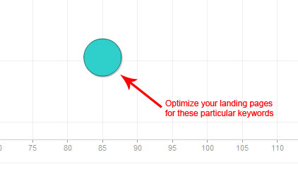
- WHAT TO LOOK FOR: Here you’ll want to look for dots that are plotted farther along the x-axis…especially ones that are large or red.
- WHAT TO IMPROVE: You’ll want to optimize the landing pages for these particular keywords.
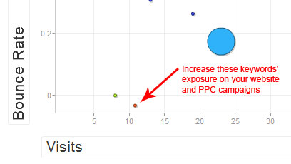
E-commerce/Goal Conversion Rate shows your keyword conversion rate and this is important to plot because it can point out keywords that are highly converting but that aren’t receiving a high level of traffic.
- WHAT TO LOOK FOR: Look for small, red dots located close to the x-axis as these are the keywords that should get the most attention from any optimization efforts.
- WHAT TO IMPROVE: Increase these keywords’ exposure on your website and focus on these within any of your PPC campaigns.
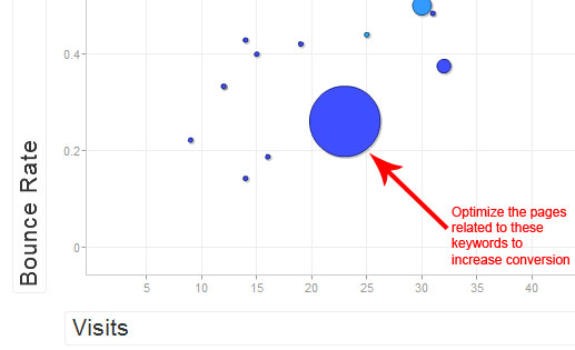
Revenue/Per Visit Goal Value shows the amount of money each keyword drives to your website.
- WHAT TO LOOK FOR: The large, blue dots are the ones to focus on here as that indicates that while the keyword brings a decent level of revenue to your site, if converting better, it could bring even more.
- WHAT TO IMPROVE: Optimize the pages related to these keywords in order to improve the conversion.
TIP: Check the boxes next to any of the keywords on the right side of the chart to enable Google Analytics to tag their respective dots for a quick and easy way to pick them out of the crowd.
Earlier, I mentioned there was a fifth dimension, “Time.” Well, here’s the cool part of the motion chart (as if motion charts weren’t already cool) and how it gets its name. Below the chart is a slider that allows you to view the data interactively as it relates to time (based on the date range you set for your report). Move this slider from left to right and you’ll begin to see how your keywords do over the data range you’ve set.
This adds some very interesting layers to the patterns and trends you’ll be able to discern. For example, if you notice the conversion rate for a certain keyword goes up during a particular time of the year, you may want to consider investing more PPC dollars for that keyword during that time period.
TIP: Check the “Trails” checkbox in the lower-right corner of the chart to maintain a visual path of each selected dot as it moves through your timeline.
For those of you who hadn’t yet discovered the power of utilizing motion charts to better analyze data and reveal previously unnoticed patterns and trends, I hope this has helped convince you of their value as another go-to tool in your ongoing SEO improvement efforts. And keep in mind that motion charts are available for most reports within Google Analytics that show tables.
So now get out there and improve your SEO keyword targeting…Happy charting!
-
 The WebFX team is made up of more than 450 subject matter experts in digital marketing, SEO, web design and web development, social media, and more. Together, they’ve helped WebFX’s clients earn more than $3 billion in revenue from the web — and that’s just in the past five years.@webfx
 -

WebFX is a full-service marketing agency with 1,100+ client reviews and a 4.9-star rating on Clutch! Find out how our expert team and revenue-accelerating tech can drive results for you! Learn more
Try our free Marketing Calculator
Craft a tailored online marketing strategy! Utilize our free Internet marketing calculator for a custom plan based on your location, reach, timeframe, and budget.
Plan Your Marketing Budget

Looking for More?
Get expert ideas, industry updates, case studies, and more straight to your inbox to help you level up and get ahead.
"*" indicates required fields
Try our free Marketing Calculator
Craft a tailored online marketing strategy! Utilize our free Internet marketing calculator for a custom plan based on your location, reach, timeframe, and budget.
Plan Your Marketing Budget