
As a designer, I feel there’s nothing more intimidating than staring at a blank canvas in Photoshop knowing it’s your job to produce a beautiful, effective, winning design for your client and not knowing where or how to begin. Going into a project without any real direction is the single largest mistake I feel you can make when starting a design. Without determining and understanding the end-goals of your client’s business, you’re simply stabbing in the dark for direction. Even if you do manage to produce a design that “looks pretty,” it’s inevitable it won’t be as effective or well-thought-out as a design that transpired with a strong design concept in mind.
What exactly is a concept?
A concept is essentially the backbone to any strong design.
It’s the core idea behind all of the choices you’ll make throughout the rest of the design process. Every element within your design should reflect and support your core concept. For this reason, the concept development step is the single most important phase of the entire design process.
Imagine you’ve been given the task of designing a site that conveys playfulness, fun and imagination. In order to create a design solely based off of these concepts, you need to make sure every element of your design fully supports and reflects “playfulness, fun and imagination.” 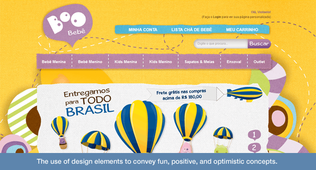
The Core Design Elements
Line:
Consider: Should any element on this site have a border? Borders communicate staying “within a box,” putting a damper on the imagination aspect.
Maybe elements should be exploding outwards from their constraints? And what makes a line playful or fun? Is a straight line playful?
Hardly. Rounded or curved lines are much more approachable; while squiggly, hand-drawn lines convey playfulness even further. What about lines that vary in width?
Or dashed or dotted lines? Which direction should these lines travel? Upwards is definitely a more optimistic, fun direction than downwards.
And diagonal lines tend to convey much more energy than simple horizontal or vertical lines. Take all of these factors into account when determining every line you use in your design.
Shape:
How does one communicate fun and playfulness through shapes?
Well, think about what shapes appear most approachable. Squares, triangles, stars, hexagons…all have hard edges and sharp corners. A circle, on the other hand, has no corners.
You can’t cut yourself on a sphere. You attribute circles with things like balls (I’m talking bouncy, soccer, basket, tennis, etc.), which you intuitively associate with fun and playfulness. That’s an easy one.
Even if you can’t use circles for all your elements, consider keeping shapes as safe, playful and fun as possible. Custom, curved shapes can be a solution – or applying rounded corners to rectangles and squares can be another.
Value:
Value is the tone and contrast of your work.
It’s the use of light and dark in your design. For a design that’s aiming to convey our concepts, it’s best to keep the tone light and bright. Dark colors tend to convey seriousness, professionalism, luxury, sadness, anger and a full spectrum of other emotions – there are way too many to list.
Light colors, on the other hand, tend to convey positivity, fun, happiness, playfulness and much, much more. For a project like this, I would focus on keeping the design bright and use strong contrast for calls-to-action. Value also ties in with our next design element as well:
Color:
This is an extremely important element to your design, as color psychology is intense.
Based on what we determined from “Value,” it’s probably best to keep things bright. Think about colors that make you happy and want to touch them. Yellow and bright blue remind you of the sun and the sky.
Bright orange is cheery – yellow-green reminds you of spring and growth. Bright pink and purple, albeit tied with being somewhat feminine, are becoming extremely popular as highlight colors for strong calls-to-action and convey a sense of playfulness in their own right. 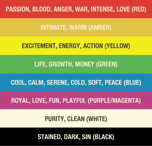 Darker colors, such as navy, violet, grey, and black are more commonly perceived with serious, professional, or, at times, even negative connotations.
That’s not to say you shouldn’t use them. It’s all about hitting your concept.
Texture:
Texture is the physical quality of a surface.
Applying some sort of texture to nearly every element of your work is also becoming extremely trendy in web design right now, so it’s important to think about when, where and how to use it. Are you looking to engage someone in a way where they want to touch your work? Texture is a fool-proof way of achieving that goal.
If you’re creating a mobile app for kids to use on their iPads (or their parent’s iPads), then it makes complete sense. Texture helps convey playfulness because play generally involves touch, and people enjoy touching things when they’re curious how it feels. Have you ever seen an extremely layered painting and just wanted to reach out and feel it?
Well, odds are you’re not allowed, but the fact that you’re drawn to touch it speaks for itself. 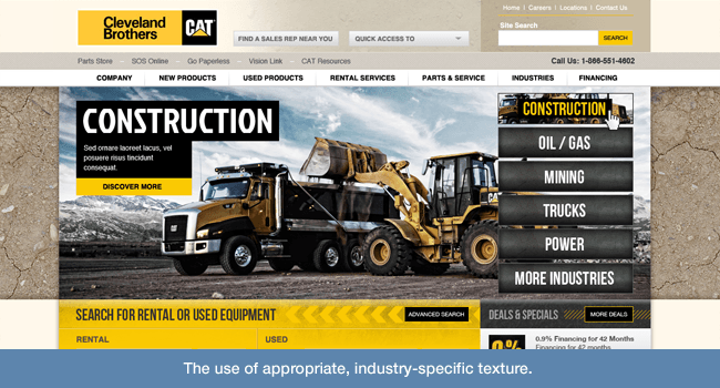 Also consider using textures that apply to the specific industries for which you’re designing. For instance, if you’re creating a design for a company that sells linens, it makes sense to use textures that convey fabrics.
If you’re doing a design for a company that installs hardwood floors, it makes sense to use textures that appear to be wooden. Construction companies may want to focus on solid, concrete or steel textures while a company that makes faucets may want to focus on smooth, polished, light-reflecting textures. It all seems very obvious, but it’s also extremely easy to fall in the trap of using arbitrary textures just to make things look more tangible.
Just like all other elements, take strong consideration in whether or not the textures you’ve chosen fully support your desired concepts.
Size:
Size is extremely important in any design you work on. It’s used to create interest, harmony and unity between all the elements of your design.
For our particular concepts, imagine you need a strong call to action that really draws someone’s attention. While all elements of design play into that, size is definitely a huge part. If something is dominating your screen visually, you’ll be drawn to it.
Or, on the contrary, if something is very small but surrounded by whitespace you’ll be equally drawn to that.
Now that we understand our design elements, how do we start conceptualizing?
Having a strong understanding of design elements is only one part of the process. The second step is determining which concepts you should actually be targeting for your particular client.
Define the Problem:
You can’t come up with a solution (or concepts) until you determine what the problem is. Before coming up with a concept, you need to determine what the client is currently doing wrong in terms of branding, design, site goals, etc. But how do you do that?
Research:
Research the brand and their industry. Having a strong, thorough understanding of your client and their competition is extremely important in coming up with effective design solutions. What is the brand?
Who are their customers? What is the overall objective of their business? What are their competitors doing?
What’s working for them? What’s not working? How can you take what’s working for their competitors but do it better?
Get to know your client:
I feel like this goes without saying, but it’s extremely important to meet with and talk with your client (In person, if means allow).
It’s imperative you develop a strong, meaningful relationship with them. Understanding them on a personal level as well as a business level is a key factor, as getting to know someone personally reveals much more about their business than they would ever reveal when asked about their business upfront. The most important thing about meeting with your client is looking and listening for the little things.
A simple gesture, a facial expression, an off-the-cuff comment, can strike great creativity and inspiration for the designer. Oftentimes key information is hidden in-between the lines and can be missed if you’re not listening actively. Take note of any key words they may mention when discussing their brand and business.
Jot them down, and return to them later. Additionally, don’t assume you know what those words mean. Look them up.
Research their definitions. Look up their origin. Find other words that mean the same thing in a thesaurus.
Take the words you find in the thesaurus, and restart the process. Rinse and repeat until you feel you’ve dug deep enough. It’s all about understanding the brand and coming up with the perfect words that best convey that brand.
Time to Dwell
Once you’ve met with your client, asked the pertinent (and seemingly un-pertinent) questions, and had a little time to think, you probably have some ideas swimming around your head. This is a good thing. Let them swim, and let things sink in.
For me, a very important part of the process involves trying NOT to think about the design. There have been numerous times when I’ve been sitting at my desk, staring at Photoshop or a blank sheet of paper, just scribbling ideas and throwing them out over and over again, only to discover that, as soon as I head out for the evening and hop on my bike, a great idea suddenly hits me as I’m cruising down the street. I find that great conceptualization will happen on its own when the time is right.
You never know when it’s going to hit you, and it’s definitely not something that can be forced, but it’s something you need to actively work towards. This is one of the challenges a creative faces. What’s important is being flexible enough to meet those moments when the idea hits you and really focus and expand on them – otherwise it will be lost.
When you’re in the mood to think design at its purest, you’ll know, and your mind will run wild.
Take things back to basics.
A basic list of guidelines I consciously go through when I consider any design:
- Try to think about your client’s goals in the rawest, most pure form.
- What does the company sell/create?
- What does the company do at heart? Eliminate all the fluff they tell you. What do they DO? The answer should be no longer than a sentence.
- What are its core values? Again, eliminate fluff.
- How do those values and ideals translate into concepts?
- What are competitors doing?
- What’s working? What’s not?
- What is the end-goal of the site?
- How do all of these values, considerations, and goals relate to concepts?
- How can you take those concepts and effectively achieve the site’s goals through design?
I personally spend a significant amount of time on this process. It takes a while – that’s the bottom line. It’s important.
Coming to grips with a new brand isn’t exactly easy – especially when you’re working with dozens of clients daily. But having a system to work within definitely helps me, and I hope it can help others as well.
Summary
Understand concept.
Without a strong concept, your design will fail. You will be mixing and matching styles with no core values in mind. It could look pretty in the end, but that’s simply not enough in today’s market.
Understand design elements. If your design elements don’t effectively support your concept, again, you design will essentially fail. If there is any part of your design that you feel is not working, odds are it’s not fully supporting your concept.
If you have an entire design that isn’t working, it’s probably best to scrap what you have and start from scratch. I know that sucks, but you’ll be better off in the end. Understand your client.
Talking in person is the best way to achieve this. Pay attention to the intricacies of the conversation. If you’re on-location, observe and take note of your surroundings.
Ask questions unrelated to the company/brand itself. Try to get to know your client on a personal level in an effort to learn more about the brand itself. Take some time and really think about where you want to start.
Building on bad ground will yield bad construction. Take your client’s core values in mind and break them down to their rawest form. Analyze, research, break-down and repeat until you have the most basic, simplistic definition of your client’s brand possible.
Take that definition and build from there. 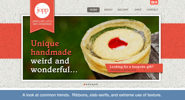
Additional things to keep in mind when developing concepts
- Be creative. It’s your job. It doesn’t matter what kind of client you have. Always push yourself to come up with a unique, effective solution.
You probably won’t hit it 100% of the time, but if you never push yourself, you never will.
- Start at the beginning. Focus on your concept. Without a good concept, you’re just making something that looks nice. Sure, it might be okay by your client’s standards, but you should always hold yourself to your own.
- Be wary of trends. Trends in design can be extremely easy to fall into. I’m guilty of it – nearly every designer is. If you’re in the industry, I’m sure you recognize what’s popular and unpopular.
Push yourself to not fall back on those trends, and create solutions that genuinely work towards and support your client’s goals.
- Keep at it! The more ideas you play with, whether good or bad, the more likely you’ll come up with something awesome soon. Try not to get discouraged. If you do become frustrated, take some time, step away, re-evaluate the situation and go from there.
It can be very stressful, especially with imminent deadlines, but the bottom line is great design isn’t something you can force – it’s something you have to work at.
-
 The WebFX team is made up of more than 450 subject matter experts in digital marketing, SEO, web design and web development, social media, and more. Together, they’ve helped WebFX’s clients earn more than $3 billion in revenue from the web — and that’s just in the past five years.@webfx
 -

WebFX is a full-service marketing agency with 1,100+ client reviews and a 4.9-star rating on Clutch! Find out how our expert team and revenue-accelerating tech can drive results for you! Learn more
Make estimating web design costs easy
Website design costs can be tricky to nail down. Get an instant estimate for a custom web design with our free website design cost calculator!
Try Our Free Web Design Cost Calculator
Share this article


Web Design Calculator
Use our free tool to get a free, instant quote in under 60 seconds.
View Web Design CalculatorMake estimating web design costs easy
Website design costs can be tricky to nail down. Get an instant estimate for a custom web design with our free website design cost calculator!
Try Our Free Web Design Cost Calculator


