

Calls to action are some of the most important parts of the Internet landscape. Without them, site visitors wouldn’t know what to do when they looked at a page, and the overall conversion rate for any website would be pretty much zero. And there’s a major reason CTAs are so effective — they’re part of the human psyche.
Whenever we go to a page on a site, we expect some form of direction concerning what to do next. And the same is true for your potential customers. They want something on the page that’ll satisfy them on a psychological level.
There are four main parts to the psychology behind calls to action, and when you know them, you can make your CTAs more effective than ever before.
1. Anticipation
Anticipation is the sensation that builds when you’re waiting for something to happen. It could be preparing for the big monster reveal in a horror movie, looking forward to your paycheck at the end of the week, or checking your phone for an important email. You know it’ll happen — you’re just not sure when.
On the Internet, anticipation begins the moment someone lands on a page. Whenever they start reading, skimming, watching, or whatever they’re doing, some part of them is anticipating a payoff based on what they want to know. So say you just wrote a blog post on how to optimize YouTube videos.
The anticipation starts right from the title. Someone reading this blog wants to know the answer to how you optimize YouTube videos. The anticipation continues through the body of the post, which you can build by providing examples, photos, and other details that give people an idea about the upcoming payoff.
The goal is to engage your reader by making them want to read to the end of a blog post, watch to the end of a video, or complete some other action that will bring them closer to your brand. It’s like a comedian telling a joke — they have to go through the setup before they deliver the punchline. If the setup takes too long, people lose interest.
And if the punchline comes too soon, it won’t have the same effect. The key is building the anticipation of your customers to the point where you’ve given them enough information and you know you can wrap it up.
How to capitalize on anticipation
Most people anticipate positive events — it’s just how the brain works. That means you can get the most out of anticipation by creating a positive experience for your user.
Using agreeable language in your text, a comfortable design scheme for your page, and a positively-worded CTA are all ways that you can make the most of your readers’ anticipation. And agreeable language doesn’t have to pander to an audience — you can just state something that you know your demographic will accept. QuickSprout does this expertly.
The text in their general writing is almost exclusively positive, and it’s at least pleasant to read (if not inspirational) so that you feel positive, too. And the whole time you’re reading, there’s a good-looking call to action right next to the text that offers its readers something they can’t resist. 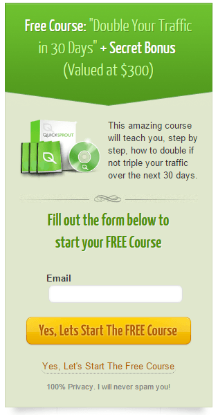 Free information on how to get insane increases in traffic.
So while the body text makes you feel positive, but you don’t just have to feel that way — you can act on it with this CTA. All you have to do is submit an email, and you get free information that’ll help you do exactly what QuickSprout is talking about. The only negative text to be found on most of QuickSprout’s changes are right at the bottom of their CTAs — “I will never spam you!” But just about everyone is okay with negativity when it’s about spam.
I mean, it’s pretty much the worst.
2. Expectation
When you have anticipation, you also have expectation. An audience expects a punchline at the end of a joke. A reader expects a resolution at the end of a story.
And your readers expect a call to action at the end of your post. Satisfying these expectations is what makes the anticipation worthwhile. The thinking behind this is the same as the psychological principle of a perceptual set, and it basically means that people have a set of expectations based on the context of what they see.
Below is one of the most popular examples.  Depending on how you read — left-to-right versus top-to-bottom — the object in the middle either looks like a B or a 13, respectively. Similarly, your website’s visitors have a set of expectations when they read a page.
If it’s a signup page, they expect a CTA that says something like “Sign Up.” If it’s a product page, they expect a CTA like “Add to Cart” or “Buy Now.” Basically, no matter what page a user visits, they expect to be told what they can do next in the context of the page they’re reading.
How to use that expectation
The best way to satisfy a visitor’s expectation of a CTA is to give them one. But it shouldn’t just be simple text — it has to contextually jive with the rest of your page, and it has to stick out against the backdrop of the rest of your site. You can do this by using big buttons in a strong color that’s noticeably different from the rest of your website’s color scheme, like red.
Facebook does this really well on their signup page, although their CTA button isn’t actually all that large. Their site is mostly a neutral blue, white, or gray. So their call to action is… 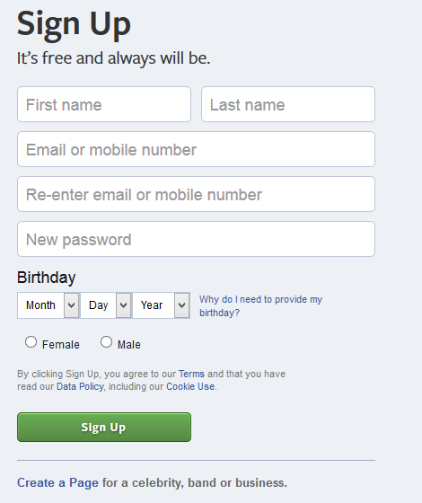 Green?
Although warm colors like orange are thought to be best for CTAs, green makes sense for Facebook’s color scheme. They don’t need a harsh, aggressive color like red to get people to sign up when the rest of their site is completely neutral. A little green is sometimes all it takes to stand out, which is great news for any CTAs that have to do with money, nature, or Kermit the Frog.
3. Reward
When you have anticipation and expectation, you need to also have a reward. In this case, the reward is having their expectation satisfied by finding (and clicking) your CTA. Reward is one of the most basic functions of the human brain, and it’s one of the most satisfying experiences of being a person.
It’s also a huge part of motivating people to do pretty much anything, including their jobs. And for some reason, reward seems to be more intense with buttons. People love a good button — and if you’re not sure if that’s true, check out the video below about a social experiment on reddit that dealt exclusively with pressing buttons (without a pre-set reward).
Just think about what you’d do if someone told you not to press a button and then left the room for 20 seconds.
You could also take a look at the control console of your car, the icons on your desktop, or the controls for your coffee maker. The odds are good that one — or all — of these things uses buttons a lot. Buttons are rewarding.
And they’re especially rewarding when you can push them and get something you want – which is exactly what your CTA does.
How to make CTAs rewarding
So how do reward and buttons play into CTAs? Well, make your CTA rewarding. Make it a big, awesome button that people can’t wait to press, and when they do, show the button pushing back because of the click.
Also, use rewarding language on your CTA. Short, simple, and practical statements that use words like “get,” “start,” and “discover” provide a sense of excitement that capitalizes on a user’s anticipation, satisfies their expectations, and drives them to get their reward. Last, promise the user that they’ll get something for their time.
Everyone loves a little somethin’-somethin’ for free, whether it’s a trial of your software or a PDF download.
4. Focus on the user
This is the most obvious point in this list, and you’ve probably heard it a thousand times before. But what you probably haven’t heard is that your focus on the user doesn’t always have to be about a user’s experience with your product, service, or company — you can reflect your focus in your actual text. The most common way to do that is to address the reader in what you’re writing, which is actually what I’m doing right now.
Using “you” (or second person) is more conversational than using “he,” “she,” it,” and other third-person pronouns, so it’s like you’re talking straight to your reader. Third person feels like you’re reading a book — second feels like you’re having a conversation. It may not sound like it makes a difference, but it creates a huge change in your tone, your approachability, and the overall directness of your writing.
Just picture Uncle Sam. 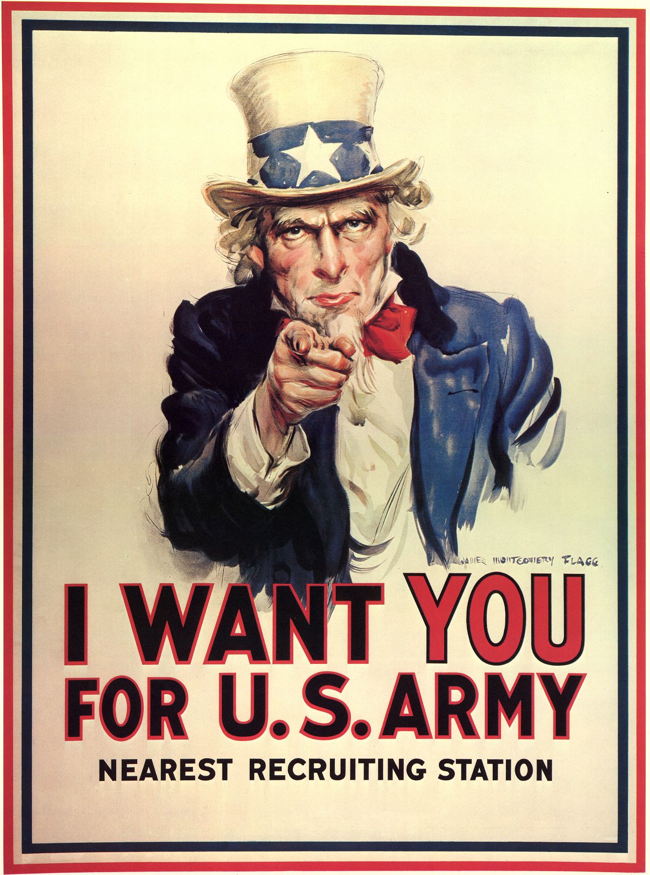 Can you imagine that poster saying “I WANT THAT GUY” and getting the same result? Neither can I.
How to focus on the user
While second-person language works for addressing your readers in text, you should switch to first-person language on your CTAs.
The idea (in theory) is that you set the reader up by having a conversation with them, and then you give them the choice to click your CTA. So while you’re directly addressing the reader on your page, your CTA is you backing up, handing the reader the controls, and letting them make the decision for themselves. It’s not 100% clear why first-person language is so useful on CTAs, but it probably has something to do with the fact that people like to feel ownership and control of their actions.
Even if the CTA is your suggestion, people want to feel like it’s their decision to click it. Retail employees, managers, business owners, everyone — there’s just something incredibly satisfying about being in control of your life and your decisions. Yes, someone is clicking your CTA button, but it was their choice to do it.
In the same way, it may be your service, but it’s their account, their free download, their opportunity to win a year’s supply of eggs for some reason. The product belongs to you — but the decision belongs to your users.
Using the psychology behind calls to action
Now that you know the science behind them, you can use sales psychology to improve your CTAs. The results should be an all-around improvement in your conversion rates — though to make sure it’s working, you should always test.
Visual Website Optimizer is one of the best ways to test your CTAs, and it doesn’t take any coding knowledge. So if you want to determine the effectiveness of a new CTA before implementing it permanently, test it out using VWO. What trends have you seen in your CTAs?
Have you found any trends in improvement? Let me know in the comments!
-
 Trevin serves as the VP of Marketing at WebFX. He has worked on over 450 marketing campaigns and has been building websites for over 25 years. His work has been featured by Search Engine Land, USA Today, Fast Company and Inc.
 -

WebFX is a full-service marketing agency with 1,100+ client reviews and a 4.9-star rating on Clutch! Find out how our expert team and revenue-accelerating tech can drive results for you! Learn more
Try our free Marketing Calculator
Craft a tailored online marketing strategy! Utilize our free Internet marketing calculator for a custom plan based on your location, reach, timeframe, and budget.
Plan Your Marketing Budget
Share this article
Maximize Your Marketing ROI
Claim your free eBook packed with proven strategies to boost your marketing efforts.
Get the GuideTry our free Marketing Calculator
Craft a tailored online marketing strategy! Utilize our free Internet marketing calculator for a custom plan based on your location, reach, timeframe, and budget.
Plan Your Marketing Budget


