
No matter what marketers say, you can’t deny the many benefits of a strategically organized viral piece of content. Whether you intended for it to go viral or not, there’s a lesson in all of them that you can hopefully apply to future pieces. Over the years, WebFX has had the unique opportunity to make several of its own viral pieces, in which have been viewed millions of times throughout the web.
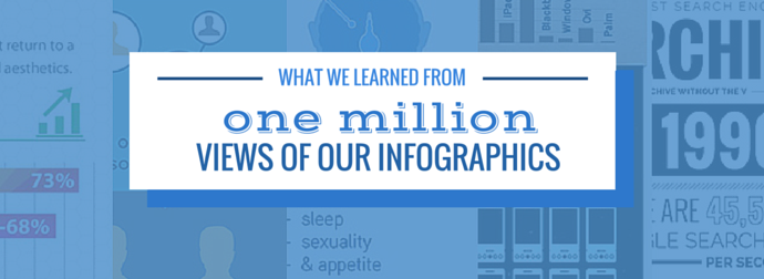
Through infographics, interactive charts and even just plain cool designs, we’ve managed to learn a few things about going viral. Now we’re sharing the things we’ve learned about infographics! Just to give you some perspective, we’ve been on the receiving end of nearly a million page views as a direct result of our infographics. They’ve been featured on sites like Mashable, Forbes, and Huffington Post.
They’ve been mentioned on TV shows, popular podcasts, and YouTube channels. And even this past December, the WebFX domain made the front page of reddit. Bragging aside, here are some things we learned.
Infographics are changing
In basic economic terms, the supply of infographics has gone through the roof, and demand, rightly so, has nearly disappeared. Everyone has seen the potential behind a viral infographic and imagines their own showing up on sites like Mashable and HuffingtonPost. Journalists are tired of them.
Some marketers no longer recommend them (although we still do). Simply said, infographics are freaking everywhere. Four years ago, you’d be the talk of the town with a cruddy design and hardly any research.
Now? Good luck. 
“Stand out. Be different!” That applies to a lot of things, but do this with your infographics and you’ll likely be noticed.
You can’t just present statistics anymore
Making a cool image that includes some crazy stats just isn’t enough.
It’s been done before. Everyone has seen that already. They just aren’t as interested in it anymore.
There needs to be a narrative. Tell a story with your data! Solve a problem with your story!
Make it unique. A long JPEG might not be the best way to present your information. Think of other mediums and channels you can use to better demonstrate your topic. You may end up not creating an infographic at all!
It might be better to make a map instead: 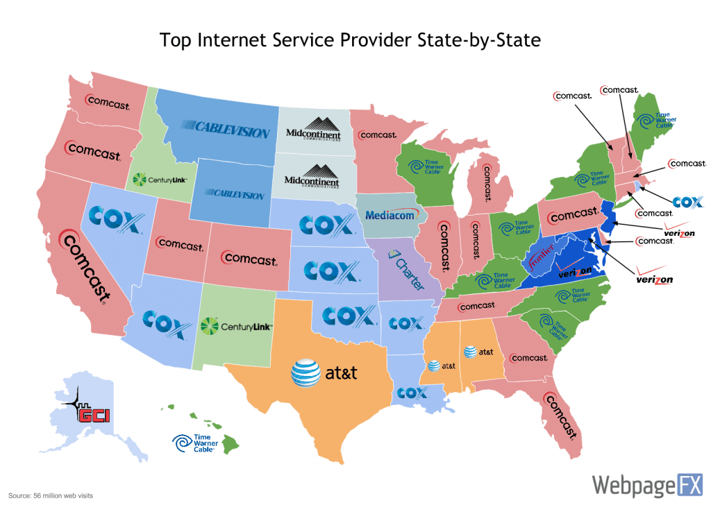
Get it out the door
You can spend as much time as you want perfecting an infographic.
However, sometimes it’s best to just get it out the door.  One of our marketing team’s values is “ship, measure, improve, repeat.” This mentality has allowed us to be more efficient and focus on what really matters when we are working on a project. You could have your designers make an exuberant amount of revisions before it is just right and ready for your audience.
But the fact is it would have been fine eight revisions ago. By the eighth revision, your eyes are so trained to the visual that you overlook certain areas, and spend too much time contemplating adjustments to smaller details. Eventually you will lose interest in the infographic completely, and the excitement needed for pitching it to other people will have significantly diminished.
Don’t wait too long
We debated several elements on our Famous Internet Firsts infographic just like this.
And being that it was a major milestone for the Internet and the World Wide Web, each day that went by meant we would lose interest from our target audience as it got further and further away from our intended publish date. 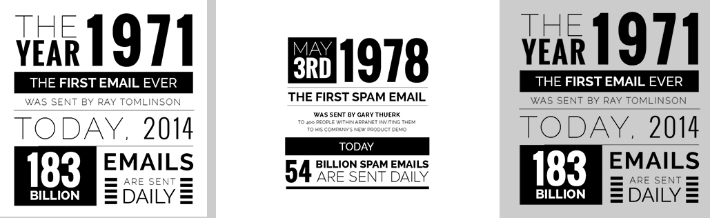
(click to view full size) We made the decision to quit pondering over some formatting issues and just go with our gut. How’d it do? It was featured on several sites, including Verizon’s news blog.
So, not too bad! 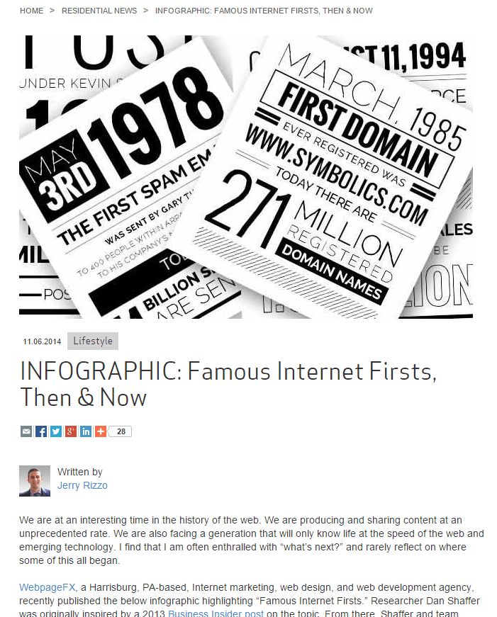
But we now know what kinds of things to consider ahead of time for improving similar infographics we create in the future. Ship, measure, improve, repeat.
Alternative promotional methods
Differentiating the way your infographic is promoted can yield high rewards as well. Sometimes, that might just mean getting yours to be seen by the right set of eyeballs.
Standing out to these types of influencers is key to getting your infographic out there. Maybe an email isn’t the best thing to do. Rather, try getting your content in areas where those influencers are spending their time.
Last year, we created a blog post that detailed the merger of Comcast and TWC. In the post, there were two maps of the US detailing the outlook of the ISP landscape. The maps were shared around, and eventually the Amazing Maps Twitter account picked it up and tweeted it to its audience of 200,000 followers.
Awesome! The tweet itself generated a few shares and views, but nothing truly groundbreaking. 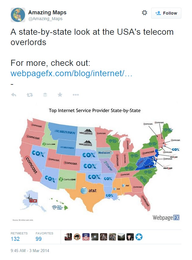
He reached out to us, and we had a writeup within a day or so. 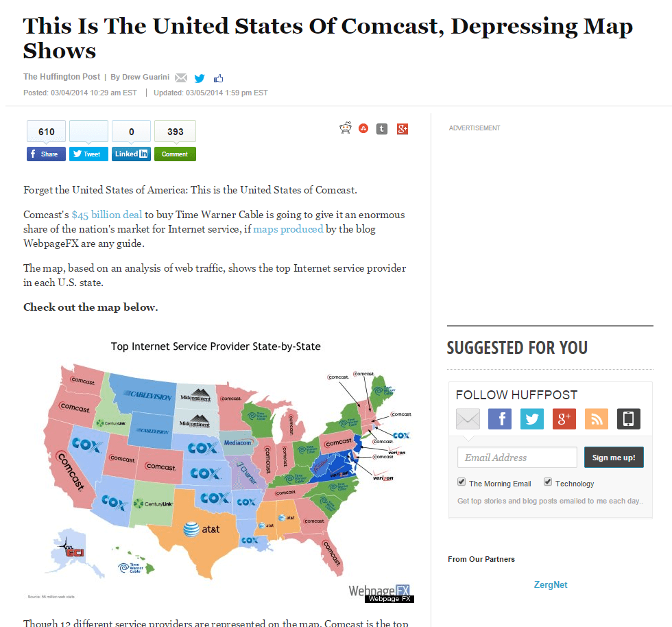
Get your content where discovery is more likely to happen
That example may have just been sheer luck, but it proves the point.
Email pitches can quickly fall through the cracks and be easily lost. Find where your intended influencers are hanging out, then rework your approach to promoting your content.
Don’t freak out
The chances of something going drastically wrong are pretty good.
If you’re going viral, thousands of people will see it. That means thousands of people with their own opinion will probably have something to say about it. Sorry.
Missing something? Forgot spell check?
 Let’s say your infographic makes its rounds and eventually spurs some conversations in the comments section or an online forum.
Excitedly, you check it out only to find that the thread is riddled with complaints, grammar corrections, and design suggestions from a wealth of “experts” who gladly offer their advice free of charge. Most of the time, you can ignore the over-the-top criticism. But if there is a grammar mistake, don’t be afraid to admit it! Everyone is human.
Just fix it, and let them know where to find the corrected version. No one said you weren’t allowed to make any last minute adjustments to your own content!
What if something really bad happens?
More often than not, those who are interested in what you made will gladly give you time to make things right. So act quickly and do what you can to correct the issue. A while back, we created an infographic about the science of happiness.
Barely after we had hit the publish button, someone had stolen our entire infographic. What do I mean by stolen? Well, they took the image, changed the colors slightly, and slapped their logo over ours.
They then posted it to Visual.ly under their own name. 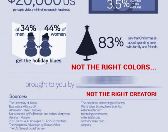
I remember watching Visually’s view count quickly rise to over 10,000 views on an infographic we made, while someone else was getting all the credit. What’s worse is that several high authority sites including HolyKaw were posting it!
Resolve the issue and move on
We had to contact Visually and tell them what happened.
After showing them proof and giving them our information, we had the correct infographic (different colors, right logo, and high resolution) transferred to our own Visually account. That meant that the trending infographic was accredited to the right company. The next task was to reach out to a dozen or more high authority sites that posted the wrong infographic and attributed the wrong company.
Surprisingly, this was really easy. Upon contacting each site, explaining what happened, and showing them the higher resolution version with the correct coloring, we eventually got every single attribution link pointing to us! Not only that, but each site was extremely apologetic and made the change as soon as they could.
Just ask!
You’ll miss 100% of the shots you don’t take.
So be sure to ask for a share, a link, or whatever you want.
Ask influencers
 This is a simple lesson, but well worth the mention. You never know what influencer, blogger, or editor will really enjoy something you’ve made.
It’s worth reaching out to them!
Ask your viewers
Likewise, you should also be asking for things from your viewers. This can be done in a few different ways. It sounds simple, but one of the viral pieces we created was missing a share button for StumbleUpon.
We were seeing almost 1,000 real time visitors on our site for this piece, but the StumbleUpon shares were extremely low. Upon adding this button, the stumble count quickly shot up, which brought in an additional channel of traffic for us. The page now has over 9,000 stumbles!

Take it a step further
If just adding a share button for a particular service would bump up traffic, why not actively ask them if they shared it? So we did. We added a pop-up. (gasp) The pop-up asked “did you like this?” when a user moved to close the tab, along with a simple Facebook like box.
Just below that, we asked for their email address. That way we could email them when we made something just as awesome further down the road. 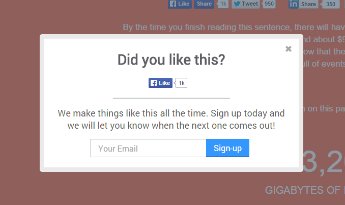 Just by asking, we generated hundreds more shares and collected hundreds of email addresses.
Now we have a backlog of people to send to when we create another infographic!
We’ve learned a lot
As you might have gathered, we’ve learned a great deal from our experiences. We’re proud to have gotten so many views from so many people!
We hope that by sharing the lessons we’ve learned from creating, distributing, and promoting our infographics, you’ll pick up on a new tip or idea of your own. Next time you publish a new piece of visual content, why not refer back to our lessons and see if you can apply any of them to your own situation? Have any questions or comments?
Leave them below and we’ll get back to you. Thanks for reading! Photo credit: Jazbeck, Quinn Dombrowski (CC)
-
 Dan is a marketer for WebFX who likes everything tech, marketing, and startups. Follow him on Twitter @ShafferDan.@ShafferDan
 -

WebFX is a full-service marketing agency with 1,100+ client reviews and a 4.9-star rating on Clutch! Find out how our expert team and revenue-accelerating tech can drive results for you! Learn more
Try our free Marketing Calculator
Craft a tailored online marketing strategy! Utilize our free Internet marketing calculator for a custom plan based on your location, reach, timeframe, and budget.
Plan Your Marketing Budget
Share this article
Maximize Your Marketing ROI
Claim your free eBook packed with proven strategies to boost your marketing efforts.
Get the GuideTry our free Marketing Calculator
Craft a tailored online marketing strategy! Utilize our free Internet marketing calculator for a custom plan based on your location, reach, timeframe, and budget.
Plan Your Marketing Budget


