

If you’re responsible for monitoring the performance of your company’s site, you know that there are a ton of different metrics to measure.
Many of them are important for understanding how well your site does at furthering your business goals, and can also give you insight as to what can be improved.
But of all the metrics relating to your site, the most important is its conversion rate. From the minute a visitor arrives at your site, you should direct them to take action towards becoming a customer. But how can you tell if your site does this?
Beyond looking at the rates in your analytics account, here’s how to make sure that your company’s site is designed to convert:
If you’d like to talk about your custom web design needs, contact us online or call us at:
888-601-5359
Consider your site’s function
One of the first steps in conversion analysis is determining what your site needs to accomplish.
So, what role does your website play in your company’s sales funnel?
If you run an ecommerce store, for example, your goal is for visitors to make purchases directly on your site. And although you need other content on your site to introduce your company and show potential customers how they’ll benefit from your products, you ultimately want to drive them to product pages.
If you own a local business, on the other hand, your site’s main purpose is to convince potential customers to visit your physical location.
And although site visitors can’t immediately become customers online, you should make it clear that your business is worth checking out – and also make it as easy as possible for them to locate your address, hours, and phone number.
If you’re a B2B company (like WebFX), your site’s function depends on your industry. In most cases, though, it serves to generate leads via contact forms or phone calls.
Start with your homepage
Now that you know what your site needs to accomplish, it’s time to integrate conversion into your web design.
Imagine that you’re a first-time visitor to your company’s website.
Go to your homepage, and consider what you would do. If there’s no immediate call to action (CTA), you’d probably either look for something that sounded interesting to click or go to another site. And if there is a CTA, is it compelling enough that you’d want to listen?
This is a difficult question to answer if you’ve already spent a lot of time on your site, so it can be extremely helpful to enlist the help of someone outside your company, like a family member or friend.
And if you really want an objective opinion, there are plenty of users on Fiverr that are willing to test sites for $5.
Your site should direct users to take action right off the bat, and if it doesn’t, it’s time for a change. If you don’t let your visitors know what action that is, they won’t know to do it.
Add CTAs to every page
Beyond your homepage, the other pages on your site should also contain CTAs.
This doesn’t mean that you should add a giant quote form to the center of every single one, but users shouldn’t have to navigate back to your homepage to take the action you want. The best way to do this is by including a CTA in your header or footer that links to a particularly important page like a contact form or best-selling product.
That way, no matter where a visitor is on your site, they can quickly and easily take the next step to becoming a customer.
As you add CTAs to your pages, it’s important to test what works and what doesn’t. Using tools like Unbounce, you can run A/B tests to compare the conversion rates of different pages to be sure that you’re using the most effective strategies for your site.
For more information on A/B testing, check out our free beginner’s guide with everything you need to know.
Keep your sales funnel in mind
Although your calls to action are ultimately what compel site visitors to become customers, all the content on your site should move them through the sales funnel.
However, this doesn’t mean overwhelming them with constant CTAs.
To start, you can create top-of-funnel content (like blog posts and infographics) that’s designed to answer basic questions about your industry and optimize it for long-tail keywords to attract visitors. Then, add links to middle-of-funnel content like case studies or customer testimonials.
From there, you can link to your high-conversion, bottom-of-funnel pages where visitors can either fill out a contact form, make a purchase, or take whatever other action your site is ultimately designed to encourage.
This way, the pages on your site work together to introduce your company to visitors, tell them why they should become customers, and allow them to do so – all in one seamless, high-converting process.
A hole in your marketing funnel will drain your sales.
Learn how to patch it with our free tool.
Fix Your Marketing Funnel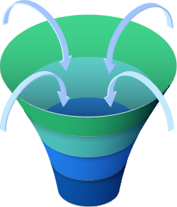
Is your site designed to convert?
If your site isn’t moving visitors through the sale funnels as well as it should be, it’s time to make a few changes.
And if you’re not sure how to create effective CTAs, check out this blog post for some creative inspiration.
-
 Trevin serves as the VP of Marketing at WebFX. He has worked on over 450 marketing campaigns and has been building websites for over 25 years. His work has been featured by Search Engine Land, USA Today, Fast Company and Inc.
 -

WebFX is a full-service marketing agency with 1,100+ client reviews and a 4.9-star rating on Clutch! Find out how our expert team and revenue-accelerating tech can drive results for you! Learn more
Try our free Marketing Calculator
Craft a tailored online marketing strategy! Utilize our free Internet marketing calculator for a custom plan based on your location, reach, timeframe, and budget.
Plan Your Marketing Budget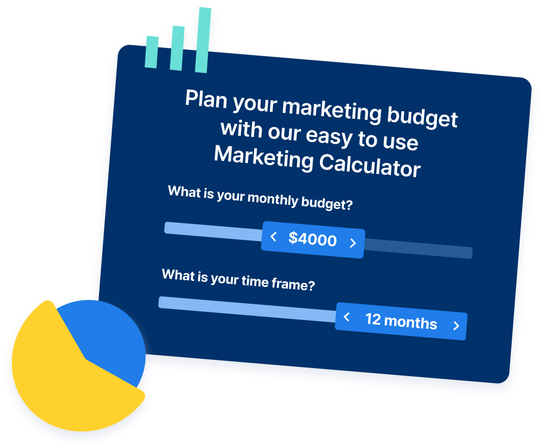
Share this article
Maximize Your Marketing ROI
Claim your free eBook packed with proven strategies to boost your marketing efforts.
Get the GuideTry our free Marketing Calculator
Craft a tailored online marketing strategy! Utilize our free Internet marketing calculator for a custom plan based on your location, reach, timeframe, and budget.
Plan Your Marketing Budget


