

At their core, landing pages are designed with the goal of directing and converting visitors. You may want your visitors to go to a specific page, or you may want them to take action on something. Every element of a landing page has to work harmoniously to influence users to watch a video, read a call-to-action, or click a button.
Businesses will have different goals with their landing pages, and conversion rate optimization (CRO) is a process that can help them get there. Whether you’re designing landing pages or improving your existing ones with CRO, it’s helpful to benchmark from live examples for inspiration. Below you’ll find five landing page examples along with actionable tips you can immediately start using to help boost your conversion rates.
These are some of the best landing page examples for inspiration.
1. Getrest.co
 First off is a pre-release landing page for an Apple Watch charging station. We’re greeted by a high resolution image of the product, accompanied by the name and description in large and legible text. As we scroll down, the product deconstructs itself, highlighting its simplicity and elegance in design.
Three content blocks make up the next area, which offer clear and concise product descriptions, supported by high resolution imagery. We arrive at the call-to-action at the halfway point, where visitors are encouraged to pre-order the product for a discounted price.
Conversion tips from this landing page example:
- A strategic pricing tactic is employed, labeled as a “pre-order special” and giving visitors incentive to purchase now. This insinuates prices will return to a more expensive price at a later date and creates a sense of urgency.
- Don’t overload or confuse visitors with excessive information. A clean landing page with a clear purpose keeps visitors focused on your conversion goal. This a one-page site and visitors immediately understand what the product is, along with the value and quality behind it.
2. Mapbox

A unique selling point is clear when it comes to Mapbox. They’ve captured the essence of minimalism, displaying the primary benefit of their service along with image examples. Touting the slogan “Design the map your [keyword] deserves,” visitors with different goals can get a sense of how the product can benefit their respective situations.
As we scroll down, we pass through social validation from big brand names like Pinterest and Etsy, flowing into a full-page call-to-action supported by a GIF of their app in action. Smack dab in the center is a call to action to start making a map in seconds, for free.
Conversion tips from this landing page example:
- Product versatility can be exemplified by simply modifying one word. In the case of Mapbox, they alter their slogan to support check in services, applications, markers, and even adventures.
- Repetition helps convert more visitors by providing multiple opportunities to start. Consider highlighting and displaying unique selling points (USP) in a progressive path, so the further visitors scroll the more convinced they become. Try accompanying each USP with a call-to-action button that varies in text, but directs to the same page.
3. Tookapic
 With nearly 3,000 photos and over 1,000 photographers signed up, Tookapic has done an excellent job of converting curious creatives and artists into members of their social photography community. We’re greeted with a full-width landing page where the background changes between user-submitted photos. Right in the center is a clear call-to-action, a quick statement of how their service benefits us, a button to get started, and a link to browse community photos.
As we scroll down we pass through three cleanly designed content blocks with call-to-action buttons for getting started and browsing. This landing page aims to convert visitors into members of the community with direct links to signing up.
Conversion tips from this landing page example:
- Tookapic leverages its community content multiple times throughout its landing page as a way to highlight active members and attract visitors. Consider tapping into your own communities and featuring unique content as a way to both honor their loyalty and peak the interest of new visitors.
4. Stampready
 The email marketing software industry is becoming a very crowded place. With services like MailChimp, Aweber, and ConstantContact, it’s a fairly intimidating space. Stampready kicks off their landing page with an extremely clear description of service: “Create & send campaigns simplified.” This overlays a video which details their software in-depth.
Visitors who continue to scroll after watching the video are greeted by small content blocks that include more descriptions of services, pricing details, and an incentive to sign up (a 50% discount off first purchases). Most notably on their landing page is a fully functional calculator that appeals to two types of customers. One is the “pay as you grow” for new/small sites, while the other is a custom plan based on their number of subscribers.
Conversion tips from this landing page example:
- Strategic use of a professionally made video has been reported to significantly increase conversion rates. Budget-willing, consider investing in producing a video to support your landing page goals.
- Design with customer profiles in mind. If you have a pretty good idea of two or three types of customers, try creating functional tools (such as a calculator) and copy to appeal to those types.
5. Ceramcor
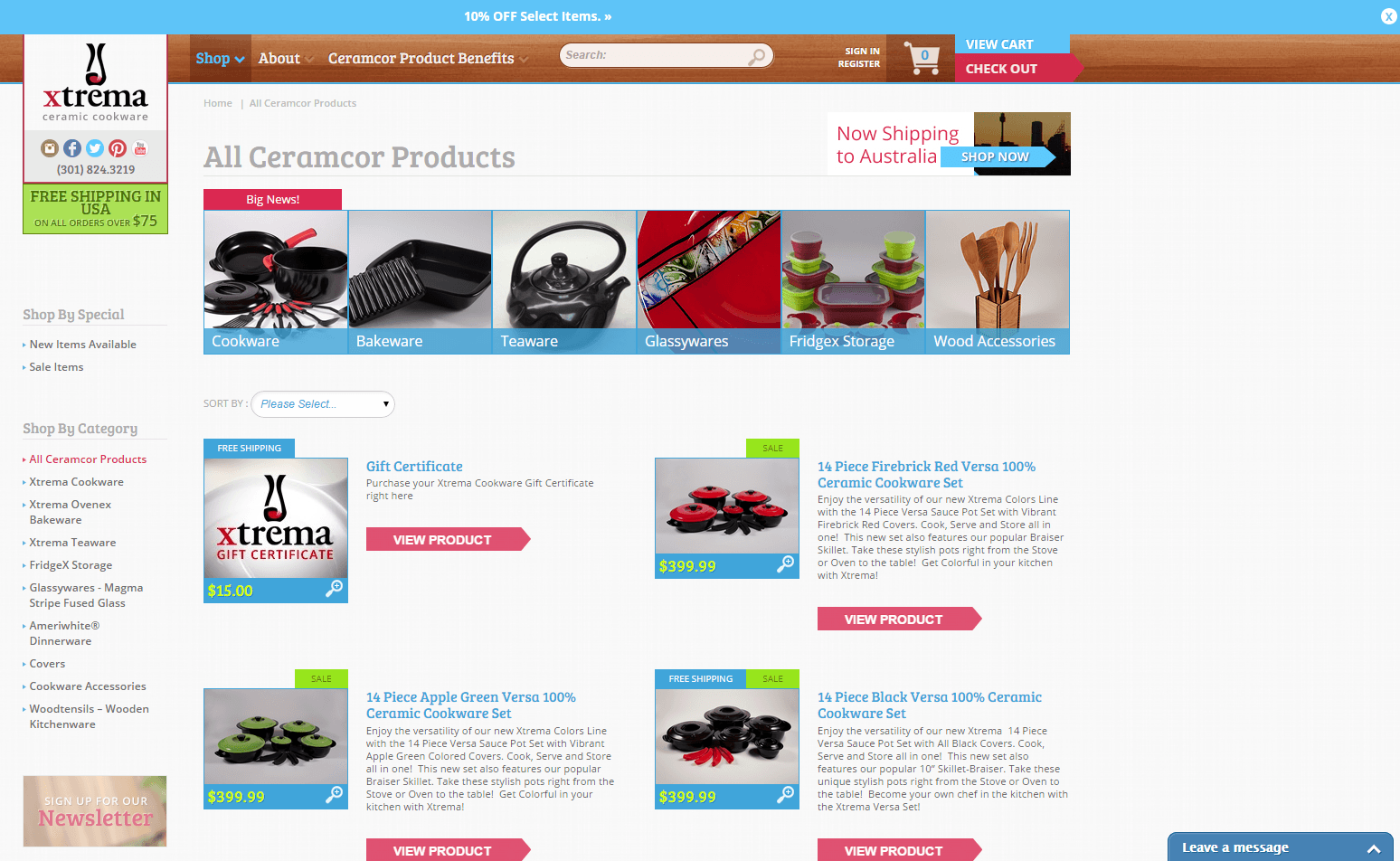 Up next on our examples of landing pages is one of our very own ecommerce clients, Ceramcor. The goals and needs of an ecommerce platform diverge from the modern landing pages we’ve seen, with only a few things to click. One of Ceramcor’s primary goals was to create an intuitive online shopping experience to improve conversion rates on their product landing pages.
Designing for intuition requires a study of user behavior and digital interactions. To improve the click through rate between product pages from the main landing page, horizontal and vertical product categories are displayed to allow visitors easy access as they browse. Two incentives are also included to improve conversion rates. To help convert social traffic into happy customers, we designed the following Facebook landing page: 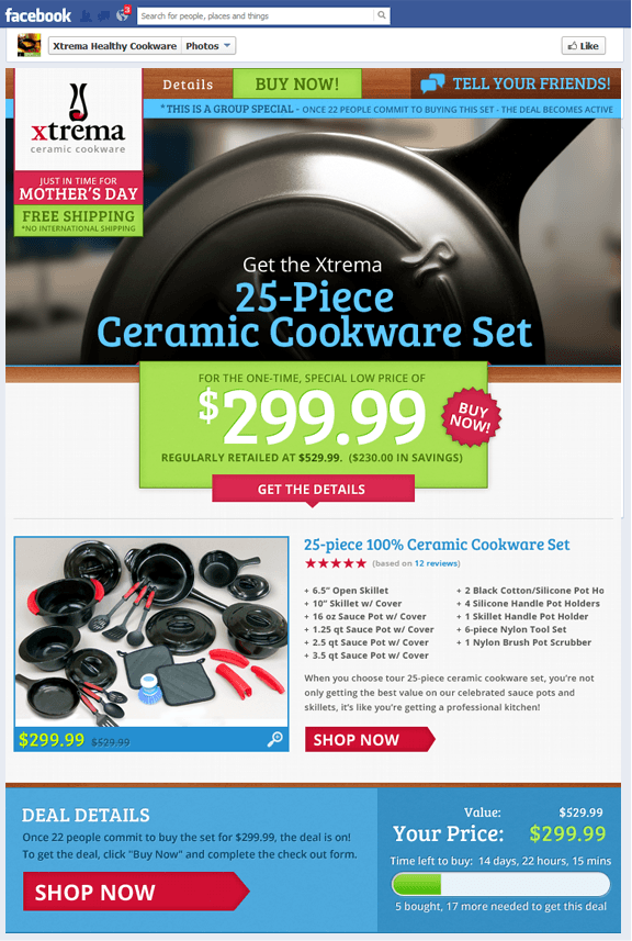 In this Facebook landing page example, we highlighted one of the top product bundles – a 25 piece cookware set – and gamified the deal by requiring 22 people to commit to purchasing for a massive discount.
The strategy behind this was to use urgency as well as word-of-mouth incentives to catalyze conversions while leveraging the relevancy of Mother’s Day. Collectively we were able to increase annual revenue by 85% and conversions by 12% and also reduced the bounce rate by 60%. Read a case study for this client’s design here.
Conversion tips from this landing page example:
- Consider using a sticky banner ad that offers discounts/incentives on product and service pages, such as “10% off select items.” You can also use urgency commands such as “free shipping on all items for the next 2 hours.”
- Try giving prominence to items that are on sale and/or are eligible for free shipping with attention-grabbing colors. Instead of browsing through a catalog of identically designed product blocks, visitors will have an easy time taking advantage of your sales.
- For brands that have started to build up social communities, consider developing social media landing pages to reach the friend and family networks of customers.
Start Converting More Visitors with Effective Landing Pages
Landing pages are the bedrock of revenue for many businesses, and checking out some of the best landing page examples can help you improve your own. Ranging in length, design, and purpose, a proper landing page design factors in:
- Audience profiles and research
- Contextual use of products/services
- Clear call-to-actions and one focused message
- High resolution media (images + video)
- Intuitive user behavior
- Unique selling points, benefits, and features
- A/B testing copy, colors, and overall layouts
- Testimonials, easy contact methods, and small blocks of text
Have any questions about how to design an amazing landing page that converts? Contact us today!
-
 Trevin serves as the VP of Marketing at WebFX. He has worked on over 450 marketing campaigns and has been building websites for over 25 years. His work has been featured by Search Engine Land, USA Today, Fast Company and Inc.
 -

WebFX is a full-service marketing agency with 1,100+ client reviews and a 4.9-star rating on Clutch! Find out how our expert team and revenue-accelerating tech can drive results for you! Learn more
Try our free Marketing Calculator
Craft a tailored online marketing strategy! Utilize our free Internet marketing calculator for a custom plan based on your location, reach, timeframe, and budget.
Plan Your Marketing Budget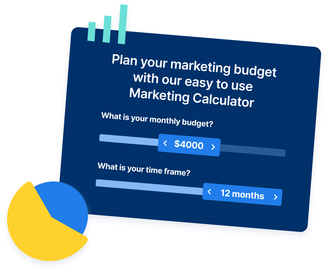
Share this article
Maximize Your Marketing ROI
Claim your free eBook packed with proven strategies to boost your marketing efforts.
Get the GuideTry our free Marketing Calculator
Craft a tailored online marketing strategy! Utilize our free Internet marketing calculator for a custom plan based on your location, reach, timeframe, and budget.
Plan Your Marketing Budget


