
Any experienced Internet marketer will tell you that one of the most important metrics for a site is the conversion rate, or the percentage of visitors who take steps to become customers. This number is important because it shows how effective your site is at making people want to more about your company or make a purchase, instead of just leaving after they find what they were originally looking for. You may already know that the process of improving your site’s conversion rate is called conversion rate optimization.
What many business owners don’t realize, though, is that it shouldn’t just be limited to landing pages or other pages intended to drive specific actions. In fact, the pages that a visitor sees directly after converting can have a huge impact on what they do next. When a visitor signs up for a newsletter, creates an account, or makes a purchase, their time on your site isn’t necessarily over.
They’re directed to a thank you page, and the content on that page can either make them leave, or stick around on your site. So how can you create a great thank you page that will make your visitors stay? Here are a few thank you page examples from companies that got it right:
Crazy Egg
After signing up for Crazy Egg’s newsletter, I was taken to this simple, straightforward page: 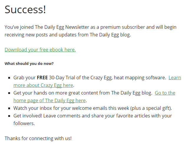 First, they start off with positive messaging.
By calling my action a “Success!” and referring to me as a “premium subscriber,” they’ve already got my attention. From there, they give me a number of different options – all of which are preferable to me leaving their site. I’m given a choice between downloading a free ebook, learning about a free trial, or returning to the homepage of the blog I just subscribed to.
It’s worth noting, though, that even though the CTAs are similar, they positioned the ebook first – likely because that’s the action they want subscribers to take most. After these options, I’m reminded to watch my inbox and told that I’ll be receiving a “special gift.” This is a great way to ensure that subscribers will actually read their newsletter and not just let it sit in their spam folder.
Wistia
When I made an account with Wistia, a video hosting company, I was directed to a very unique thank you page: 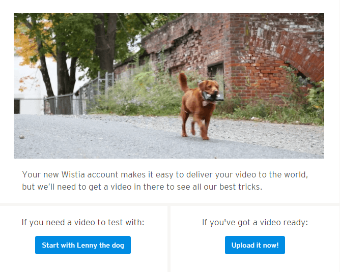 The first thing I see is a video of an adorable dog “delivering a video,” which is not only entertaining, but also relevant to what the company does.
From there, I have two options: test out Wistia’s features with the dog video, or upload my own video to test. This strategy is extremely effective at getting users to experiment with the platform. Instead of making new members wait until they have a video ready to go, they can jump right in and get a feel for what Wistia can do.
They can play with the appearance, controls, social bar, timeline actions, and captions, which will only make them more excited to get their own video up and running.
Unbounce
Considering that Unbounce is a conversion rate optimization company, I had high hopes for their thank you pages – and the one I saw after signing up for their newsletter didn’t disappoint: 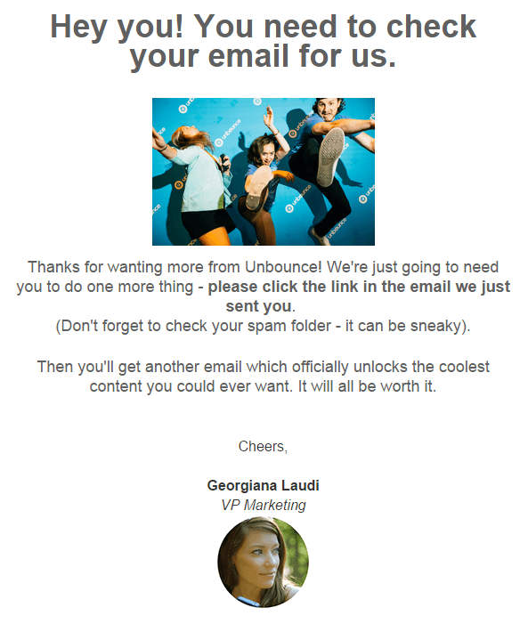 Not every company could get away with starting a page by saying, “Hey you!”, but in this case, it works. It’s casual but attention-grabbing, and makes sense with the photo below it.
The rest of the copy is written in a similar style, and even though the message they convey is basically the same as thousands of other email subscription confirmation pages, it comes across as much more interesting. I was actually looking forward to this email, mostly because I figured it would be written in an entertaining fashion. Plus, who wouldn’t want to read “the coolest content you could ever want”?
Pixabay
When I finally decided to create an account on stock photo site Pixabay (after months of entering captchas as an unregistered user), I was taken to this thank you page: 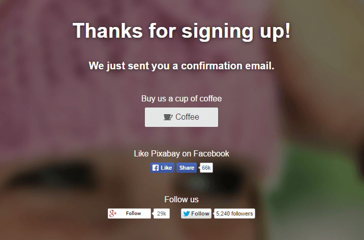 The actions they want me to take are simple: make a donation and follow them on social media. The social media buttons are pretty standard, but what stood out to me is the “Buy us a cup of coffee” call to action. Everything on the site is free, and while there are “sponsored images” from Shutterstock that finance the site, they also accept donations.
But let’s face it – how many people would actually click on a “Donate now” button? The coffee button is much more interesting, and at the same time, makes donating seem much more reasonable by implying that the amount can be as small as the cost of a cup of coffee.
Change.org
If you’ve ever signed a petition on Change.org, you’ve likely seen a page much like this one: 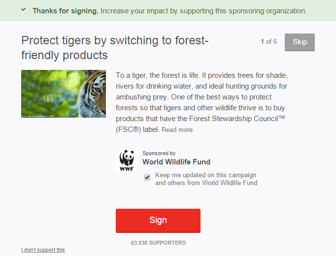 And if you’re anything like me, you’ve spent the next half hour or so signing petitions to save animals, protect the environment, or champion human rights.
The genius of this page is that it doesn’t just encourage me to “increase my impact” by signing for random causes, it presents petitions that are similar to the one I’ve already supported. At the same time, if I see one I don’t necessarily want to sign, I can skip it and see other options. And though the copy at the bottom is small, it certainly gets the point across.
Who’s going to click “I don’t support this” on a page about saving wildlife? Certainly not the user who just signed a petition to protect the elephants.
The takeaway
If you’re looking to improve the thank you pages on your site, there are certainly a few strategies here that could work.
That being said, it’s important not to overdo it and risk overwhelming your visitors with too many CTAs. If you’ve noticed any other impressive thank you pages (or have one you’re particularly proud of on your own site), please let me know in the comments below!
-
 Trevin serves as the VP of Marketing at WebFX. He has worked on over 450 marketing campaigns and has been building websites for over 25 years. His work has been featured by Search Engine Land, USA Today, Fast Company and Inc.
 -

WebFX is a full-service marketing agency with 1,100+ client reviews and a 4.9-star rating on Clutch! Find out how our expert team and revenue-accelerating tech can drive results for you! Learn more
Try our free Marketing Calculator
Craft a tailored online marketing strategy! Utilize our free Internet marketing calculator for a custom plan based on your location, reach, timeframe, and budget.
Plan Your Marketing Budget
Share this article
Maximize Your Marketing ROI
Claim your free eBook packed with proven strategies to boost your marketing efforts.
Get the GuideTry our free Marketing Calculator
Craft a tailored online marketing strategy! Utilize our free Internet marketing calculator for a custom plan based on your location, reach, timeframe, and budget.
Plan Your Marketing Budget


