

“Responsive,” “mobile-friendly,” and “mobile-optimized” are phrases we’ve all heard frequently over the past few years. Keeping mobile requirements in mind is definitely more important than ever – but what actually constitutes mobile-friendly content? In this post, I’ll explore exactly what high-quality mobile content looks like.
I’ve put together 4 guidelines you can follow to make sure your mobile content is the best it can be.
Why worry about mobile?
As a preface, it always helps to consider the “why.” To start, Google made it crystal clear how important mobile optimization is with its “mobile-friendliness” update in April of last year. Essentially, any site that didn’t pass Google’s mobile-friendliness test would not rank as well in mobile search results. Google summed up the goal of their update with the below graphic: 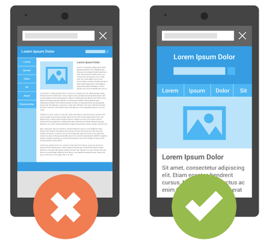 While that update is now old news, there are three more pressing reasons to keep mobile optimization at the top of your priority list:
- A month after the mobile-friendly update, Google officially announced that mobile search queries had effectively surpassed desktop search queries.
- Google will release a new update in May that will amplify the effects of their mobile-friendliness ranking signal from last year.
- Google-backed projects like AMP are picking up steam. These are clear indicators that the future of Internet marketing will be inextricably tied to mobile-friendliness.
In 2024, you have to think about what “mobile-friendly” means from both a search engine perspective and a user perspective. It’s not just about avoiding a SERP penalty anymore.
1. Stop retrofitting desktop content to mobile standards
Many marketers create content with desktop computers in mind, then hack a barely-functional mobile solution together after the fact. This practice is contradictory to industry trends and often results in more work for everyone involved.
Adopt a “mobile-first” mindset instead of leaving it on the back burner. Thinking in terms of mobile -> desktop is more productive and efficient than sticking to the outdated desktop à mobile model.  I’m not saying that you should completely eschew desktop-formatted content in favor of a mobile-only strategy, however.
You’ll see the best results by maintaining a diverse marketing strategy that pulls from all (successfully tested) channels, as always. Within that framework of diversity, though, you may find more or less success with various approaches. Among the most popular are:
- The “device-irrelevant” approach to content creation
- Designating certain content for mobile and certain content for desktop
- Modifying the same piece of content based on the viewer’s device
No matter your choice, the main takeaway here is that we’re far past the point where mobile can remain a tier-two priority.
2. Get better at writing headlines
It’s no secret that headlines have long been (and always will be) one of the most important aspects of content creation. It doesn’t matter how great the bulk of your piece is – a boring or irrelevant headline means one less viewer. Users are faced with an endless supply of information, and headlines are the only way they can determine whether your content is worth their time before clicking. In the world of mobile, headlines are even more important.
Mobile functionality allows for shorter attention spans than desktops do. A headline is often all a mobile user will see before deciding to read on or return to the SERPs, because mobile screens have such little above-the-fold real estate to work with.
3. Structure mobile content differently
This again has to do with the limited above-the-fold space available on mobile. If you get your headline right, you need to follow it up with some powerful content.
The first few lines of text should be concise and attention-grabbing. If you opt for an image-first approach, make it colorful, engaging, and relevant to the rest of the article.  Mobile users don’t necessarily read less than desktop users, they just read it differently.
Take large blocks of text, for example. They’re tedious to read even on a desktop computer, but look especially daunting and inaccessible on small mobile screens. The best mobile content is every bit as rich and engaging as desktop content but displayed in a more digestible, instantly-gratifying format.
4. Reconsider what “mobile-friendly” is
“Mobile-friendly” has essentially been a synonym for “responsive” over the past few years.
Marketers and designers would simply ensure a piece of content looked good on all screen sizes. More recently, marketers have started to realize that this approach to mobile content needs to be overhauled. While responsiveness is clearly important, there are many other factors that contribute to truly high-quality mobile content.
How do mobile users consume content? How do they interact with it? Where do their eyes first go on a mobile screen compared to a computer screen?
These are all questions you should ask yourself when coming up with a mobile content strategy. Of course, it’s important to check all of Google’s mobile-friendly boxes. But, it’s just as important to optimize your mobile content in accordance with viewers’ preferences.
High-quality mobile content is not about what (or how much) you write, so much as how you write it.
Has your company developed a new approach to mobile content?
If you or your company has a specific approach to mobile content, I’d love to hear about it in the comments below!
-
 Ryan is a Lead Marketing Consultant at WebFX. Follow him on Twitter @rmaake107!@rmaake107
 -

WebFX is a full-service marketing agency with 1,100+ client reviews and a 4.9-star rating on Clutch! Find out how our expert team and revenue-accelerating tech can drive results for you! Learn more
Try our free Marketing Calculator
Craft a tailored online marketing strategy! Utilize our free Internet marketing calculator for a custom plan based on your location, reach, timeframe, and budget.
Plan Your Marketing Budget
Share this article

Maximize Your Marketing ROI
Claim your free eBook packed with proven strategies to boost your marketing efforts.
Get the GuideTry our free Marketing Calculator
Craft a tailored online marketing strategy! Utilize our free Internet marketing calculator for a custom plan based on your location, reach, timeframe, and budget.
Plan Your Marketing Budget